How Behance went responsive with Sass and Require.js
Learn how Behance used Sass and Require.js to build a complex responsive search and discovery tool for its homepage, optimise mobile performance and retrofit sections of its website
Sign up to Creative Bloq's daily newsletter, which brings you the latest news and inspiration from the worlds of art, design and technology.
You are now subscribed
Your newsletter sign-up was successful
Want to add more newsletters?
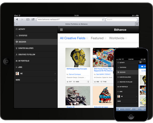
At Behance, we recently made our powerful search and discovery tools on the homepage responsive.
Making a responsive website was new territory to all of us, so none of us had experience designing or building one, let alone any first-hand experience with best practices or tricks for doing so.
How different should the phone view be from the tablet view from the desktop view? How should we structure our code? What tools and frameworks should we use? Does anybody in this Apple-happy office have an Android phone we can test on?
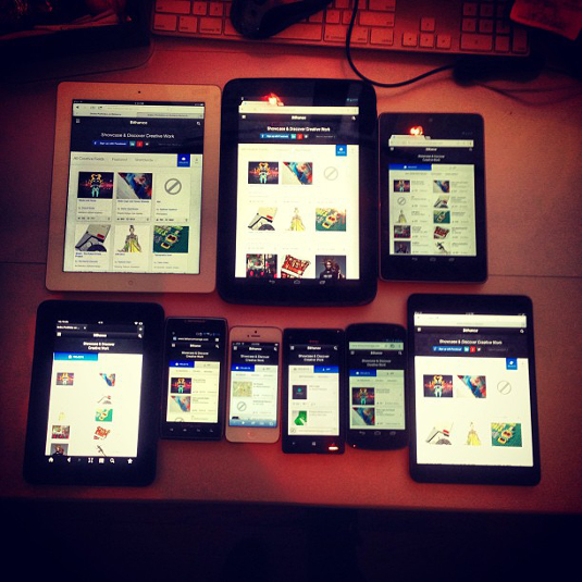
Article continues belowWith a small team of dedicated developers, we got it done and learned a lot. We laid a foundation of responsive modules that could be re-used on the rest of the site using the power of Sass to make our CSS clean, modular and extensible. We flexed our JavaScript muscles by making and using our own breakpoint notifier and using Require.js for modular JS and asynchronous code loading. We also built up a modest mobile device testing station in our office to boot.
Since then, we've started working on making other pages of Behance responsive and have launched our first fully-responsive website for the 99U. Here are the most important things we learnt from our first responsive endeavour:
Retrofitting a website is hard
There are a number of considerations to make when you retrofit a site to be responsive. Behance wasn't originally built with responsiveness in mind and had too many pages to upgrade the entire website to be responsive all at once. We had to think carefully about how we could upgrade pieces of the site without affecting others. We would need a different base layout, a new way of including our CSS and JS, and some way to create or adjust existing components (popup dialogs, form elements, etc) to be responsive without negatively impacting older, non-responsive pages.
The layout
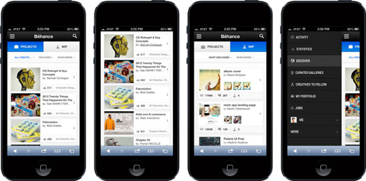
One of the first things we had to do was change the core of our layout to be responsive. Our fixed-width columns were the first to need adjusting, plus we needed to implement a special header toolbar and off-screen navigation (or, as we like to call it, 'the basement') for phones and tablets. Our new layout included:
Sign up to Creative Bloq's daily newsletter, which brings you the latest news and inspiration from the worlds of art, design and technology.
Markup for the toolbar and basement navigation
Getting rid of elements is the easiest way to make the most important content fit comfortably on smaller screens. We love to display: none; anything that doesn't strictly improve the mobile browsing experience. Sometimes you can't remove things entirely, and that's when off-canvas elements come into play. We decided to go with an off-canvas menu for our main site navigation. We liked that it offered a way to keep elements accessible without being visible all the time and that the design pattern was common enough that users should already be comfortable using it.

The HTML was structured like:
<div class="top-panel">
    <div class="hamburger"></div>
    <!-- site content -->
  </div>
  <div class="basement">
    <!-- basement items -->
  </div>
And the structural and functional Sass code:
.basement,
  .top-panel {
    @include translate3d(0,0,0);
  }

  .basement {
    height: 100%;
    position: absolute;
    top: 0;
    left: 0;
    width: 75%;
  }

  .top-panel {
    @include transition(transform .2s ease 0s);
    display: block;
    overflow: hidden;
    position: relative;
    height: 100%;
    top: 0;
    left: 0;
    z-index: 2;

    .basement-open & {
      @include translate3d(75%, 0, 0);
    }

  } // .top-panel
The JavaScript binds a click/tap event to .hamburger to toggle a basement-open class on the body. When added, the content panel slides to the right, revealing the basement underneath. When removed, the content panel slides to the left, covering the basement. Since the animations are using CSS transitions instead of JavaScript animations, the effect is smooth.
Feature detection
We use the feature detection library has.js throughout the site, and dropped a line in along with Require.js at the beginning of our tag to add a class when a user is on a touch device:
<script type="text/javascript">
  require(['has'], function(has) {
    $(document.body).addClass(has('touch-device') ? 'touch-device' : '');
  });
  </script>
Thanks to Require.js, the call to the library is asynchronous and fast, so it's non-blocking. We used the class to style certain elements differently if the user is on a touch device. Modernizr is another popular library that provides similar functionality.
We also used conditional comments for our HTML tag so we could fix the inevitable IE-only display issues:
<!--[if IE 7]> <html class="ie ie7"> <![endif]-->
<!--[if IE 8]> <html class="ie ie8"> <![endif]-->
<!--[if IE 9]> <html class="ie ie9"> <![endif]-->
<!--[if (gt IE 9)|!(IE)]><!--> <html> <!--<![endif]-->
A viewport meta tag to ensure content always fits the device and cannot be zoomed or scaled by the user
It took us a few minutes to figure out why our site wasn't scaling at all on mobile devices before we had this in place. It's restrictive, but we want our content to fit the device screen at all times and, if the design is right, the user won't need to zoom in for anything anyway.
<meta name="viewport" content="width=device-width, initial-scale=0.0, user-scalable=no, minimum-scale=1.0, maximum-scale=1.0" />Asset loading
Maintaining or improving performance of a site can be hard when you retrofit, since you are building extra functionality into an established system. We wanted to keep load times down as much as possible. We used Require.js to asynchronously load the majority of JS files and experimented with a few different ways of including our CSS files:
Method 1: A link tag per breakpoint
<link rel="stylesheet" href="desktop/site.css" media="(min-width: 1025px)" />
<link rel="stylesheet" href="tablet/site.css" media="(min-width: 604px) and (max-width: 1024px)" />
<link rel="stylesheet" href="phone/site.css" media="(max-width: 603px)" />
Our primary hope for this approach was that the CSS files wouldn't download on a device without a matching media query. As a result, we prevented complex desktop styles being undone by the CSS for the simpler phone and tablet views. But, in practice, not only were all the CSS files always downloaded, we found that IE8 wouldn't load any media-qualified links at all, leaving the desktop site completely unstyled. We could have just removed the media attribute from the desktop CSS, but decided we didn't like the file structure and number of HTTP requests this created anyway.
Experiment 2: Media queries within the CSS
We opted for a desktop-first approach and layered any necessary phone and tablet styles on top by putting our media queries last. With this approach, your CSS file may look like:
/* desktop styles */

@media (min-width: 604px) and (max-width: 1024px) {
  /* tablet styles */
}

@media (max-width: 603px) {
  /* phone styles */
}
The biggest benefit here is that there are fewer HTTP requests for the browser to make. We ramped it a degree by using Sass partials for each breakpoint and utilities (like our variables and mixins), so the end result is a single CSS file. However, our code and file structure is a little more modular:
$tablet_upper: 1024px;
    $phone_upper: 603px;

    @mixin phone {

      @media (max-width: $phone_upper) {
        @content;
      }

    } // @mixin phone

    @mixin tablet {

      @media (min-width: $phone_upper+1) and (max-width: $tablet_upper) {
        @content;
      }

    } // @mixin tablet
_utility.scss partial
@import "_utility.scss";

  /* desktop styles */

  @import "_tablet.scss";
  @import "_phone.scss";
site.scss
Then, within each _tablet.scss and _phone.scss file respectively:
@include tablet {
    /* tablet styles */
  }
_tablet.scss partial
@include phone {
    /* phone styles */
}
_phone.scss partial
With Sass, any file whose filename starts with an underscore is a partial (a file that doesn't compile directly to a CSS file, but instead only compiles when it's imported from a regular Sass file). It's also important to note that a media query doesn't increase specificity, so any media queries you use should come after all your base styles.
The compiled code results in a single CSS file (like the example above), but for development, our files are structured and separated neatly. Sass source maps make it easy to use the inspector and see exactly what line and Sass file a rule came from, even if it's nested within other rules and imported from a partial. If you're using Firefox, FireSass will let you view this information in the styles panel of Firebug. Sass source map support has been available experimentally in Chrome since version 24 and Sass 3.3 will offer even more advanced source maps.

Component upgrades
Similarly to how we utilised partials for breaking up our responsive styles, we also created partials for our new responsive components. It's an ongoing set that will grow over time, but for now our file structure looks a bit like:
responsive.scss
  responsive/
    _popups.scss
    _buttons.scss
    _inputs.scss
Our compiled responsive.css gets included on any responsive page, and comes with the contents of our partials that adjust our existing components to be mobile-friendly. We also have a set of less commonly used components that can be included only in the files that need them (for example, a social media icon on a project page that isn't used very often).
The JavaScript has to respond, too
The homepage of behance.net is a complex page that can sort, search and filter multiple different types of content based on a number of different criteria. The core of its interactive power comes from our use of client-side templating with mustache.js and AMD modularity with Require.js.
Sometimes we needed code to run in one breakpoint but not another. For example, there's no need to load phone-specific mustache templates if the user is on a desktop, or to initialise the basement navigation on a desktop since it's only visible at tablet size or lower.
We built our own breakpoint notifier around the native matchMedia API so we could check the breakpoint the browser was currently in and fire events when the breakpoint changed. The latter is useful if you need to do something like initialise the basement when the user resizes their desktop browser window to be small enough to warrant it.
A native matchMedia check may look like:
if (window.matchMedia("(max-width: 603px)").matches) { /* window is less than 603px wide */ }With our wrapper, you define your breakpoints:
media({
  'phone'  : 'all and (max-width: 603px)',
  'desktop': 'all and (min-width: 1025px)',
  'tablet' : 'all and (min-width: 604px) and (max-width: 1024px)'
});
Then you can do a few different operations with it, including a basic boolean check:
if (media.is('phone')) { /* window is less than 603px wide */ }Running code automatically when a certain breakpoint matches:
media.on('phone', function(isPhone) {
  this.requestView( isPhone ? 'phone' : 'desktop' );
});
Or running code when you enter or leave a breakpoint:
media.on('tablet:enter', initializeBasementNavigation);
media.on('phone:exit', stopListenForResize);
With the breakpoint values in sync between the CSS and JS, the end result makes for a seamless transition between breakpoints and optimised code execution times.
Test responsive content on real devices
We started by testing the phone and tablet code by resizing our windows up and down in a desktop browser, in the iOS simulator and on our personal iPhone 5s. We were feeling pretty good about it until one of the developers pulled the site up on his older Android and pointed out how sluggish it performed and how clunky it was to use. It was a far cry from what we'd seen up to that point.
We immediately gathered up a list of the most popular devices (both generally speaking and as reported by Google Analytics) and bought a bunch of contract-free phones and tablets so we could do some real-world testing.

Tools like weinre and Adobe Edge Inspect make it easy to view, inspect and debug your content across devices. If you don't have the devices at hand, you may have luck with groups like Open Device Lab, who have started a grassroots movement establishing physical locations around the world for web and app developers to go to use a shared community pool of devices.
In our device testing, we were surprised to find quirks on some Android devices in places where it worked fine in others, some critical IE bugs on Windows Phones, varying user experience issues and performance differences across the board. No two ways about it, you have to test on real devices.
Sweat the small stuff
We worked hard to fine tune the details and usability of every breakpoint so that a user would have the best experience possible no matter what device they used (which is also why testing on real devices proved to be so important and valuable).
We tweaked box-shadows and border-radius values for better performance on desktop, and removed many of them for phone and tablet views. Chrome Canary has several amazing tools for gathering performance metrics, which will help you figure out your problem areas and measure the impact of your optimisations.
We spent time making sure that hit areas on smaller screens were big enough to be easy to tap and that our hover and active states made sense for a tap as well as a mouse. We got rid of WebKit's obtrusive transparent-black tap highlight color by setting the following code on tappable elements that had our own touch style:
-webkit-tap-highlight-color: transparent;We also solved a bit of flickering on iOS and Android devices by enabling hardware acceleration on specific elements using:
-webkit-backface-visibility: hidden;
-webkit-transform: translateZ(0);
We figured that we'll never use a fixed position element on a phone or tablet ever again. The original intent was for the toolbars at the top of the screen to be fixed at every breakpoint. We found out pretty quickly that, in practice, fixed position elements are sluggish and choppy while scrolling on handheld devices, and also didn't play well with our CSS-transformed basement navigation implementation. We opted to get rid of our incredibly useful (but horribly performing) fixed-position toolbars from the phone and tablet breakpoints in favour of a less stilted scrolling experience.

Conclusion
Ultimately, we were pleased with the final result and came out with a ton more knowledge than we started with. We carry these lessons through every new responsive project we work on. We're always learning something new along the way, whether that's a technique, a trick, a tool, or something else.
Responsive web development is still fairly new in the grand scheme of things, and we're always experimenting and testing new and better ways of doing things.
How do you build your responsive sites? Do you have any tips for retrofitting, or a better way to handle responsive code? Let us know in the comments below!

The Creative Bloq team is made up of a group of art and design enthusiasts, and has changed and evolved since Creative Bloq began back in 2012. The current website team consists of eight full-time members of staff: Editor Georgia Coggan, Deputy Editor Rosie Hilder, Ecommerce Editor Beren Neale, Senior News Editor Daniel Piper, Editor, Digital Art and 3D Ian Dean, Tech Reviews Editor Erlingur Einarsson, Ecommerce Writer Beth Nicholls and Staff Writer Natalie Fear, as well as a roster of freelancers from around the world. The ImagineFX magazine team also pitch in, ensuring that content from leading digital art publication ImagineFX is represented on Creative Bloq.
