If you want to create great designs, you need to find great images, and you need to use these images in the right way.
Research shows that content with relevant imagery gets 94% more views than content without imagery. And there’s a simple reason for that: visuals are processed 60K times faster in the brain than text. So using pictures the right way couldn’t be more important.
In this post, we’ll look at 10 ways you can use images more effectively to better connect with your audiences and keep your clients happy.
Article continues belowIn an ideal world, of course, you’d always be able to commission your own bespoke imagery. But timescales and budgets don’t always allow for that. So if you’re in need of high-quality, royalty-free images fast, head to iStock. Here you’ll find millions of exclusive, royalty-free stock files, and powerful search tools to help you find the perfect images quickly.
01. Use images that tell a story

At its heart, design is about forming an emotional connection. And a story that’s begging to be shared is the ideal way to evoke a tangible reaction in your audience.
The key to that, most of the time, lies in imagery. After all, research shows that visual content is more than 40 times more likely to get shared on social media than other types of content.
Take the image above, showing people hiking through the cold to experience the majestic spectacle of the Northern Lights. Imagine you were creating poster designs for a travel company aiming to target students organising their Gap Year. Depending on how it was used, this image could be used to convey a story of people seeking that special connection with nature and a once-in-a-lifetime experience that every young traveller would identify with.
For another great example of images that tell a story, From Love to Bingo the Cannes Lion film (above) by Almap BBDO and Getty Images, shows the journey from youthful love to old age in just over one minute, using 873 individual stock photographs.
02. Seek out images with meaning

Every day, 300million images are shared through Facebook and 70 million via Instagram. It’s a torrent of visual noise, so how can a single image get anyone’s attention?
The simple answer is that the images we pause for tend to be those that have a degree of meaning to us. In short, we ignore anything emotionally neutral and subconsciously seek out a personal connection.
According to research by The New York Times’ Customer Insight Group, people share content online for five key reasons. They are: to bring valuable and entertaining content to others, to define themselves to others, to nurture relationships and stay connected, to feel more involved in the world, and to support causes or issues they care about.
In other words, the imagery you use in your designs should connect you to your audience by meeting one of those needs, just like this Stop Deforestation. Stop The Killing. poster campaign by Malaysian Nature Society.
Or take the blueprinting image above. Imagine you were creating designs for a business-to-business app aimed at young entrepreneurs. This image of a young woman working “in the zone” conveys a spirit of quiet determination that could be used to evoke a real sense of empathy in that target audience, and make them feel you understand where they’re coming from.
03. Match your brand values

Brand values are the link between a company and its audience. But it’s not just enough to state these values in a design manual. Every single piece of branding for that company has to embody them, in a meaningful way.
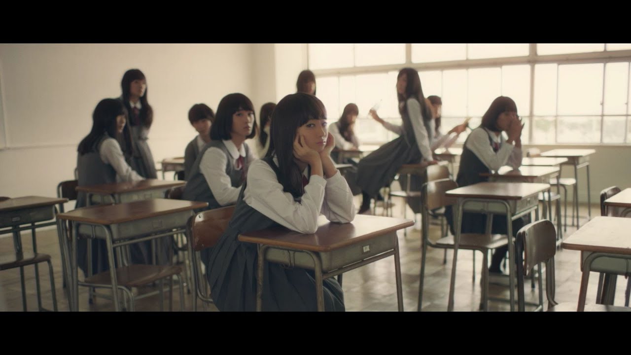
Take beauty brand Shiseido, which states its goal is to help people live more beautifully (in its own words – ‘This moment. This life. Beautifully’). Its ‘High School Girl?’ campaign (below) with the tagline ‘Everyone can be pretty’ and eventual clever twist, resonates completely with these values, allowing it to make a very human, emotional connection with its audience.
As a designer, then, whenever you’re choosing imagery for a campaign, you need to ask yourself not just ‘Is this a good image’, but ‘Does this image fit with the client’s core values?’.
04. Let images breathe on social media

We’re all taught at design school to make tactical use of white space: to leave judicious amounts of space (which doesn’t actually have to be white) around an element to bring focus, establish clear hierarchy and provide balance. And social media makes this principle more important than ever.
With more and more visual noise assaulting us on Facebook, Instagram, Twitter and elsewhere, good use of white space can make it easier for audiences to understand and read an image when scrolling quickly.
For example, the integrated advertising campaign The Line by Our Watch was created to raise awareness of violence in relationships. The campaign imagery makes excellent use of white space (in this case, it’s actually blue) to help make the point clearly and concisely.
05. Feature real people, with real emotions

There was once a time when people expected to see polished, flawless models in agency design. But the rise of social media has changed all that. Now what our increasingly sophisticated audiences are looking for is authenticity, and they can smell fakery a mile off.
Visual content that features real people and explores raw emotions – from a thrill-seeker’s exhilaration to a parent’s love – hits the sweet spot for sharing. And a great example can be found in skincare brand SK-II’s Marriage Market Takeover campaign(below).
Like Dove’s Real Beauty campaigns before it, this aims to empower Chinese women and shatter stereotypes. By focusing on human relationships and the stories of real people, SK-II’s video is able to move its audience to share and connect. To see more examples of real women with real emotions, check out iStock’s Gritty Woman Collection.
06. Use targeted social media images to support wider campaigns

These days, even if a brand campaign is mainly taking place across mainstream media, you should still be thinking about how creating custom visual content for social media channels can support it.
Having a presence on primarily visual channels like Pinterest, Instagram and Snapchat allows you to connect with people that traditional methods can’t reach, and here, the importance of using the right eye-catching imagery cannot be stressed enough.
In New Zealand, the NZ Transport Agency’s Snapchat anti-drug-driving campaign (above) offers an innovative example of using point of view imagery to make a powerful connection with a hard-to-reach audience. It shows clearly spending time creating visual content for social media can help widen your reach, boosting awareness and driving traffic back to your website.
07. Optimise your alt text

Yes, we know it’s tedious. But optimising the alt text (short for ‘alternative text’) of the images on your website or blog is incredibly important for boosting your traffic from image search results.
That’s because (although we’re sure they’re working on it), Google Image Search can’t yet decode images on web pages to determine what they are, but relies heavily on the alt text that website owners include to describe them. Alt text is also used by screen readers for the blind or visually impaired.
So think about your alt text carefully. Above all, it should be brief and describe what the image portrays, as the examples above show.
08. Use colour strategically

As we stated earlier, the goal of any design is to encourage an emotional connection in the viewer. And it’s important not to ignore the powerful role that colour plays in provoking emotions.
So don’t choose a colour simply because it looks good. Consider correlating the different hues you use in your imagery with the emotion or characteristic you want to invoke.
This will largely depend on the context and the target audience, of course. But as a general rule of thumb: red = action and excitement; blue = trust and strength; green = peace, growth and health; grey = balance and calmness; orange = friendliness, cheerfulness and confidence; yellow = optimism, clarity and warmth; and purple = knowledge and imagination.
To discover a great selection of colourful and eye-catching photos, check out iStock’s ‘Colour Surge’ category.
09. Represent your audience

One key ingredient to creating a design that connects with your audience is, of course, knowing that audience. And once you’re clear who it is you’re targeting, why not make that explicit by featuring similar people in any imagery that you use?
Nowadays, image libraries like iStock have a diverse selection of fresh, authentic-looking imagery. So take time to find the right images, and narrow down your selection by using conceptual keywords (eg, family, togetherness, authentic) as well as geographic keywords (to ensure culturally appropriate imagery).
10. A/B test your images

At the end of the day, there is no infallible, scientific way to ensure your images will resonate with your audience. But, online at least, there is a way to be clear about what works and what doesn’t: by trial and error.
So try A/B testing how well different images in your designs fulfil your client's stated goals on social media, its own website and other sites where it has a presence.
Of course it’s easy to jump to the wrong conclusions, so first read A/B Testing Checklist to avoid making mistakes in your interpretation of the results.
Get your imagery right
At the end of the day, imagery is the main way we as humans communicate, transcending all language and cultural barriers. Finding the right images and using them correctly is key to creating designs that resonate with your audience, and nobody knows that better than iStock.
With so many people around the world visiting iStock’s website every day, it’s able to keep track of the latest visual trends on a day to day basis (check out our iStock trends for 2017 post). And that means it’s able to provide millions of exclusive and authentic images that fit exactly what designers need.
Best of all, thanks to Creative Bloq’s partnership with iStock, we’re able to offer an amazing 10% off all iStock credits: just use code ZNKPC46N today at iStock.com.

