How to colour-correct your 3D renders
Just because your 3D software has completed a render, that doesn't mean your image is complete. Rob Redman explains how to colour-correct your creations.
CG applications tend to produce images with lots of detail across the whole range of the render. While this is great, as it gives more freedom to adapt and edit, it does mean the initial beauty pass can look somewhat flat.
You can try fixing this in 3D with lights and shadow adjustment but this may mean compromise in other areas, so in this article I will show you some of the more common tool, tips and techniques I use to give a bit more life and filmic look to my work.
Although you can take this as a step by step process, I won't be teaching you which buttons to press and I see it more as a selection of possible edits that you can use to create your own distinctive style. I'm a firm believer in giving people ideas to get them started on the road to developing their own style. If I just tell you to do A, then B so you get to C it is very easy to become trapped. So take these ideas and mix and match, disregard as you see fit and come up with your own unique ways of working.
Article continues belowThe final topic covered is all about colour and it is there that you will find you develop most of your signature look. The rest of the tools and tips below all have their place but mostly they will support your colour correction and grading.
01. Linear Workflow
If your 3D software has the feature (most do these days) then use it. Working linearly will not only make your renders more realistic, with more accurate lighting and colour, but will give you far greater leeway in post.
An image in linear space will have more details in the shadows and highlights, so you can make adjustments here without seeing as many anomalies. Try to keep your entire workflow in linear space if you can, including painting textures, building shaders and any postwork you do. Skipping parts can throw up inconsistencies which will be harder to fix down the line.
02. Levels and Curves adjustments
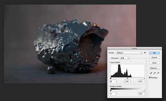
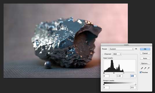
Almost always the first thing I do with an image is to duplicate the background layer and then to adjust the levels and curves. Starting with the levels (CMD+L) you can see the histogram has no information towards the right/brighter part of the image. This accounts for the render lacking in overall brightness and by dragging the right-most slider to the left you can fix this. Drag to where the information begins and you will be off to a good start.
Sign up to Creative Bloq's daily newsletter, which brings you the latest news and inspiration from the worlds of art, design and technology.
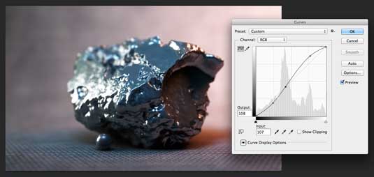
I use an initial curves adjustment (usually on it's own adjustment layer) to add a little contrast to the image. A gentle S shaped curve is a good place to start, with a point added in the middle of the curve and moved to where the majority of the mid tones are. I then add a point to raise the highlights and one to increase the shadows:
03. Chromatic Aberration
As you may have noticed by now 3D artists tend to spend quite some time adding the same elements to their renders that a photographer goes to all manner of ends to reduce.
Photographers, specially commercial product photographers, want to eliminate as many of the effects that the lens produces as possible. This can mean anything from blurs and warps (see later) to noise and chromatic aberration.
This is something that happens as light passes through the glass. The result you see on your screen is a slight offset between the colours, as they have refracted differently to one another.
Solutions
Expensive lenses virtually eliminate this or correct for it however as a 3d artist it can be worth adding a small amount. If you are trying to match footage for compositing or you want to have a slightly more photographic look then give it a go. Some software even has profiles for specific lenses.
As the real world effect generally increases towards the edge of the image I try to replicate it in post. I duplicate my image twice. The first is given a small amount of aberration followed by a reduction in opacity, then the second is given a little more aberration and I use a large feathered selection to delete the central portion of that layer, so the overall effect of the chromatic aberration has a falloff toward the centre of the image, much as a photo would.
04. Blurs and Warps

Another great tool for generating a familiar photographic look is to introduce some blur and noise to your work. For blur I would suggest depth of field, either slight or heavy if you want to give things a macro look. Adding some edge blur can look good to but try to be subtle.
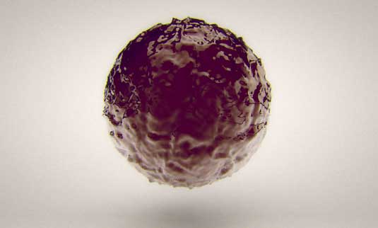
You can see here that I added some depth of field to replicate the look of a wide aperture. The render, along with a little contrast boost and film grain, looks more photographic than a standard straight render. As for warps, keep these subtle too. I tend to use the lens correction tool in a negative way for this, by loading the filter and hitting 'D' then dragging on the image, for realtime feedback.
You can be quite extreme here, so be careful. A small amount of curvature on straight edges will go a long way, as you can see in the car park image for stage 5.
05. Noise
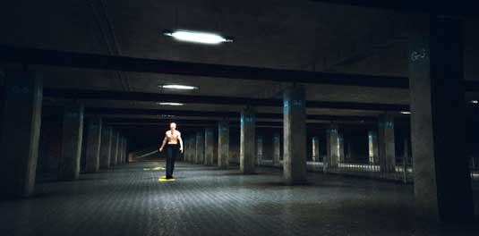
Noise is generally a bad thing but adding a little late in the process can be a good thing, helping to unify any of the other adjustments you made and add a touch of the film look at the same time.
I use Lightroom to add film grain, as I prefer the control I have with it but you can use Photoshop's add noise or magic bullets film grain tools too. They all have different approaches, so see what you have to hand or what suits you best. As with all these things keep it subtle.
06. Colour
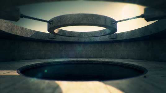
This is where you can make your mark and you can be less subtle if you want. Colour in an image is what really sets the tone and style, second only to lighting but with a definite relationship to it.
The best way to work with colour is on a duplicate of you main original layer, or on an adjustment layer.
More often than not I will work on colour after my initial curves and levels adjustments are done. No matter if you're trying to emulate your favourite look or come up with one of your own a little reference to the colour wheel will help you here. It's usually best to work in opposites in both colour and brightness. Let's look at recent trends.
The Transformers movies amongst many others have really pushed this to the limits and it doesn't matter if you like it or not but it's very easy to see. Shadows are lifted with a blue/teal tint and highlights are slightly muted with warmer tones, sometimes almost salmon-like.
There is no rule that says you need to stay within these bounds but I personally think it helps the viewer to feel comfortable with what they are looking at. Experiment with different combos and see what you find pleasing. I've seen some work with yellowish highlights and purple tinted shadows that looked amazing. It's just a case of playing around and seeing what you come up with.
Removing colour
Another possible colour choice would actually be the removal of colour, either selectively or as a whole. Desaturating an image can add a touch of class, or try over-saturating, with lightened shadows for a 70s retro feel.
Or push further for that 'Yellow Bastard' or 'Goldie' look from Sin City (amongst others). You can accomplish this using various combinations of keying and garbage mattes. The step by step is a bit out of the scope of this article but the fundamental principle is very easy to get to grips with.
Conclusion
Although I have mentioned some stages of the process that are best suited to a particular adjustment please don't feel confined to that. Grading is all about experimenting and creating a look to help the viewer understand, subconciously, what the creator wants them too.
Don't be put off by the tools either. There are some very expensive options out there but almost all image editors will let you do most of this kind of work, to some extent or another.
And once you have practiced on stills, don't forget you could just as easily work the same process with your animations. In fact if you work in After Effects, almost everything above can be done in the same way, all to one adjustment layer if you like. The main difference would be using a bezier warp to add some lens warp, instead of the Photoshop filter.
Delivered in conjunction with ZED!
This content was produced in collaboration with HP & Intel as part of ZED - a Pop-Up Studio for the Creative Community held in Soho, London. For more information about ZED and any future events see here.

The Creative Bloq team is made up of a group of art and design enthusiasts, and has changed and evolved since Creative Bloq began back in 2012. The current website team consists of eight full-time members of staff: Editor Georgia Coggan, Deputy Editor Rosie Hilder, Ecommerce Editor Beren Neale, Senior News Editor Daniel Piper, Editor, Digital Art and 3D Ian Dean, Tech Reviews Editor Erlingur Einarsson, Ecommerce Writer Beth Nicholls and Staff Writer Natalie Fear, as well as a roster of freelancers from around the world. The ImagineFX magazine team also pitch in, ensuring that content from leading digital art publication ImagineFX is represented on Creative Bloq.
