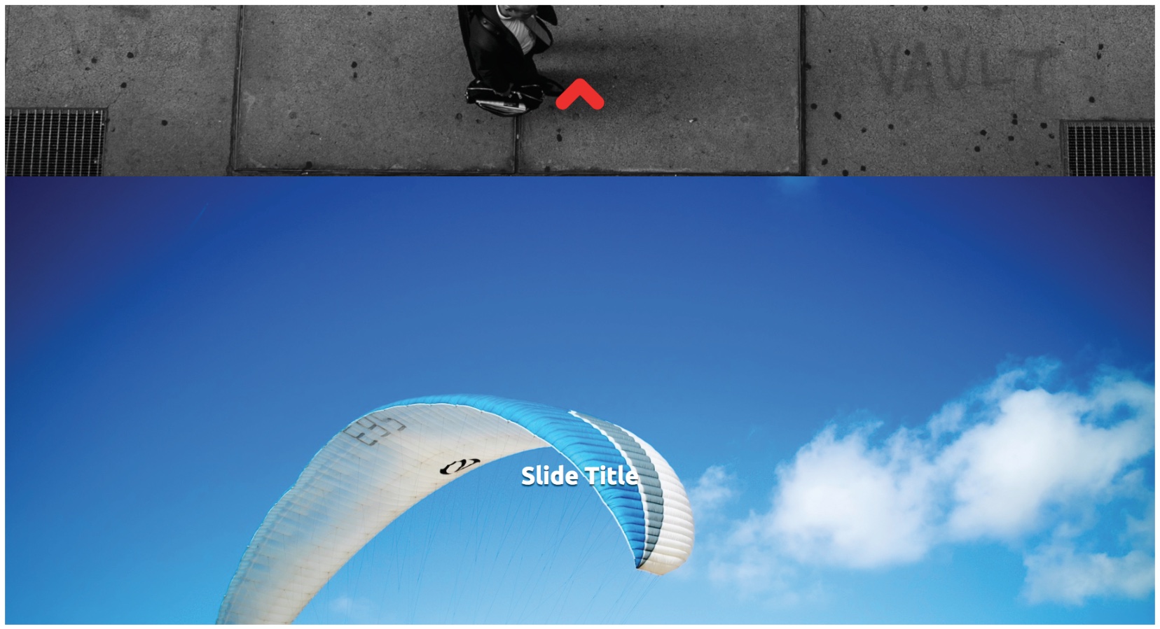
Say hello to CSS Scroll Snap points
Never heard of CSS Scroll Snap points? Find out how they will take scroll manipulation away from JS and into the browser.

Sign up to Creative Bloq's daily newsletter, which brings you the latest news and inspiration from the worlds of art, design and technology.
You are now subscribed
Your newsletter sign-up was successful
Want to add more newsletters?
Anyone who has tried to create some kind of scroll locking, snapping or manipulating will know how tricky it can be. Until recently, JavaScript was the only option, but always seemed to produce a mixture of success and choppy or questionable performance from device to device.
However, using this new property, carousels or sliders and other scroll-manipulation techniques can be easily created and controlled using CSS.

The main scroll snap properties
Due to varying implementations of the specification, multiple properties are required to experiment with this new CSS. The main new properties required to experiment with this new feature are:
scroll-snap-type: mandatory;
scroll-snap-destination: 100% 0%;
scroll-snap-points-y: repeat(100%);
The scroll-snap-type property currently accepts three values: none (the default value); mandatory, and proximity. The mandatory value will force the scroll inside the snap container to the nearest snap point, proximity will snap but in a much more relaxed manner.
Both the scroll-snap-destination and scroll-snap-points-y are applying the same value: both apply the scroll snap points to 100% of the height of the elements inside the scroll snap container (defined by the scroll-snap-type) property, along the Y (vertical) axis. Combined with the ‘vh’ and ‘vw’ properties, full-screen elements can easily be created.
.carousel {
width: 100vw;
height: 100vh;
overfl ow-x: hidden;
scroll-snap-type: mandatory;
scroll-snap-destination: 100% 0%;
scroll-snap-points-y: repeat(100%);
}
Sign up to Creative Bloq's daily newsletter, which brings you the latest news and inspiration from the worlds of art, design and technology.
.carousel__item {
width: 100%;
height: 100%
Learn more about CSS

Brenda Stover is a Silicon Valley native who has been making websites since the early days of Geocities. She has been using CSS Grid in production for websites since its initial release to browsers in March 2017, and is a big fan.
Let her tell you more about CSS Grid in her talk at Generate New York from 25-27 April 2018. Brenda will show step by step how you can progressively enhance your site with CSS Grid and write a bulletproof fallback for older browsers.
Want to see Brenda talk? Then get your ticket now
Related articles:

Steven Jenkins is a freelance content creator who has worked in the creative industries for over 20 years. The web and design are in his blood. He started out as a web designer before becoming the editor of Web Designer magazine and later net magazine. Loud guitars, AFC Bournemouth, Photoshop, CSS, and trying to save the world take up the rest of this time.
