CSS Houdini: All you need to know about the hottest APIs
Discover how CSS Houdini's APIs are bringing CSS and JavaScript closer together, plus how to use them.

Sign up to Creative Bloq's daily newsletter, which brings you the latest news and inspiration from the worlds of art, design and technology.
You are now subscribed
Your newsletter sign-up was successful
Want to add more newsletters?
CSS Houdini gets its name from the world-famous Harry Houdini. Why? A group of developers – from well-known organisations such as Apple and Google, and the CSS Working Group – wanted to demystify the magic of CSS and get better control of website rendering. So they formed the CSS Houdini Task Force.
But what exactly is CSS Houdini? It is a set of low-level APIs that gives developers the power to extend CSS by taking control of the styling and layout processes inside a browser. It gives direct access to the CSS Object Model (a set of APIs allowing the manipulation of CSS from JavaScript) and allows users to read and modify CSS style dynamically, ie. with JavaScript.
Houdini is only partially supported at present, so is at the very early stage of adoption. While you wait for more support (talking of support, make sure your web hosting service is giving you what you need), why not try this collection of CSS animation techniques that will definitely work.
Article continues belowWant to build a site with little coding knowledge? You need a website builder. And if you have a lot of design or media files to stash away, choose the most reliable cloud storage around.
Why you need CSS Houdini
Browsers are very good at abstracting complex styling tasks away from developers. It will split paragraphs of text on to separate lines without needing to be told. Elements can be sized and placed next to each other automatically by using a couple of properties and letting the rendering engine handle the rest. Each time the page updates, the browser will take the HTML, CSS and JavaScript and convert them into pixels on screen in a process known as the 'rendering pipeline'.
Firstly, the browser reads through the content and builds a structure known as a render tree, which is then used to calculate where things should appear on the page in a layout step. From there, it turns those into pixels in a step called painting. With all the elements painted, it sticks them together into one page in a process called compositing. To improve the performance of a website, we should always focus on optimising the critical render path.
If we want a visual effect on a site that the browser does not support natively we instead need to add JavaScript and HTML with polyfills. This makes repetitive changes near the start of the pipeline, which results in poor performance.
Sign up to Creative Bloq's daily newsletter, which brings you the latest news and inspiration from the worlds of art, design and technology.
The aim of Houdini is to open up CSS and allow developers to apply these polyfills further along the pipeline and speed things up. They also open up new opportunities to create effects not previously possible. While not every website will use these new APIs directly, they allow frameworks and libraries the opportunity to level out browser inconsistencies.
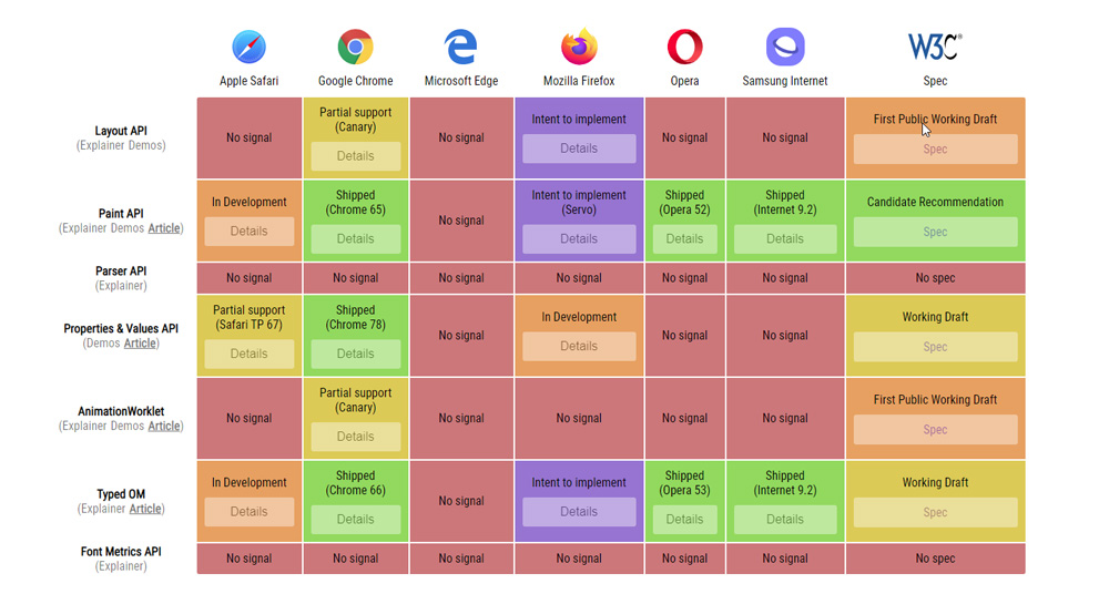
Support for CSS Houdini
The APIs have been worked on for the past few years, with each one being jointly developed by all members of the Houdini task force. All the APIs follow the strict W3C standardisation process.
If enough of a consensus is reached, an initial draft specification known as a 'working draft' is created. From there, it gets refined further before reaching 'candidate recommendation' level.
A specification marked as a candidate recommendation can start to gather feedback from implementors — in this case browser vendors. This is where we start to see wider browser support. From here, it goes to 'proposed recommendation' and then 'W3C recommendation', where it starts to achieve full browser support.
Currently, the forerunner is the Paint API which is at candidate recommendation level. The Chromium-based browsers Chrome, Opera and Samsung Internet all support it, with Firefox and Safari working on their implementation. Typed OM is closely related and as a result these same browsers support this as well.
Chrome is leading the way with the other APIs. To play around with the Layout API, animation worklets or the Properties and Values API, you need to use Chrome Canary with 'Experimental Web Platform features' flag enabled. These are still under active development and can change at any point.

What is the Paint API?
The penultimate step in the rendering pipeline is the painting phase. At this point, the browser knows exactly the content to show but not how it appears. The rendering engine will look at the styles applied to each element and adjust its instructions accordingly.
While some styles are fairly straightforward, others allow functions to run that decide their appearance. For example background can take many functions, which include url() for images, rgb() for colours and linear-gradient() for a gradient effect.
#target {background: paint(my-effect);}The Paint API allows us to define our own painting function, which works in much the same way. All functions create an image that the engine can make use of depending on the property it’s used against.
class MyWorklet {
       paint(ctx, size, style) {} }
The only requirement inside a paint worklet is a single paint method. Here we provide a set of instructions that a browser can follow whenever it needs to repaint the element. It is called with a few arguments that give the method some useful info.
The first argument is a context, which provides a space we can draw upon. It works similar to the context used when drawing onto <canvas> elements, by using instructions such as moveTo and fillRect to start building up the image that CSS can make use of.
There are some differences between this context and that used for <canvas> elements. For example, there are no image data or text methods available for security and performance reasons, but it is possible they will appear in later revisions to the specification.
The second argument contains the dimensions of the paintable area it needs to create. Typically, this is the width and height of the target element including padding. We can use this information to make sure we are drawing onto the context in the right place.
We can also ask for a set of other style properties. For example, we could want to change the colour of the background to complement the text colour. This is done through a getter within the worklet.
static get inputProperties() {
    return ["color", "--custom-property"]; }
The inputProperties value is an array of all properties the worklet is interested in. This can include custom properties that supply some further customisation. These values are passed in as the third argument to the paint method as style objects from the Properties and Values API.
There is a fourth argument that can be used to access arguments supplied to the paint function in CSS. This allows for configuration at the point of definition, such as the colours to use in a gradient. This is working its way through the specification process and is not ready for use just yet.
registerPaint("my-effect", MyWorklet);
The worklet needs to be registered with the browser for it to be picked up in CSS. The registerPaint method takes the name we use to reference it and the worklet itself.
CSS.paintWorklet.addModule("my-worklet.js");Finally, in order to link the JavaScript to the CSS, the browser needs to download the worklet. By supplying the path, the browser handles the rest of the process for us.
What does Typed OM do?
The CSS Object Model (CSSOM) has been part of JavaScript for a long time. It allows us to extract the computed style of an element reading its style property or by using getComputedStyle. The former returns styles applied directly to that element, while the latter includes all styles including inherited ones.
document.body.style.fontSize // “2rem”
window.getComputedStyle(document.body).fontSize // “32px”
The value they return is always a string regardless of what was supplied originally. This makes adjusting these values buggy and inefficient for us as well as the browser as it needs to constantly convert back and forth between a number and a string.
document.body.fontSize += “1rem”; //
“2rem1rem”, not “3rem”
The Typed OM works similar to the CSSOM but also provides types for the values. There are two new ways of accessing them — the attributeStyleMap works like the style property, with computedStyleMap like getComputedStyle.
document.body.attributeStyleMap.get("font-size")
document.body.computedStyleMap().get("font-size")
These both return a CSSUnitValue object, which contains the value and the unit as separate properties ready to be read and updated.
These objects can also be created and used directly to calculate values, much like the CSS calc() function does.
The Typed OM is capable of plenty more, such as type conversion and value clamping. Check out Google's 'Working with the new CSS Typed Object Model' and the official W3C spec for more information.
Properties and Values API: Add types to custom properties
CSS custom properties — also known as CSS Variables — allow us to define a value in one place and use it elsewhere. For example, we could create custom properties to hold theme colours that elements further down the page could make use of.
The problem with custom properties becomes apparent when we try to animate between them. As the property could refer to anything, the browser falls back to treating it as a string. As there is no way it knows how to animate between strings, it ends up jumping from one to the other.
The Properties and Values API helps by providing types to custom properties. We can use JavaScript to register a property with the browser, which then takes care of the rest.
CSS.registerProperty({
  name: "--main-color",
  initialValue: #ecf0f1,
  inherits: true,
  syntax: "<color>"
}
);
The registerProperty method is a new property on the CSS global object. Here we define a few characteristics about the property such as its name, an initial value if it is not specified and whether or not it inherits from elements higher up.
The important attribute is syntax, which describes the type of the property. CSS already knows how to deal with different types of data including numbers, angles and URLs. By specifying the type, we can save the browser work and let it know what our values are.
Improve performance with the Layout API
All browsers have layout algorithms in place to help position content. By default, all elements will be in flow layout. In Latin scripts such as English, any elements set as inline will flow left to right in the inline direction and any elements set as block will flow top to bottom in the block direction.
While they work well, they make most websites look the same. To make a site stand out, we would need to use properties such as position: absolute and calculate offsets manually. A site such as Pinterest uses this approach to make its masonry-style layout, but it can cause performance issues on larger pages.
The Layout API aims to avoid this problem by handing this logic to a worklet. It knows the desired dimensions of the parent and its children and can instruct the renderer exactly where it wants them.
class MyLayout {
  static get inputProperties() { return [] }
  async layout(children, edges, constraints,
 styleMap) {}}
registerLayout("my-layout", MyLayout);
Each worklet requires a layout method, which runs each time it needs to recalculate the layout. It also needs to be asynchronous as laying out the content inside can be paused or moved to a separate thread at any time. The first argument is an array of children with the styles that are applied to them.
The second contains border, padding and scrollbar size known as the element’s edges. The third defines the rest of the usable space called the constraints. The final argument details the properties being requested from inputProperties similar to the Paint API.
child.layoutNextFragment({ fixedInlineSize:
200 })
All this information is used to generate positioning instructions called fragments. The layoutNextFragment method takes information about the child, such as its desired inline and block size and the renderer takes care of the rest. The result is a set of fragments ready for the browser to paint.
body {display: layout(my-layout);}On the CSS side, the layout is defined like any other. The layout function takes the name supplied when registering the worklet. While the option is open to everyone, it’s unlikely most would need to create layout worklets for every site. Worklets can be shared and included on a site without knowing about the underlying algorithm. This API is more likely to be used as a way to polyfill future layout systems.
This content originally appeared in net magazine.

Matt Crouch is a front end developer who uses his knowledge of React, GraphQL and Styled Components to build online platforms for award-winning startups across the UK. He has written a range of articles and tutorials for net and Web Designer magazines covering the latest and greatest web development tools and technologies.
