8 state-of-the-art CSS features (and how to use them)
Learn how to build and style future-proof sites with the latest and greatest CSS properties.
Sign up to Creative Bloq's daily newsletter, which brings you the latest news and inspiration from the worlds of art, design and technology.
You are now subscribed
Your newsletter sign-up was successful
Want to add more newsletters?
CSS is constantly evolving and a host of exciting new features have been added to make the specification an even more powerful weapon in a web designer's toolset.
CSS Grid takes layouts to new levels not seen before, custom properties introduce the concept of variables while feature queries check for browser support. Media queries moves up a level with new accessibility properties, variable fonts offer maximum creativity with minimum code bloat while scroll snapping eliminates the need for JavaScript. Check out our cool CSS animation examples to see what you can create. Or, to build a site without code try these website builders.
For those looking to get creative there is CSS Shapes for unique layouts and a host of blend modes and filters to introduce Photoshop style design effects. Read on to find out how you can use these must-try features in your latest builds. But remember, a complex website means you need a web hosting service that can support your needs.
Article continues below01. Custom properties
If you’ve use a preprocessor like Sass, or indeed a programming language like JavaScript, you’ll no doubt be familiar with the concept of variables — values that are defined for reuse throughout your code. Custom properties enable us to do this in our CSS, without the need for preprocessors. Variables can be set at the :root level (creating global variables) or scoped within a selector. They can then be called using the syntax var(-›-myVariableName). For example, we might set a variable called --primaryColor like this:
/* On the root element (a global
variable) */
:root {
--primaryColor: #f45942;
}
/* Scoped to a selector */
.my-component {
--primaryColor: #4171f4;
}Now we can use that variable as a property value:
h1 {
color: var(--primaryColor);
}Custom properties are inherited, which has some very useful implications. One of those is theming. Take the above example: We can define a global variable ( #f45942 – a bright orangey red) for --primaryColor at the root level, so every instance where we use this variable the value will be red. But we’re also redefining the same variable within a selector, with a different value (#4171f4 – medium blue). So for every instance where we use the --primaryColor variable within that selector, the computed value will be blue.
Setting defaults
The scoping of variables is a great feature, but one that might catch you out on occasion! If you try to use a variable that is not yet defined, the resulting value will fall back to the browser default, or an inherited value, rather than a variable defined further up the cascade. In some cases, it might be appropriate to set a default value:
Sign up to Creative Bloq's daily newsletter, which brings you the latest news and inspiration from the worlds of art, design and technology.
h1 {
color: var(--primaryColor, blue);
}How do custom properties differ from preprocessor variables?
Custom properties differ from preprocessor variables in a few key ways. Preprocessor variables are compiled before your code is sent to the browser. The browser never sees that a value is a variable, it only sees the end result. Custom properties are computed in the browser. You can inspect them in modern developer tools, change the variable and see the resolved value. They are dynamic variables, meaning their values can be changed within CSS, or at runtime with JavaScript.
Unlike preprocessor variables, custom properties can’t be used within selector names, property keys or media query declarations — only CSS property values. CSS preprocessors still have plenty of benefits, so we’re likely to see them sticking around for a while longer, but they’ll likely be used more often in combination with custom properties.
02. Feature queries
Feature queries are a way to test whether a browser supports a particular CSS property-value combination within your CSS file. They virtually remove the need for feature-detection libraries like Modernizr. The syntax is similar to a media query: You use the at-rule @supports, followed by your property-value pair, wrapping the code to be executed if the browser meets the specified conditions.
Feature queries are well-supported in modern browsers, but they are relatively new, and one “gotcha” is that some browsers you might want to test for support might not support feature queries themselves. Often the best way to handle this is to provide fallback styles first (outside of the feature query), then wrap your enhancements for supporting browsers inside the @supports rule.
Be aware, feature queries need only be used sparingly. One of the great features of CSS is that browsers will simply ignore any properties or values that they don’t understand. It’s best to only employ feature queries when not doing so would cause a visual bug, otherwise you could be setting yourself up for a lot of extra work.
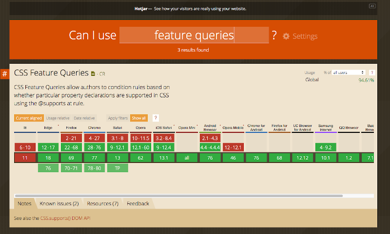
How to use feature queries
To test for support of a single property value, we can provide the fallback first. In this example, we’re providing a flexbox fallback for browsers that don’t support Grid layout.
.my-component {
	display: grid;
}
@supports (display: grid) {
	.my-component {
		display: flex;
	}
}
03. Media queries
You’ll likely be accustomed to using media queries to detect the width and height of the viewport, and the type of media (most commonly screen or print). The level 5 Media Queries specification brings us some newer media features to (optionally) test for, which are already supported in some browsers. These offer some great benefits for accessibility.
Users with vestibular disorders, and those who suffer from motion sickness, may not appreciate web pages with a lot of motion, such as animations and parallax scrolling effects. Using the prefers-reduced-motion media query, we can provide users who opt out with a reduced-motion alternative.
.my-element {
	animation: shake 500ms ease-in-out 5;
}
@media (prefers-reduced-motion: reduce) {
	.my-element {
		animation: none;
	}
}
It’s becoming increasingly popular for websites to provide an alternative dark theme. Prefers-colors-scheme allows us to query whether the user has set a system-wide preference (using the keywords dark, light, or no-preference), and show the appropriate colour scheme accordingly.
/* Media queries 02 */
body {
	background: linear-gradient(to
	bottom, #b5faff, #ffe2b4);
}
@media (prefers-color-scheme: dark) {
	body {
		color: white;
		background: linear-gradient(to
		bottom, #0c1338, #3e3599);
	}
}
04. Variable fonts
In general, if we want to include a number of different fonts faces of the same family on our webpage, we would need to load the same number of font files. The more font files you load, the more weight you add to your page, with an impact on performance — so it’s usually wise to load a maximum of three or four font files (depending on your performance budget).
Variable fonts change all that. They enable us to load a single font file for an entire font family. Although this file will usually be larger than a single font would, if you want to take advantage of different weights and styles, then a variable font is the more performant solution. If you've bought a whole font family, remember to stash it safely in cloud storage so you don't lose your files!
Variation axis
Not only that, but with variable fonts, we’re not limited to a small subset of font weights. When working with regular fonts, the available font weights are given in multiples of 100. Typically, 400 might be the regular weight, 300 the light weight, and 700 the bold weight — with different families supplying more weights or fewer. Variable fonts have an axis of variation, which provides us with a range of values for properties like the font weight. A font might have an axis of 1–900, which would provide us with access to 900 different weights!
The axis of variation is not just limited to weight. Variable fonts can have different axes for x-height, slant, serif length and contrast (to pick just a few examples) — meaning that a single font file could give us access to hundreds, or even thousands of variations! We could even animate these properties, enabling us to achieve some really cool effects. Mandy Michael (https://codepen.io/mandymichael) has a whole load of creative demos that really test the limits.
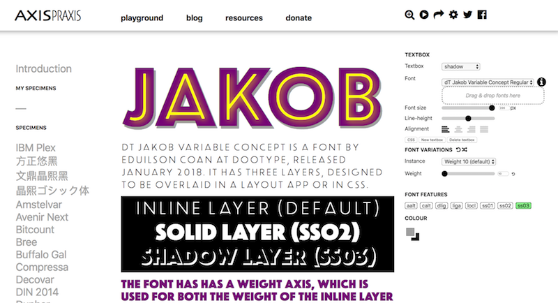
Browser support for variable fonts is pretty good, and many font foundries are actively developing new variable fonts that you can start using now — although these often come at a premium, especially for the more fully-featured font families. If you just want to get started playing around with variable fonts to see what they can do, there are a number of variable font playground sites:
Be aware, if you want to use variable fonts right now you need to make sure you’re using an up-to-date operating system — they won’t work on older OSs.
Font-variation-settings
While we can alter the font weight easily enough with the font-weight CSS property, font-variation-settings is a new property that gives us full access to a font’s different axes of variation. These include both registered axes and custom axes.
Registered axes
There are five different registered axes, which correspond to various CSS properties. Each of these has what’s known as an “axis tag”. The registered axes are: wght (font-weight), wdth (font-stretch), slnt (font-style: oblique/angle), ital (font-style: italic), opsz (font-optical-sizing). We can access these axes either by the CSS property, or with font-variation-settings.
These axes are not necessarily all included in every variable font (some may only have one or two axes), but they are likely to be the most common.
Custom axes
Custom axes are bespoke axes included by the font designer, and could be anything at all. They could include (for example) serif length, x-height, even something more creative (and less typographically typical), like rotation.
Both types of axes must be expressed as a four-character tag. Registered axes must be lowercase, while custom axes are uppercase. Both can be combined in the font-variation-settings property. Font-variation-settings is animatable, which can allow for some very cool UI effects! Some very interesting experiments have been produced using icon fonts too.
05. Graphical effects
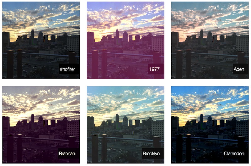
If you’re familiar with design tools like Photoshop and Illustrator, you might be aware of blend modes and how they can be used to produce different effects on images. The way blend modes work is to blend two or more layers together using mathematical formulae to calculate a resulting value for each pixel. The layers could be anything — images, gradients or flat colours. Some blend modes produce a darken result (e.g. multiply, which multiplies the pixel values of the layers), some a lighter one (e.g. screen and overlay). We don’t need to understand the maths in order to use them, however. Playing around with different blend modes can give us a good feel for which of them produce the desired results when combined with different layers.
With the CSS properties mix-blend-mode and background-blend-mode, we can achieve Photoshop-like image effects in the browser. Both properties take the same values, but work slightly differently.
Background-blend-mode
Background-blend-mode blends together the background layers of the element we’re targeting. Our element could have background images, colours and gradients, and they would all be blended with each other without affecting the foreground content. We can specify multiple values for background-blend-mode, one for each background layer.
.my-element {
	background: url(#myUrl),
		linear-gradient(45deg, rgba(65, 68,
		244, 1), rgba(203, 66, 244, 0.5)),
		rgba(244, 65, 106, 1);
	background-size: cover;
	background-blend-mode: screen,
	multiply;
}
Mix-blend-mode
Mix-blend-mode affects how the element blends with its parent and its siblings, including any foreground and background content, and pseudo-elements. Some interesting creative effects can be achieved by blending overlaid pseudo-elements (::before and ::after).
.my-element {
	background: rgb(244, 65, 106);
	mix-blend-mode: multiply;
}
CSS filters
CSS filters can also be used to create striking visual effects, using the filter property and filter function values. Unlike blend modes, they apply a graphical effect directly to the element they are targeting, and an element can have multiple filters applied.
Convert to grayscale
We can manipulate the colours of an element with a greater degree of control than relying on blend modes. Filters can convert an image to grayscale, adjust the brightness, contrast and saturation, blur an element or add a drop shadow. They can also be animated too, and look great with hover effects.
SVG filters
CSS filters are in fact simplified versions of SVG filters. The CSS filter property also takes a url() function, allowing us to pass in a URL to an SVG filter. SVG filters are extremely powerful and allow for some incredible image effects — but they’re also far more complicated than CSS filter functions! Sara Soueidan has a wonderful article series on Codrops if you’re interested in diving into coding your own custom SVG filters. Check out the article at https://tympanus.net/codrops/2019/01/15/svg-filters-101/
Clipping and masking: beyond rectangles
We’re used to dealing in boxes on the web, but not everything has to be rectangular! Clipping and masking are two sides of the same coin, and are different ways to hide and show different parts of an element so that the background shows through. This gives us the power to introduce interesting and creative shapes to our designs.
Clip-path
The clip-path() property allows us to “cut out” an element by defining a path. It takes a number of basic shape functions, inset(), circle(), ellipse(), or polygon(), which allows us to craft more complex cutout shapes using pairs of xy co-ordinates to define the path. Alternatively, we can also pass in an SVG path using the path() function, or using url() to provide an SVG path ID.
Not inside the path
Clipping an element clips everything outside of the path you define, but the element itself is still a rectangle. If you have content which extends out of the clip path’s boundary, that too will be clipped — it won’t wrap inside the shape.
Mask-image
mask-image enables us to show and hide parts of the image by using an image (SVG or transparent PNG) or gradient as a mask. Unlike clip-path, we can add texture to our images with masking, as the mask source doesn’t need to be a path — it allows for degrees of transparency.
06. CSS Shapes
The CSS Shapes specification allows us to wrap text around floated geometric shapes, creating some interesting, magazine-like layouts. This is made possible using the shape-outside property. Similar to clip-path, we can give this property a basic shape function circle(), ellipse(), inset(), polygon(), or a URL to an SVG path, and in fact the two work in harmony very well! shape-outside will wrap our text effectively, but it won’t affect the floated element. If we want the text to look like it’s wrapping around the image or floated object, we can use the same value for clip-path. Use shape-margin to add whitespace between the shape path and the content wrapping it. Take a look at the Stuff & Nonsense site to see how CSS Shapes is used to wrap text around a central image.
Firefox has a shape-path editor within the dev tools panel, which is especially useful for working with complex shapes. However, use with caution. Wrapping the leading edge of a paragraph of text is great for artistic effect, but is not always great for user experience. Complex jagged shapes can make blocks of text harder to read. For important content, you might want to steer clear.
07. Scroll snapping
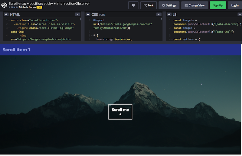
Many websites take advantage of JavaScript libraries to provide a slick, native app-like scroll experience, where content “snaps” to points as the user scrolls. Now, with the Scroll Snap specification, we can do this right within our CSS file — there’s little need to import in heavy JS modules to bloat your page!
To implement scroll-snapping we need an element to act as our scroll container. The direct children of the container dictate the points that will be snapped to, and can be aligned in various ways within the snap area.
Scroll snapping can be even more effective when combined with another new CSS property value — position: sticky. This position value “sticks” an element to a specified position while scrolling within its container — another behaviour that was previously only possible with JavaScript. Check out this Scroll snap with position: sticky and intersectionObserver example.
08. CSS Grid and layouts
Front-end developers have hacked layout with whatever tools were available to use at the time — most recently flexbox, which a lot of modern grid systems use. But flexbox was never designed for building strict grids — its purpose is flexibility!
CSS Grid is the first specification that’s designed for two-dimensional layout, allowing us complete control over building a layout and placing items on both the row and the column axis. Building a responsive layout with Grid doesn’t require calc() or hacking around with negative margins. The secret weapon is the fr unit — a new unit exclusive to grid. The fr unit sizes grid tracks (rows and columns) as a proportion of the available space. It takes into account any fixed tracks, gutters and content, then distributes the remaining space accordingly. Jen Simmons coined the term “Intrinsic Web Design” to describe the new era of web layout that Grid ushers in.
How to use CSS Grid
Grid requires an element with the display property value set to grid, to act as the grid container. The direct children of the grid container are the items that can be placed on the grid. We use the properties grid-template-rows and grid-template-columns to define the tracks (rows and columns) of the grid, and column-gap and row-gap to define the gutters (the gaps between the tracks).
.grid {
	display: grid;
	grid-template-columns: repeat(4, 1fr);
	grid-template-rows: repeat(4, 200px);
	gap: 20px;
}
We’re using the repeat() function to keep the code more concise, as an alternative to the longhand (e.g. grid-template-columns: 1fr 1fr 1fr 1fr). This example also uses the shorthand gap for row-gap and column-gap.
The code above gives us four row tracks, each 100px high, and four column tracks that each fill an equal proportion of the available space, using the fr unit.
It’s worth noting that this isn’t the only way to create grid tracks. Implicit tracks can also be created by placing grid items. It’s useful to read up a bit about this if you’re using Grid, as it pays to get a deeper understanding of how Grid behaves under different conditions, and can make coding a layout much easier.
We can place items on the grid by referencing grid line numbers, which are numerical lines that sit between each track. Here, we’re using the shorthand grid-column and grid-row for grid-column-start, grid-column-end, grid-row-start and grid-row-end. These tell the browser at which line our item should start and end on each axis.
.item {
	grid-column: 1 / 4;
	grid-row: 2;
}
Grid provides us with many different ways to place items: we could instead name our grid lines:
.grid {
	display: grid;
	grid-template-columns: [image-start] 1fr
 1fr 1fr [image-start] 1fr;
	grid-template-rows: 200px [image-start]
 200px 200px [image-end] 200px;
	gap: 20px;
}
Alternatively, the grid-template-area property lets us “draw” a grid layout with text.
.grid {
	display: grid;
	grid-template-columns: repeat(4, 1fr);
	grid-template-rows: repeat(4, 200px);
	gap: 20px;
	grid-template-areas:
		‘.          .          .         .’
		‘image image image .’
		‘image image image .’
		‘.          .          .         .’;
}
Using either of these methods, we can simply reference the corresponding grid area when placing a grid item:
.image {
	grid-area: image;
}
This article was originally published in creative web design magazine Web Designer. Buy issue 290 now.
