How to create SVG animation with CSS
Learn how to add SVG animation to icons more quickly and easily with CSS.
Sign up to Creative Bloq's daily newsletter, which brings you the latest news and inspiration from the worlds of art, design and technology.
You are now subscribed
Your newsletter sign-up was successful
Want to add more newsletters?
Wondering how to do SVG animation without the headache. The idea of getting bogged down in JavaScript libraries can really put people off, but SVG animation doesn't need to be so daunting. CSS can handle selecting individual paths within an SVG to create effects, and knowing just the basics can allow you to turn flat, tired icons into something more impressive.
When you consider how this can be integrated into different designs, it doesn't take long to realise that the possibilities for SVG animation are endless. Below, we'll run through the fundamental steps of SVG optimisation and animation using CSS. For more motion inspiration, take a look at these cool CSS animation examples and a look at the code behind them.
How to create SVG animation with CSS
01. Create and save your SVG
First up, you'll need to create an SVG to work with. For this tutorial, we'll be using a simple graphic made in Adobe Illustrator. When using Illustrator to export an SVG reduce the size of the artboard to fit the graphic, and then click 'Save As'. Select SVG from the 'save as type' dropdown menu, then 'SVG code…' on the SVG Options dialogue. If you need the software, see our guide to the best graphic design software or our piece on how to download Illustrator.
Article continues below02. Optimise your SVG for the web
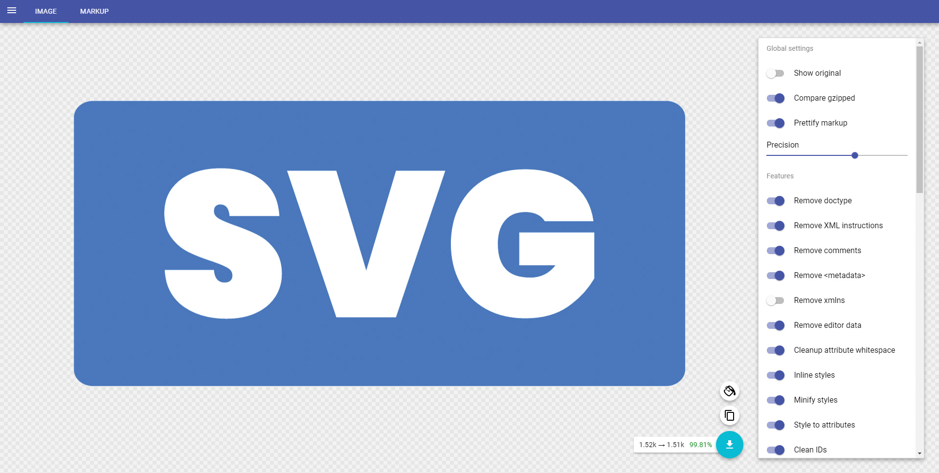
Cutting out unnecessary tags will make YOUR image easier to deal with. This can be done manually by copying the code to your favourite editor and removing empty tags and metadata. Alternatively, a fantastic resource called SVGOMG can do this automatically. Just paste the code into the 'Paste markup' area on the SVGOMG interface, then copy the image again using the button on the bottom right.
03. Set up a HTML Document
Once you have the SVG image you want to animate ready and optimised, open your code editor of choice and set up a blank HTML document. We'll write the CSS animation in a file called main.css, so create this too. To keep things focused on the animation, we've pulled in the CSS-only version of Bootstrap 4.1.3.
04. Build the layout for your SVG animation
Now, let's build the bones of our layout and make a space for our SVG. Add a header and two columns: one on the left for some text, and one on the right, which will hold the SVG that we'll be animating. To liven the page up, use a second, static, SVG as a background on the body tag.
05. Place the SVG
We're using our animation to make the introduction at the top of the page more interesting. Paste the optimised SVG code into the second column on the page. If using bootstrap, give the SVG the class img-fluid to make sure it scales on mobiles.
Sign up to Creative Bloq's daily newsletter, which brings you the latest news and inspiration from the worlds of art, design and technology.
06. Add classes to the SVG
Adding classes to the SVG allows CSS to select the individual shapes within the image. This means you can animate different shapes of the image at different times, creating a more complex effect.
<svg>
<g>
<rect class="rectBackground" width="147.4107"
height="68.7917" x="31.2946" y="114.1042"
rx="4.5882" ry="3.9565" fill="#2a7fff"/>
<path class="rectText" d="..." vector-effect="non-scaling-stroke" stroke-width=".470476156" font-size="12" fill="#fff"
fill-rule="evenodd" stroke="#fff" stroke-linecap="round"/>
</g>
</svg>
07. Initial states
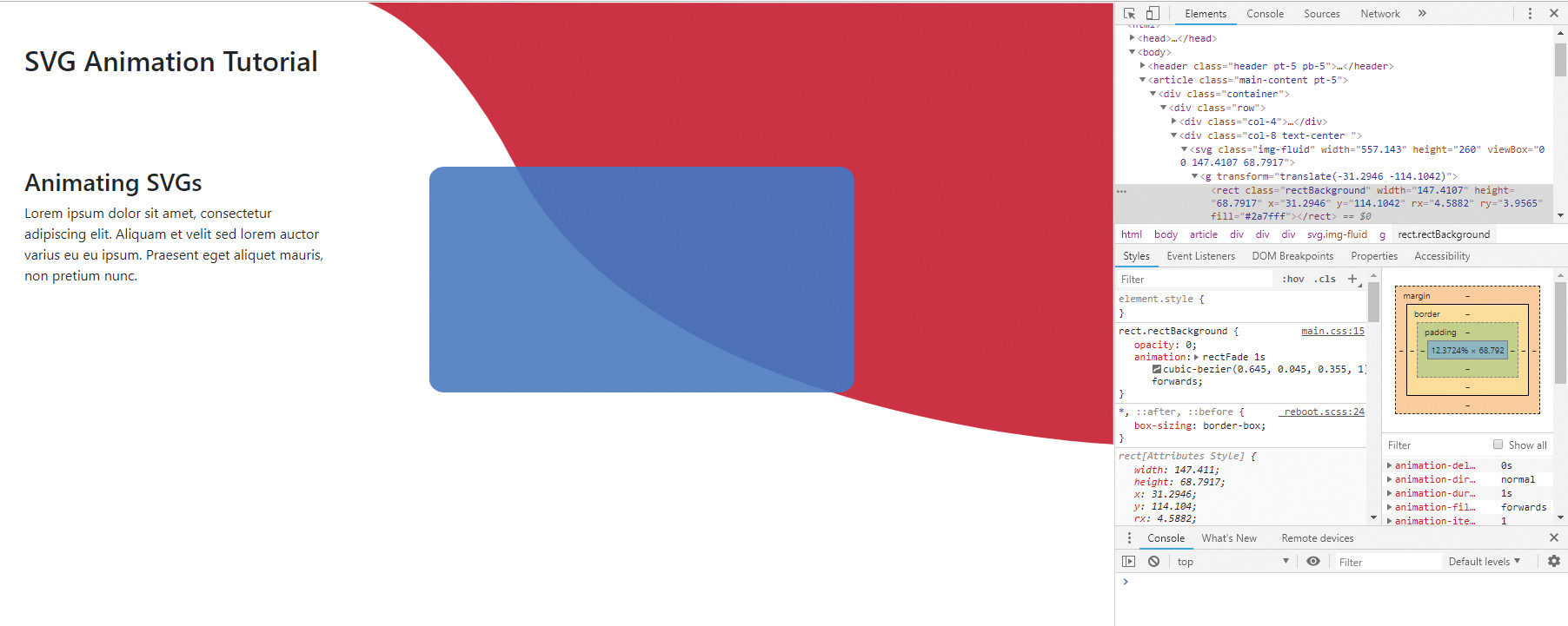
Selecting our SVG elements in CSS is the same as any other element. We use our classes to select those elements within the SVG. Both parts of our SVG will start as hidden when the page loads, so let's use CSS to set both element's opacity to 0.
path.rectText {
opacity:0;
}
rect.rectBackground{
opacity: 0;
}
08. Declare the animations
We need to declare the name and keyframes for each animation so that CSS knows what we want to do when we ask it to perform an effect. I've chosen textDraw and rectFade, as they describe each animation. rectFade will be a simple two-step animation. textDraw will have an extra middle step.
@keyframes textDraw {
0%{}
50%{}
100%{}
}
@keyframes rectFade{
from{}
to{}
}
09. Assign animation and properties
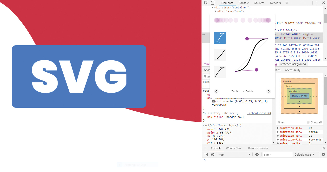
We add the rectFade animation to the rectBackground element and give it a duration of one second. An easeOut cubic bezier is being used to give it a smoother feel. We add forwards so the element keeps the properties of the last keyframe when the animation ends.
rect.rectBackground{
opacity: 0;
animation: rectFade 1s cubic-bezier(0.645,
0.045, 0.355, 1) forwards;
}
10. Add the rectangle animation
With just two keyframes, all we need to do for our rectangle is set a start and finish set of attributes. Let's start with a 1% width and finish on 100% to give an 'expanding to the right effect'. We can also set opacity: 1 to the last keyframe so the shape fades in at the same time.
@keyframes rectFade{
from {
width: 1%;
}
to {
width:100%;
opacity: 1;
}
}
11. Add the text animation
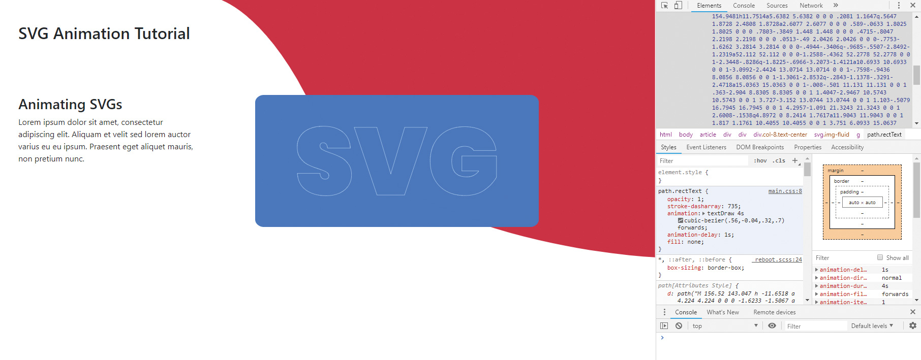
Next, we will create a line-draw effect on our text and then use a fill to fade in. To set up the text animation we give it our textDraw with a four-second duration. The cubic bezier has been modified on this step to give it a slightly different pace of movement.
path.rectText {
opacity:0;
animation: textDraw 4s
cubic-bezier(.56,-0.04,.32,.7) forwards;
}
12. Delay the start to the text animation
Our text needs to run just as the rectangle has finished fading in. Because the rectangle has a one-second duration, delay the start of the text animation by that time.
path.rectText {
opacity:0;
animation: textDraw 4s
cubic-bezier(.56,-0.04,.32,.7) forwards;
animation-delay: 1s;
}
13. Emulate line drawing
To get our line drawing effect we will use the stroke-dasharray and stroke-dashoffset parameters. Your values will be different to mine depending on the SVG you are using. To find your value, use your preferred developer tools and increase stroke-dasharray from 0 until the entire shape is covered by one stroke.
path.rectText {
opacity:0;
stroke-dasharray: 735;
animation: textDraw 4s
cubic-bezier(.56,-0.04,.32,.7) forwards;
animation-delay: 1s;
}
14. First line drawing keyframe
Now we have our one very large stroke that covers the entire text path, let's offset it by its own length to effectively push it away. Using stroke-dashoffset for the same value as our dasharray should do it. Let's set this in our first keyframe. We'll also make the shape fill transparent and set the stroke to white if it isn't already.
0%{
fill:rgb(255, 255, 255, 0);
stroke:#fff;
stroke-dashoffset: 800;
opacity: 1;
}
15. Draw the lines
Our middle keyframe appears at 40% through the animation. We bring the stroke-dashoffset back to zero so the dash covers the entire path. We can re-add the transparent fill at this stage to make sure the fill only appears once the drawing is complete.
40%{
stroke-dashoffset: 0;
fill:rgb(255, 255, 255, 0.0);
}
16. Fill in the shape to finish the SVG animation
For the last part of the animation, we will fill the shape in white. All we need to do for the last keyframe is raise the alpha value of the fill colour. This creates the fade-in effect of the fill.
100%{
fill:rgb(255, 255, 255, 1);
stroke-dashoffset: 0;
opacity: 1;
}
This article was originally published in creative web design magazine Web Designer. Buy issue 286 or subscribe.
Read more:
Joe has been building websites his whole life, and he now runs Corebyte Ltd, a small web development company in Southampton.
