Add SVG filters with CSS
A step-by-step guide to adding special effects to text and images on your site using CSS and SVG filters.
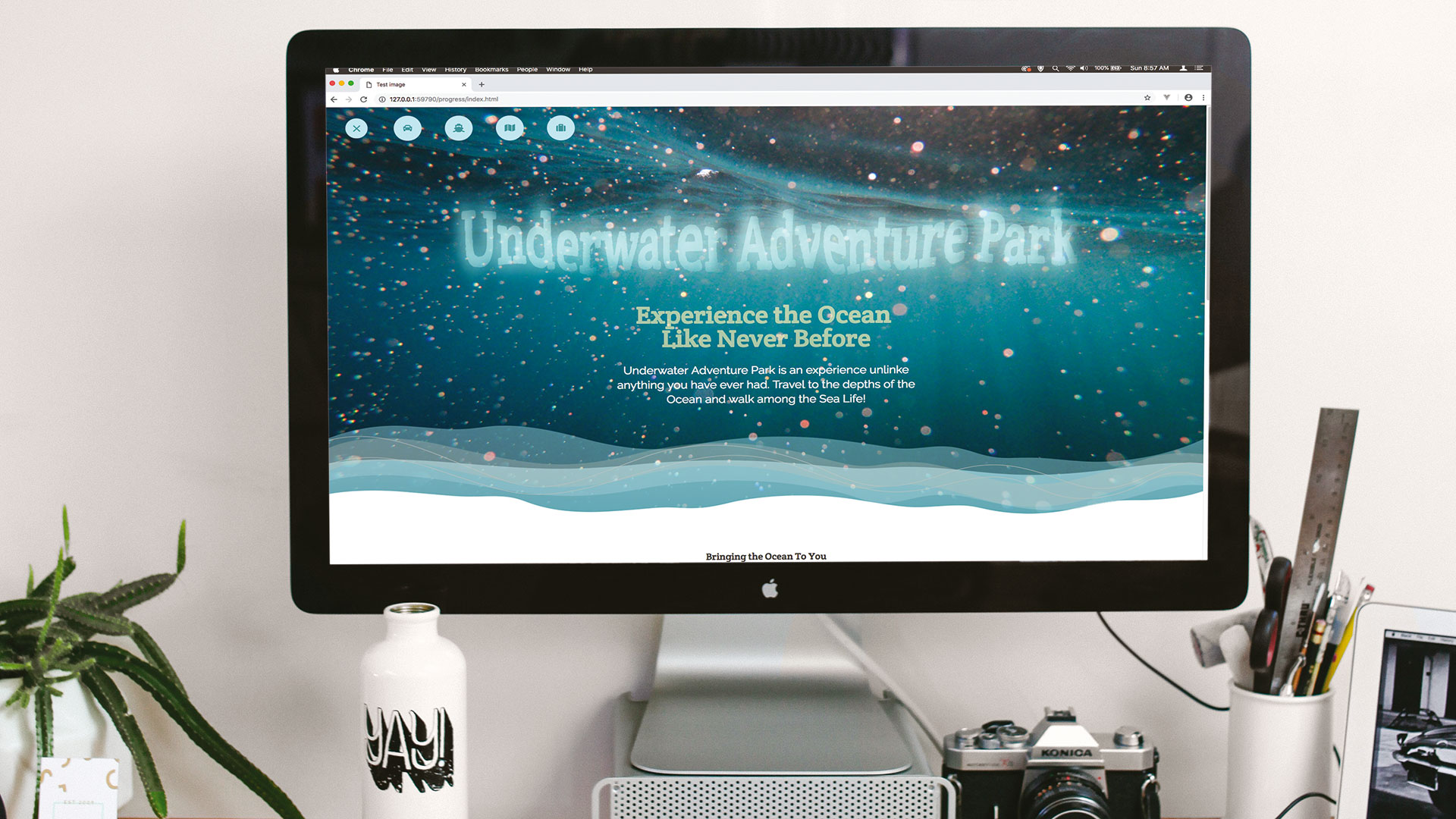
SVG has been around since the early 2000s, and yet there are still interesting ways that designers are finding to use it. In this tutorial the focus will be on the filters that are applied through SVG – but instead of applying them to an SVG image, we'll show you how they can be applied to any regular page content.
The way the filter is applied to the SVG is actually through CSS, by telling it what ID the filter has. Using that same idea, the filter can be applied to regular text, for example. The good part about this is that you can add some great graphical looks to your text, which would have only been previously possible by applying a number of Photoshop filters and saving as an image. Using the SVG filter, the text remains accessible and selectable, as it is still just a regular text element on your page.
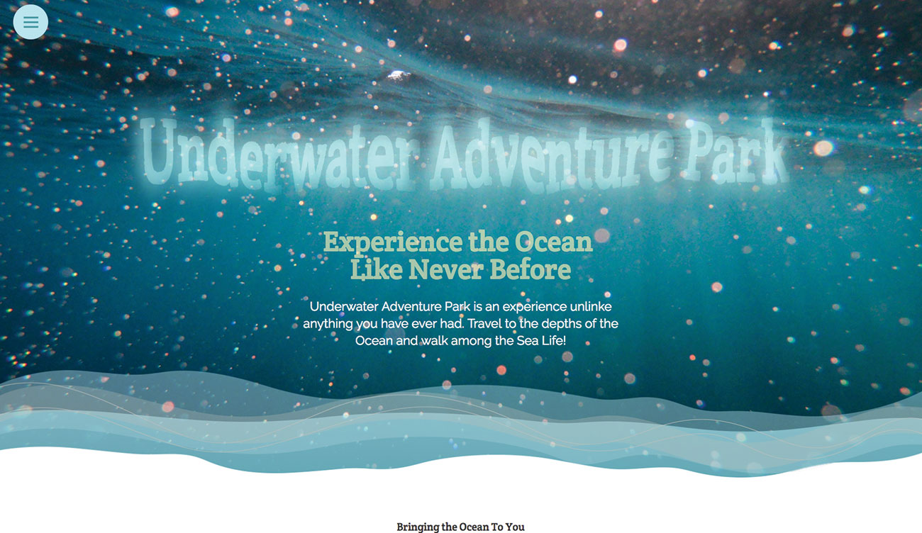
The code here will create a displacement map to text that also contains an alpha map to make it appear watery and fit the theme of the page. Then another filter will be created that makes a menu appear as water blobs, which stick slightly together but blob apart as they move further away. Again this keeps with the theme of this particular page and shows two creative ways to apply SVG filters to other content.
Article continues belowInterested in learning more about SVG? Take a look at our article on everything you need to know about SVG on the web. Alternatively, add some interest to your sites with one of these cool CSS animation examples.
- Download the files for this tutorial from FileSilo
01. Get started
First, you need to download the project files using the link directly above. Once you've done that, drag the start project folder onto your code IDE and open the index.html page. You will see there is some page content already written. The header section needs to be created, and this will contain the headline that will be affected by an SVG filter. Add the code here, just inside the body tag.
<div class="bg">
		<div class="middle">
			<h2 class="headline">Underwater
			Adventure Park</h2>
			<div class="intro_block">
02. Close the header
Now the header is finished, with all the text for it in place. If you view your page in the browser at the moment, you will see a water image with some text on it. The headline, which is still currently unstyled, is going to be styled up and have the SVG filter applied to it.
<h3 class="subhead">Experience the Ocean
<br>Like Never Before</h3>
				<p class="intro">Underwater
				Adventure Park is an experience
				unlinke anything you have ever
				had. Travel to the depths of
				the Ocean and walk among the
				Sea Life!</p>
			</div>
		</div>
	</div>
03. Create an SVG filter
The SVG code can be added anywhere on the page, but as it won't be seen, it can be a good idea to place it at the bottom, before the closing body tag. The SVG filter creates turbulence noise. Notice the filter has an ID – this is what enables the CSS to apply this to another element on the page.
Sign up to Creative Bloq's daily newsletter, which brings you the latest news and inspiration from the worlds of art, design and technology.
<svg xmlns="http://www.w3.org/2000/svg">
		<filter id="displacementFilter">
			<feTurbulence type="turbulence"
			baseFrequency="0.004" numOctaves=
			"2" result="turbulence" />
		</filter>
</svg>
04. Hide the SVG
Move over to the page.css file now, and above all the CSS code for the rest of the page will be where our new CSS will go. Here the SVG is set to not display on the page at all. The heading two tag is set to have the right typeface applied to it.
svg {
	display: none;
}
h2 {
	font-size: 5.5vw;
	font-family: 'Crete Round', serif;
}
05. Add to the headline
The line-height is set to zero because later the headline will be animated, so having control over its scaling on the page is important. It's also given some padding so that it sits with the right amount of space around it and the colour is changed.
.headline {
	line-height: 0;
	display: inline-block;
	padding: 70px;
color: #ccffff;
06. Finish the headline
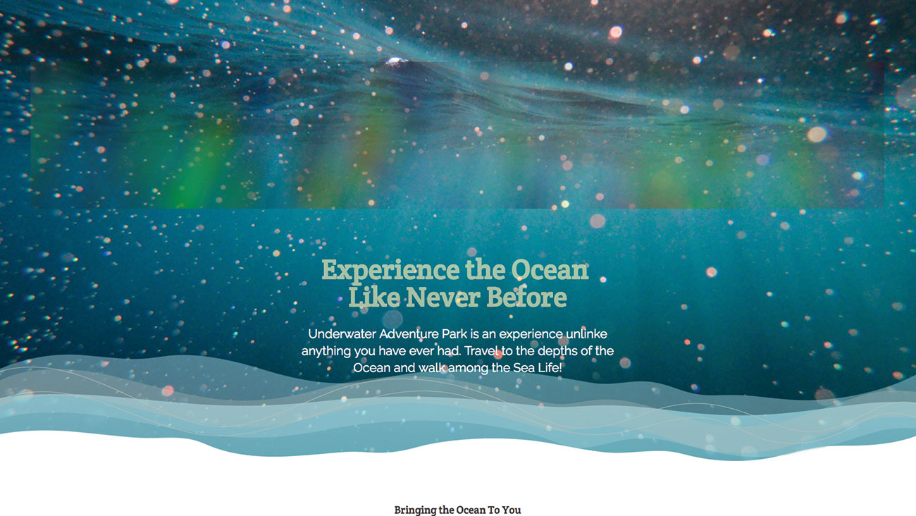
In finishing off the headline class, the next line applies the displacementFilter ID in the SVG to the text. The translate3d ensures that the text becomes hardware accelerated. The scale is changed slightly to ensure that when the displacement is applied it looks right.
	filter: url(#displacementFilter);
	transform: translate3d(0, 0, 0);
	transform: scaleY(1.8) rotateY(-2deg);
}
07. Make it displace
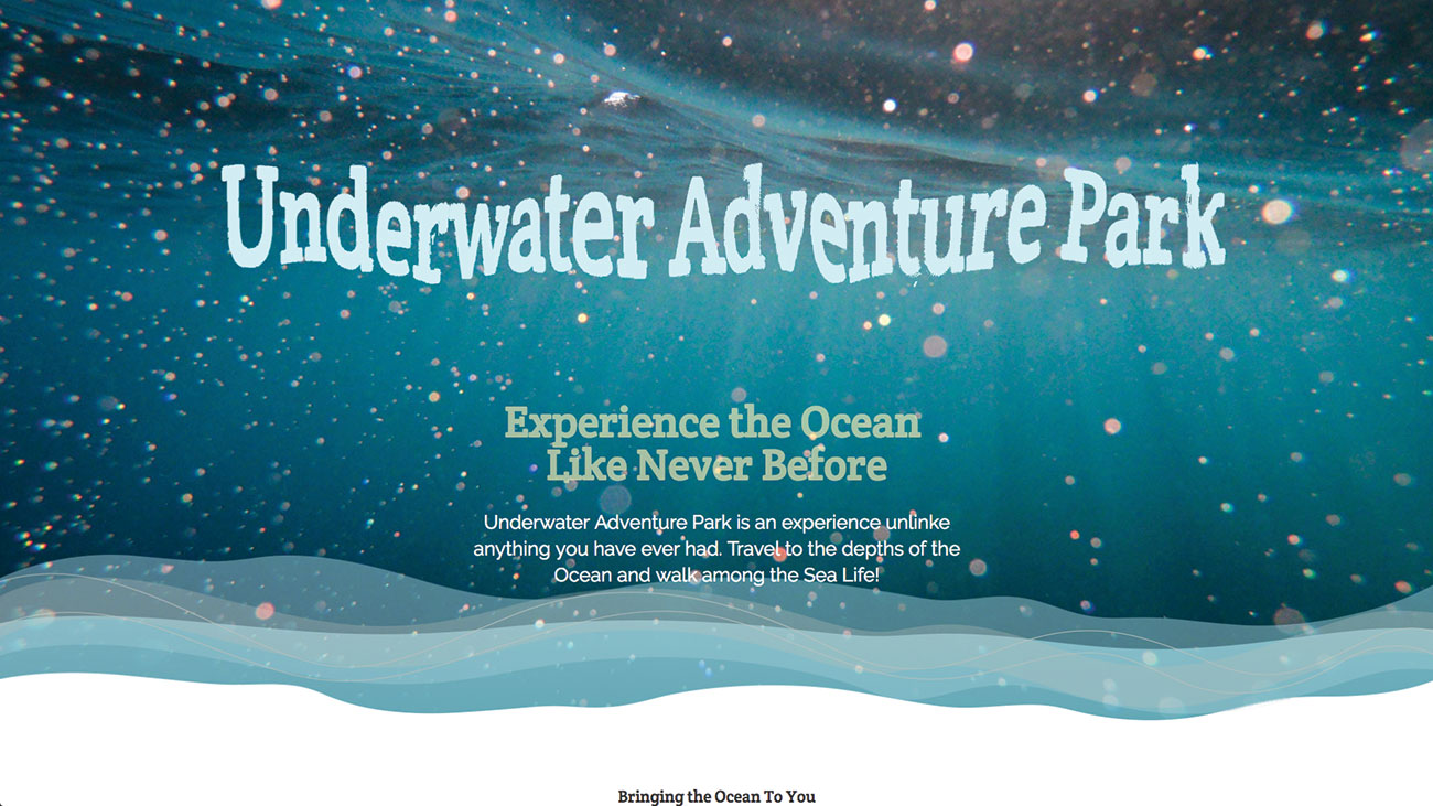
If you test the filter at this stage the turbulence completely replaces the text. That's easy to fix. Go back to the filter code in the index.html page. This takes the turbulence and the source graphic, which is the text, and applies it as a displacement filter. Try changing the base frequency and the number of octaves in the turbulence.
<feDisplacementMap in2="turbulence" in="
SourceGraphic" scale="30" xChannelSelector="R"
yChannelSelector="G" result="disp" />
08. Soften the edges
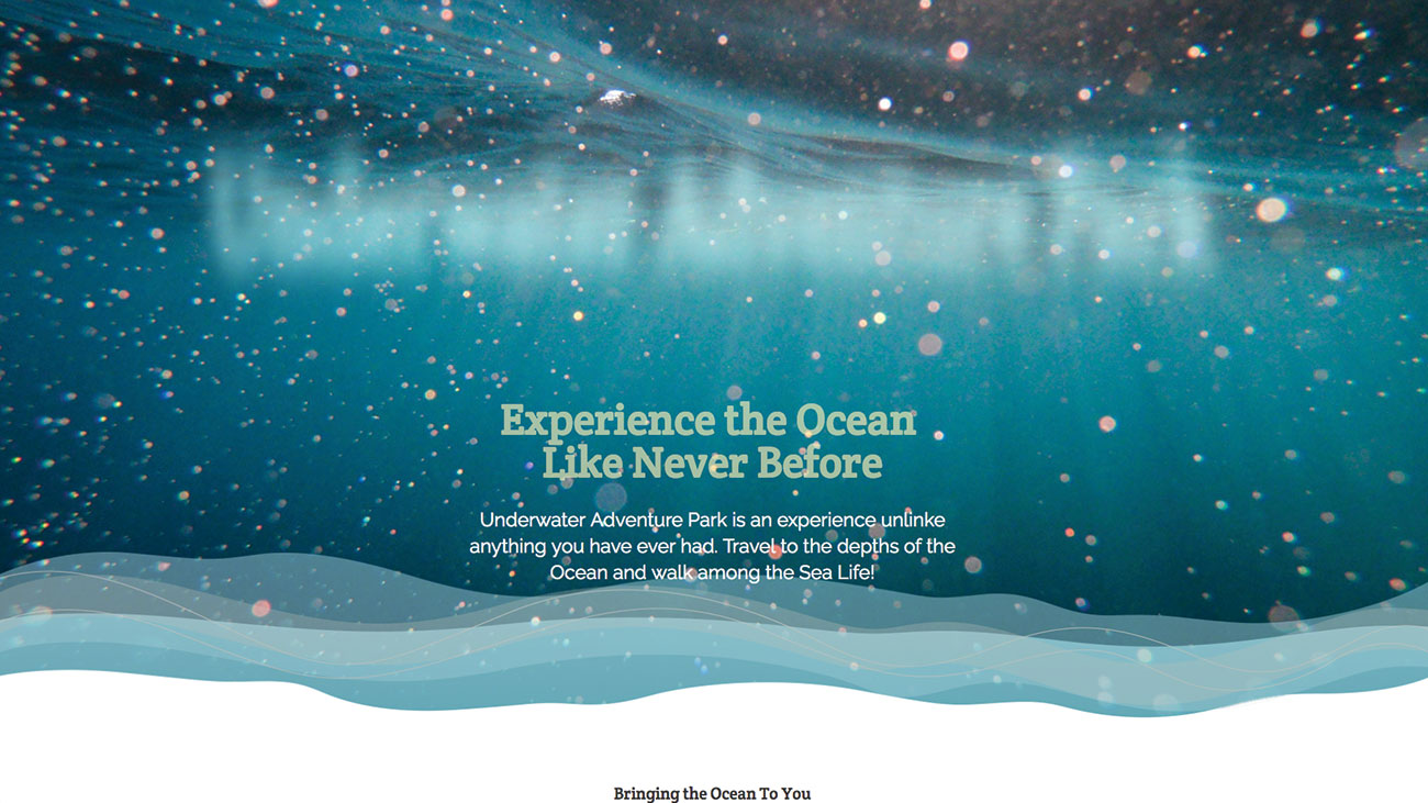
The edges look a little harsh for a watery effect. That can be cured with a Gaussian blur. Add the code after the displacement map. When you refresh the page, it has definitely blurred the text but the displacement is gone. Again these are elements that can be fixed on the way to creating the effect.
<feGaussianBlur in="SourceGraphic"
stdDeviation="15" result="blr" />
09. Composite the two
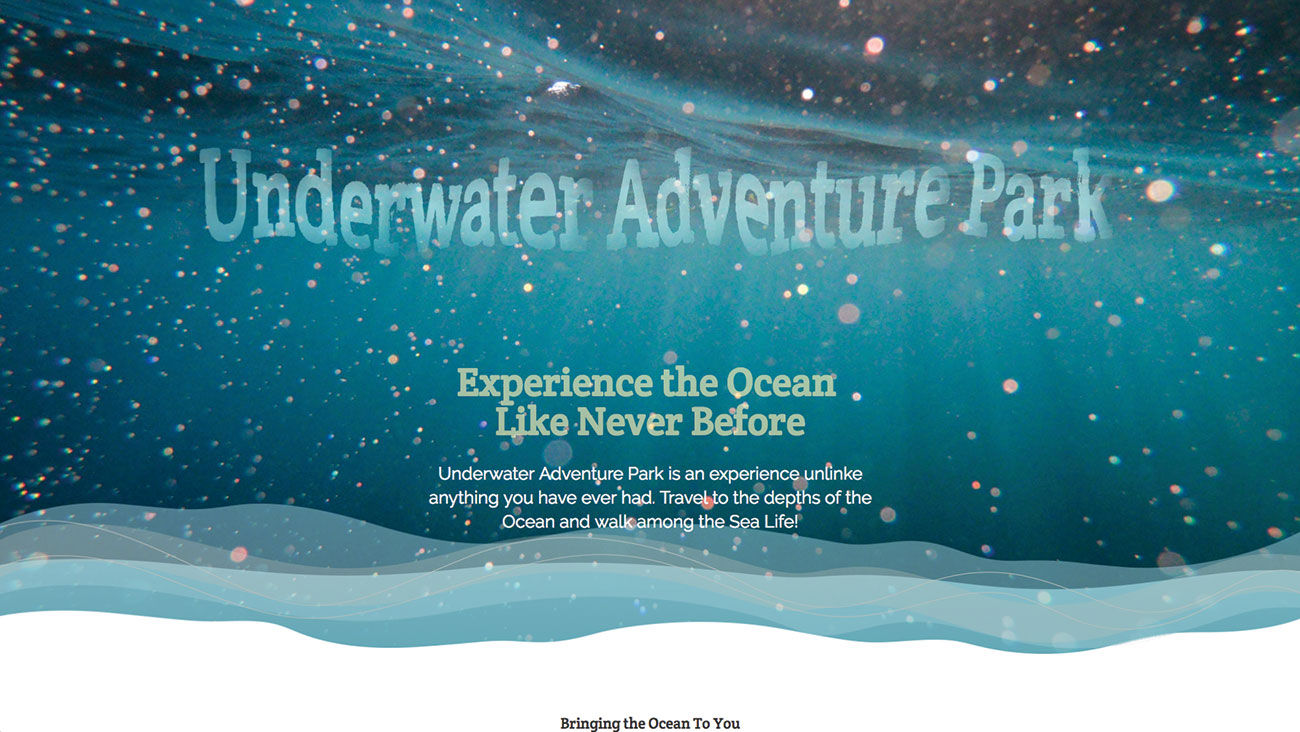
Add the composite line here below the previous Gaussian blur. You will see that this combines the blur and the displacement together, and also creates a watery translucent effect to the text. It has gone some way to softening the edges, but not enough. It would be good if the original blur could be added into this.
<feComposite in="blr" in2="disp" operator="in" result="comp" />10. Merge the blur
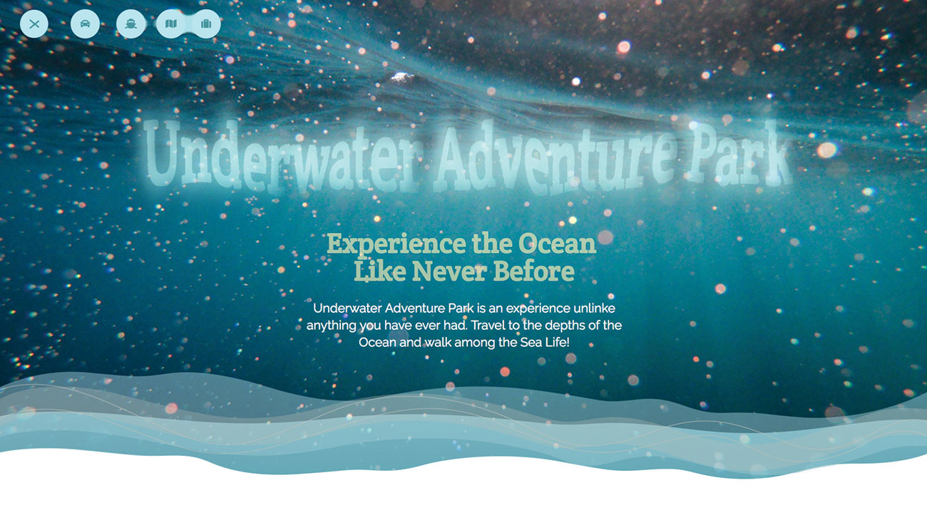
A merge operation enables the final result of the composite to be merged with the blur effect. This now looks like it fits with the background image and seems to fit with the lines of light coming through the water. The best part about the text is that it is still selectable and part of the page, unlike if you created this in Photoshop.
<feMerge result="final">
				<feMergeNode in="blr" />
				<feMergeNode in="comp" />
			</feMerge>
11. Create an animation
Go back to the page.css file and add in the keyframes as shown here. This will just scale up the font size from a zero vertical width to a 5.5 vertical width. At the start this will be applied to the headline, so that the text scales up and into place on the screen. As the text moves, the displacement will also change over the length, giving a watery ripple.
@keyframes scaler {
	from {
		font-size: 0vw;
	}
	to {
		font-size: 5.5vw;
	}
}
12. Change the h2 style
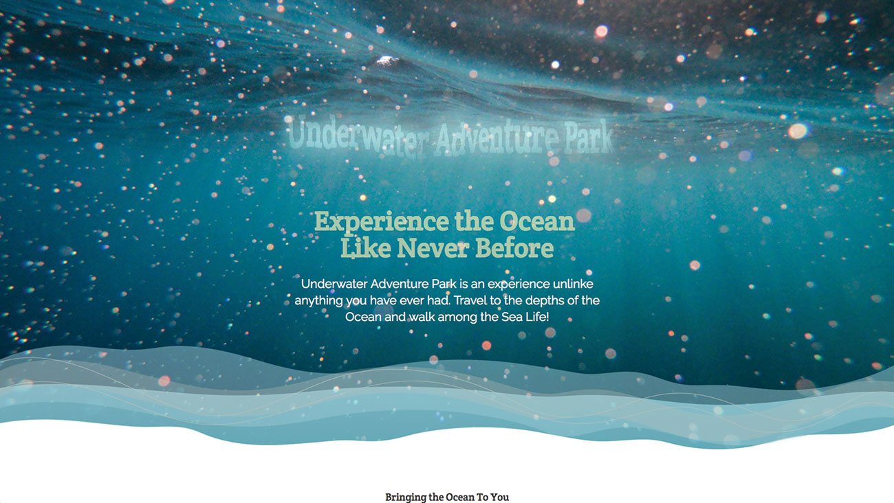
The h2 style was previously added in step 4. Replace that code with this new code, which adds the CSS animation over four seconds to the heading. The animation stops and holds on the last keyframe. Save this and test it in the browser to see the text rippling into place.
h2 {
	line-height: 0;
	font-size: 0vw;
	animation-name: scaler;
	animation-duration: 4s;
	animation-fill-mode: forwards;
	font-family: 'Crete Round', serif;
}
13. Add navigation
Now let's create a suitable water blob-inspired animation using another SVG filter. Add the following navigation content to the very top of the body code, before the heading that was started in the first step of the tutorial. This will create the basics of a hamburger menu in a circle.
<nav class="menu">
		<input type="checkbox" href="#" class=
		"menu-open" name="menu-open" id="menu-
		open" />
		<label class="menu-open-button"
		for="menu-open">
			<span class="hamburger
			hamburger-1"></span>
			<span class="hamburger
			hamburger-2"></span>
			<span class="hamburger
			hamburger-3"></span>
		</label>
14. Finish the navigation
Now the remaining navigation elements can be added. This also uses the Font Awesome open source icon library, which has been added to the head section to link from the CDN of this library. Each menu circular element will have an icon inside of it.
<a href="#" class="menu-item"> <i class="fa
fa-car"></i> </a>
		<a href="#" class="menu-item"> <i
		class="fa fa-ship"></i> </a>
		<a href="#" class="menu-item"> <i
		class="fa fa-map"></i> </a>
		<a href="#" class="menu-item"> <i
		class="fa fa-suitcase"></i> </a>
	</nav>
15. Add the new filter
Another filter is going to be added for this effect. In the SVG, add this code after the closing filter tag of the code added previously. Here the effects are built up in a very similar way to previously. This will allow for the menu to look like sticky blobs of liquid moving apart.
<filter id="shadowed-blob">
			<feGaussianBlur in="SourceGraphic"
			result="blur" stdDeviation="20" />
			<feColorMatrix in="blur" mode=
			"matrix" values="1 0 0 0 0  0 1 0 0
			0  0 0 1 0 0  0 0 0 18 -7"
			result="blob" />
			<feGaussianBlur in="blob"
			stdDeviation="3" result="shadow" />
			<feColorMatrix in="shadow" mode=
			"matrix" values="0 0 0 0 0  0 0 0 0
			0  0 0 0 0 0  0 0 0 1 -0.2"
			result="shadow" />
16. Finish the filter
The remainder of the filter is added here, which completes the effect that will be placed on each circle of the menu items. This will cause the elements to have the liquid blob effect added. Save this page and then switch over to the 'design.css' file.
<feOffset in="shadow" dx="0" dy="2"
			result="shadow" />
			<feComposite in2="shadow" in="blob"
			result="blob" />
			<feComposite in2="blob"
			in="SourceGraphic" result="mix" />
		</filter>
17. Apply the filter
The CSS code can now be added to the different design.css, just to keep all of the navigation CSS together in the same place. Some code has been added, but here the filter is applied to the menu, which will be a fixed menu so that it is present on the screen at all times.
.menu {
	filter: url(“#shadowed-blob");
	position: fixed;
	padding-top: 20px;
	padding-left: 80px;
	width: 650px;
	height: 150px;
	box-sizing: border-box;
	font-size: 20px;
	text-align: left;
}
18. Make the menu work
The menu is set to turn invisible when the menu is open. The hover element of each of the menu items is created so that there is a change when the user hovers over this. Each child of the menu is given a 0.4-second transition when the menu items are returning to their original position.
.menu-open {
	display: none;
}
.menu-item:hover {
	background: #47959f;
	color: #b2f0f8;
}
.menu-item:nth-child(3), .menu-item:nth-
child(4), .menu-item:nth-child(5), .menu-
item:nth-child(6) {
	transition-duration: 400ms;
}
19. Add a hamburger
The burger icon is elevated above the other elements by changing its z-index. The menu grows when the user hovers over this, and clicking the menu will now get the burger to animate from three lines of a burger to an 'X', indicating the option to remove the menu.
.menu-open-button {
	z-index: 2;
	transition-timing-function: cubic-
	bezier(0.175, 0.885, 0.32, 1.275);
	transition-duration: 400ms;
	transform: scale(1.1, 1.1) translate3d
	(0, 0, 0);
	cursor: pointer;
}
.menu-open-button:hover {
	transform: scale(1.2, 1.2) translate3d
	(0, 0, 0);
}
20. Move the elements
The first menu item is actually the third child of the menu, as there is a checkbox and the hamburger before it. Adding this enables the first menu element to move into position once the menu is clicked by the user. Each menu element will move out with a slightly longer time.
.menu-open:checked + .menu-open-button {
	transition-timing-function: linear;
	transition-duration: 400ms;
	transform: scale(0.8, 0.8) translate3d
	(0, 0, 0);
}
.menu-open:checked ~ .menu-item {
	transition-timing-function: cubic-
	bezier(0.165, 0.84, 0.44, 1);
}
.menu-open:checked ~ .menu-item:nth-child(3) {
	transition-duration: 390ms;
	transform: translate3d(110px, 0, 0);
}
21. Address the remaining movement

The remaining menu elements are moved out with different speeds. This enables the elements to stick together in the early stages of the animation, which will give the blobby liquid look, using the SVG filter. Save the documents and see the finished results in your browser.
.menu-open:checked ~ .menu-item:nth-child(4) {
	transition-duration: 490ms;
	transform: translate3d(220px, 0, 0);
}
.menu-open:checked ~ .menu-item:nth-child(5) {
	transition-duration: 590ms;
	transform: translate3d(330px, 0, 0);
}
.menu-open:checked ~ .menu-item:nth-child(6) {
	transition-duration: 690ms;
	transform: translate3d(440px, 0, 0);
} 
This article was originally published in creative web design magazine Web Designer. Buy issue 283 here or subscribe to Web Designer here.
Related articles:

Mark is a Professor of Interaction Design at Sheridan College of Advanced Learning near Toronto, Canada. Highlights from Mark's extensive industry practice include a top four (worldwide) downloaded game for the UK launch of the iPhone in December 2007. Mark created the title sequence for the BBC’s coverage of the African Cup of Nations. He has also exhibited an interactive art installation 'Tracier' at the Kube Gallery and has created numerous websites, apps, games and motion graphics work.
