7 ways to simplify your ecommerce site
A simpler site will lead to more conversions and make you more money. Here's how to achieve it.
Sign up to Creative Bloq's daily newsletter, which brings you the latest news and inspiration from the worlds of art, design and technology.
You are now subscribed
Your newsletter sign-up was successful
Want to add more newsletters?
It can't be repeated enough. When it comes to ecommerce, simple websites are better.
The art of ecommerce web design tends to change based on testing and realizations that companies have about how consumers act, but as of right now, we know that it's a good idea to follow some of the main rules such as letting consumers refine their actions, letting people reverse choices and making it clear that items are out of stock.
Functionality is a key component in the ecommerce world, but how does simple design empower those who are walking through websites to find the right products in a reasonable time?
Article continues belowIt's all about simplicity, and according to the study mentioned above, visually complex websites are consistently seen as less beautiful compared to their simpler counterparts. Whether it's beauty you're looking for or an online store that improves conversions, it seems as if the best type of UX is a clean one, a simple one; heck, a UX that is more about the consumer and less about being flashy.
So, how do you go about keeping a UX simple when planning for an online store? After all, it's not exactly the easiest task to cut out online store elements when the client is asking for everything from comparison tools to email marketing popups.
Keep reading to learn about sticking to that simple philosophy, and hopefully you can communicate it to any naysaying clients as well.
01. Fix the checkout and cut out junk
Although countless surveys, studies and articles insist that a one step checkout process is the way to go, you'll still find thousands of online stores that force customers to walk through more steps to get what they want.
Sign up to Creative Bloq's daily newsletter, which brings you the latest news and inspiration from the worlds of art, design and technology.
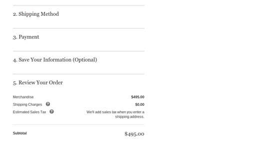
High abandonment rates are inevitable when the payment process takes too long, so it's imperative to minimize the clutter and the amount of steps as users try to pay for products.

For example, a customer clicking on the shopping cart icon should really be the only button they have to push until that trusty Complete Checkout button is selected.
The key is to consolidate information to fit it all on one page. Sometimes moving shipping information next to personal contact information is all it takes. The two column layout is a useful friend in this situation, because it enables you to cram more information on that one checkout page.
02. Allow orders without accounts
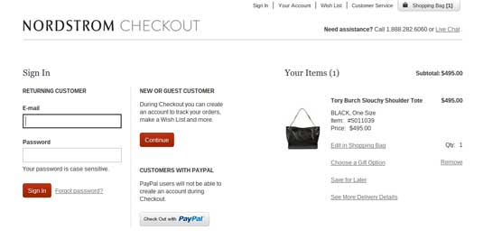
Putting obstacles in front of a consumer makes your designs less effective. Therefore, since the designs are less effective, they are less valuable. A common mistake made with online store design is to ask customers to make an account before they've bought anything. This is where choosing the right platform comes into play, since, if you design your site using a popular solution like Shopify or Bigcommerce, you're more likely to have a guest account module, or the option to include one quickly.
The idea is to capture information and track customers, but at what cost? Would you, or a client, rather make more money up front or deploy a brief inconvenience that could potentially turn away customers forever?

Guest accounts are a solid plan, considering you can build a certain amount of trust with a person by not asking for their information. Even then, that trust may accumulate to a point where they are willing to give up personal information in the future.
Regardless, the simpler process wins.
03. Don't drop the ball with site search/filtering
You know what makes a site extremely simple to navigate? A Search bar that's easy to find. The same goes for filtering tools, especially if you have a wide range of products on the site.
Far too often we see filtering tools hidden behind the homepage, or a search bar that's halfway down the homepage. What's the point of these if they aren't going to help users from the second they land on the homepage? The same goes for navigation and categories.
04. Highlight customer service and contact options more than you'd expect
You know that footer filled with contact and support information? How many people do you think actually scroll down there when they have a question?
A hidden, cluttered footer is no way to treat the contact information that so many customers want to use for getting their questions answered. Do your design a favor and generate a small modules at the top of the site so that links, phone numbers and email addresses can be inserted without taking up much space.
05. Overpower product pages with clean detail and stunning media
Take a look at the product pages on your most recent ecommerce website design. How many images are allocated to each product? What about videos or other types of media? Are the product descriptions short, yet detailed?

Since product pages generally determine whether or not someone is going to buy a product, it's essential to have clean formatting, with limited fluff in the textual part of your product pages.
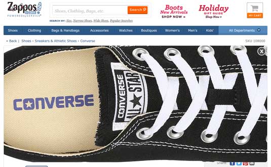
Images require a professional touch, and don't even think about only putting one image, or an image without a zooming feature. Eight of ten US online stores offer guest accounts, and so should you.
06. Create an easily modifiable shopping cart
This part of an ecommerce website design often goes unnoticed, yet it's essential for decreasing cart abandonments.
It's all about the shopping cart and whether or not users can modify the contents from a single page, without having to go jump through hoops to get exactly what they want.
It's interesting, because Amazon is usually on the good end of examples, but this time it's not the case. If you add an item to the shopping cart and go to the checkout, it's a pain in the butt to get back to the shopping cart to remove or modify items.

I'm not sure if they assume people will just give up and checkout with what's in the cart, but it's more annoying than anything. What's funny is they actually ask if you want to go back to the cart when hitting the back button.
07. Skip the pizazz, and highlight what people come for
Highlighting email subscription forms, social media buttons and blog post thumbnails often seems like a great way to show that you're willing to give out free content.
Unfortunately, these items are not considered high priority for a customer who came to the online store for an item.
In terms of the homepage, clear out the clutter, and place all focus on the items in the store. A banner with a promotion or new item announcement is fine, but everything in terms of social media, blog posts and other complementary information is to be saved for other pages or sidebars.
Over to you…
Now that you've had a chance to understand how to keep UX simple when planning for an online store design, drop us a line in the comments section below if you have any other suggestions for designers interested in keeping online stores clean and simple.
Related articles:
