5 quick ways to improve your portfolio dramatically
Sign up to Creative Bloq's daily newsletter, which brings you the latest news and inspiration from the worlds of art, design and technology.
You are now subscribed
Your newsletter sign-up was successful
Want to add more newsletters?
As your creative calling card, you want your portfolio to be as effective and alluring as possible. But because it’s (by definition) a very personal project, it’s sometimes difficult to take a step back and look at it dispassionately, to assess what is and isn’t working properly.
At Creative Bloq we’re continually checking out new design portfolios, and while most of them are great, there’s usually one or two things they fall down on that can be easily rectified.
Based on this, we’ve come up with a checklist of five quick and easy changes that would improve many an existing portfolio website. Take a look and see which ones could help you bring your portfolio to the next level. For more on this, see our post on how to create an online portfolio.
01. Add a call to action
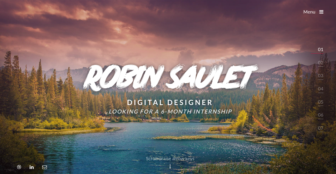
Many portfolio websites present a range of stunning work, but there’s a total lack of context as to what the person is, and what they’re seeking from you. So whatever the reason the designer originally created the website, it’s unlikely to achieve its goal.
Ask yourself, then, what you want to get out of your portfolio site. Are you looking for a new job, or a freelancer looking for new opportunities? Do you primarily want people to know about your side projects, or are you looking for new collaborators?
Whatever the reason you’ve created a portfolio site, let people know; ideally on your homepage, as French UI/UX designer Robin Saulet has done with beautiful succintness (see above).
02. Tell people what you can do

Many portfolio websites fall down because they just show a gallery of work but don’t explain what you did to create it. Employers and potential clients don’t always know design works, so it can helpful to spell out what specific skills you have.
Sign up to Creative Bloq's daily newsletter, which brings you the latest news and inspiration from the worlds of art, design and technology.
Brittany Chaing, a front end software engineer in Boston, shows one way to do it in the example shown above. Similarly, Irish web designer Owen O’Donnell’s site uses a series of discs to visualise his ‘comfort level’ with different tech (eg HTML5 = 100%, jQuery = 75%).
03. Show your face
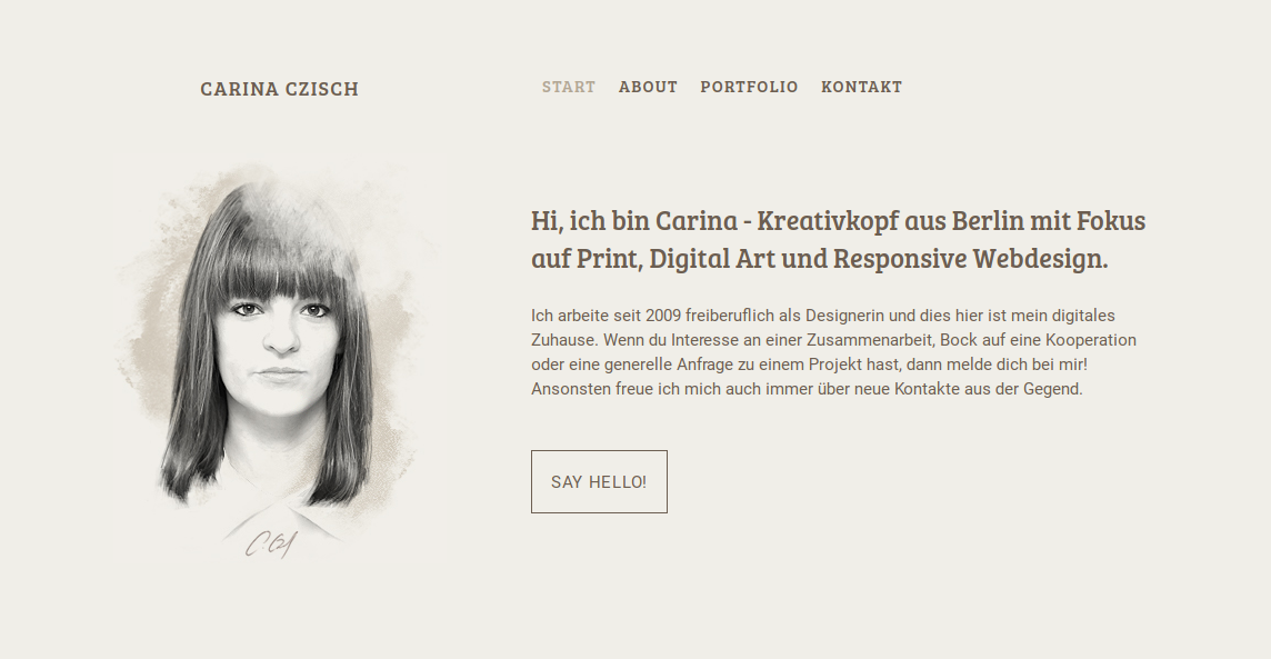
Many designers are loathe to show themselves on their portfolio. But including an image of yourself on your homepage isn’t narcissistic; it’s just a very natural way of building trust.
None of us are happy with the way we look, of course but that’s irrelevant; it’s not a beauty contest, it’s about making a human connection. Because, like it or not, all business is personal, and as much about building relationships as it is about skills and experience.
Carnia Czisch, a creative head from Berlin with a focus on print, digital art and responsive web design, shows just how to do it on her stylish portfolio site (above).
04. Add a resume
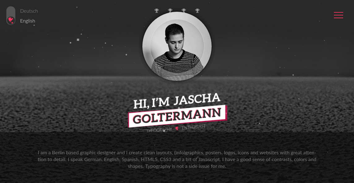
Whether you call them CVs or resumes, many creatives think they’re old hat. But more traditional employers and clients really do find them useful, and so it’s a great idea to provide a downloadable version on your portfolio site, as Berlin based graphic designer Jascha Goltermann has done.
Business-like clients will also appreciate a link to your LinkedIn page for the same reason. So put yourself in their shoes, and don’t miss out on a potential job or project just because you’re trying to “look cool” in front of your trendy designer mates.
05. Remove unnecessary images
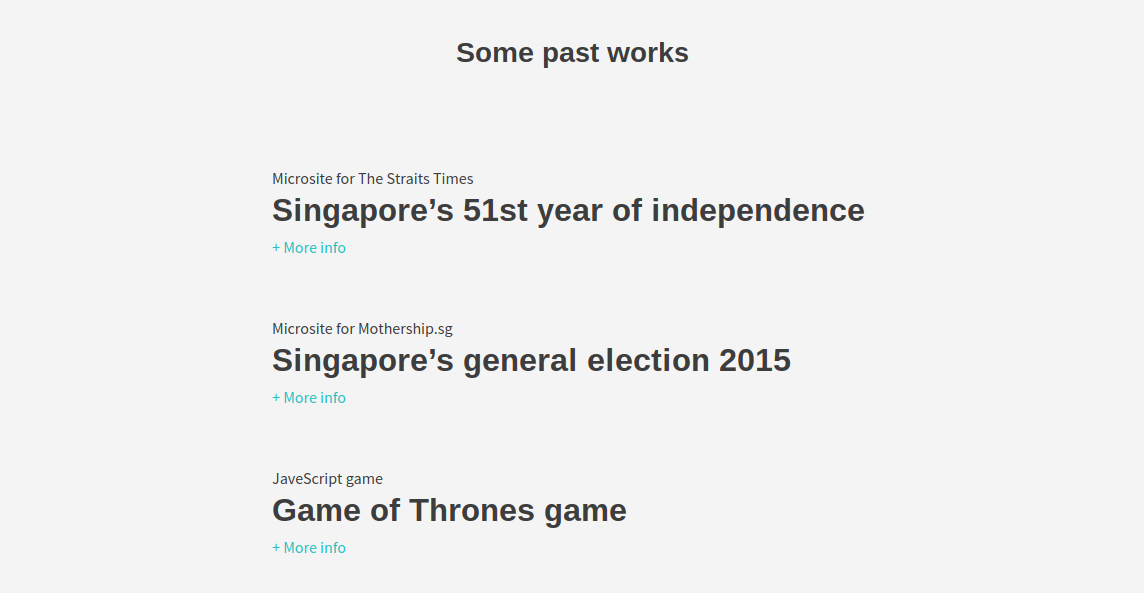
Minimalism for its own sake can be annoying. But you should constantly question whether images or text on your site are necessary, or just ditchable clutter. Because the simpler your site is to use and navigate, the longer people will stay and the more of your work they’ll end up looking at.
For example, Tuo Yu Sheng, UX designer and coder from Singapore, has only text links to his work on his portfolio homepage. Does the lack of images mean a loss of impact? In this case, we’d argue the opposite: we were compelled to click through and find out just what that Game of Thrones game looks like...

Tom May is an award-winning journalist specialising in art, design, photography and technology. His latest book, The 50 Greatest Designers (Arcturus Publishing), was published this June. He's also author of Great TED Talks: Creativity (Pavilion Books). Tom was previously editor of Professional Photography magazine, associate editor at Creative Bloq, and deputy editor at net magazine.
