Latest about Computer Arts

How to give a good presentation: tips and tricks for public speaking and pitching
The design industry's best speakers share their golden rules for presenting your work with style.

20 packaging designs to inspire you
Inspirational packaging design examples, plus online resources.

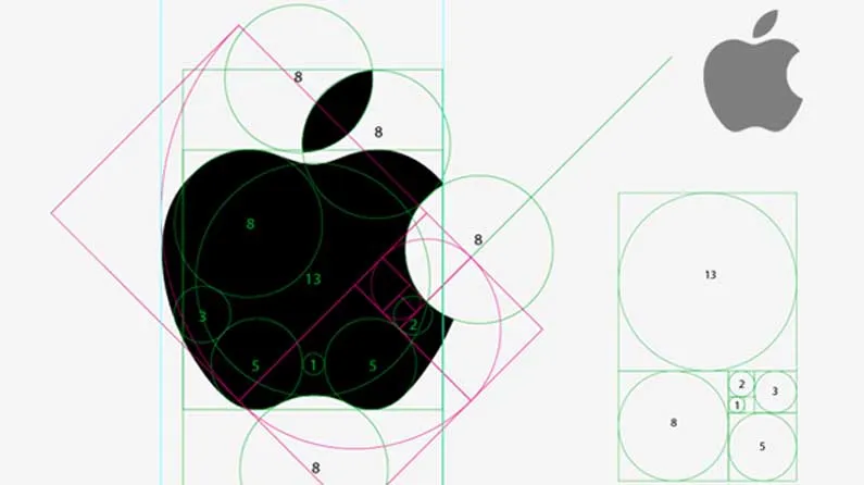
20 iconic brands and why they work
These brands may not be the biggest, but they're certainly iconic.

How to choose the right typeface
Top tips for picking the perfect fonts for your next project.

How to create anaglyph images in Photoshop
Create anaglyph images with this step-by-step tutorial for an old-school 3D effect.

10 fantastic logo fonts
Designing a visual identity? Here are some great logo fonts.

Colour theory: a complete jargon-free designer's guide
Everything you need to know about colour theory.
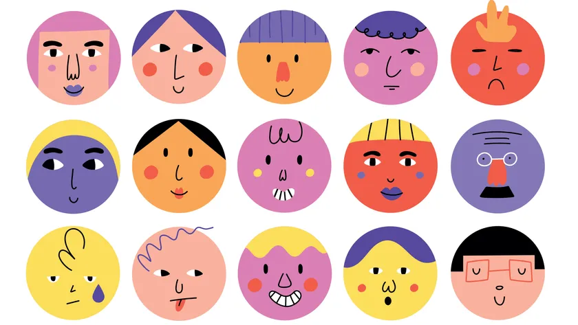
33 expert character design tips
Leading artists and illustrators share their character design tips.

LATEST ARTICLES