
You've surely seen logo grid systems used to demonstrate the shape and proportions of famous logos, but you may be wondering how to use them. This geometric design technique isn't necessary for all projects, but the fact is that logo grids, construction guides and circles can be powerful techniques (see our guide to how to design a logo for more.
In the guide below, Niall O'Loughlin from 99designs shares his biggest dos and don'ts of using logo grids in a design project. For more inspiration, see our pick of the best new logos.
How to use a logo grid system in your design
01. Use relevant grid systems and geometric shapes the start
A great example of the effective use of a logo grid system is in & Walsh's identity design for the Jewish Museum in New York. The agency created the entire brand identity based on the grid system of the Star of David symbol, and the result was a unified and striking visual identity.

By using a logo construction guide, the designs evoked the past while introducing a fresh, modern look to the museum's brand. Following relevant grid systems and geometric shapes from inception worked well in this case and is a great lesson for us to remember, with relevance being the key here.
02. Don't over-rationalise your logo with 'mathematical' grids, empty metrics or imaginary geometry
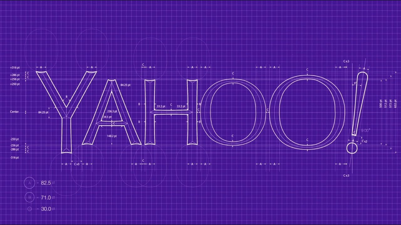
It's crucial to note that in the example above, the logo grid was used to create the design, not to justify it. There's no point in designing a logo and then slapping it on a grid to try to create a rationale behind it!
In creating Yahoo's 2013 logo rebrand, CEO Marissa Mayer and their in-house design team used a 'mathematical' blueprint as a logo construction guide. They also released a video to explain their precise design process, and to point out "some of what was cool/mathematical" in the design. When it came to the exclamation point, Mayer states that "our last move was to tilt the exclamation point by nine degrees, just to add a bit of whimsy".

The explanations weren't convincing to some, and the design was widely criticised, with many in the design industry questioning the supposedly 'mathematical' qualities. This serves as an example of how over-rationalising a logo design and using 'mathematical consistency' doesn't necessarily result in a better design.
03. Use a grid as a guide to create a timeless logo
When Raymond Loewy sat down to design Shell Oil's logo design, he used a logo construction grid as a guide to create an iconic design that hasn't changed much since 1971. Not every line of the logo matches the grid exactly, but the grid is clearly an integral part of the design that helped achieve balance and symmetry, making the logo more powerful and recognisable than previous iterations.

We learned a lot about the fundamental concepts of art and design as well as the process behind the Shell logo in Design Basics, a great read from David A. Lauer & Stephen Pentak.
04. Don't apply mathematical ratios to a logo where they don't exist
This widely circulated logo construction guide has been used by some to explain the timeless appeal of the Apple logo design. But it wasn't used to design the logo (see our Apple logo history).

The graphic claims that the Apple logo is a good design because it's composed of perfect circles and follows the Fibonacci sequence and golden ratio. However, this claim has been soundly debunked by several mathematicians and designers, and if you look closely you can see that the lines of the apple do not adhere to strict geometry and that the numbers do not add up to the golden ratio.
It's only natural to want to quantify good design down to geometry and numbers, and it would be awesome if there was a magical mathematical formula we could use to create perfect logo designs. But perfect geometry doesn't always appeal to the human eye, and one could argue that the Apple logo is successful because it's not geometrically precise.
05. Use grids and geometric shapes to add polish and symmetry to your design
The elegant logo design shown below uses a construction guide to great effect. To create their design for the "All Day Ruckoff" logo contest, designer Kaelgrafi used a construction guide to achieve symmetry and maintain consistent spatial relationships between each line and curve of his design.

Perfect circles were used to create the corners of each shape, and it's clear that the designer made a refined sketch of the design beforehand and polished it up in a vector program. This is a successful example of using a grid and basic geometric shapes to create a compelling and professional-looking design.
06. Start every design project with a layout grid (no exceptions)

As you can see in the breakdown above, when Microsoft last redesigned its Bing logo, it ensured it would be consistent their other product logos by using the same angles and grid-based design.
Learning to integrate your logo design into the grid can have a big impact on visual and long-lasting success. Consider a logo grid as the invisible force that gives the visible its structure and holds everything in its proper place. It helps ensure that concepts are visually consistent from one product to another.
Choosing a construction guide in your logo design process, allows you to not only make sure that it maintains its visual meaning and structure, but also enhances your design by maintaining focus instead of distracting from it.
For more ideas, see our pick of the best logos of all time. And if you're looking for type ideas, see our pick of the best free web fonts.
