11 designs that rocked the world
Design goes far beyond making things pretty and functional: it can be a strong force for change too, as these examples show.
Good design should be about solving a problem and communicating a message, as well as appealing to the eye. Truly great design, used in the right way, can go beyond that and influence people's opinions and actions, the way they interpret the world, and even the way they live their lives.
Accordingly, many designers believe their roles should come with more than a sprinkling of social responsibility. Whether it's a persuasive political poster, an era-defining magazine cover or an engaging charity campaign, sometimes design really can help change the world – and hopefully for the better. Here are 11 inspiring examples…
01. World War I recruitment posters
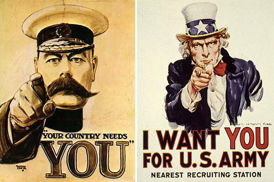
In the first half of the 20th century, and particularly the First World War, posters were a particularly striking form of propaganda, stoking the war effort on both sides of the Atlantic. Blanket recruitment drives employed the winning combination of powerful illustration and stark, direct messaging to drive millions of young men to their nearest recruiting station.
Article continues belowThe imposing figures of Kitchener, the British Secretary of War, and Uncle Sam himself in full patriotic regalia – both with fingers pointed directly outwards at the viewer – are indisputably persuasive.
The introduction of conscription before the Second World War would make general recruitment posters all-but redundant in favour of more focused campaigns targeted at specialist services, particularly for women, and the industrial and agricultural effort.
02. Che Guevara poster
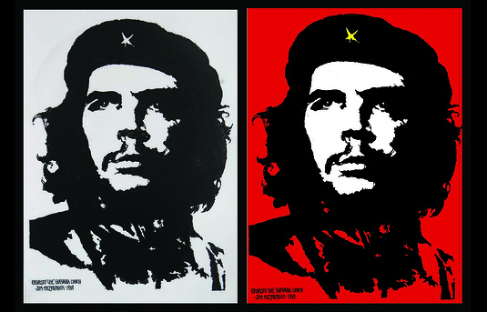
When Irish artist Jim Fitzpatrick developed a simple design based on Alberto Korda's photograph of revolutionary leader Che Guevara, he had no concept of how iconic it would become. It was 1967, and he'd received a copy of the photo from a Dutch anarchist group from which to produce an image for their magazine. At this point, Guevara was alive and an inflammatory symbol at the peak of Cold War tension – and it never made it to print.
After his murder, Fitzpatrick revisited the image as a commemorative poster, created using a paper negative, and printed in black and red with a hand-painted yellow star. He intended the image to "breed like rabbits", and allowed the silhouette-style image to be reproduced without copyright all around the world. Ironically, over the decades this revolutionary symbol grew into a highly commercialised property – and now adorns the walls of millions of students rather more used to rebelling against parents and teachers than an oppressive regime.
Sign up to Creative Bloq's daily newsletter, which brings you the latest news and inspiration from the worlds of art, design and technology.
03. Labour Isn't Working poster
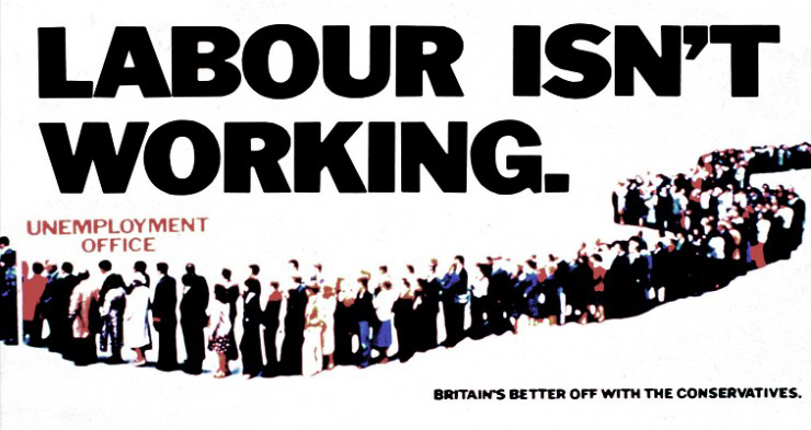
One of only two political ads to be inducted into Campaign magazine's Hall of Fame, and certainly one of the most pivotal, iconic and influential election posters ever to have graced UK billboards, Saatchi & Saatchi's 1979 'Labour Isn't Working' campaign on behalf of the Conservative Party simply depicted a long, snaking queue of job-seekers outside an unemployment office.
As a piece of design, it's incredibly simple – but it hooked into a powerful public feeling of discontent that helped catapult the Conservatives into 18 years of office. The poster spawned a whole series of follow-up campaigns over the years, including 'Labour Isn't Learning' in 2012 – and in a twist back on the Conservatives, an 'Austerity Isn't Working' version created by UK Uncut. The same year, the Republican Party replicated the design for the US Presidential Election with the slogan 'Obama Isn't Working' – unfortunately for the GOP, it didn't prove quite so effective across the pond.
04. Time magazine covers

There are few more era-defining publications than Time magazine: being featured as its cover star has become a shorthand for having reached the pinnacle of relevance at any given point. Its primary approach of leading on a closely-cropped photographic treatment of an individual – coupled with the long-running Person of the Year contest – has made the title an influential litmus test for contemporary culture for decades.
Of course, a weekly magazine that's been running since 1923 has built up an awe-inspiring archive that effectively chronicles and reflects the last 90 years of history, but has also helped to shape public perception of events.
Time has only deviated from its instantly recognisable red-bordered cover four times since 1927: an issue released after 9/11, when it became black; an Earth Day issue in 2008, when it turned green; a commemorative issue 10 years after 9/11, when it was metallic silver; and a second use of silver to mark Barack Obama's Person of the Year selection at the end of 2012.
05. Adbusters campaigns
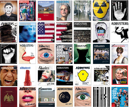
Founded in Vancouver, Canada in 1989, the non-profit Adbusters Media Foundation has a fierce anti-consumerist, pro-environment manifesto that, in the organisation's own words, galvanises a "global network of artists, activists, writers, pranksters, students, educators and entrepreneurs who want to advance the new social activist movement of the information age".
Design plays a pivotal role in its messaging, not least through Adbusters magazine – which openly confronts capitalism and commercialism through an approach its calls 'culture jamming' – challenging and attempting to reverse assumptions about the status quo through parody, satire and subversion, whether within the pages of the publication itself or out in the wider world.
The organisation has also launched global campaigns such as Buy Nothing Day, TV Turnoff Week and most notably, Occupy Wall Street, which has become probably the most talked-about Western protest movement of the current decade.
06. Anti-smoking ads
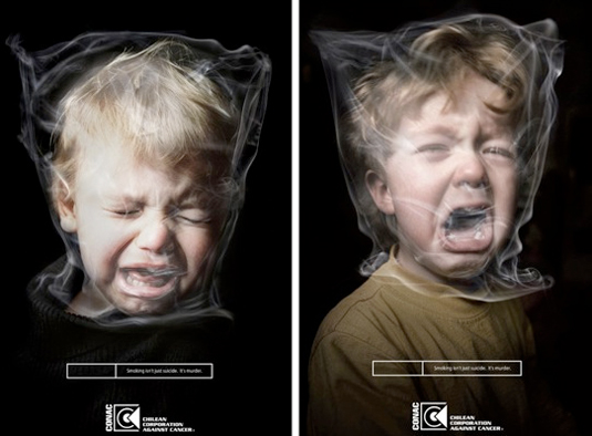
Smoking and advertising were once such happy bedfellows. Stylish film stars with cigarettes dangling from their lips; rugged, chiseled cowboys in the desert taking a drag; slapstick antics polished off with a satisfied puff of cigar smoke. How things have changed.
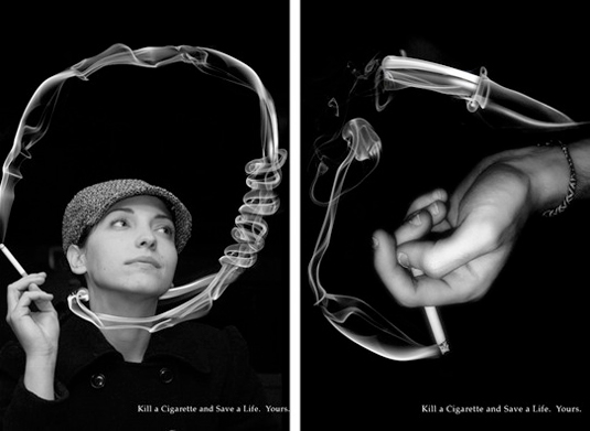
Some of the most unsettling, and in some cases downright shocking campaigns of the last decade or so are united in a bid to persuade the world's smokers to kick the habit before they kick the bucket.
Whether it's as simple and harmless as dispelling the idea that smoking makes you cool, to far more hard-hitting messaging and imagery concerning death, disease and often most disturbingly, damage to children, the considerable persuasive power of design is on show across the board.
07. (RED) branding
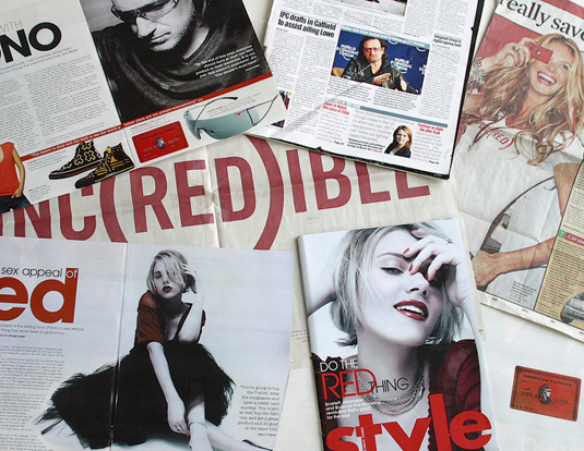
In (RED) founder Bobby Shriver's words, Wolff Olins took his vision "from an idea on a napkin to a tangible visceral vision that was game changing". Since it began in 2006, this project has demonstrated how design can help to make a genuine impact, in this case drawing together the might of the world's biggest brands to help eliminate AIDS in Africa.
With a unique brand architecture that presented their recognisable logos 'to the power of (RED)', the organisation attracted partners of the calibre of Amex, Converse, Emporio Armani and Gap.
By 2013, it had raised over $200million, making it the largest private sector contributor of the Global Fund to fight AIDS – with additional partners such as Apple, Coca-Cola and Starbucks adding their banners to the fray.
08. Our Choice
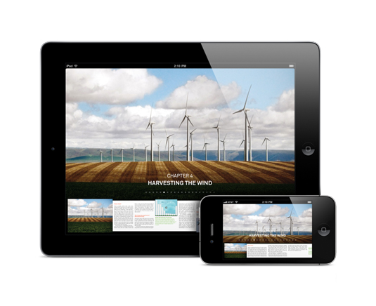
Following in the footsteps of Al Gore's 2006 documentary An Inconvenient Truth, this immersive experience created by Push Pop Press and Melcher Media pioneered a new mode and level of user interaction in a digital book. Building on the film that preceded it, Gore presents an in-depth analysis of the causes of global warming, groundbreaking insights and potential solutions.
It's all delivered as an inspiring package of photography, interactive infographics, animations and documentary footage, with a groundbreaking multi-touch user interface that enables readers to intuitively pinch, zoom, browse, play and explore the data-rich content within. It's a superb example of how great design can deliver an important message in a compelling way.
09. Barack Obama 'Hope' poster

With his roots in the skateboarding scene, South Carolina-born graphic designer and illustrator Shepard Fairey built a name for himself with his 'Andre the Giant' guerrilla sticker campaigns – but it was his involvement in the 2008 US Presidential election that really catapulted him towards global recognition.
Fairey's now-iconic Barack Obama 'Hope' poster, featuring a four-colour portrait of the then-Senator in red, beige, light and dark blue, also came in 'Change' and 'Progress' varieties, and was created in a day. Having started life as a screen-printed poster (which sold out almost immediately), the design spread virally across the United States and the rest of the world as a symbol of what American politics could potentially become.
The revelation the following year that Fairey had based the design on a photograph by Associated Press photographer Mannie Garcia without permission – and later admitted to destroying evidence in the ensuing legal battle with AP – led to a community service and a hefty fine. Amongst designers, it's now as much a symbol of copyright infringement as it is a piece of political iconography. But whatever the circumstances of its creation, its influence during the election campaign was enormous.
10. Greenpeace BP parodies
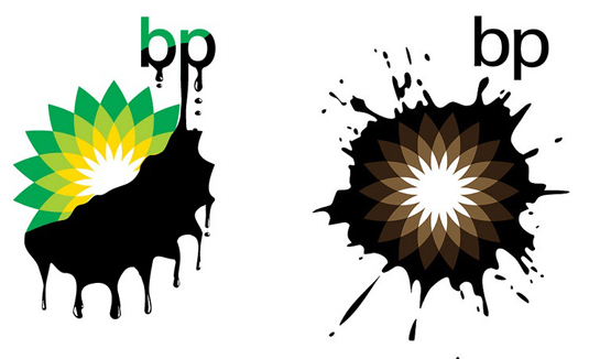
Like Adbusters, Greenpeace has something of a mischievous reputation for social activism. In 2010, in the wake of the notorious BP oil spill – in which some half-a-million gallons of oil were leaking into the Gulf of Mexico each day, with efforts to stem the flow proving woefully ineffective – the global environmental charity took it upon itself to subvert the oil giant's brand.
Greenpeace threw open a design competition in three categories – professional designers and students, the general public, and young people under 18 – to redesign BP's Helios marque, which Landor Associates had rolled out a decade before in a bid to emphasise its 'green' credentials. The brief was simple: "Show that the company is not 'beyond petroleum' – they're up to their necks in tar sands and deepwater drilling." The response amongst designers and non-designers alike was overwhelming, with parodies flooding the internet.
11. Pioneer plaque
The early 1970s saw a shift in mankind's idea of its place in the grand scheme of things. The 1969 Moon landing and the earlier Earthrise photo – a shot of the Earth rising above the Moon's horizon, taken during the Apollo 8 mission – helped trigger a mass realisation that our world is just one small planet in an enormous universe, and that there's a lot to explore out there.
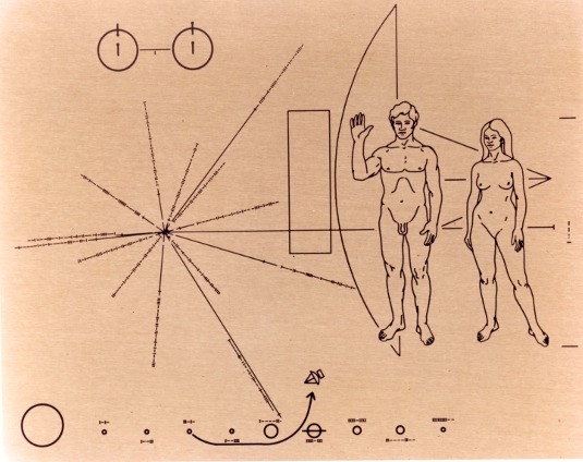
NASA's 1972 Pioneer 10 was the first mission to Jupiter, intended to fly past the planet before being flung out into interstellar space. Included with its instruments for analysing the biggest planet in the solar system was a small plaque made of gold-anodised aluminium. Designed by Carl Sagan and Frank Drake in just three weeks, the plaque's strange design is a message from mankind, featuring figures of a man and a woman (standing in front of a silhouette of Pioneer for scale), a diagram showing the Sun's position relative to the centre of the Galaxy, a map of the Solar System that also shows Pioneer 10's trajectory and, the icing on the space cake, an illustration of hyperfine transition of neutral hydrogen.
Will aliens ever find it and translate its message? Unlikely; Pioneer 10 is currently headed towards Alderbaran, 68 light years away. It'll take two million years for Pioneer to get there; don't hold your breath.

Nick has worked with world-class agencies including Wolff Olins, Taxi Studio and Vault49 on brand storytelling, tone of voice and verbal strategy for global brands such as Virgin, TikTok, and Bite Back 2030. Nick launched the Brand Impact Awards in 2013 while editor of Computer Arts, and remains chair of judges. He's written for Creative Bloq on design and branding matters since the site's launch.
