Picking the best magazine fonts for your publication is a vital early step to take, whether you’re making your own DIY zine or launching a brand new title with global aspirations. Your typeface as a magazine is the conduit between your writers and their audience, and the choices you make will have a huge impact on how your publication is perceived.
You may want a one-size-fits-all font that works as well for your headings as it does for your body copy, or you may prefer to use multiple fonts for different purposes. In this guide, we’ve supplied you with a range of flexible options to do it all, with plenty of free fonts that you can use for personal or commercial projects without paying a penny.
If you’re launching a digital-only magazine, check out our guide to the best free web fonts. And we also have an expert rundown of the best magazine covers of all time, in case you need a little design inspo.
Free fonts for magazines
01. Montserrat

Yes, it is extremely popular, to the point of overuse. But things do tend to be popular for a reason, and you really can’t go wrong with Montserrat if you want to produce a good-looking magazine with readable type. Originally designed by Julieta Ulanovsky, who took inspiration from the signage in the Montserrat neighbourhood of Buenos Aires, it’s an elegant sans serif that’s available in nine different weights, giving you real versatility, and it’ll work equally well for headings and body copy.
02. Lora

This well-balanced serif font would suit long-form essays and reviews. Taking some inspiration from calligraphy, Lora blends nicely brushed curves with strong distinctive serifs, and is definitely one to consider if you’ve got no budget to speak of, but want something that feels elevated. It only offers a couple of weight options, however.
03. Gentium Plus

If you’re looking for a straightforward, nuts-and-bolts font for your magazine’s body copy, Gentium Plus is a good one. It’s a clean and legible serif, nothing too showy – if you want something a little weightier, there’s also Gentium Book Plus. It’s made and distributed, like many fonts, by SIL International, an evangelical Christian nonprofit that promotes linguistics and literacy around the world.
It’s worth mentioning that the organisation has come under its share of criticism for its hammer-like approach to promoting Christian values to indigenous cultures. You of course don’t have to truck with any of that to download and use a free font, but it’s best to go in eyes-open.
04. Tourney

If you’re putting together a technology, science or SFF magazine, then Tourney could be an excellent choice, especially for your headlines and page furniture. Designed by Tyler Finck, Tourney is available in several different weights, giving it a good level of flexibility. It’s also recommended for sports publications.
05. Kreon

Kreon is a free font that was specifically designed by Julia Petretta for magazine, newspaper and print use, so should definitely be high on your consideration list. It has a slab-serif look and its consistent thickness makes it highly readable. It offers five weight options, and its legibility is pretty tolerant of being used at small sizes.
06. Grenze

This impactful typeface has a classical flavour, resisting smooth curves in favour of rounded angles that subtly call to mind the early days of printing presses. It’s another one that’s designed specifically for magazines, offering nine weights for a broad palette of styles. Its immediately distinctive, but doesn’t feel too gimmicky, and there’s no compromise on legibility.
07. Italiana

We’ve suggested quite a few solid body-copy fonts so far, but Italiana is a good one for headlines in particular. Designed by Santiago Orozco, it’s elegant and distinctive, with a subtle thick-to-thin contrast and attractively low-key serifs. Bear in mind that you’ve only got one weight option though – another reason it’s best for headlines rather than body copy.
08. Belgiano Serif

This is a slick, malleable serif font that scales up and down really well. With satisfyingly thick verticals it offers good, clean legibility, and is a great way to stop yourself from resorting to Times New Roman. Belgiano Serif is designed by Fajarisha Phonna, and is available for free on Dafont.
09. Clear Sans

You might run the risk of being called boring, but if you’re putting together a magazine where readability is of much greater value than style, then Clear Sans is a workmanlike font that will get the job done. Its narrow proportions and clear, distinct characters give you plenty of latitude for fitting text into columns without compromising on legibility.
10. Source Serif

Source Serif is a flexible font designed by Frank Grießhammer. Its latest version is Source Serif 4, which offers a range of optical sizes – useful for magazine work. It’s a good alternative to nice but overused fonts like Garamond. While Source Serif is available via Adobe Fonts, it's also available as an open-source project, so you can get hold of it for free.
Paid-for fonts for magazines
11. London

Billing itself as a ‘luxe serif’, London is an excellent font to have in your back pocket if you’re putting together a fashion or style magazine. Its thick-to-thin contrast produces lettering that is striking and impactful without being too overbearing, and would fit the bill nicely for headings and logos. It’s designed by Jen Wagner and is available at Creative Market.
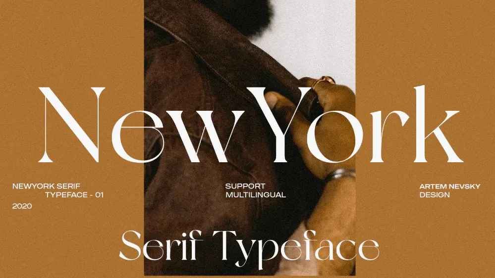
12. New York
Continuing our metropolitan theme, Artem Nevsky’s New York font is free to download for personal use – so if you’re distributing a zine for free, go nuts, but for commercial use you’ll need to buy a licence. Hearkening back to the mid-century looks of iconic magazines like the New Yorker (naturally), it’s impactful enough to work for headlines while being smooth and legible enough for body copy.
13. SIGNIA Pro

This impactful, modern-feeling sans serif is inspired by European street signage. If you like the clean lines and easy legibility of Montserrat, but simply can’t bear the idea of using such a popular font, SIGNIA Pro is a nicely elevated alternative – though be aware that it doesn’t give you as many weight options.
14. Bebas Neue Pro

A popular, professional font, Bebas Neue Pro by Ryoichi Tsunekawa is another option that requires kissing the Adobe ring in perpetuity. It received a refresh and update in 2024, adding a long-awaited lowercase script that makes it a viable option for magazine work. There’s an enormous selection of weights available for this elegant, efficient typeface.