6 logos that shouldn't work but do
Logos need to communicate a message about a brand's values and personality. Just as there are all kinds of brands, there are all kinds of logos. They come in all colours, shapes and styles. But despite the variety, most designers would agree on certain commandments to follow.
A logo should be clear and legible, as you can find out from our guide to brilliant logo design. It should tell us the brand name, whether in words or not. It should also be relevant to the brand and what the brand does, without too much guessing. On top of that, it should be scalable and ideally work without colours to give it versatility.
A logo is also usually intended to stand the test of time, which means thinking with longevity in mind and not following passing trends. But rules are sometimes made to be broken. There are cases of logos that tear up the rule book and yet prove to be successful, memorable representations of their brands. Here are seven logos that break the rules and the reasons why they work.
01. Airbnb
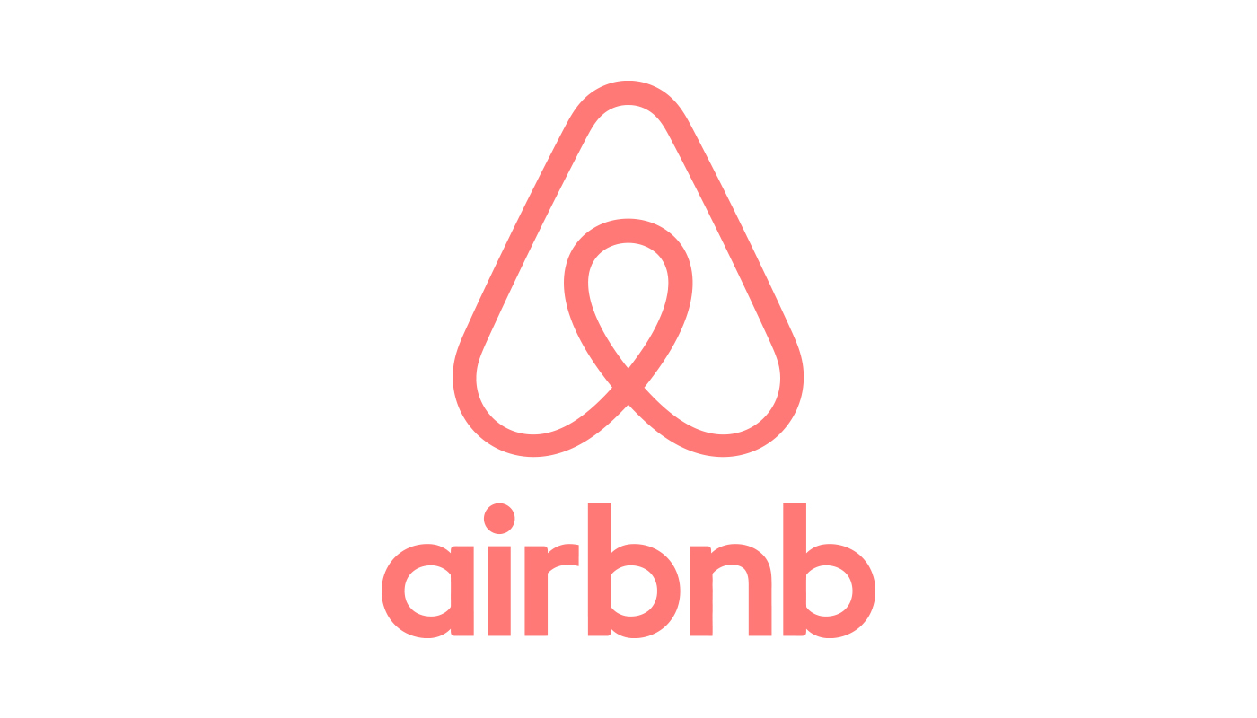
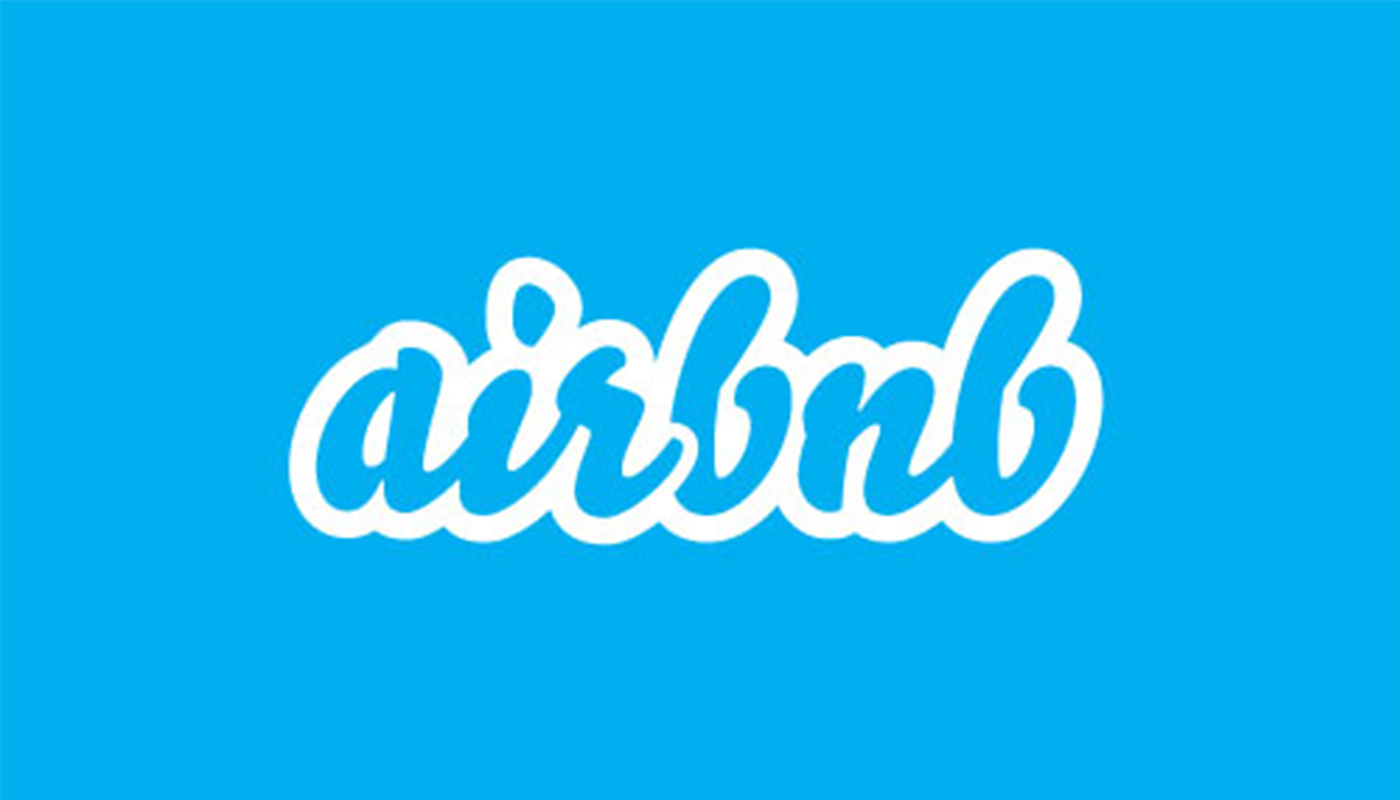
Simplicity is considered a strength in logo design, but not to the point of such abstraction that nobody understands the meaning. If a logo should tell a story and be relevant to what a brand does, Airbnb’s apparently random abstract mark shouldn’t work. Devised by San Francisco-based DesignStudio, the 'Bélo' was conceived as a symbol representing belonging. It combines the A of Airbnb, a location icon, the shape of a person raising their arms, and a heart. But no one sees any of that. Instead it looks like a laundry care symbol, or worse, something far ruder.
Yet despite all that, it actually works. Airbnb's previous blue logotype looked not unlike that of a million other brands in 2008, including Twitter and Skype. The Bélo is distinct, recognisable and memorable. It has an element of arcane mystery, made less intimidating by the bespoke coral colour. Its simplicity and symmetry also make it scalable to fit into an app icon so that it can represent the brand's name on the screen of a mobile phone.
02. Instagram

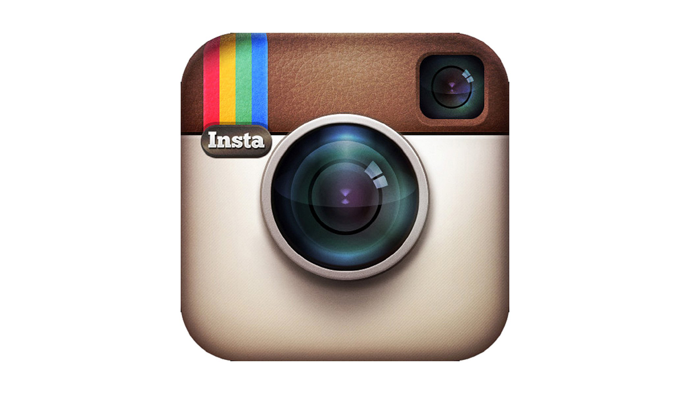
When Instagram ditched its skeuomorphic Polaroid-like camera for a new logo in 2016, many users were predictably outraged. The new glyph was a drab, generic, ultra-minimised flat abstraction of a camera chalked over a sunset colour gradient that would leave it looking dated in the blink of an eye. People complained it looked cheap, poorly crafted, and like something from a set of stock flat design icons.
But feelings can change. People calmed down, and a design that initially seemed to lack resonance with the brand’s audience has come to be accepted. It’s also probably a better representation of what Instagram has become in the last four years. No longer simply a tool for aficionados to edit and share pictures, it’s now a branding, marketing and storytelling platform in which imagery is still key but photography plays only a part. The logo seems more in tune with the aesthetics of many of the app's users and the influencer industry it created. The much-mocked gradient doesn’t feel dated yet, and it helps convey some of the warmth missing from the identity of parent company, Facebook.
03. London Symphony Orchestra
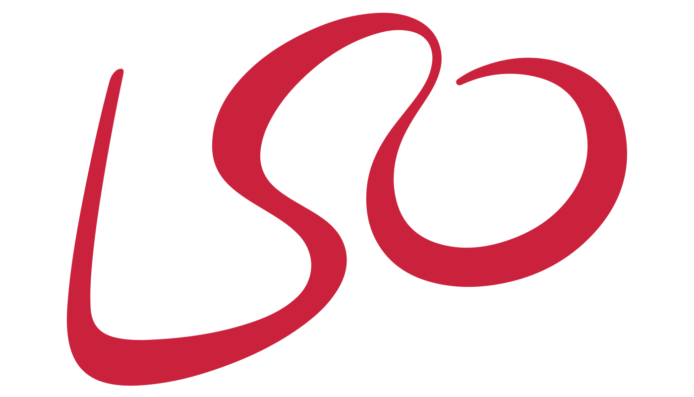
Created from a single flowing line, the London Symphony Orchestra's logo is hardly the most legible monogram. The three capital letters are linked together with ligatures in unsual places, and a viewer’s first impression might be that they’re looking at a foreign script. But the unusual lettering makes us look more closely, and the logo reveals a surprise that’s entirely relevant to the brand. The monogram forms the outline of the most important member of the orchestra – the conductor, baton in his left hand (the L) and his right hand waving to the orchestra (the O).
It takes a bit of work to get it, but the LSO’s audience is a cultured lot and the logo is usually going to be seen in context. The modern, flowing lettering still feels fresh and different for the sector, breaking with any staid reputation that a classical orchestra might have. The same consultants, London-based The Partners was later able to capitalise on the initial concept of the logo to develop a striking visual identity for the orchestra’s 2017/18 season by visualising movements of the conductor to create images and type.
04. Nintendo
The Nintendo logo doesn't quite look like the logo of a technology company in the 21st century. Designed in 1976, it looks not only slightly retro, but its red roundedness recalls the cartoonish feel of Mario Bros and the younger age group the games appealed to. It made sense then that the company would try to modernise and 'age-up' the design with the launch of the Wii in 2006. The then-president Reggie Fils-Aimé blocked proposals for a complete redesign but the red was changed to grey. This made the logo less invasive when printed on hardware, and looked more modern and mature, but the grey logo lacked the resonance of the red.
In 2016, the company embraced its traditional colour. When a company reverts back to an old logo a decade on, there's a risk it could be seen as going backwards rather than forwards. But for Nintendo, it had the opposite effect. The return to the red 1976 logo showed confidence and pride in the company’s roots, communicating a brand that felt no need to condescend to contemporary trends.
05. Museum of London
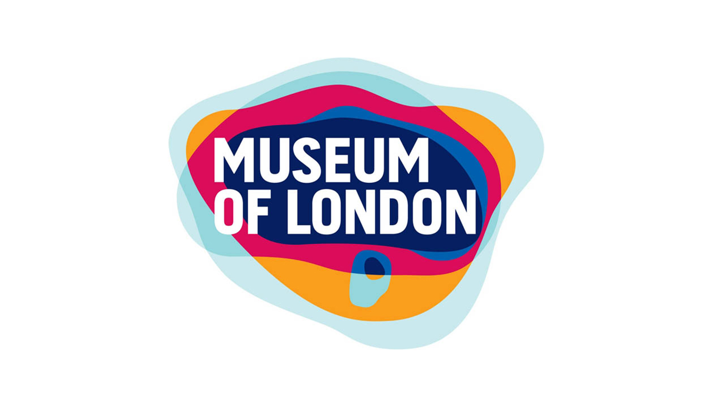
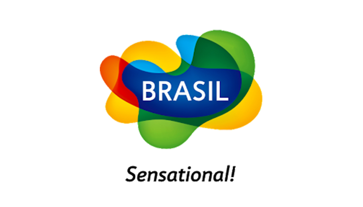
A good logo should be timeless and strong enough to ride changes in tastes and trends. This means designers should think twice before taking inspiration from current design trends. In the mid-2000s, designs using overlapping liquid shapes were everywhere, including in logo designs. The below logos for the newly merged Bandai Namco and the Brazil tourism board were just a couple of examples. In this context, the Museum of London logo was first accused by some of lazily jumping on the trend for overlaid blobs of colour, and too many blobs of colour at that. And what did it say about the Museum of London?
Well actually everything. In this case the blobs of colour mean something. The overlaid shapes represent London's geographic limits as it expanded over time, and will continue to expand in the future: Roman London, medieval London, modern London, and a future inner and outer city. Like a thumbprint made of many layers, the colours also give a sense of the city’s diversity. Designed by Coley Porter Bell, the logo cleverly combines history and contemporary design to create a logo that tells us exactly what the museum is all about – London’s past, present and future. The layers and liquidity of the shape also meant it could be adapted to numerous supports from bags to wraps for black cabs.
06. Demilich
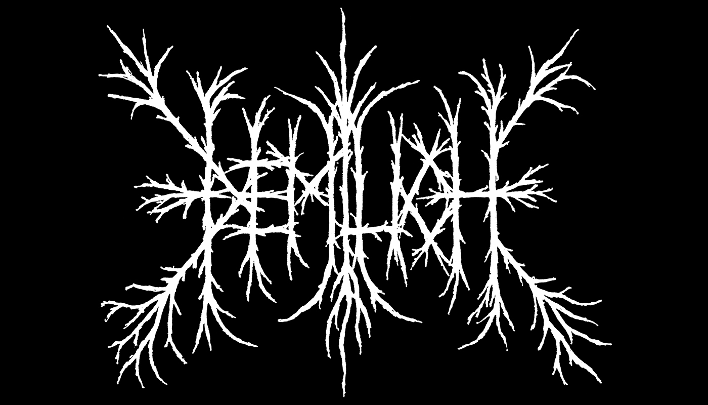
Logos are often our first point of contact with a brand, so they should tell us what that brand is. That means that when it comes to type, the most elementary rule is to use a clear, legible font or lettering. But just try telling that to Finnish metal band Demilich. The LSO logo mentioned earlier takes a moment to decipher, but with Demilich it’s all but impossible if you don’t already know the band. As an example of how all rules depend on product and the audience you want to connect with, extreme metal bands almost seem to compete to produce unreadable designs that can be deciphered only by insiders. As a fiercely independent genre, the message is that if you don't understand, it's not for you.
To outsiders many of these logos might look like Rorschach tests printed in blood, but they have their own subtle language and categories of variations. Demilich's logo from 1990 was one of the first to take influence from nature rather than gore or medieval blackletter script. The result may look like an early maximalist exploration for the Blair Witch symbol, but the intricate design perfectly embodied the complex, precise songwriting and instrumental techniques of their particular subgenre of technical death metal.
Read more:
Sign up to Creative Bloq's daily newsletter, which brings you the latest news and inspiration from the worlds of art, design and technology.

Joe is a regular freelance journalist and editor at Creative Bloq. He writes news, features and buying guides and keeps track of the best equipment and software for creatives, from video editing programs to monitors and accessories. A veteran news writer and photographer, he now works as a project manager at the London and Buenos Aires-based design, production and branding agency Hermana Creatives. There he manages a team of designers, photographers and video editors who specialise in producing visual content and design assets for the hospitality sector. He also dances Argentine tango.
