How to mix a gouache palette
With a bit of planning, it's easy to create a harmonious colour scheme using gouache paints.
Sign up to Creative Bloq's daily newsletter, which brings you the latest news and inspiration from the worlds of art, design and technology.
You are now subscribed
Your newsletter sign-up was successful
Want to add more newsletters?
Gouache is more forgiving than watercolour paint, but decisions you make early on can still affect the rest of the painting, so planning your colour choices in advance will ensure you get a pleasing palette with harmonious colours.
Although it may be tempting to dive in to start painting right away, this usually results in a lot of mistakes and tedious backtracking. If you lay down a vibrant violet sky in your initial wash, for example, the chances are that’s what you’ll end up with. Depending on the amount of moisture in your brush, gouache can also lift and mix with each layer applied on top, so there’s a limited number of times you can rework an area before it becomes a muddy mess.
This is why it helps to plan out your colour choices in advance, so all the heavy lifting is done before you even touch brush to paper. Mixing your palette from a limited pool of colours will result in a more unified colour scheme. Mix secondary colours from primaries or variations thereupon, tinted using titanium white and a subtractive black. Here's how to do it.
Article continues below01. Gather materials and get started
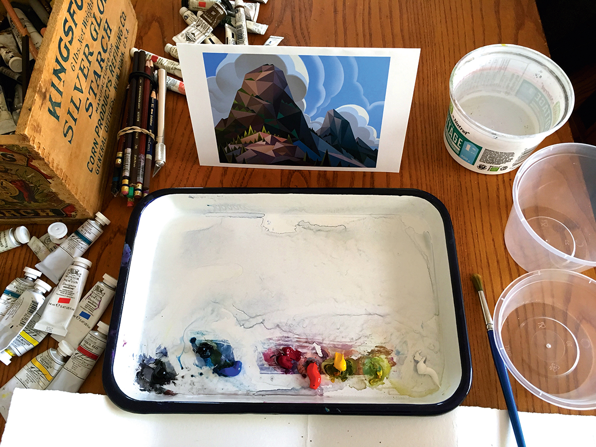
While it’s worth investing in artist-grade paints and paper, your setup itself doesn’t need to be complicated or expensive. The paints I used are M. Graham gouache and Winsor & Newton gouache, which are high-quality, colourfast brands. To avoid paint drying, store the tubes away from light and heat.
Organise your palette according to warm and cool values – the colours I used here are Ivory black, Prussian blue, Primary blue, Magenta, Cadmium red, Cadmium yellow and Yellow light, and Titanium white.
Mix the colours with the consistency of mud in mind, as you can always water them down later. Keep the colours you'll need a lot of in separate airtight containers (like these old yoghurt pots) and use them as needed. An old garbage brush is fine for mixing the colours; a palette knife wouldn’t be able to lift paint off the surface.
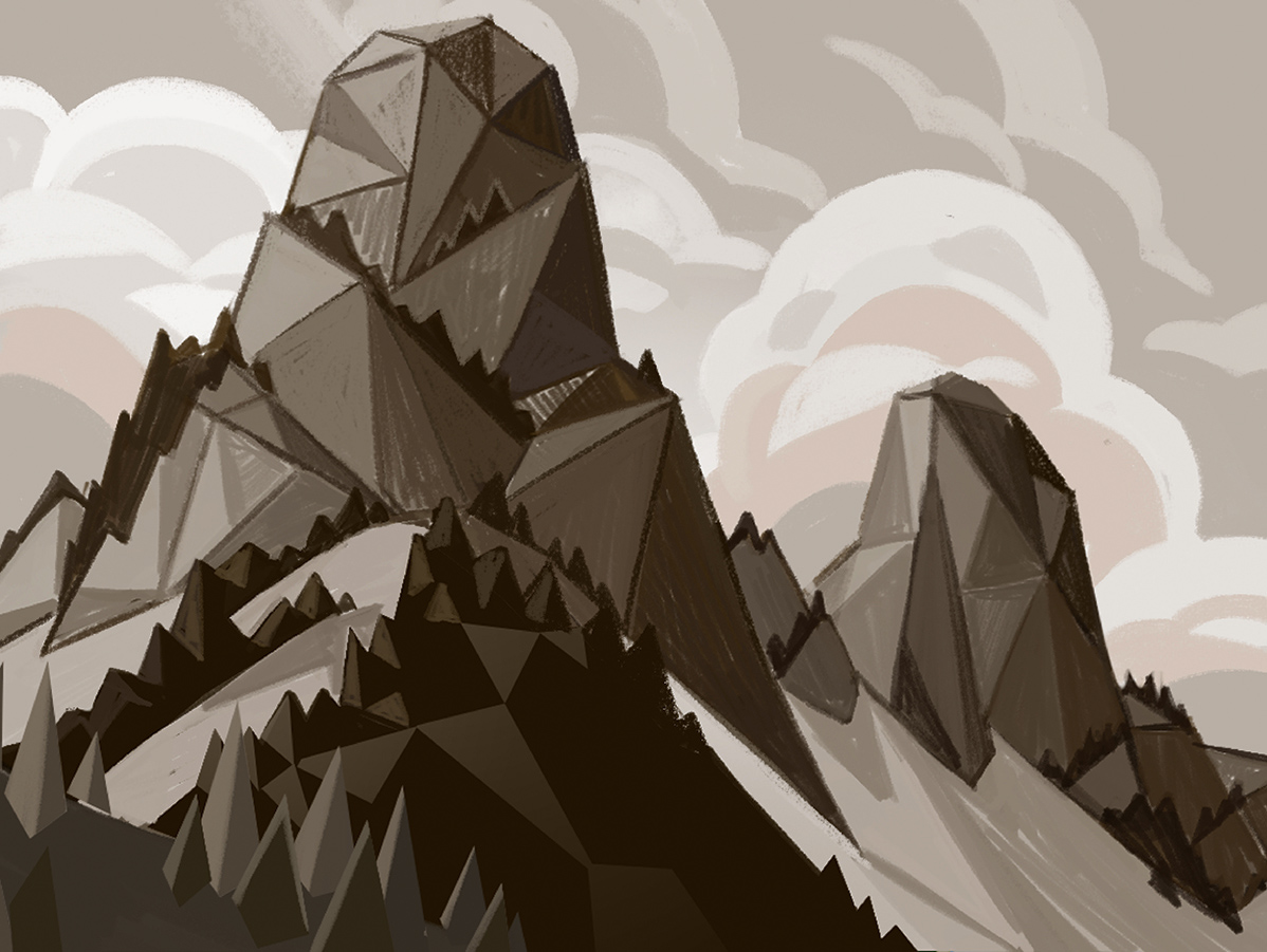
Creating a printed colour composite can really help you to match paint mixes. Plan it out in Photoshop, where working in LAB colour space makes it easier to create a more harmonious colour scheme. You can also then use the Black and White adjustment layer to check that your values work.
Sign up to Creative Bloq's daily newsletter, which brings you the latest news and inspiration from the worlds of art, design and technology.
02. Plan your painting
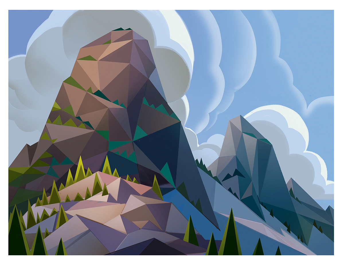
Analyse the composite image you created in Photoshop to determine the colours required to paint it, and how much of each to mix. Although this looks like a colourful image, you can achieve this look with three base mixtures.
The base colour of mountain will need a reddish brown hue that you can lay down as an initial wash and use throughout the painting. Use variations on this base colour when painting in the facets of the mountain, tinting them either warmer or cooler using the sky colour.
A black mixture can be used for darkening areas throughout the image, while tinting with titanium white will lighten areas.
The top of some trees require a bright green mixture. Cadmium Yellow light is ideal for painting bright foliage.
The sky is a slight gradient, so keep this in mind when mixing a pure blue hue, as well as a darker shade to mix in later on. A warm grey mix will be needed for the underside of the clouds, too.
03. Mix the base hues
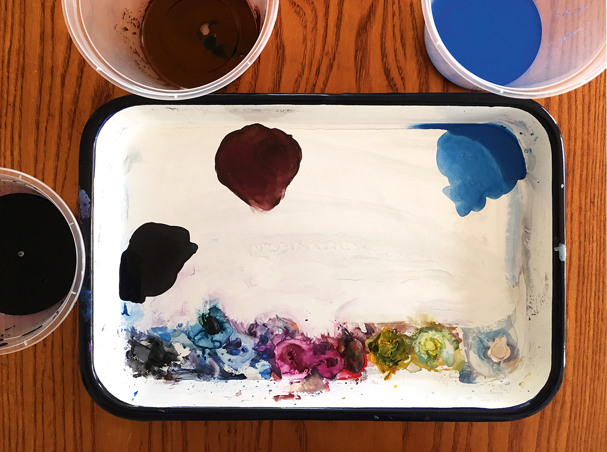
Mix the base hues first, as you’ll mix these with each other and with the other colours on your palette to achieve harmonious colours in this painting.
The black mix is a mixture of Prussian blue, Magenta, Cadmium red and Cadmium yellow. To make this as neutral as possible, test it by mixing it with Titanium white. If the result is a neutral grey (sitting between the warm and cool spectrums), then you've found my mix.
The sky blue mixture is just a straightforward mix of Primary blue. You can tint this pure mix using Magenta and Prussian blue to use as a gradient for the sky.
The base hue of the mountain is composed of Cadmium red, Magenta, Yellow and Primary blue, but keeps things on the warmer/magenta side.
04. Break it down further
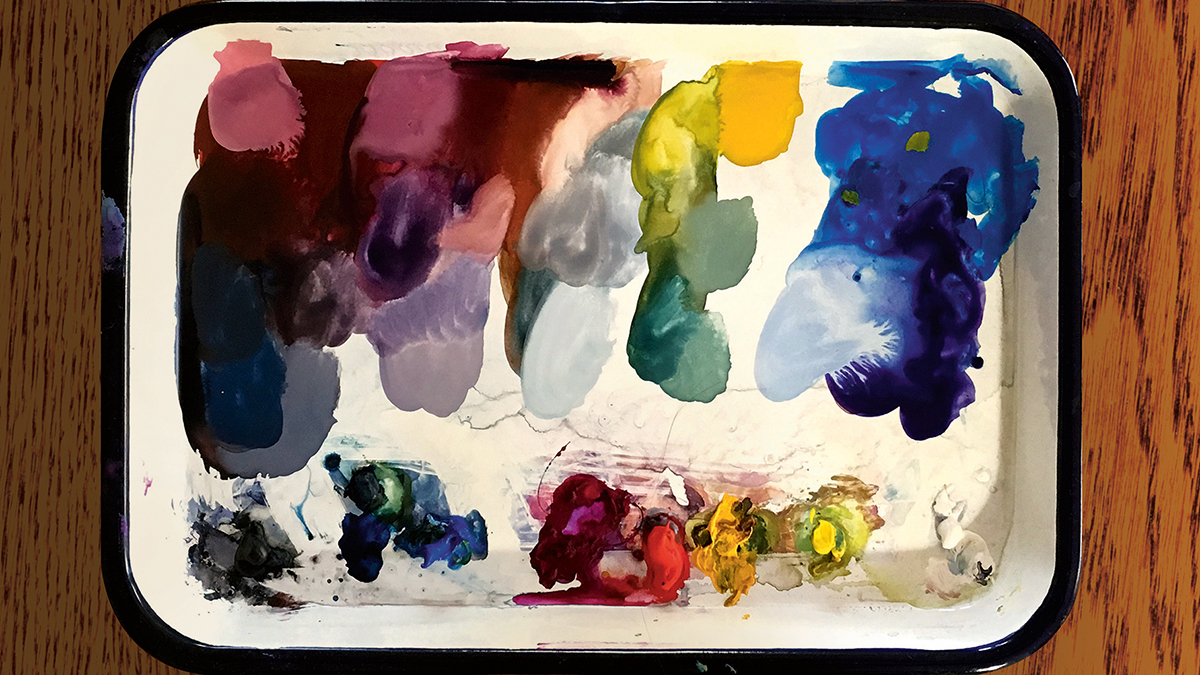
Once you've mixed everything, you'll have a full palette of base colours, bright green for the trees and darker and lighter variants that correspond with the comp.
Keep the pure colour mixes towards the top of the palette and mix from them. Use the black mixture to shade, cool things down with the sky blue mixture, or tint with white as needed.
05. Fit it all together
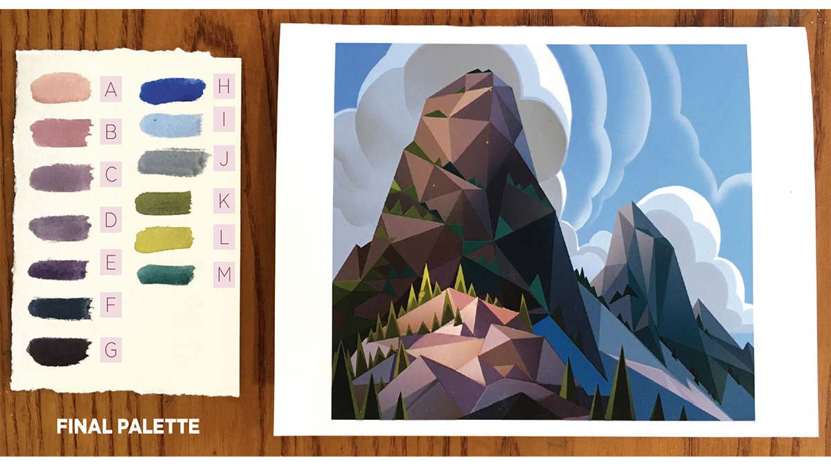
Make sure that you know how your mixed colours relate to all of the areas of your comp image before you start painting.
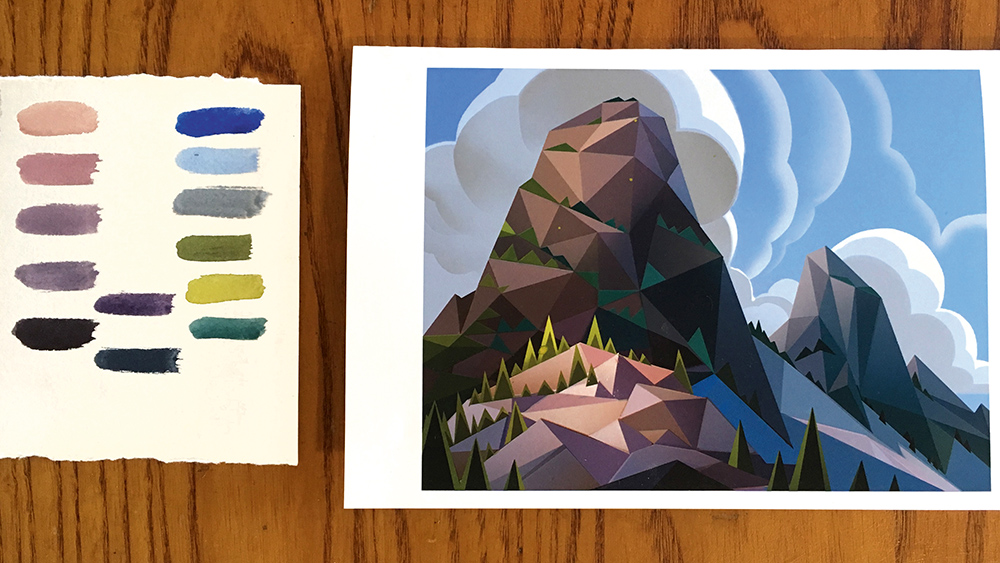
The swatch card above shows the colours contained in the palette for this image. It’s not perfect, and it will change a little during the painting process, but already you're miles ahead of where you'd be if you went in blind.
(A) is the base tint of the mountain at about 15 per cent opacity.
(B-F) are all at about 30 per cent.
(G) is a subtractive black mixture.
(J) is a neutral grey cloud colour mixed using (I), (L) and (B).
(L) is a bright green mixed from pure Cadmium yellow and (H).
(K) and (M) are both cooler satellite mixtures of (L).
Once you're happy with your mixed gouache colour palette, start painting.
This article was originally published in issue 152 of ImagineFX, the world's best-selling magazine for digital artists – packed with workshops and interviews with fantasy and sci-fi artists, plus must-have kit reviews. Buy issue 152 here or subscribe to ImagineFX here.
Related articles:
