Are these new McDonald's print ads brilliant - or just confusing?
We're not quite lovin' it.
Sign up to Creative Bloq's daily newsletter, which brings you the latest news and inspiration from the worlds of art, design and technology.
You are now subscribed
Your newsletter sign-up was successful
Want to add more newsletters?
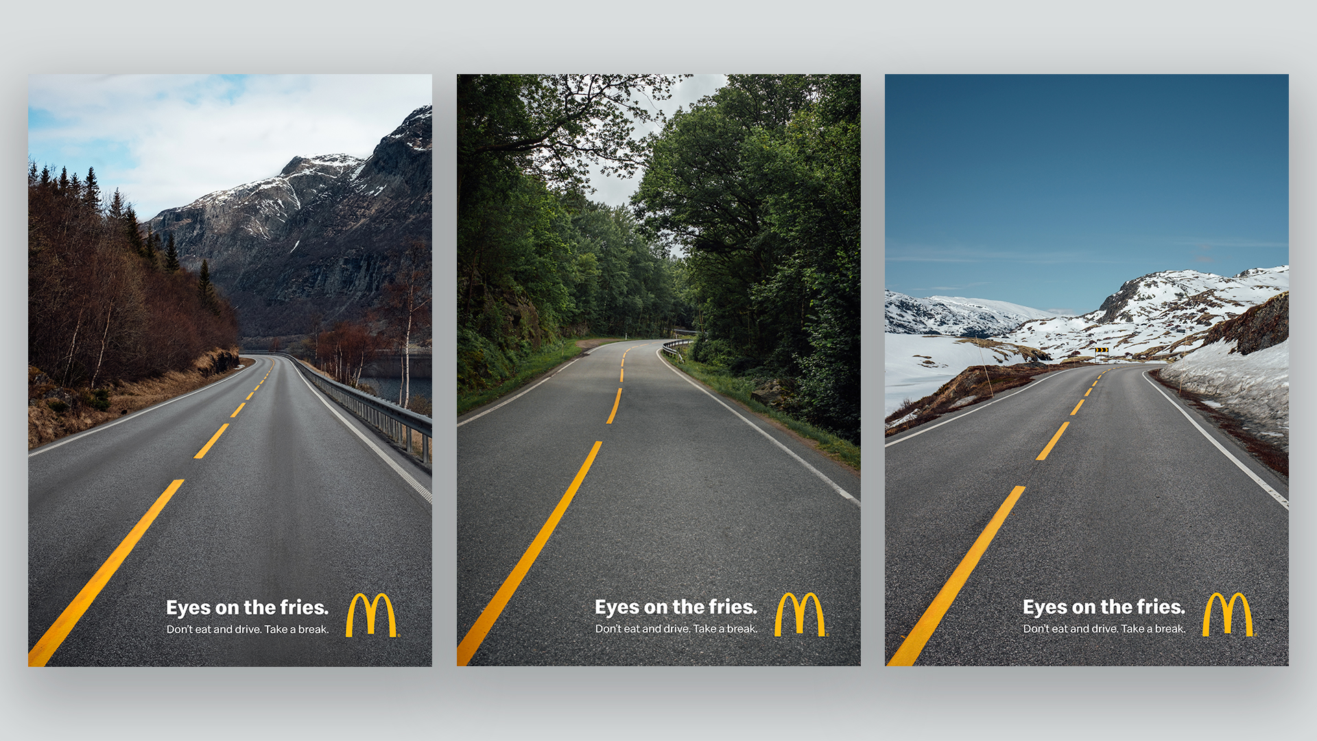
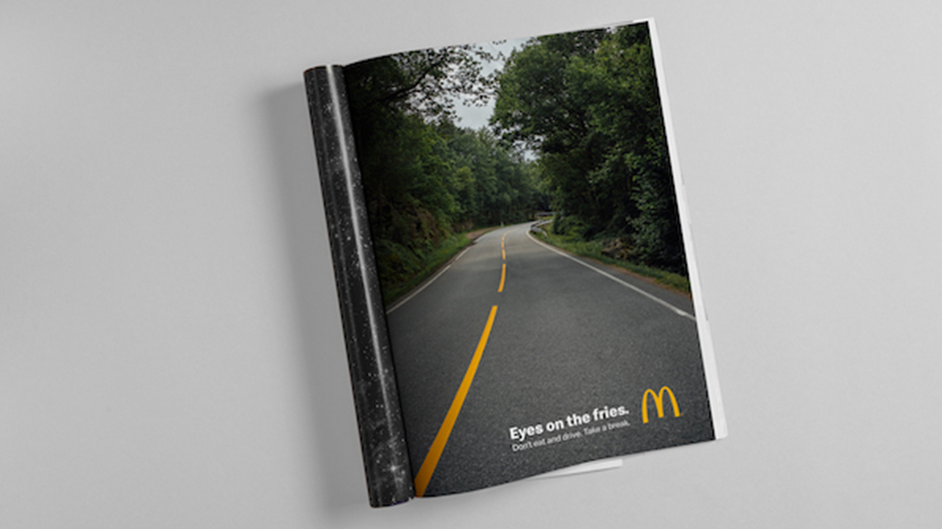
It's no secret that we're fans of McDonald's' clever and innovative ad campaigns here at Creative Bloq, but we can't decide whether its newest posters are brilliant, or a little too confusing. The ads feature scenic road routes from the point of view of a car, with the road markings bearing the unmistakable McDonald's yellow, captioned "Eyes on the Fries".
These beautiful Scandinavian landscapes and eye-catching minimalist designs are part of a campaign promoting road safety in Norway, encouraging McDonald's visitors not to eat and drive. But while they're bold and minimal ads, we're not sure the message is entirely clear - so it's unlikely to be making it onto our best print ads roundup.
According to AdWeek, McDonald's revealed in a statement that in Norway, over a third of its meals are sold through the drive-thrus, so it's perhaps no surprise that it is taking responsibility in ensuring the road safety of its customers. Designed by Nord DDB, a second print ad design and takeaway bag sticker will now sport a green and yellow minimalist design of a road captioned with the same 'eyes on the fries' tagline featured on the print ads.
Article continues below 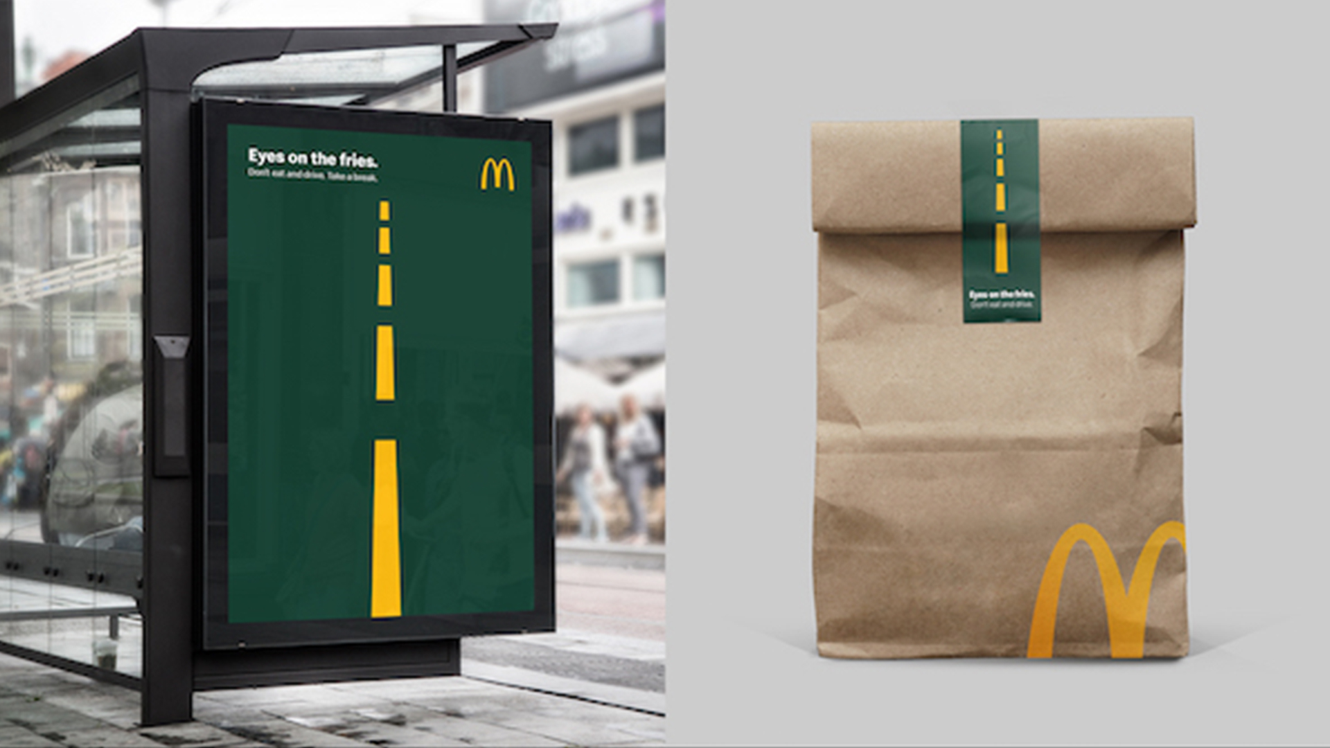
While the road markings are designed to resemble McDonald's fries, we can't help but feel that the message is slightly conflicting, with the viewers seemingly being instructed to focus on their food rather than the actual road. Perhaps if the road markings were made to look like actual fries it would be a little more obvious that we're being told to keep our eyes on the road.
One Twitter user felt similarly to us, explaining, "With the yellow stripes and heading 'Eyes On The Fries' I thought it meant 'next stop McDonald's' instead of what the subtitle and explanation say".
While this ad is proving to be difficult for us to get our heads round, the advertising company TBWA Paris recently gave us a masterclass in McDonald's ads, releasing the brilliant McDrive campaign last November and the pixels campaign in July.
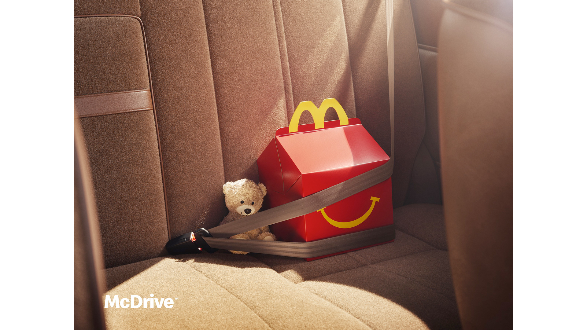
While the message is a little puzzling, we can't fault the intention behind the campaign. And hey, at least it's nowhere near as bad as that kissing burgers ad we saw last year.
Sign up to Creative Bloq's daily newsletter, which brings you the latest news and inspiration from the worlds of art, design and technology.
Read More:

Amelia previously worked as Creative Bloq’s Staff Writer. After completing a degree in Popular Music and a Master’s in Song Writing, Amelia began designing posters, logos, album covers and websites for musicians. She covered a range of topics on Creative Bloq, including posters, optical illusions, logos (she's a particular fan of logo Easter eggs), gaming and illustration. In her free time, she relishes in the likes of art (especially the Pre-Raphaelites), photography and literature. Amelia prides herself on her unorthodox creative methods, her Animal Crossing island and her extensive music library.
