Apple somehow made the iPhone call screen even worse
iOS 17 is full of great design – and this.

Apple is a company known for its design prowess, but every now and again the company doesn't get it quite right (see: Magic Mouse 2, which might finally be getting a redesign.) And while Cupertino's finest certainly knows a thing or two about UI design, the iPhone's call screen has been bothering users for years. And it just got even... worse?
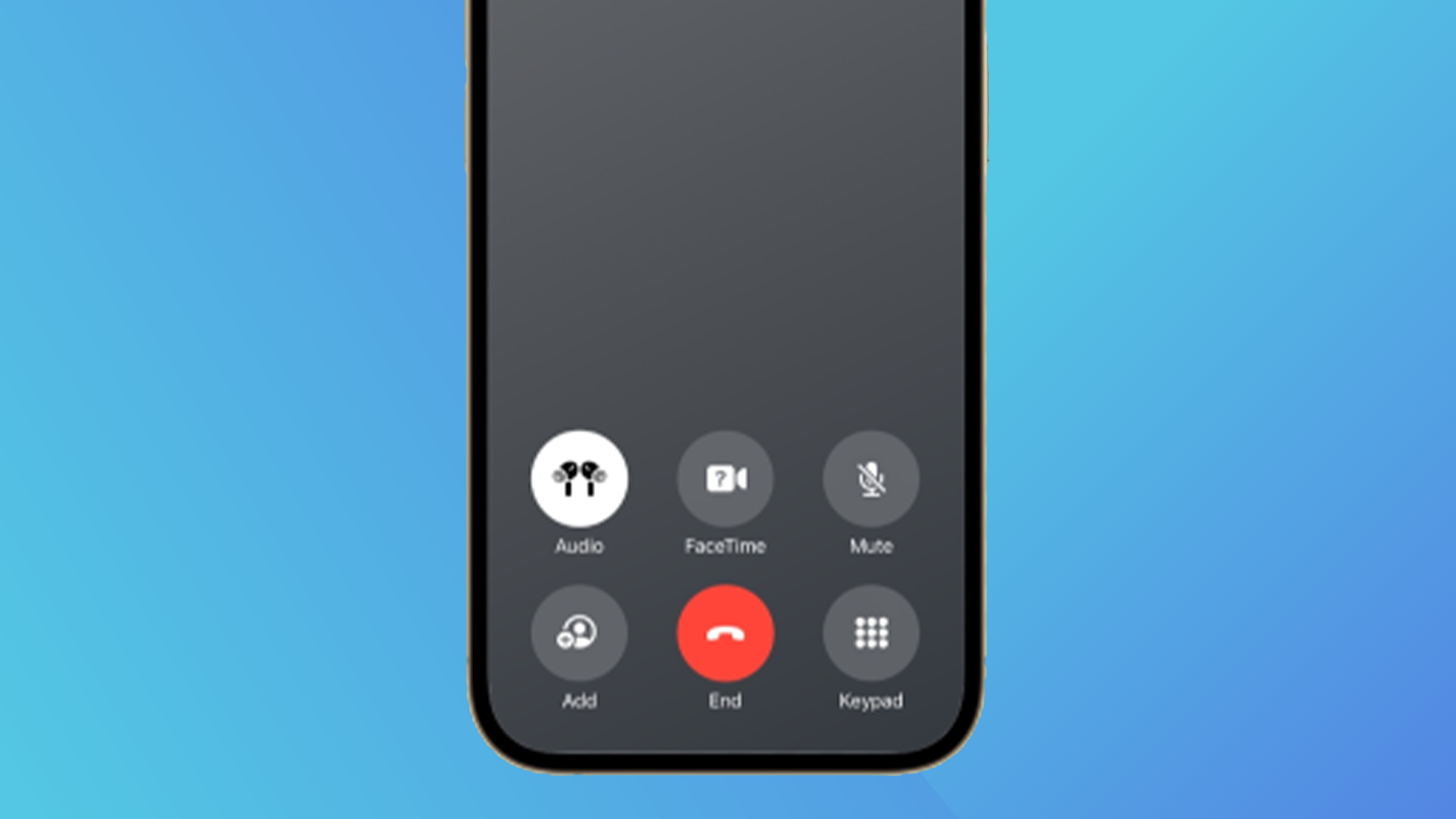
With the release of iOS 17, buttons and icons have moved to the bottom of the call screen, leaving a sea of emptiness in the middle (and unlike the best uses of negative space, this one doesn't seem to be for artistic reasons).
New default call screen ios 17 is way too ugly and out of place from r/ios
.@AppleSupport I hate the new layout of the buttons on the iPhone call screen in iOS 17. Now there's so much dead space in the middle of the screen. Before and after pics: https://t.co/FxAGrgZSUA pic.twitter.com/brldgPrfuZSeptember 20, 2023
Users have taken to Twitter (sorry, X) and Reddit in their droves to complain about the new look, which seems decidedly un-Apple. Sure, Contact Posters are a major feature of iOS 17, letting users design a call screen for themselves. But when calling a contact without this enabled, we're treated to this dull and confusing default, with a plain grey gradient in the middle and the controls confusingly bunched together at the bottom.
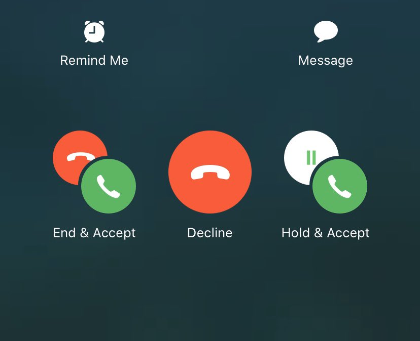
But then again, Apple has form when it comes to confusing users with its call screen icons. If you've ever received a second call whilst already on the phone, you've probably experienced the sheer panic, horror and terror of having to decide what to tap. And it doesn't help that Apple throws a bunch of icons in your face, making the decision even more confusing:

Indeed, for all the design delights across iOS 17 (including some adorable animations), it seems Apple is still struggling with the UI for perhaps the most basic function of a mobile phone – making and receiving calls. Still, with the iPhone 15 Pro Max already proving a technical marvel, we can forgive a few minor oversights.
Sign up to Creative Bloq's daily newsletter, which brings you the latest news and inspiration from the worlds of art, design and technology.

Daniel John is Design Editor at Creative Bloq. He reports on the worlds of design, branding and lifestyle tech, and has covered several industry events including Milan Design Week, OFFF Barcelona and Adobe Max in Los Angeles. He has interviewed leaders and designers at brands including Apple, Microsoft and Adobe. Daniel's debut book of short stories and poems was published in 2018, and his comedy newsletter is a Substack Bestseller.
