Drug branding usually works a little differently to other sectors. The naming of products is a linguistic art, there are strict rules about what can be shown (and what must be shown) on packaging, and many countries have restrictions against direct-to-consumer marketing. This might explain why even the biggest pharma companies haven't tended to give a lot of attention to logo design.
Few medications have memorable logos, with the Eli Lilly's Prozac perhaps being one of the rare exceptions with its radiant sun in the 'O'. That product became a household name in the '90s. Today, Novo Nordisk's Ozempic has acheived similar fame, and it also has one of the cleverest drug logos yet (see our pick of the best logos of the 1960s for more inspiration).

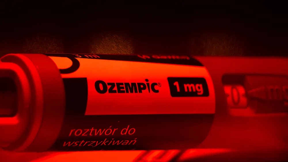
Ozempic was developed as a diabetes medication but use for weight loss quickly became fashionable among celebs, leading to shortages of the product. Like many medicines, the brand name feels cryptic but no doubt took many rounds of discussion to arrive at something that sounds sciency while being pronouncable.
But unlike most drugs, it feels like a lot thought also went into the Ozempic logo. The 'i' in the logotype recalls the form of an exclamation mark, with the elements reversed to create an abstract representation of a needle (Ozempic is an injection). But it can also be seen as human head and torso – with a very slim waist. And it seems this is entirely intentional.
In its brand guidelines document (see graphic designer Igor Biasini's Creative Pool portfolio), Novo Nordisk states: "We’ve customized the letter ‘i’ of Ozempic to represent a human character icon, which gives a warmth to the logo and accentuates our patient-centered approach.”
The document doesn't confirm that the person was intentionally made slim to allude to the product's popular off-label use for weight loss, but the size of the 'i' is so much more narrow than the other letters in the logo that I think a seasoned graphic designer like Biasini must have known what he was doing.

The logo may be clever (at least for a drug logo), but I'm also surprised that it hasn't been more controversial. The 'i' is so skinny that it could be seen as promoting an unhealthy relationship with weight. Also, despite its popularity, Ozempic has not been approved for weight loss (Novo Nordisk's Wegovy based on the same active ingredient has). Alluding to an off-label use in branding would normally get the ire of regulators, such as the FDA.
One person who has raised concerns about the design is Northern Arizona University sociologist James I. Bowie. In an analysis of the logo for the business media outlet Fast Company, he suggests that "The willingness of Ozempic’s manufacturer to let its logo make a bold, if perhaps unwarranted, visual claim may represent a tiny step back toward the early days of medicinal branding," noting that back in the 19th-century "new and largely bogus 'patent medicines' often employed striking graphic trademarks to push sales."
Speaking of the pharma sector. There's a new Johnson & Johnson logo that replaces one of the oldest logos that was still in use.

