Colour harmony is the theory of combining colours in a way that is harmonious to the eye. It's the 'magical glue' that binds all of the elements of your painting together. Without it, you can have the perfect subject to paint, a great base drawing, strong composition, and correct values, but end up with a painting that looks wrong. This problem is pretty common, and the chances are, it’s because the colours you’ve used lack harmony.
In real life, the light falling onto elements and the air surrounding them affects the colours we see. The colours on a misty day are completely different to those on a bright and sunny one. It is this ‘atmospheric veil’ of lighting conditions that unifies all the elements of a painting together.
01. Use a ground colour

I always apply a ground colour before starting a painting. It means I won’t need to fill every gap on the canvas, but more importantly, it helps harmonise the piece. The ground colour helps establish an atmosphere, and it can even show through thinly painted areas of the finished piece.
My ground colour varies – it could be pink, orange, ochre or grey – depending on the mood of the scene. In this unfinished painting, I chose a vibrant orange to convey the feeling of heat. This colour appears across the whole painting and although in the final piece, many of the gaps are filled in, the feeling remains.
For my oil paintings I use primed MDF boards, as they have the correct absorbency for my painting style. I prime each with three coats of acrylic gesso before applying my ground colour.
02. Use a limited palette

As a beginner, it is easy to get carried away and buy every colour available. But using a limited palette has many benefits. Fewer colours means you mix most of the colours yourself. I very rarely buy green, for example. Instead, I mix it from two blues and two yellows, so all the greens on my painting look related, and are harmonious with the blues and yellows.
The fewer colours you have, the better you’ll get to know them, and the better you’ll become at mixing them. Too many different colours can lead to chaos. Try using only three colours (yellow, blue, red) plus white. You’ll be amazed at how may hues you can make and how harmonious they will look.
I mainly use Winsor & Newton Artisan Water Mixable Oil Colours, which means no solvents are needed.
03. Don’t always wipe your brushes

This tip is rather controversial, and many artists probably won’t agree, but it works for me. I often paint with the same brush for an extended amount of time and consecutively work on various colours without needing to wipe or clean my brush in between. This results in a painting full of harmonious colours that all share some of the same pigments.
Obviously, the vibrant colours, strong highlights and darkest darks need to be done with clean brushes to ensure maximum impact. But the mid-tones can benefit from a bit of blending. This technique sometimes even helps to make the highlights stand out.
I like to use Rosemary & Co Ivory Filberts (Sizes: 0, 1, 2, 3, 4, 7) and Riggers (Sizes: 0, 2). These combine the silkiness of synthetic brushes with the firmness of hog bristles.
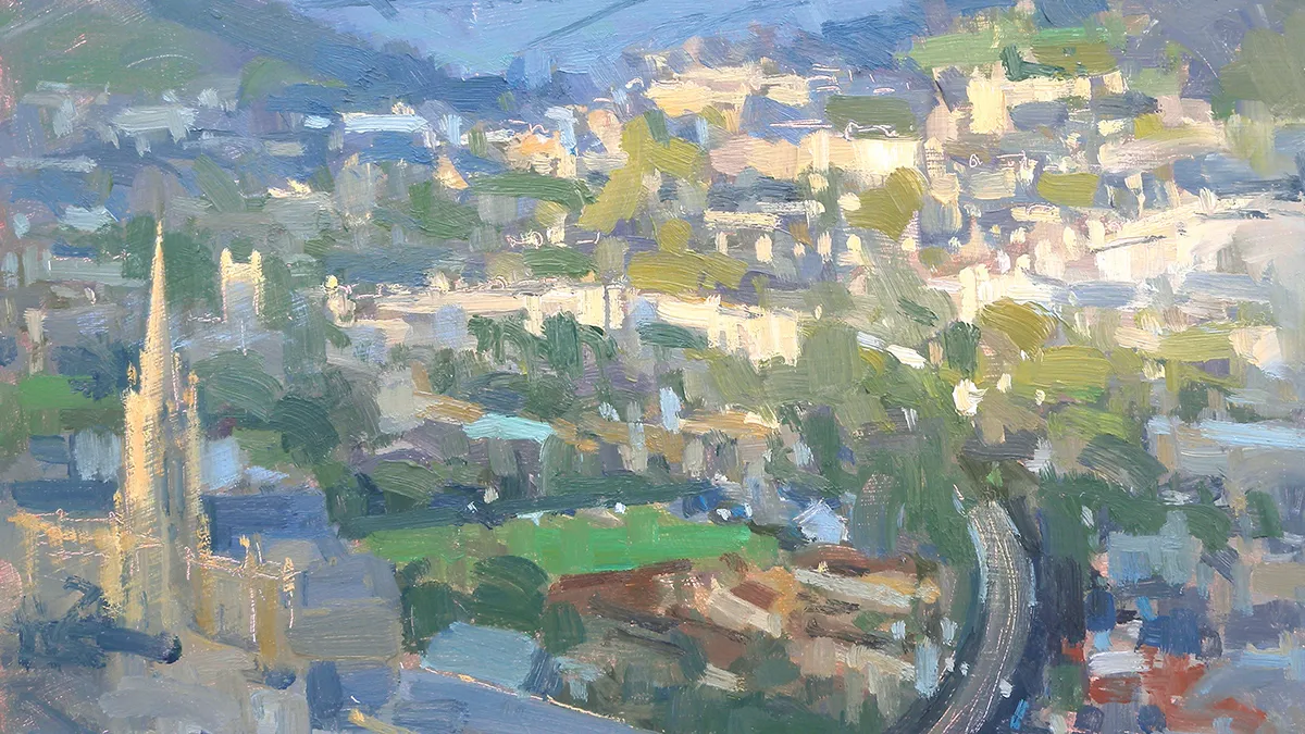
04. Work across the whole canvas

When I paint, I try to see the painting as a whole. If I load my brush with purple, for example, I add brushstrokes everywhere I can see purple in my piece, instead of simply focusing on small areas. I then do the same with the next colour. This helps to harmonise the painting and makes all the elements relate to each other.
In this image, note how the same colours appear everywhere on the painting. This technique also has the advantage of making the painting look good at every stage because no areas are left untouched – this is particularly useful when painting outside, as the weather might force you to stop your piece sooner than planned.
05. Add glazing

If you have already finished your painting but it still lacks harmony, you can glaze the whole canvas with a colour that adds a specific mood. This reduces the intensity of the colours but links the elements together. Think of it as a little bit like adding a tinted glass over a scene to make it look sunnier, mistier or darker.
There are various ways to add glaze. Mix a medium (Winsor & Newton Artists’ Painting Medium works well) or a retouching varnish with a small amount of paint and cover the whole canvas. Make sure you follow the instructions to avoid cracks. Alternatively, load a dry brush with a small amount of paint and apply it thinly over the dry surface.
This article originally appeared in issue 11 of Paint & Draw magazine. Buy a copy here
Related articles:

