The designer's guide to Gestalt Theory
Use the Gestalt principles to make your designs more coherent.
Sign up to Creative Bloq's daily newsletter, which brings you the latest news and inspiration from the worlds of art, design and technology.
You are now subscribed
Your newsletter sign-up was successful
Want to add more newsletters?

Five times a week
CreativeBloq
Sign up to Creative Bloq's daily newsletter, which brings you the latest news and inspiration from the worlds of art, design and technology.

Once a week
By Design
Sign up to Creative Bloq's daily newsletter, which brings you the latest news and inspiration from the worlds of art, design and technology.

Once a week
State of the Art
Sign up to Creative Bloq's daily newsletter, which brings you the latest news and inspiration from the worlds of art, design and technology.

Seasonal (around events)
Brand Impact Awards
Sign up to Creative Bloq's daily newsletter, which brings you the latest news and inspiration from the worlds of art, design and technology.
In the 1920s, a group of psychologists in Germany developed a series of theories of visual perception known as the Gestalt Principles, or Gestalt Theory. Along with systems such as grid theory, the Golden Ratio and colour theory, the Gestalt Principles form the basis of many design rules we follow today.
It's important for graphic and web designers to learn these principles. If you understand what they tell us about how we perceive visual objects and their arrangements, you'll be able to create a more coherent design that will better connect with your audience.
What is Gestalt Theory?
The term Gestalt means 'unified whole', which is a good way of describing the over-arching theme behind the Gestalt principles. These refer to the way in which humans, when looking at a group of objects, will see the whole before we see the individual parts.
01. Similarity
02. Continuation
03. Closure
04. Proximity
05. Figure/Ground
06. Symmetry and order
If you collect together your design elements in a visual arrangement using one of the various approaches that we explain below, your design will feel more connected, coherent and complete.
The prominent founders of the collection of theories were Max Wertheimer, Wolfgang Kohler, and Kurt Koffka. While the principles were developed over a number of years, they came to prominence in part thanks to Rudolf Arnheim's 1954 book, Art and Visual Perception: A Psychology of the Creative Eye. This became a must-have art book of the 20th century, and regularly features on university course text lists.
Six Gestalt principles
The best way to understand Gestalt is to look at the different principles. It's well worth reading Arnheim's book, but to summarise there are six common, basic Gestalt Principles. We've broken each of these down with a simple example below.
01. Similarity

When objects looks similar to one another, viewers will often see the individual elements as part of a pattern or group. This effect can be used to create a single illustration, image or message from a series of separate elements.
Sign up to Creative Bloq's daily newsletter, which brings you the latest news and inspiration from the worlds of art, design and technology.

The similarity between different elements can be shape, colour, size, texture or value. The more commonality that individual elements have, the greater the sense of coherence, thanks to similarity.

A particular element can be emphasized when it's dissimilar, breaking the pattern of similarity. This effect is called an anomaly.
02. Continuation

Continuation is the principle through which the eye is drawn along a path, line or curve, preferring to see a single continuous figure than separate lines. This can be used to point towards another element in the composition, and is seen where a line is cut through one object, often in a curve, aligning perfectly with a secondary element.

03. Closure

Closure is a common design technique that uses the human eye's tendency to see closed shapes. Closure works where an object is incomplete or the interior space of an element is not fully closed, but the viewer perceives a complete shape by filling in the missing information. This technique is often associated with stencilled artwork, but is also closely associated with logo forms.
04. Proximity (aka grouping)

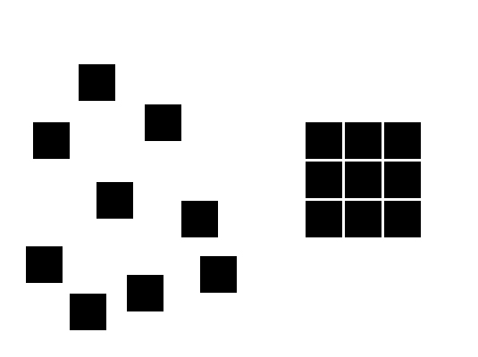
Proximity uses the close arrangement of elements to create a group association between those objects. If individual elements are also similar, they will tend to be perceived as a single whole, even though they are separate elements.

Proximity or grouping can be achieved with lots of different commonality including shape, colour, texture, size or any other visual attribute.
05. Figure/ground

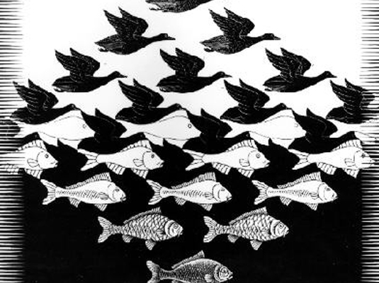
This principle describes the eye's tendency to see and separate objects from their surrounding background. A classic example uses a vase/candlestick illustration to show two faces peering at each other, but you can also see this effect in a variety of logo designs. It works because human eyes want to see the figure (foreground object) and background (ground) as two different planes of focus.

Everything that is not figure is considered ground, which can be used to create some interesting visual effects and tricks, particularly when the designer or artist introduces deliberate ambiguity – a favourite technique of the surrealist MC Escher.
06. Symmetry and order
Put simply, this principle says that a composition should not provide a sense of disorder or imbalance, as otherwise the viewer will waste time trying to locate the missing element, or fix the problem, rather than focusing on the message or instruction.

You can achieve symmetry by providing a good balance or sense of symmetry in your design elements, such as the windmill illustration below. This provides the viewer with a feeling of harmony.
Related articles:

Sam is a designer and illustrator based in Scotland, UK. He splits his time between art and design, motion and video and writing for various creative titles. He has written a book about web design, Pro CSS3 Layout Techniques and contributed to typography book, Fonts and Typefaces Made Easy.
