Stockholm-based design studio Snask is known for being playful, quirky and anything but dull. So it’s a surprise to learn that sometimes the team have ideas that are just too whacky – even for them.
Described by Paul Sahre as “like Titanic played backwards” and by Thomas Both as “the designers we all want to be”, we’re pretty excited about seeing Snask in person at Something Good in Bristol, UK, next month.
We’ll be reporting on the high points of the event then, and as a Creative Bloq reader you can get 20 per cent off tickets to come along too with the code: CreativeBloq20. In the meantime, we caught up with Snask for a quick interview.
Asked whether the team ever have ideas that are too whacky to follow up on, they reply that there are many. “Almost every week we come up with some funky horse shit that no-one would ever keep working on for more than giving it a laugh,” they say.
“But sometimes one of those grow and become a real thing. A real horse shit.”
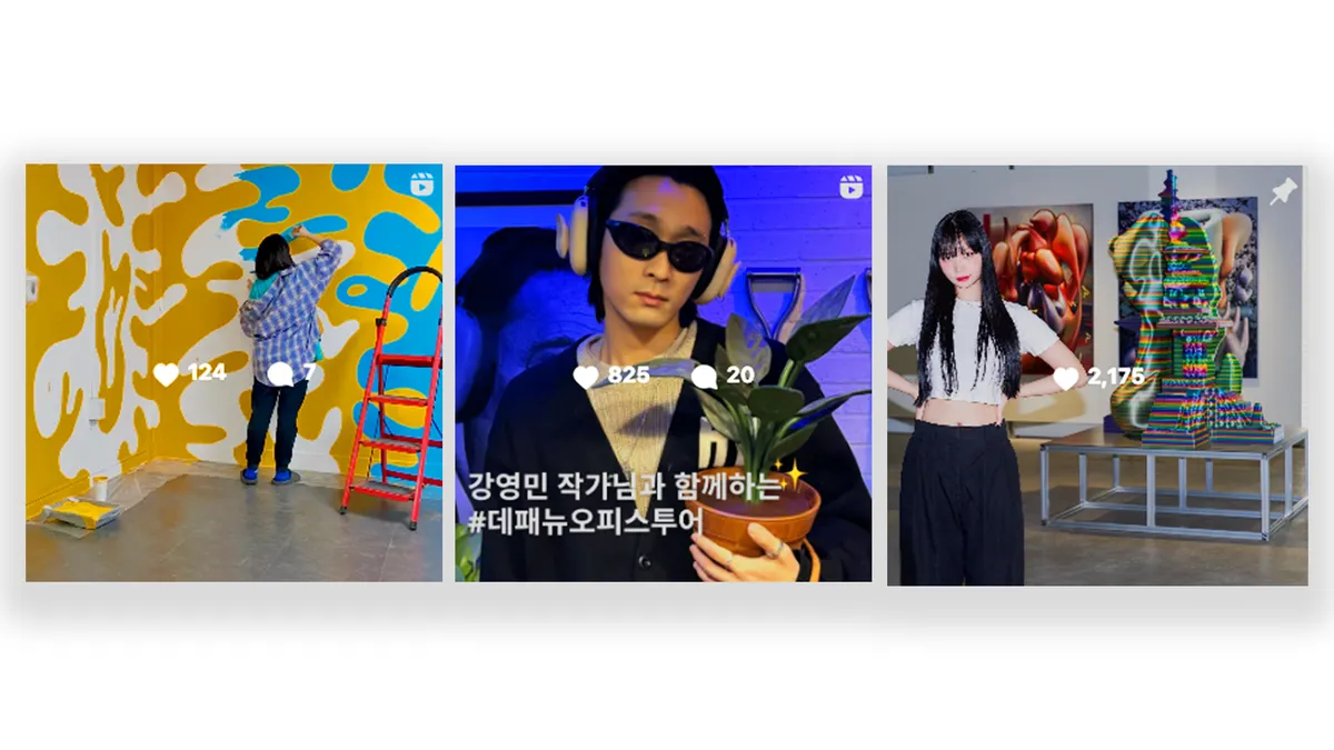
Snask is certainly talented when it comes to turning unusual ideas into reality. Some notable works include its own shower beer, its own pink bike and even a rebrand for North Korea.
Beyond that, Snask creates branding and design work, stop-motion and live action video for clients including H&M, Samsung, Universal Music Group and Microsoft.
Get the Creative Bloq Newsletter
Daily design news, reviews, how-tos and more, as picked by the editors.

So what is the secret of the team’s success? “We look ridiculously great, like Ryan Gosling,” they tell us. “No, probably the opposite, and since we don’t look amazing we have to try harder, make more jokes and develop our personalities. Get some ambition and drive and hope someone will marry us because of that.
"Other than that I think we care about our own agency brand a lot.”
Looking back at its early days, the team says there were some mistakes. “Our whole business is based around messing up actually. That’s how we learn things, since we’d rather come up with our own solutions than listen to a conservative industry.”

It is perhaps this independent, pioneering and optimistic spirit that attracts clients and fans to Snask. The studio's work is fun, colourful and full of life, and certainly original.
“We don’t believe that much in colour theory,” the team reveals. “Blue is depressing but also used for IT as well as being the colour of the sky and the ocean breeze. Yellow is the sun and a way to say forgive me as well as death in China. Red is anger and hot and danger and also the colour of Norwegian and Virgin airlines.
“We love pink, of course. But we love a lot of colour. At the same time we dress quite non-colourfully.”
Catch Snask at Something Good in Bristol, UK, on 6-7 October, where you can expect: “Inspiration and rock'n'roll... Perhaps some rap.” Creative Bloq readers can get 20 per cent off tickets with the code: CreativeBloq20.
Related articles: