Kiehl's hits back at censorship with font made out of pubic hair
A new campaign says 'pubic hair, don't care'.

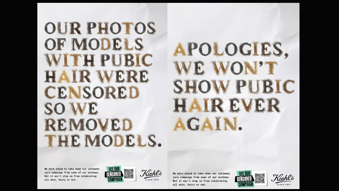
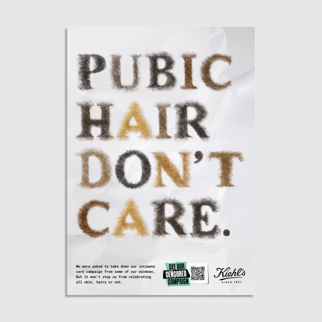
Skincare brand Kiehl's has launched a provocative new campaign celebrating body positivity in an unexpectedly offbeat way. Introducing its new custom typeface 'Pubic Display Type', the brand's unapologetic new font is smashing bodily stigmas, recreating the alphabet in pubic hair as a clap back to criticisms over its recent intimate care campaign that was censored for being a little too candid for some shoppers.
The L'Oreal-owned brand had launched a new campaign for its new products, including Ingrown Hair & Tone Corrective Drops, using photos of a model in their underwear showing a small amount of pubic hair. Some stores were asked to remove the ads, which led Kiehl's to create a new strategy in partnership with Marcel. They decided to remove the model from the ads, and replace them with a new font. Like many of the best print adverts, it definitely catches your attention.

Kiehl isn't the first to create a font inspired by pubic hair (and it may not be the last?), but it's probably the most high-profile brand to do so.
Article continues belowHeadlines for the new campaigns in the new font were: 'pubic hair don't care', 'our photos of models with pubic hair were censored so we removed the models' and 'apologies, we won't show pubic hair ever again'. Text in the bottom left explains the stunt, saying, "We were asked to take down our intimate care campaign from some of our windows. But it won't stop us from celebrating all skin, hairy or not". There's also a QR code that takes people to the censored campaign.
Some of the best typography conveys a message through thoughtful design, standing out from the crowd whether it's with fancy serifs, irregular shapes, or indeed, pubic hair. Will this type go down as some of the best typography of the decade? I'd be surprised if it did, but it's certainly a good publicity stunt, and a great way to get people to think about why there's so much shame and disgust around body hair.
Sign up to Creative Bloq's daily newsletter, which brings you the latest news and inspiration from the worlds of art, design and technology.

Natalie Fear is Creative Bloq's staff writer. With an eye for trending topics and a passion for internet culture, she brings you the latest in art and design news. Natalie also runs Creative Bloq’s 5 Questions series, spotlighting diverse talent across the creative industries. Outside of work, she loves all things literature and music (although she’s partial to a spot of TikTok brain rot).
- Rosie HilderDeputy editor
You must confirm your public display name before commenting
Please logout and then login again, you will then be prompted to enter your display name.
