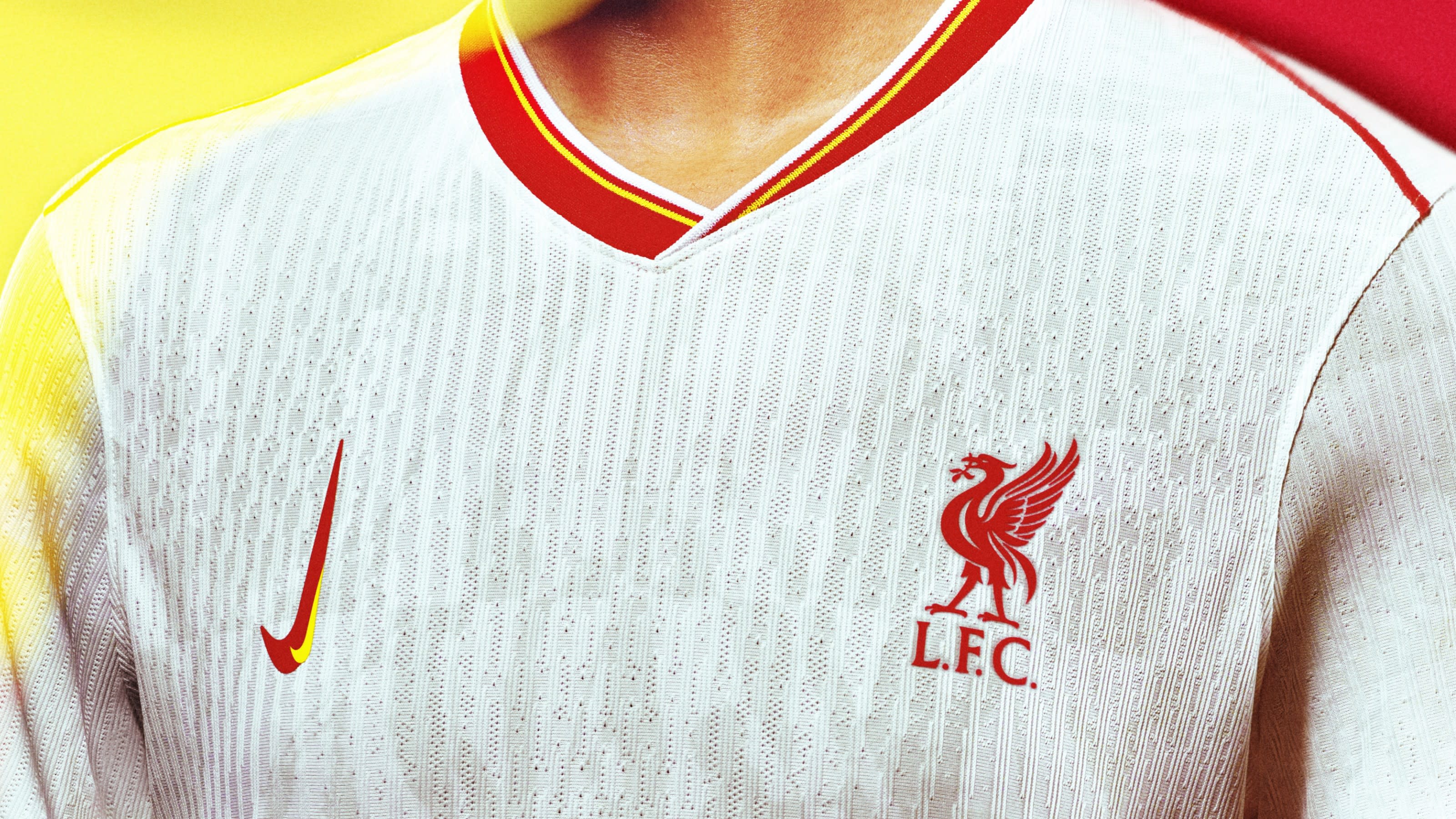
No, the Nike logo on Liverpool FC's new kit isn't a mistake
It’s a bold celebration of women’s football.

Liverpool FC has debuted its new third kit and while it may appear unassuming at first, fans have noticed a strange detail with the Nike logo. It might look like a bizarre design error, but the new vertical Nike logo holds an important hidden meaning, paying homage to the inspiring growth of women's football.
The Nike logo is one of the most iconic wordless emblems of all time, featuring its iconic swish design inspired by the wing of the goddess Nike in Greek mythology. Due to its notoriety, the Nike logo isn't often subject to change but the new Liverpool kit's subtle yet impactful design tweak is a powerful blend of heritage and empowerment.

The double vertical Nike swoosh on the new Liverpool kit was created as a way to celebrate "the women's game and its acceleration in world sport", featuring a dual red and yellow colour palette that integrates the team's iconic colours. As part of Nike's 'Together We Rise' collection, the fresh kit is 'rebellious by design' according to the Liverpool FC website, taking inspiration from the female punk artists that helped to pioneer the city's legendary music scene.
Article continues below"It's really slick, it's fierce and I love the energy of the kit.," says LFC women ambassador, Natasha Dowie. "It makes me really proud to have been one of the first to play professionally and to see now that girls can have a dream to be a professional player," she adds. A subtle yet impactful reimagining, the new kit design showcases how a humble change in perspective can be a dramatic and empowering symbol of momentum, pioneering and legacy.

For more design inspiration, check out the National Football Museum's sleek new logo. If you're after more sporting news, check out the Chicago Bulls logo concept with a clever hidden reference
Sign up to Creative Bloq's daily newsletter, which brings you the latest news and inspiration from the worlds of art, design and technology.

Natalie Fear is Creative Bloq's staff writer. With an eye for trending topics and a passion for internet culture, she brings you the latest in art and design news. Natalie also runs Creative Bloq’s 5 Questions series, spotlighting diverse talent across the creative industries. Outside of work, she loves all things literature and music (although she’s partial to a spot of TikTok brain rot).
