7 things to consider when creating a collage
Some fundamental things to keep in mind when composing, collating and arranging a digital or analogue collage.

Sign up to Creative Bloq's daily newsletter, which brings you the latest news and inspiration from the worlds of art, design and technology.
You are now subscribed
Your newsletter sign-up was successful
Want to add more newsletters?
Often, the term 'collage' evokes memories of school scrapbooks, with ad-hoc arrangements of lipstick, floating eyes and mismatched letters torn from the pages of fashion magazines. However, collage can be so much more; it can be a fun weekend art activity, a relaxing hobby for evenings after work, or a professional business, whether that’s selling prints or doing editorial artwork.
Whatever you turn your collage into, here are some tips that will help you to create a beautiful and balanced piece of artwork, whether you’re working on a computer or going old school with analogue materials. For those going digital, check out this list of awesome collage makers, or see our post on how to make a photo collage in Photoshop.
All images created by the writer. Click on the top right-hand corner of each image to enlarge.
Article continues below01. Consider composition
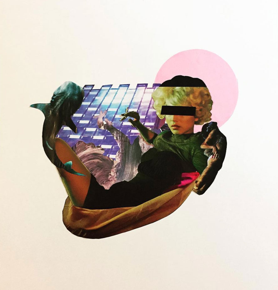
When starting a collage, it is best to think of it in terms of composition, or even curation. Try using a variety of compositional techniques, such as the rule of thirds, one point perspective or try and capture fluidity and movement in your piece. The beauty of working with existing materials is that you already have an infinite number of elements and starting points, so it is very much a process of trial and error to see what works.
Hold back from sticking anything down too early, and instead have fun playing around with lots of different arrangements. And remember, even if you do decide to stick it down but aren’t happy with the result, you can always cut that up and start again.
02. Choose a theme
If you are having trouble finding inspiration for your collage, it can be helpful to give yourself a theme, as sometimes setting limits can force you into making creative decisions. It can be something as simple and obvious as 'summer', or as abstract and open to interpretation as 'tomorrow'.
This way, as you are perusing your materials, things that resonate with this particular theme will jump out, helping you to build up a more specific image bank. This is also a good way to churn out multiple collages, or to work in series, as the material you amass might be too much for just one piece of artwork.
Sign up to Creative Bloq's daily newsletter, which brings you the latest news and inspiration from the worlds of art, design and technology.
03. Use contrast to build tension
One of the most effective strategies when approaching design of any kind, be it graphic design, cinematography or architecture, is the use of contrast. A healthy dose of contrast makes for great tension in a piece, and this is something that humans respond particularly well to.
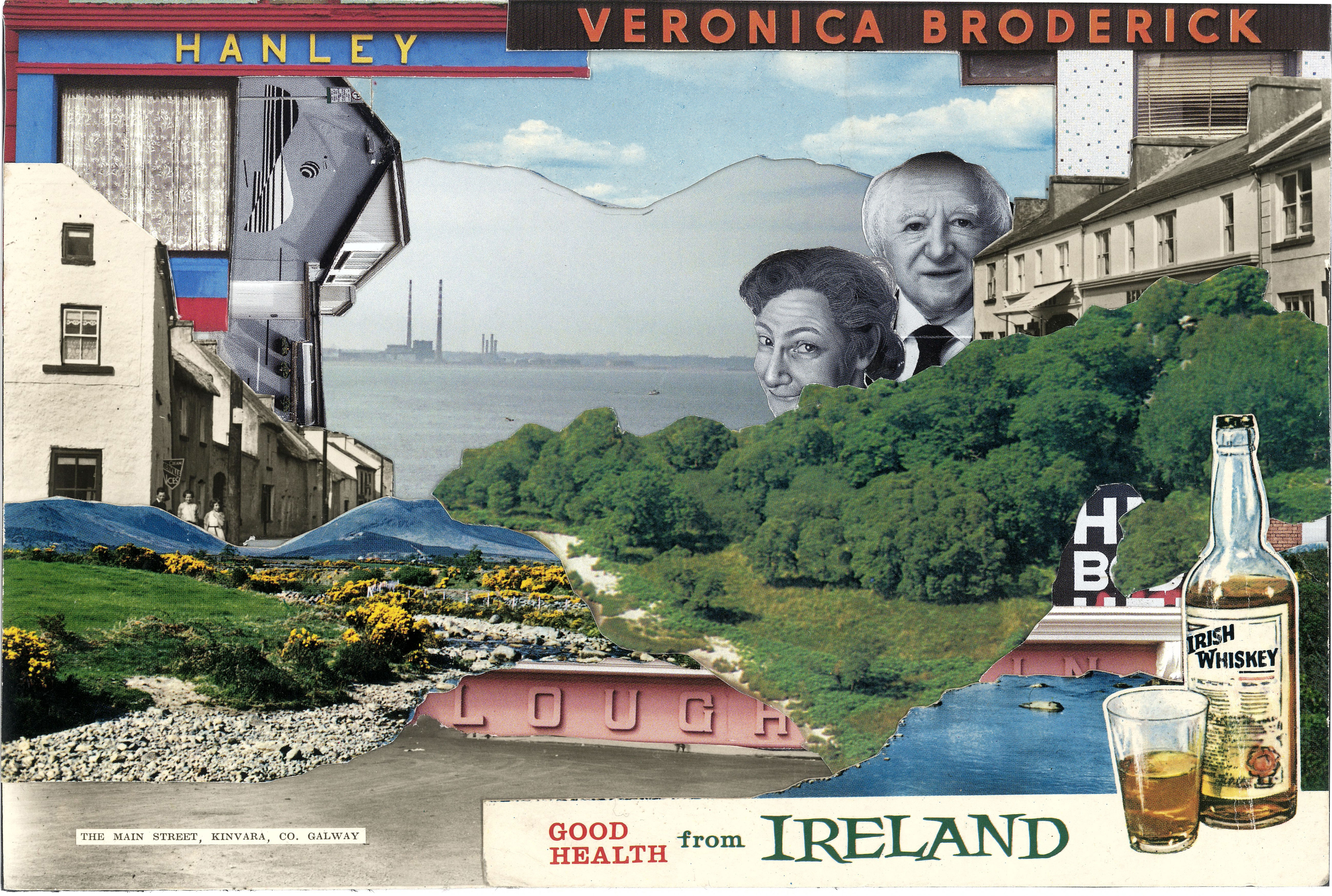
In a collage, putting contrasting elements next to each other, such as a vintage black and white scene juxtaposed with a loud, contemporary photograph, or a close up, highly defined detail set against a blurry background, can create this kind of intriguing tension.
04. Work with patterns and textures
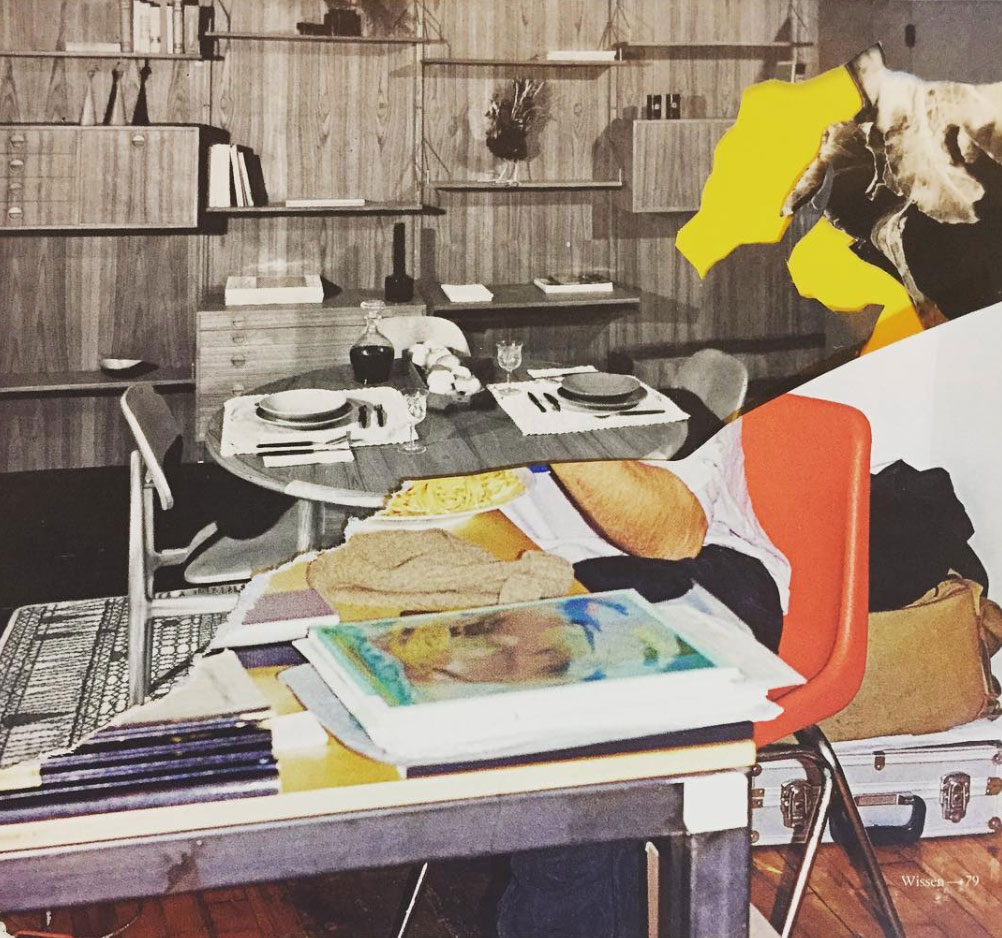
It is easy to overlook the less obvious elements found in magazines. Instead of focusing on figurative imagery, look instead for repeating patterns, say on wallpaper or a carpet, or the voluminous billows of a silk skirt, complete with the interplay of light and shadow, or the fine texture of a feather, or curly hair. Zooming in on these elements and using clever crops can transform them into abstract additions that catch the viewer’s eye.
05. Incorporate typography
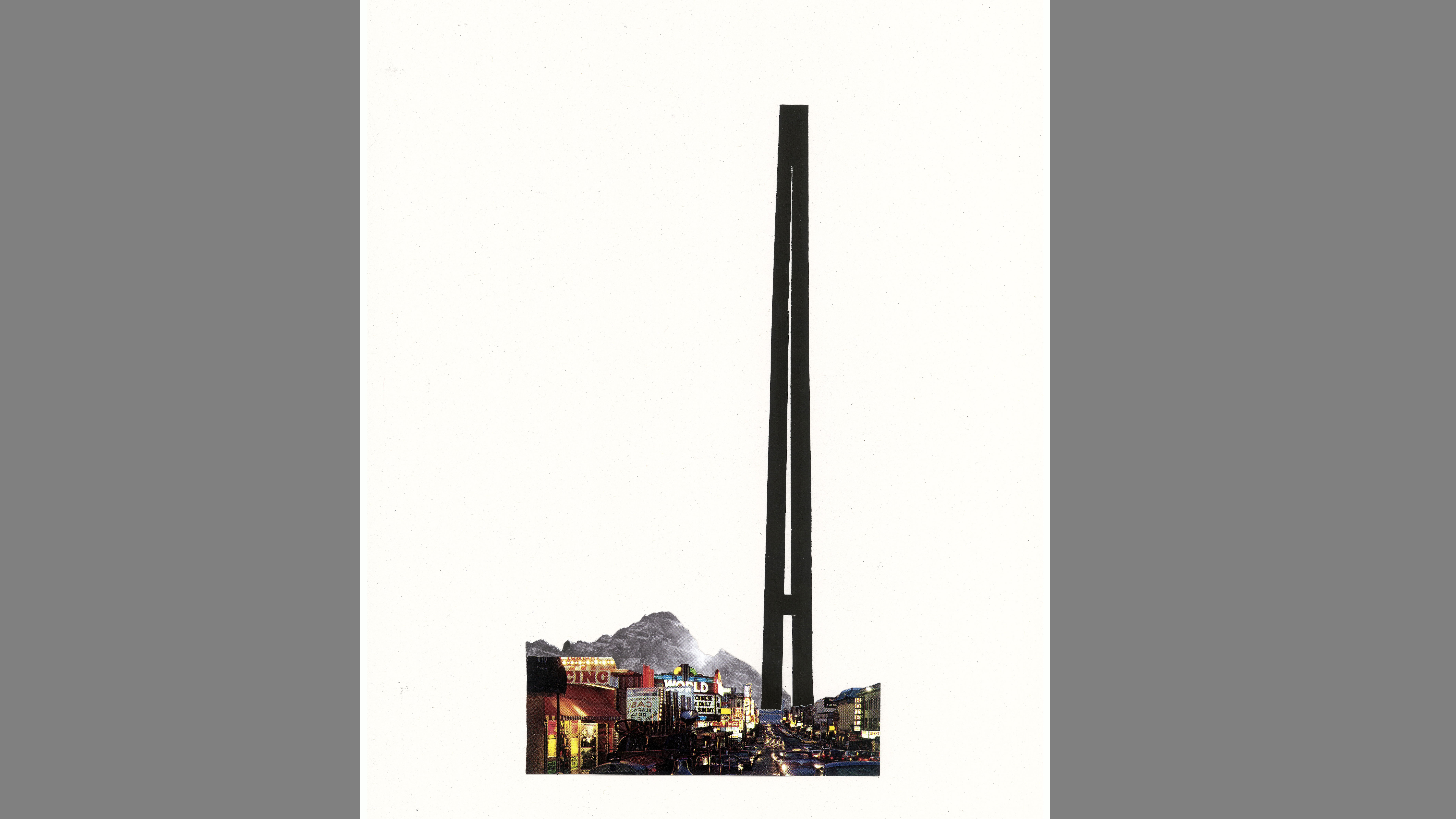
If done right, typography can turn a simple image into a profound message, a protest sign or a quirky poster. Instead of mixing letters, try using entire words, and mix serifs with sans serifs, or bold and light fonts, to create the tension mentioned above. If you need some typography inspiration, check out our list of free fonts.
One prominent letter can play a defining role in an artwork, and be used in creative ways that imbue it with new meaning, such as the 'A' here, which could also be read as a mountain peak. Be careful though, because sometimes incorporating typography or slogans can make your artwork look like an advertisement.
06. Play around with colour
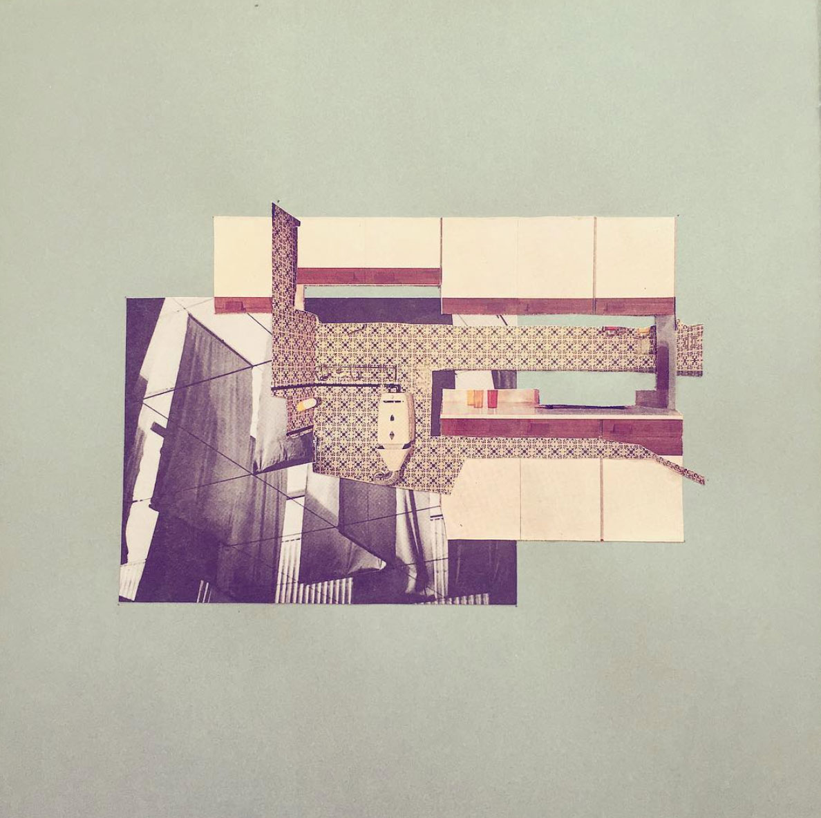
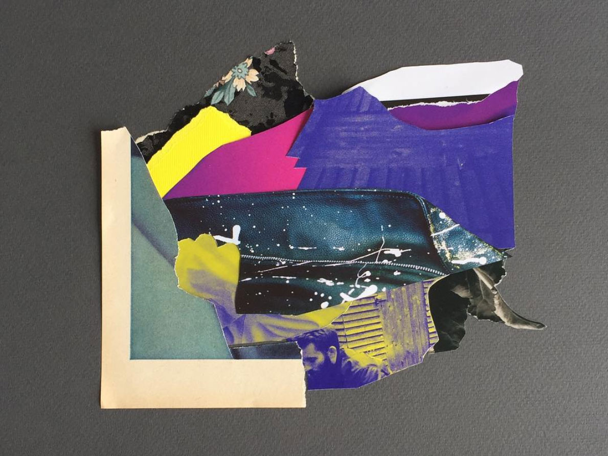
Colour is one of the most important elements in art and design, regardless of the genre. In collage, one way to familiarise yourself with different colour tones can be to set yourself the challenge of creating a piece using just one colour. Blue, for example. As you search for blue in your material, you’ll realise how different the blue of a sky is to the blue of water, and how variable shots of water or sky are in themselves. Blues might appear from things you wouldn’t expect, such as window reflections, or shadows.
07. Consider the negative image
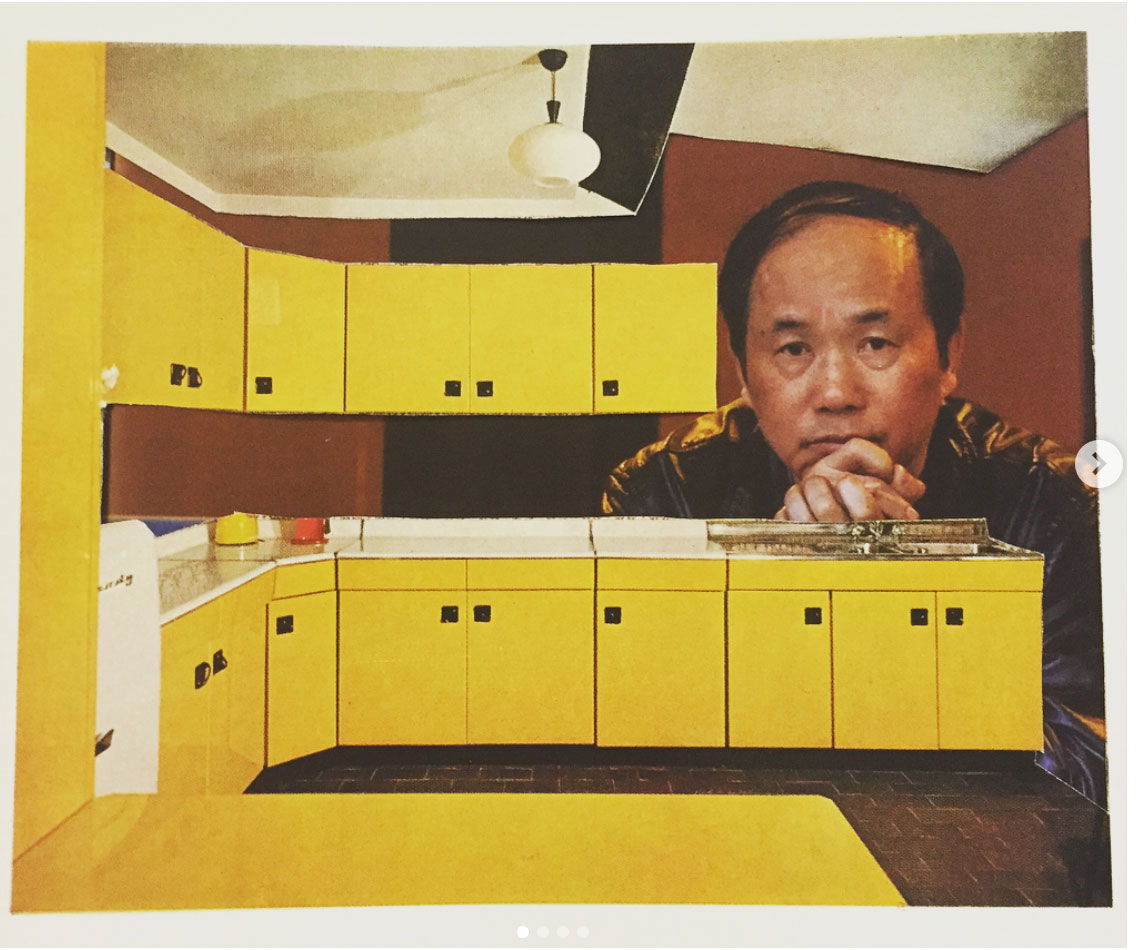
Whether you are working with real pieces of paper or with digital software, the process of cutting out is still the same. With existing material in particular, many happy accidents can arise through the removal of one image. When you cut something out, turn the paper around and see if the reverse negative is an interesting form. Can you still make out what the image was? If you put a contrasting piece of paper behind it, what happens? Play around with the negative, because there is a lot of opportunity here to make an exciting new work with very little effort.
Read more:
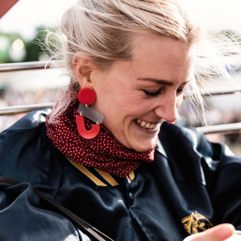
Sorcha O'Higgins is a collage artist and freelance writer. With a background in architecture and urban art, she works mostly with existing analogue material to create both abstract and figurative work. Her collages use bold colours, patterns and contrasting elements to create playful, direct and sometimes brazen images.
