The best design ideas often go unnoticed by most people. That perhaps shouldn't be surprising. Unlike art, which aims to grab attention and provoke, great design primarily serves a function and solves problems, although it ideally does so in a way that also looks very attractive.
By definition then, if it's done well, it's likely that many people will never notice the best design ideas unless they're looking for them. To quote God in Futurama: "If you do things right, people won't know you've done anything at all." In this article, we pay tribute to the conceptual design thinking and outstanding execution behind eight of the best designs in different niches, from graphic design to digital design, interior design and product design.
We think these examples all deserve recognition as truly game-changing designs that can serve as lessons in how to do design right. Just to emphasise how great these design ideas are, we've also included a few examples of how NOT to do the same thing for contrast. For more on great design, see our article on design thinking.
The best design ideas in different fields
01. Graphic design: London Tube map

The London Tube Map was originally created by Harry Beck, a London Underground electrical draughtsman, in 1931. His revolutionary idea was to abandon geographical accuracy in favour of geometric simplicity.
Inspired by the electrical circuit diagrams that Beck drew during his day job, his map represented London's complex, sprawling underground transport network as a simple system of coloured, criss-crossing lines. His employers initially rejected his approach as too radical, but a test run was hugely popular with the public, so they quickly changed their minds. The map has been updated periodically since, as more lines and stations have been added, the basic design remains intact a testament to the fact that the best design ideas can have a very long lifespan.
The downside, of course, is that the map makes it more difficult for visitors to judge how far places are from each other. Transport for London has consequently had to post signs at key stations, advising tourists that it may be quicker to walk between them. However, overall, that proved to be a sacrifice worth making. The design has become the gold standard around the world for clarity and usefulness. (Though it doesn't mean people haven't created concept tube map redesigns over the years.)
From New York to Shanghai, subway maps have followed this basic template of colour-coded circles and lines, and it’s even been used for other purposes, visualising everything from US National Parks to the solar system. The wider lesson here for designers is clear: making something simpler is usually the path to making it better... even if that might mean sacrificing some accuracy along the way.
Worst idea: Lots of other transit maps

If you’re a lifelong Londoner, you probably take the Tube Map for granted, but the great design behind it becomes apparent if you compare it with the maps of some other transport systems. Examples like the one above, from Transit Map Hall of Shame show just how hard it is to present a complex network in a way that's comfortable for the user to read.
02. Digital design: What3Words

These days, geolocation technologies allow anyone with a mobile device to identify their exact location. But annoyingly, sharing that location with others is not that easy. Yes, you could give someone a complex, 18-digit long series of coordinates and in theory, they could find you, or you could use Share My Location on your phone.
But if you're one of the millions in the developing world without a proper street address, good luck trying that with your local pizza delivery firm, or your neighbourhood mail carrier. Enter What3Words, a more user-friendly geocoding system that divides the entire world into three-metre squares segments, and identifies each using just three words (random example: 'belly rises indeed').
Yes, it might sound very weird, but it's both easy to remember and easy to convey to others. Plus if an error is made, it’s immediately apparent: a misheard word will almost certainly point to a place in another country, alerting both parties to instantly realise a mistake's been made.

It’s already been adopted as an address standard by the postal serves of Nigeria, Kiribati, Mongolia, Sint-Maarten, Côte d’Ivoire, Djibouti, Tonga, and Solomon Islands. "In Mongolia you can get a pizza, you can get a taxi, you can open a bank account, all with a three-word address,” CMO Giles Rhys Jones told our sister site Tech Radar.
Travel companies have also been keen to use the system, and it’s also been included as a standard feature in the navigation system of Mercedes-Benz cars. In the UK, What3Words has been used by the emergency services and has been instrumental in police rescues. As with many game-changing designs, the secret to What3Words lies in its simplicity.
03. Packaging design: Smart sunscreen

Most of us know by now how important it is to use sunscreen to protect our skin, but we're often unsure about how much of which factor to use, and when. The Australian sunscreen maker Blue Lizard pioneered a simple but very effective solution: bottles that change colour in UV light.
Its 30+ Baby Sunscreen , for example, turns from blue to bright pink, which is particularly useful on cloudy days when you may not have realised you needed protection. It’s vaguely reminiscent of Dulux’s Magic Paint, which goes on pink and dries white, helping you notice if you’ve missed any spots. Both are great examples of how thoughtful design can make life easier – an excellent principle to apply to any design work, whether you're crafting an app interface or laying out a brochure.
Worst idea: Misleading and oversized packaging
you_know_what_those_are_that_i_ordered from r/EgregiousPackaging
For the worst packaging design, just look at any of the thousands of items that come with packaging that's several times larger than the product, often in an intentional attempt to trick customers into thinking they're getting more than what they really are.
From false bottoms to plastic or card filler, there are tons of examples of egregious packing being used to fool us. In some cases, even products that are intended to be "green" come with far more packaging than seems necessary. In general, a careless use of plastic, for example in individually plastic-wrapped screws and even ear buds, can leave customers irate while showing a huge lack of environmental awareness.
04. Print design: The tourist picture dictionary

When you’re stuck in a country where you can’t speak your language, and no one speaks yours, Google Translate can be a lifesaver. But when your phone is out of battery, or there’s no available internet, then you might need to fall back on more traditional, printed means.
However, if you’re travelling around a lot of different countries, or a country where multiple languages are spoken, then you don’t want to be lugging around a ton of phrasebooks. A more elegant solution can be a picture dictionary like the Tourist Picture Dictionary. Need to find a toilet? Point to the picture of a toilet. It's as simple as that!
So it is quite a niche product, but it’s a great fallback for when all other attempts at communication break down. And it's another example of a great design idea that’s extremely simple.
05. Font design: Dyslexie font

When it comes to choosing a font, readability is always an issue. But what if the reader is dyslexic? To answer this question, Christian Boer as developed a special typeface, Dyslexie, to overcome some of the problems that people with dyslexia, including himself, can have when reading. His aim was to develop the kind of typeface that he wished existed when he was a child.
The design sets out to make it easier to distinguish different letters from each other. For example, the openings of letters are enlarged to make them look less alike and easier to recognise by their shape. Punctuation marks and capital letters are bold, emphasising the breaks, endings and beginnings of phrases, and the distance between individual letters and words is enlarged, which makes reading more comfortable and avoids the 'crowding effect'.
The font has been downloaded more than 300,000 times, and the lesson is clear. If good design is about solving a problem, then the best person to solve it is often someone who's affected on a personal level. If that's you, then great! If not, it's worth getting in touch with the relevant people and doing some serious research before you start designing.
Worst idea: Ink-saving font

Dyslexie isn't the only font design that aimed to change the world. Several fonts have aimed to save printer ink. That in itself is a fantastic idea, but this is where we see that execution is key. A study by the University of Wisconsin, looked at Ecofont, a system that adds holes to existing font families in order to reduce ink use, and found that some Ecofont fonts, such as Ecofont Vera Sans, actually used more ink than regular fonts, such as Century Gothic.
06. Interior design: the toilet-sink combo
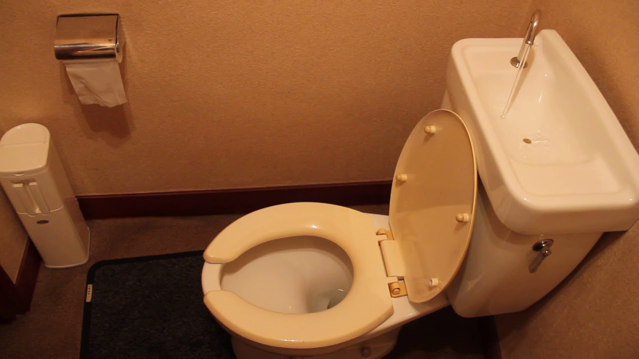
If you live in Japan, it may perplex you to know that in other countries, bathrooms separate their toilet and sink. A standard toilet model in Japan incorporates both into a very elegant and efficient system. The toilet basically has an in-built sink (note that you don't wash your hands in the toilet, but rather above it). As a result, the water for washing your hands is recycled for flushing.
This design originally came about in the 1950s as a space saver because apartments in Japan tend to be on the smaller side. But with the rising importance of environmental issues, it's gained more interest as a water saver. The device doesn’t only offer an important way to conserve water, it also gives us a wider lesson in not taking everyday designs for granted. If we continually ask, 'Could this be put together differently?', who knows what game-changing ideas we could come up with.
And the worst interior design idea? Just pick from any of the travesties in our roundup of the worst interior design fails, but how about this door for starters?
step_out_of_a_bathtub_down_a_flight_of_stairs from r/dangerousdesign
07. Industrial design: Cat’s eyes

Here’s another brilliant design that some take for granted, but which is unknown in many countries. The cat’s eye is a type of road marker that uses a retroreflector to illuminate night-time journeys using your own headlights. It has a flexible rubber dome, which can withstand the passage of traffic if driven across. It’s also self-cleaning, thanks to a build in rainwater reservoir; resistant to snow ploughs; and proves particularly useful in fog.
The original design was the work of Percy Shaw of Halifax, England in the 1930s. His inspiration came from the tramlines that reflected his headlights, helping him to see at night. One night, the tramlines were shrouded in heavy fog and he was left blindsided... until suddenly he saw light reflecting from the eyes of a cat.
While there are many reasons that Britain has one of the best road safety records in the world, this clever design, which is used on the majority of roads in the country, has certainly made a big contribution. Its success offers an important lesson to designers everywhere. If you find something useful by accident (in this case, shiny tramlines and wandering felines), why not design something that does the same thing but on purpose?
08. Product design: Ride-on suitcases

Product design student Rob Law was 21 when he came up with the idea for taking a suitcase and turning it into a ride-on vehicle for kids. And anyone who’s had to put up with an overtired and cranky child in a long-haul airport will appreciate what a fantastic idea this was.
Putting it into production was a long slog and Law was turned down by both luggage companies (who said they weren’t interested in toys) and toy companies (who said they weren’t interested in luggage). He also failed to get investment on the BBC’s Dragon’s Den, the equivalent to Shark Tank in the US. He finally got funding from The Prince’s Trust Enterprise Fund and launched the Trunki in May 2006. Within 10 years he'd sold over three million suitcases in over 100 countries, and won over 100 design awards.
There are two lessons here. Firstly, a good idea is not always enough; you often need bucketloads of patience and perseverance to convince people of your vision. Secondly, new product designs don’t have to involve radical new materials, processes or technologies. Sometimes just combining two things that already exist can be the game-changer everyone is looking for.
Worst idea: 3D TVs

Of course, it's important to remember that simply bringing two popular things together doesn't necessarily add up to a good idea. Sometimes it can lead to a truly terrible one. Remember when tech companies tried to capitalise on the popularity of 3D movies such as Avatar and spent millions developing 3D TVs.
While people were happy to wear clunky 3D glasses in a darkened cinema, far fewer were keen on doing so in their more sociable living rooms, where the smaller size of the screen also made the 3D effect far less awe-inspiring. Just a few years later, nobody was manufacturing 3D sets, and broadcasters like Sky had closed their 3D channels. It seemed that in the rush to design a revolutionary new product, everyone forgot to ask if people actually wanted it (See, Amazon's smart clock for another example).
Read more:

