When you think of iconic designs, the London Underground map is one that comes up time and time again. Originally created by Harry Beck in 1931, the linear, colour-coded diagram of London's underground transport system has arguably become the most recognisable transit map in the world.
Despite being recognised as one of the best infographics ever made, the map has been conceptually redesigned several times over the years. The most recent attempt comes from graphic designer Luke Carvill, who aimed to make it more user-friendly.
Carvill, a former Londoner who now lives in Birmingham, says on his website: "I think Harry Beck’s London tube map is one of the greatest pieces of graphic design in history, but he had no idea how large the network would become. I feel the current map is somewhat cluttered and intimidating to those unfamiliar with it. My redesign focused on simplicity, balance, and beauty."


Focusing predominantly on tourists, who mostly travel in zones one and two, Carvill's design aims to make London's busiest areas easier to see – it does this by giving them more space, and also framing the area in an Overground loop.
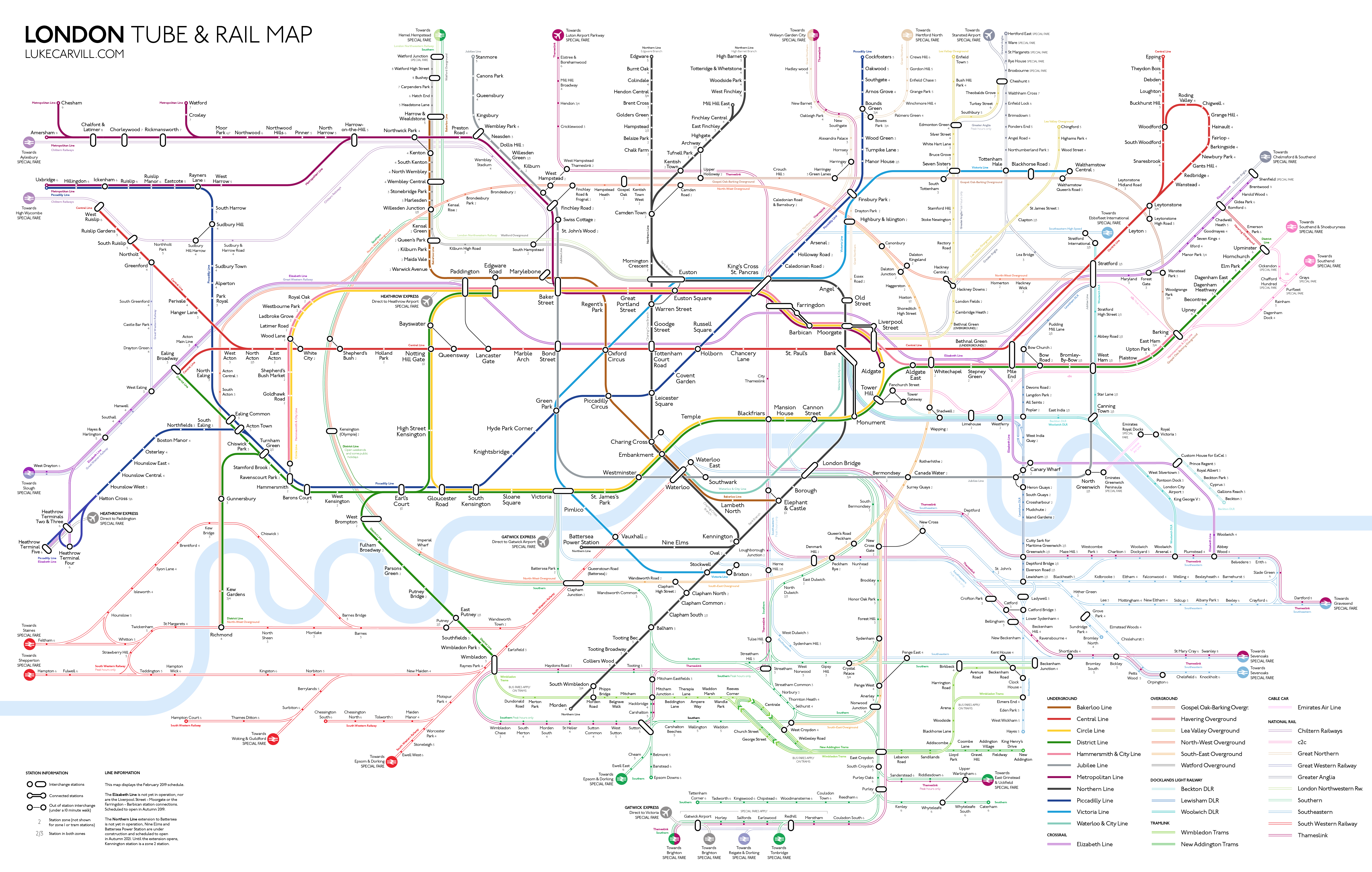
"Visual hierarchy implemented with the lines, tube lines (most frequent) in bold solid colour, other TFL services (less frequent) in a pastel shade with darker border, National Rail services (least frequent) as hollow lines," says Carvill. "This draws the attention of the eye towards the busier services and subconsciously suggests the most regular option." In addition, rather than being shown as one line, the Overground, DLR and Tramlink services are now displayed as the multiple services they are, and are named after the areas they are mostly within, or the station they terminate at, continues Carvill.

We don't know of any plans to replace Beck's original design any time soon, but Carvill's design certainly highlights how much the network has grown in the last 88 years. Is it time the London tube map was redesigned?
Read more:

