Is this the most terrifying infographic of 2021?
Prepare for an existential crisis.

Sign up to Creative Bloq's daily newsletter, which brings you the latest news and inspiration from the worlds of art, design and technology.
You are now subscribed
Your newsletter sign-up was successful
Want to add more newsletters?
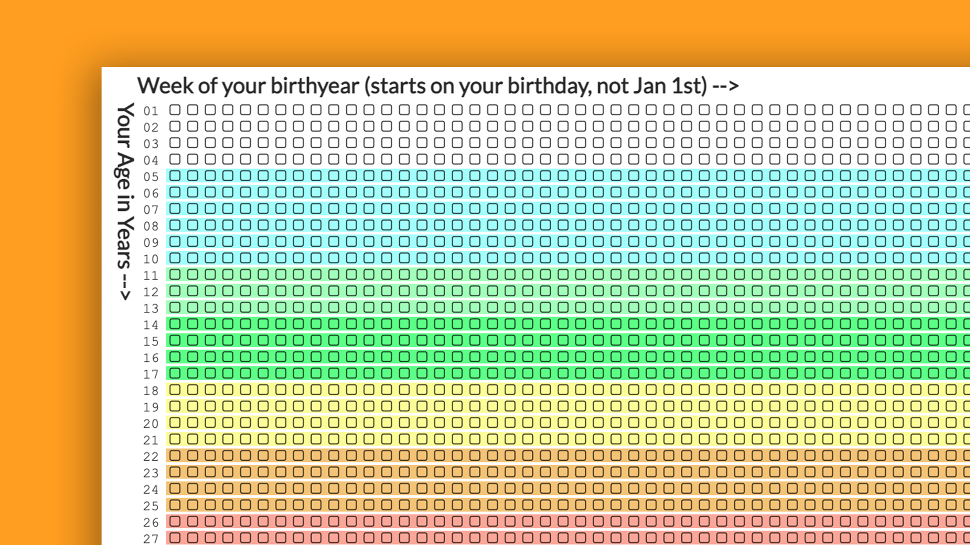
Just when you thought 2021 couldn't get any worse, we're here to remind you of our most terrifying find of the year – the Your Life In Weeks infographic. That's right gang, as January creeps ever closer we can prepare ourselves to check another year of this chilling infographic based on the average life expectancy.
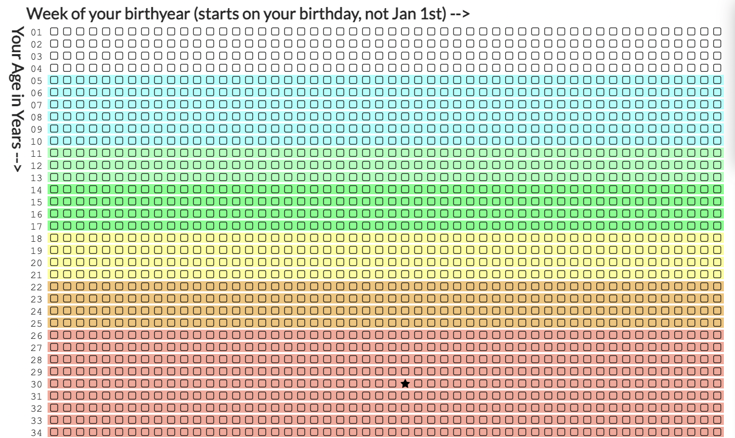
This existentialism-inducing infographic reveals how much of your lifespan you have already lived and how much time (on average) you have left – yikes. It might come as no surprise that this fairly macabre graphic has been tormenting the internet throughout the year. Sounding a little too morbid for you? Don't worry, why not check out our roundup of the best infographics for something more jolly.

To look at a personalised Your Life in Weeks chart, all you have to do is input some basic information like your birthday. With this info, the chart will separate your life into colour-coded life stages from school to retirement and pop a little star on the chart to mark where you are in your lifetime. If you head over to the website, you can also compare your lifespan to the likes of Kurt Cobain, Vincent Van Gogh and William Shakespeare. The infographic was made by "one-man development studio" Coruscant Consulting, and as genius as the design is, we hope the brains behind something so morbid is doing okay.
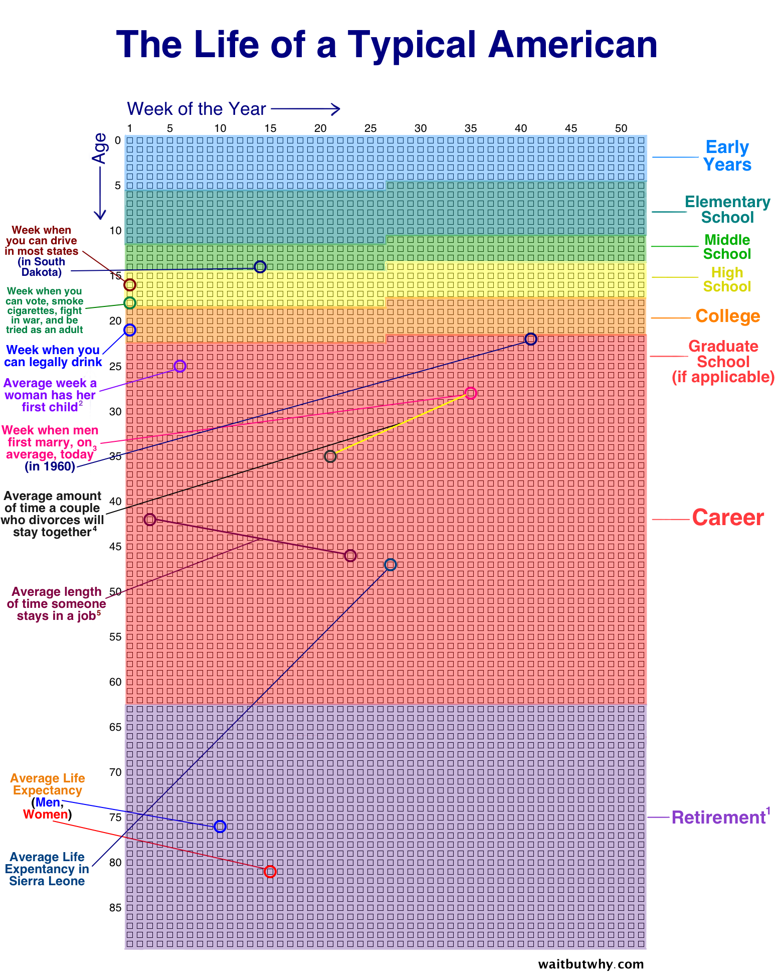
Article continues belowIt looks as though the concept of the infographic is based on a similar design by illustrator Tim Urban who posted a "The Life of a Typical American" chart on his blog Wait But Why. Urban's design features the average age of certain life events like when you can legally drive and your first child.
After the second year of dipping in and out of lockdowns, this infographic seems more poignant than ever. So if you're hoping to refresh the existential palette, why not check out some other infographics like this one that explains NFTs, or this infographic revealing 50 logo secrets. If you wanted to have a go at making your own, then check out our roundup of the best infographic makers on the web.
Read more:
- We bet you can’t get 10/10 on this AI Christmas movie quiz
- 8 must-know creative trends for 2022
- We can't get over how good Gran Turismo looks on PS5
Sign up to Creative Bloq's daily newsletter, which brings you the latest news and inspiration from the worlds of art, design and technology.

Amelia previously worked as Creative Bloq’s Staff Writer. After completing a degree in Popular Music and a Master’s in Song Writing, Amelia began designing posters, logos, album covers and websites for musicians. She covered a range of topics on Creative Bloq, including posters, optical illusions, logos (she's a particular fan of logo Easter eggs), gaming and illustration. In her free time, she relishes in the likes of art (especially the Pre-Raphaelites), photography and literature. Amelia prides herself on her unorthodox creative methods, her Animal Crossing island and her extensive music library.

