
Some logos are so familiar, you probably think you know them inside out. The McDonald's logo, for example, we bet you can call to mind at the mere mention of the brand name. The same goes for Google, or Apple. But did you know that one of those logos was designed to mimic a pair of nourishing breasts?
Okay, so it may not be so hard to work out once it's been put into your mind, but McBreasts (sorry) is a great example of how famous logos can have hidden meanings. And recently, a brilliant infographic shared on Reddit lets us into the secrets of a whopping 50 well-known logos. We like it so much it could be a serious contender to those found in our best infographics post.
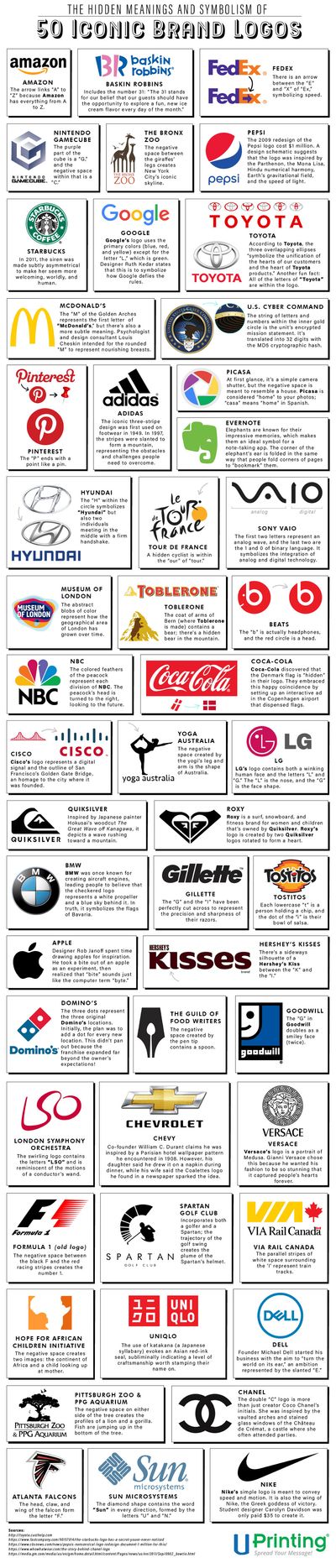
The hidden meanings in these logos are the result of a bunch of different design processes. There are lots of great examples of negative space, including the New York City skyline between the legs of a giraffe in the New York City Zoo logo, and the 'G' and 'C' in the Nintendo Game Cube cube.
Others feature design Easter eggs – the Coca Cola logo contains the Danish flag, and the Museum of London wordmark sits on actual map of the City of London (you can read more about that in our pick of the best logo Easter eggs). Then there are those with great back stories, like the reason behind the double 'C' in the Chanel logo.
We'll let you explore the rest by yourself, just click on the image to enlarge it and see the full infographic. As FoxyFoxMulder (who shared the infographic on Reddit) points out, some of the 'secrets' may have been let out of the bag already, and some hidden meanings are definitely more hidden than others. But we think it's still a worthwhile romp through the finer details of some iconic logos and it's certainly sure to serve as some great logo design inspiration.
You can check out the original post on UPrinting.
Read more:

