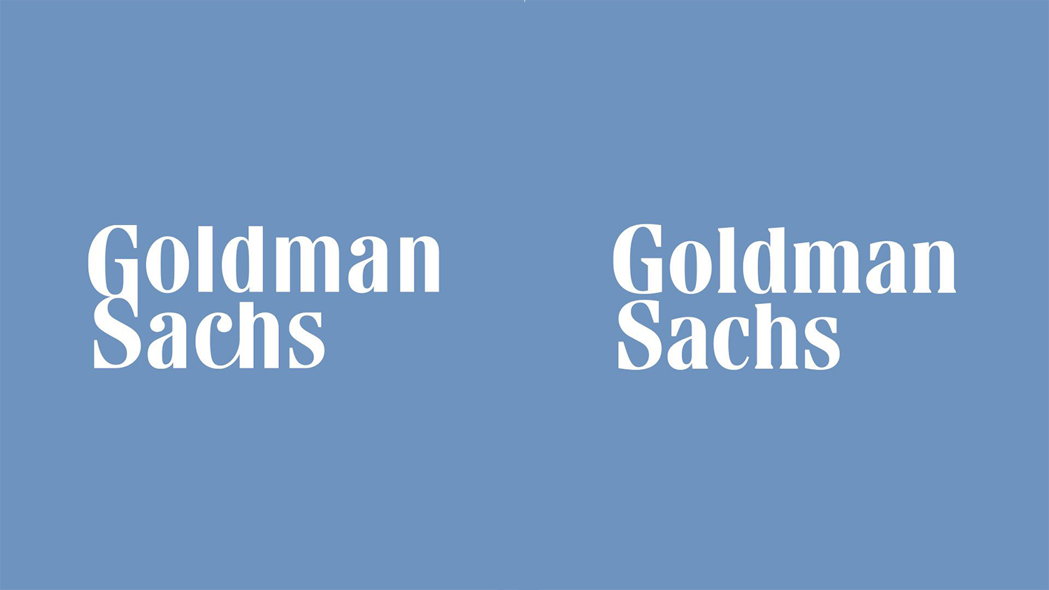
Goldman Sachs logo loses its ligature
Has it also lost its flair in the process?
Sign up to Creative Bloq's daily newsletter, which brings you the latest news and inspiration from the worlds of art, design and technology.
You are now subscribed
Your newsletter sign-up was successful
Want to add more newsletters?
Investment bank Goldman Sachs has quietly replaced its logo, doing away with the most recognisable design touch: the GS ligature. (UPDATE: you may be confused if you're reading this in 2024 because the ligature is back in the new Goldman Sachs logo!). As well as splitting the two capital letters, the new mark replaces the soft, round typeface with a much straighter choice. The kerning has also been slightly reduced.
According to Axios, the logo refresh was overseen by design agency Dalton Maag after the previous logo was deemed "insufficiently legible at small sizes". The previous typeface was based on Bodini, designed by Italian typographer Giambattista Bodoni in the eighteenth century. Check out our list of the best free fonts for some more typographical inspiration.

While it's a shame to see the elegant Bodoni-based typeface go, the improvement in legibility is clear – and we're impressed that Dalton Maag has managed to maintain a remarkably similar aesthetic with a completely different typeface. That said, the logo does seem to have lost its flair with the removal of the GS ligature. We can't help but wonder if updating the typeface and keeping the ligature would have been a win-win.
Article continues belowThe 'blue box' Goldman Sachs logo was designed in 1970 by Lippincott, "to create a unifying and cohesive brand logo to help reflect the firm's shift from an investment bank to a broader financial services firm". (This information is listed as a "fun fact" on Goldman Sachs' website).
Along with the new logo, Axios says Dalton Maag has created a custom typeface, Goldman Sans, which will be rolled out later this year. As client-specific typeface names go, we like it – although it doesn't reach the heights of One Night Sans, created by Havas London for the recent Durex rebrand.
Read more:
Sign up to Creative Bloq's daily newsletter, which brings you the latest news and inspiration from the worlds of art, design and technology.

Daniel John is Design Editor at Creative Bloq. He reports on the worlds of design, branding and lifestyle tech, and has covered several industry events including Milan Design Week, OFFF Barcelona and Adobe Max in Los Angeles. He has interviewed leaders and designers at brands including Apple, Microsoft and Adobe. Daniel's debut book of short stories and poems was published in 2018, and his comedy newsletter is a Substack Bestseller.
