8 big portfolio trends for 2017
Discover what’s hot in creative portfolios right now.
While good design doesn’t always mean following the big trends, it’s good to at least know what they are. So in that spirit, this post presents eight current trends that we’ve spotted in portfolio design.
Whether you’re creating a portfolio from scratch, or giving an old one a much-needed refresh, check out what others are doing. It might just spark some ideas of your own...
01. One-page portfolios
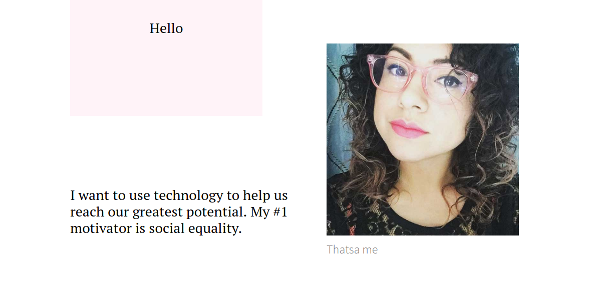
Right now, we’re seeing more and more creatives fitting their entire portfolios onto one, continuous-scrolling web page. Diana Lopez, a product designer based in Los Angeles, provides a great example of how to make this work on her site (shown above). There's great use of whitespace and some subtle scrolling effects to keep readers interested.
Gabe Abadilla, a freelance designer from San Diego, also boasts great one-page portfolio, which manages to present a huge amount of content in a blog-like style, without it ever feeling cluttered.
Meanwhile the portfolio of David Tristman, a Brooklyn-based art director, coder and illustrator, employs a more formal approach, dividing his work between six categories that can be easily accessed through a menu that’s repeated throughout.
02. Subtle scrolling effects
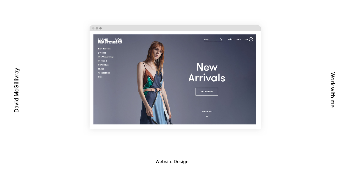
The kind of epic, flashy scrolling effects (often involving parallax) everyone was so impressed with a few years ago don’t make such an impact today.
Instead we’re seeing more and more creative portfolios employ the kind of small, subtle effects that you catch out of the corner of your eye (and consequently make much more of an impact). There are numerous examples of the trend we could share, but here are just a few.
Sign up to Creative Bloq's daily newsletter, which brings you the latest news and inspiration from the worlds of art, design and technology.
Scroll through the site of David McGillivray, a New York-based identity and digital designer, and each screengrab comes into view in a subtly appealing manner. We also love the way graphical elements bob up and down as you scroll down the portfolio page of Czech UX designer Filip Benda. And similar small pleasures are to be had perusing the portfolio projects of Dallas-based designer and art director Alex Pierce.
03. Fun with minimalism
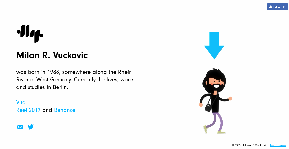
When potential employers and clients view your portfolio, they don’t have a lot of time, so the simpler it is, the better. But minimalism doesn’t have to be boring, and we’ve spotted a number of new portfolios that make simple designs enjoyable, rather than cold and stark.
For example, German designer Milan R. Vuckovic’s portfolio site, shown above, couldn’t be much simpler; but it still manages to convey a sense of personality and what he’s about. Similarly, the portfolio of Australian artist Darryn Thomas Ansted almost parodies the concept of whitespace, so generous is its use – but this sparse design merges beautifully with the style of artwork on display.
Other examples of the trend include French photographer Cecile Henryon’s portfolio, which combines some lovely illustrated touches, subtle transitions and an overall sense of elegance to create a beautiful, carousel-based portfolio. And then there’s the stark yet stunningly original portfolio design of Berlin photographer Anna Rosa Krau, which is practically a work of art in its own right.
04. Type-led
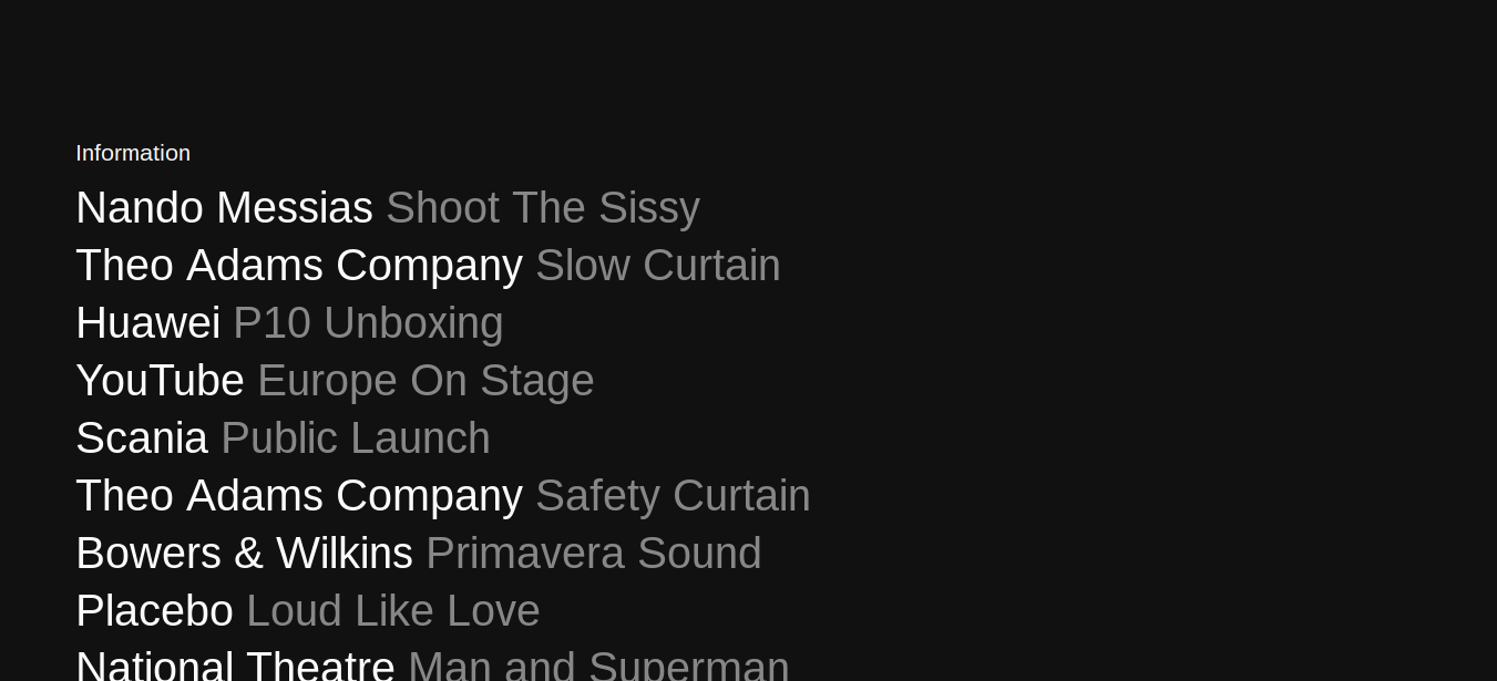
When you look at a portfolio site, you expect to see a lot of beautiful images. But recently we’ve noticed a trend for type-heavy presentation, such as the portfolio of Sam Williams Studio shown above.
This approach can also be seen on the portfolio sites of Italian brand designer and art director Alessandro Scarpellini, Singapore-based UX designer and coder Teo Yu Sheng, American designer and photographer Manik Rathee, and French art director and UI designer Stephane Issartel.
05. Monochrome
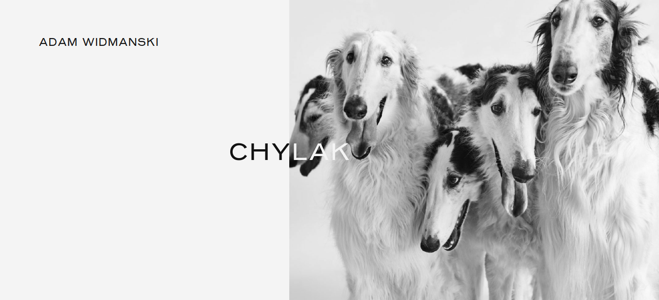
Monochrome is aesthetic choice we’ve noticed on a number of new and refreshed portfolios recently. And when done well, it can really convey an elegance and quality that helps your site stand out.
Good examples to follow include the portfolios of Warsaw-based digital creative Adam Widmanski (shown above), Danish artist and fashion designer Ulkrik Martin Larsen, and French developer David Robert (check out the effect when you hover over his text).
06. Collage
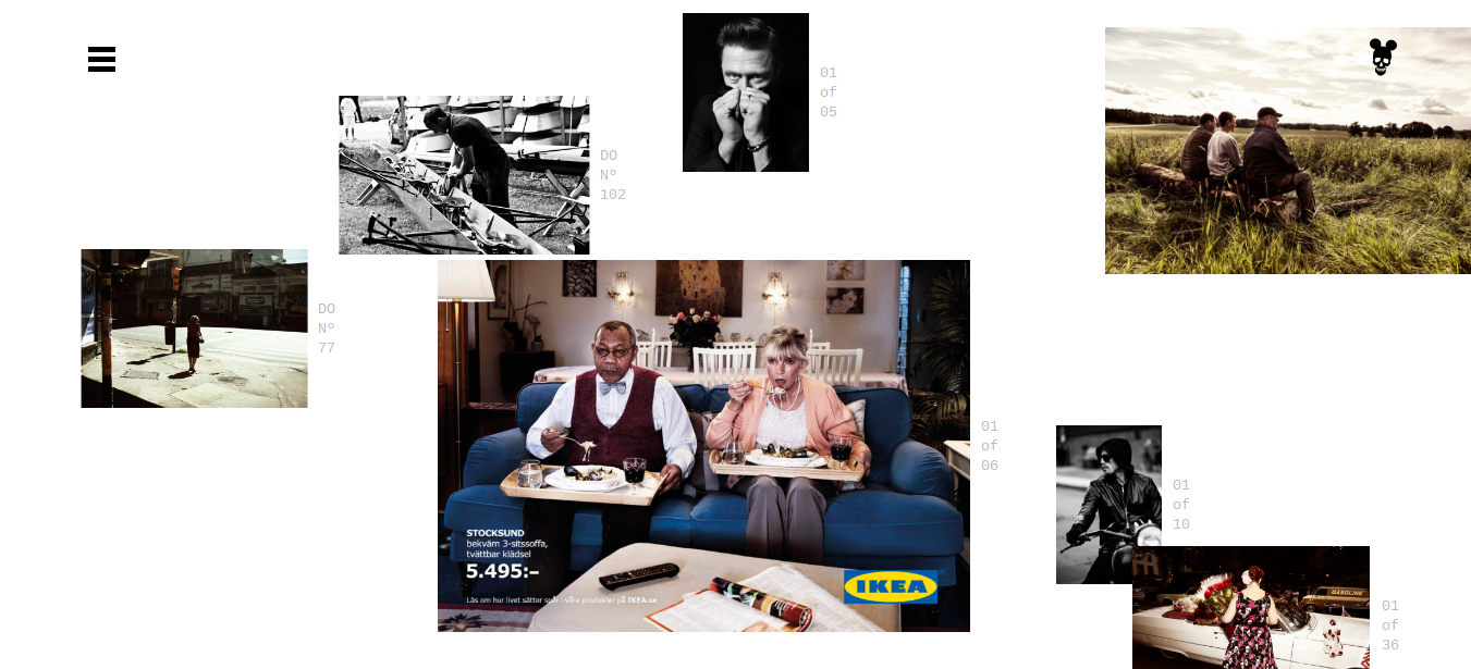
Most creatives still opt to lay out their portfolio images on a standard grid, but we’re seeing an increasing number experimenting with a collage-like approach. Examples of the trend done right include the sites of London-based photographer Will Sanders, French director, set and paper designer Alexis Facca, and photographer Stockholm-based Bjorn Terring.
07. Art directed
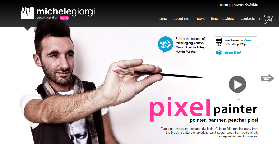
At the experienced end of the creative scale, we’ve seen a lot of top professionals getting really inventive with the design of their portfolios lately. There are too many examples out there to list, but here are a few of our faves.
Italian web designer Michele Giorgi’s portfolio is in the style of an online magazine, and has a joyous sense of fun that only works because it’s so beautifully designed. French digital designer Juliette Neveu, meanwhile, showcases a wonderfully original approach to navigation on her portfolio site that more than matches her superlative work.
Elsewhere, award-winning German designer Tobias van Schneider’s one-page portfolio is a visual feast that really shows the power of art direction to engage and intrigue. And French art director Nicolas Paries’ portfolio overlays text with images in an offbeat but entrancing style that makes it a joy to scroll through.
08. Skills infographics
You may have noticed that there’s no image accompanying our last portfolio trend, and there’s a reason for that. It’s a trend we disapprove of, and at Creative Bloq we don’t like to diss individual designers!
The trend involves little infographics, such as bar charts, that depict a designer’s skill levels in various types of software. Unfortunately, all the employers we’ve spoken to dislike them heartily. Why? Mainly, we think, because it represents a fundamental understanding of what they’re looking for: a general ability to problem-solve and think creatively, rather than knowledge of a particular type of software (the latter can be taught, the former less so).
Of course, we might not have the full picture on this, and we’d love to hear of any employers who love these little skills graphics (if that’s you, please add a comment below). But until we do, we’d advise anyone designing a portfolio to put them to one side for now.

Tom May is an award-winning journalist specialising in art, design, photography and technology. He is the author of the books The 50 Greatest Designers (Arcturus) and Great TED Talks: Creativity (Pavilion). Tom was previously editor of Professional Photography magazine, associate editor at Creative Bloq, and deputy editor at net magazine.

