Creative JavaScript site updates the world's food situation in real time
The world's food production and waste is updated in realtime in this project from web designer Luke Twyman.
Sign up to Creative Bloq's daily newsletter, which brings you the latest news and inspiration from the worlds of art, design and technology.
You are now subscribed
Your newsletter sign-up was successful
Want to add more newsletters?
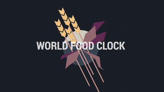
You may remember a while ago, we featured a nifty little site called Here is Today by web and interactive designer Luke Twyman in our top examples of JavaScript post.
Now, Twyman is back again with World Food Clock, which, through a brilliantly creative use of JavaScript and Canvas, focuses on food production. We chatted to him to find out more.
How did the project come about?
I was becoming aware that I, and probably a lot of people, don't really know enough about food production. I thought it would be a nice idea to create a statistical site on that theme, with reliable research and that I could add to and change around easily.
Article continues belowInitially I didn't know it would be so waste focussed, although I did know that waste and resource usage was something I wanted to include. I'm hoping that some people learn from it what I learnt in making it, and while (regarding food waste) people can start to make a difference at a domestic level, I hope it gets seen by some of the people with more influence on the earlier phases of food production as well.
What was your design approach to the project?
I knew early on I wanted to use realtime counters. Most people will never have to deal with a billion anything, so while we're used to reading them, these huge figures are often difficult for most of us to really comprehend until we can gauge them in a more relative way.
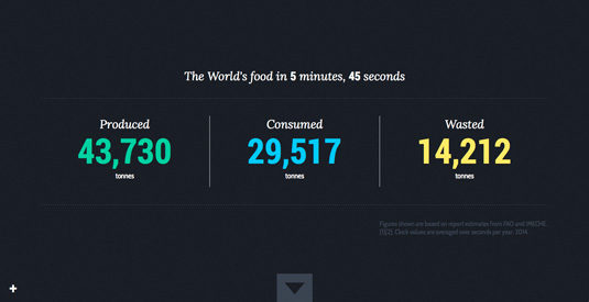
I wanted the focus to be on these numbers and for it to not be overly illustrated, so a lot of the layout work was about making these figures cleanly displayed and grouped in a logical and absorbable way. I tried to add some variety with the more visual panels, part of the process for me was wanting to make a balance between making it visual enough that it would grab peoples interest, but not so overly aesthetic that I'd feel I was detracting from the subject.
Which fonts did you use?
The headings all use Lora Italic, a fairly upright serif italic with nice curves and which contrasts well with Roboto Bold Condensed, which is what I used for all the numbers. My decision was based on the fonts being impactful, space-saving and the letter spacing keeping the numbers steady as they count up.
Sign up to Creative Bloq's daily newsletter, which brings you the latest news and inspiration from the worlds of art, design and technology.
The smaller text and labels are in Cabin Condensed, which I used in a pretty utilitarian way here but Cabin has a good screen legibility, particularly for small numbers. All three fonts have free to use web licensing.
What did you use to build it?
Everything's done in plain JavaScript and Canvas. I had considered doing something a bit more hybrid, as panels like the first one with just counters, don't really need to use Canvas at all, but it felt like for me transitioning between Canvas and non-Canvas panels would start to get messy and or confusing to work with.
What was the most technically challenging aspect of the project?
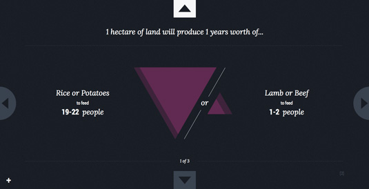
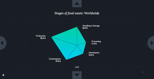
I guess the most technical bits were the two charts - the triangle ratios, and the percent pentagon. I had a clear idea of how I wanted them to look and function with smooth transitions between states, although that kind of maths is definitely not a strong point of mine so it was really just a case of persevering with some trial and error. I'm pleased with how they came out though, and now they're easy to re-use if I ever want to just plug new values in to them.
How long did the site take to create?
I think about two weeks, although this includes the research time, which was a sizeable chunk of that.
Have you seen any inspirational web designs recently? Let us know in the comments.

Kerrie Hughes is a frequent contributor to Creative Bloq, and was once its editor. One of the original CB crew, Kerrie joined the team back in 2013 after moving from her role as staff writer on 3D World. Since then she's written regularly for other creative publications such as ImagineFX, Computer Arts and Digital Camera World. After a stint working for the police, Kerrie is back reviewing creative tech for creative professionals.
