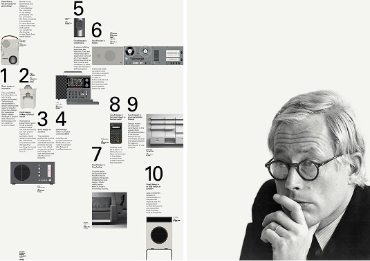
Dieter Rams' 10 principles of good web design
Lisbon-based designer Nuno Loureiro applies 20th century designer Dieter Rams' reknowned principles for good industrial design to the web.
"My heart belongs to the details. I actually always found them to be more important than the big picture. Nothing works without details. They are everything, the baseline of quality" – Dieter Rams
Since I got to know the work of Dieter Rams back in art college, I became fascinated by the exceptional products that he made for Braun from the 1950s onwards.
He was able to start a revolution in the way we use household appliances that we still use as inspiration for designing today's world, and you couldn't have a better example than Apple. Many of Apple's best sellers are using Dieter Rams' principles of design in their core features.
Article continues belowIndustrial design
One of the best known Dieter Rams design concepts is the 10 principles of good design, which make and classify good design. They cover what a designer needs to have in mind when creating a new project, but these principles are best applied to industrial design because it was there that Dieter Rams made his wonderful work.
In the mid-'70s, Rams started to give seminars about design and begun with six principles, which he improved upon over the years until the mid-'80s when he 'upgraded' this set of principles to 10, which still stand today.
These are are not hard commandments written in stone. They're not inflexible or intransigent, these are just guidelines for orientation of a good design project.
So, why not translate these 10 principles to the pixel world? Why not apply them to web design and create a discussion around what is good web design?
Sign up to Creative Bloq's daily newsletter, which brings you the latest news and inspiration from the worlds of art, design and technology.
Using my experience of work in web design and my background degree in industrial design, I humbly take the 10 principles and give them my insight to better fit the world of web design. Here they are:
01. Good design is innovative
The first principle is based on something that's the basis of web design - innovation. A designer must always keep the fact that innovation can make all the difference in a good web design in mind. Here are two base aspects:
- Approach each project with an innovative mindset and critical thinking in terms of UI and graphic design, and always try to push your ideas forward, exploring new boundaries. Use creativity as an innovative tool to stand out.
- Always keep up to date with the new stuff around you, whether it's a graphic creation tool or a new code language, using them for new ideas or to achieve new goals later down the line.
Managing innovation is a hard task that's constantly evolving, but always keep an open mind to try new ways to create and give yourself some time to try them. Only like this can you have a better range of options to create good web design.

02. Good design makes a product useful
What is a useful website, and what does it take to make a website useful?
This one is a bit tricky, because the usefulness of a website can depend on many points of view, but I want to highlight three aspects of a useful website.
- Useful for the visitor: When you a have a website that makes it easy to find what the visitor is looking for and a careful UI and display of information, it can make a website useful.
- Useful content: Your content is the most useful part of a website, without great care with your content you can easily lose a key feature that makes you website useful.
- Useful for other machines: The last point in a useful website is how you code your site, because you always have to care for aspects such as SEO and performance in order to make it useful.
03. Good design is aesthetic
The aesthetic quality of a website is the balance between the visual details and the usefulness of it. Beautiful websites are those that deliver a unique experience when you visit them, and present relevant content.
From a purely design-orientated perspective there are three points that can help a designer achieve good aesthetic quality in web design:
- Colour: Work your colour schemes carefully - they add a sweet flavour to every webpage. Try different combinations and think about the meaning of certain colours. Be prepared to have different experiences on different devices, you won't have as much control on the way a colour is displayed on a monitor as you have on a printer or an object.
- Grid / Space: When you're composing the base structure of a website, you make decisions on how information is displayed to the visitor - keep it in some kind of order or grid and work the white space really carefully. The different sizes/symmetries/orders of information effect how the human eye interprets the content.
- Typography: The way you display the text and choose a typeface has more importance than many people think, to be able to read and highlight different content is based on the typography you choose for a website.
04. Good design makes a product easy to understand
To make a website easy to understand, you have to have a clear view of the goals that the website has in order to design for those goals. You must keep the ease of use and how easy it is for a visitor to reach their goal in mind.
For example, if you have a web shop, the goal is to sell, so make your design as clear as you can, carefully tailoring the experience of displaying the products and the way the visitor checks out. At its best, a website must be self-explanatory.

05. Good design is unobtrusive
The unobtrusiveness of a website must rely on two main points:
- In the purely design-orientated point of view, Mies van der Rohe has this wonderful phrase: "less is more." It's really easy for a designer to get lost in decorative and graphic details, but don't! Keep the content live - the visitor must reach the information as fast as possible, then work on the graphic detail from there, craft the experience of visiting a website without making people get lost in it. The design should be neutral.
- The other aspect is accessibility. You must keep the basic rules of web accessibility in mind when you design a website.
06. Good design is honest
What is a honest website? Honesty in a website is having an open approach to the visitor, always giving them all the options and not making your design more important than it really is.
Example: clarify the purpose of an option or button as much as possible, or use error messages to indicate what went wrong.
An honest website presents tools that helps visitors reach their goal, a range of options, visible links and other hints that give the visitor everything they might need.
07. Good design is long-lasting
A long-lasting website is always controversial, but this principle can be applied easily to the trendy side of design. In other words, there will always be a new trend in web design. Just don't follow them without thinking carefully about the purpose of a radical change in your design.
A website must always be updated in its content, but the main structure should be long-lasting with small iterations in the design to improve the visual experience and technology to keep it fresh.
In web design 'long-lasting' has a different meaning than in real objects. The most important thing is to keep the visitors pleased with your design, and you must always be comfortable with your work. These two aspects can trigger a redesign, that, in our current age, will usually happen every two years.
08. Good design is thorough
This principle is self-explanatory. Leave nothing behind, craft every pixel of your design as though it was the most important, try to view your ideas from different points of view and carefully design the experience of visiting your website.
09. Good design is environmentally friendly
This is a hard one, and for this principle I will point to optimisation. When you design a website, you won't reduce the carbon footprint by much or save the rain forest, but there are some points that you can keep in mind when producing a website that help it perform a little bit better, such as:
- Reducing the amount of bits that it takes to download the page
- Using images that are optimised for the web
- Optimising the code the best way you can in order to make it easier for your browser to use less energy to display your website correctly.
10. Good design is as little design as possible
And last but not least, the principle that can make the real difference in good design - always be aware of the goal of your ideas, create systems that are transparent and easy to use, concentrate on the essential features of a website when designing it and keep it simple and clean to be better understood by the user.
Let the content live and breathe on the screen, the best design is the one you experience and not the one you stand for.
One of the most important ideas to retain from these principles is that we design for humans. They are the ultimate goal of our website, we always have to keep this in mind when creating a new project. Like Rams said, "The designer is the user's advocate within the company", we have to create something rational, but at the same time emotional.
When you dig deeper into the work and legacy of Dieter Rams, you can't help but feel inspired to go out and start creating amazing stuff, no matter what field of design you work in.
This is how I think this great set of principles created by one of the most important designers of the 20th century can be applied to a new design area, the digital era and to web design.
If you think differently, let me know in the comments.
Nuno Loureiro is a Lisbon-based designer at sapo.pt, Portugal's biggest portal, co-creator of dailyphotowall.net and collaborator with various Portuguese startup projects. This article was originally published in net magazine.

The Creative Bloq team is made up of a group of art and design enthusiasts, and has changed and evolved since Creative Bloq began back in 2012. The current website team consists of eight full-time members of staff: Editor Georgia Coggan, Deputy Editor Rosie Hilder, Ecommerce Editor Beren Neale, Senior News Editor Daniel Piper, Editor, Digital Art and 3D Ian Dean, Tech Reviews Editor Erlingur Einarsson, Ecommerce Writer Beth Nicholls and Staff Writer Natalie Fear, as well as a roster of freelancers from around the world. The ImagineFX magazine team also pitch in, ensuring that content from leading digital art publication ImagineFX is represented on Creative Bloq.
