Retro Fisher Price ad sparks heated debate amongst creatives
Has advertising been dumbed down?

Advertising trends come and go, and print ads have evolved to contain very different styles of images and copy over the years. Right now, creatives on Twitter have begun a fascinating discussion around the supposed dumbing down of advertising – using a retro Fisher Price advert as an example.
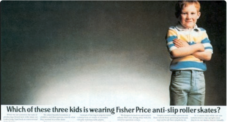
Pictured above, the advert in question is a clever way to sell Fisher Price roller skates. Featuring one child standing up and a whole load of empty space, the tagline reads: "Which of these three kids is wearing anti-slip Fisher Price roller skates?". We'll leave you to work out the joke. This could be heading straight into our best print adverts roundup.
There was a time when it was okay for ads to treat consumers as if they had brains pic.twitter.com/t83d1GCQsUNovember 8, 2022
Posted by Twitter user Dave Trott with the comment: "there was a time when it was okay for ads to treat consumers as if they had brains", the ad has sparked a discussion. Many believe advertising nowadays has been dumbed down, over-explaining or firing out easy to understand one-liners to avoid getting lost. According to many, the fast-moving consumer space has moved past advertising that takes a second to process and understand.
Article continues belowIf you can't imagine how that would look in relation to this advert, user Jono spells it out for you:
"There are three kids in this photo. The one standing up is wearing Fisher Price anti-slip roller skates. The other two are not. They fell down. We filled the negative space they left behind with a huge logo and an image of the product since you can’t see this kid’s feet."
But is it a case of creatives dumbing down their message for the audience? Copywriter WE ARE GIANT doesn't think so. "Maybe creatives are just as distracted as our target audiences are, so we're not as curious – & therefore as interesting as we have been in days of yore…?", they commented.

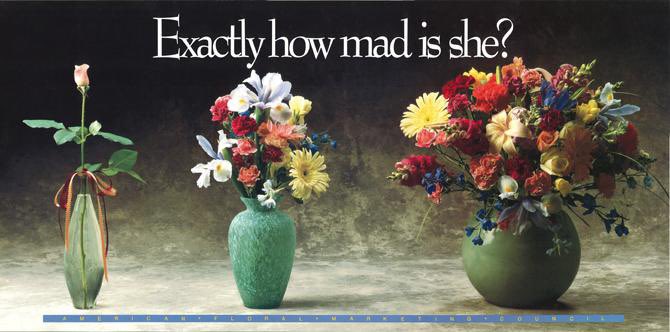
Whatever the reason for the change of pace and style, this ad (and the one above from the American Floral Marketing Council, which is also shared on the Twitter debate by several people) is the perfect blend of copy and image – perfect for making the audience pause and consider. Join the ongoing debate on Twitter, and then check out this ad design fail that's causing a stir on Reddit.
Sign up to Creative Bloq's daily newsletter, which brings you the latest news and inspiration from the worlds of art, design and technology.
Read more:

Georgia has worked on Creative Bloq since 2018, and has been the site's Editor since 2023. With a specialism in branding and design, Georgia is also Programme Director of CB's award scheme – the Brand Impact Awards. As well as immersing herself with the industry through attending events like Adobe Max and the D&AD Awards and steering the site's content streams, Georgia has an eye on new commercial opportunities and ensuring they reflect the needs and interests of creatives.
