'Over-simplified' medical packaging debate reignites
Is medical branding the right place for simplicity?

Sign up to Creative Bloq's daily newsletter, which brings you the latest news and inspiration from the worlds of art, design and technology.
You are now subscribed
Your newsletter sign-up was successful
Want to add more newsletters?
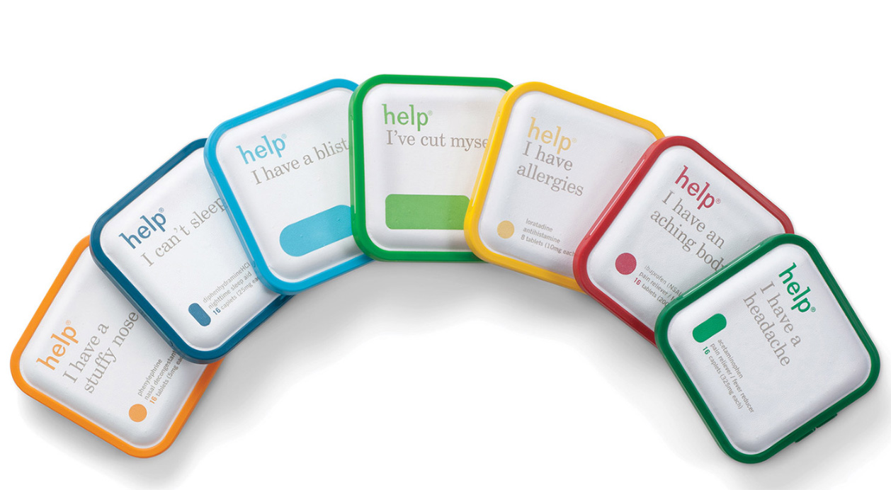
An alternative take on medical packaging, which focuses on the ailment the contents treats, is causing controversy on Reddit right now. The design pares things right back and puts the spotlight on the problem the product aims to solve. For example – suffering from allergies? You can pick up the 'Help, I have allergies' packet, rather than trying to remember that you need Loratadine.
The brand is Help Remedies, which was founded in 2008 with the aim of cutting through the noise in the US pharma category, and the packaging comes from PearlFisher. The brand's USP is that it does away with hard-to-pronouce names, instead naming the range of products after the symptoms they treat. Alongside the ailment-focused name, the minimalist packets also feature a colourful silhouette to help you recognise the packet's contents. The drug name is included, less prominently, on the front of the package.
As a design, it certainly has impact (explore more innovative packaging design examples) – but in a category where the customer's wellbeing is at stake, is it the right approach? Not everyone is convinced...
Article continues belowAlthough Help Remedies has been around a while, there's some firey discussion going on at the moment on Reddit about the packaging. User scopa0304 sums up some of the main issues people are having: "When it comes to medication and health, I don't like obfuscating the actual medication. The same reason I tell people to ignore medical labels and just look at the chemical. 'Buy Acetaminophen' I don't say 'Buy Tylenol'... It's good to give people more direction, but when it comes to health I would prefer more guidance and education as to what exactly you're taking and why."
There's also the issue that many medicines have a number of different uses – for example, Ibuprofen can be used for pain relief in general, not only 'an aching body'.
There's a time and a place for cute simplicity but it's definitely not when you're dealing with medicine
Others point out that while drug names can be confusing and difficult to remember, they serve an important purpose. "I can't take NSAIDs because of my prescription meds, but would totally buy the 'I have an aching body' without thinking because pain can be distracting," commented _Spent_.
"There's a time and a place for cute simplicity but it's definitely not when you're dealing with medicine," added three-one-five. "There's a reason those labels aren't sexy, there's important information that needs to be conveyed and it can help prevent potentially fatal mixups."
Sign up to Creative Bloq's daily newsletter, which brings you the latest news and inspiration from the worlds of art, design and technology.
All these are valid issues, but let's not be too quick to judge. The pharmaceutical industry isn't exactly a neutral landscape in the first place – we're talking about a competitive selection of brand-name medicines battling it out for customers' attentions. Help Remedies' packets do feature the active drug name, and more prominently than many of its competitors' busy packaging does (it could do with upping the contrast of the grey type on white, though). We'd argue that the problem here is relevant to our approach to pharmaceutical branding as a whole, not just this particular brand.
Check out the whole Reddit thread here, or read Pearlfisher's case study.
Read more:

Ruth spent a couple of years as Deputy Editor of Creative Bloq, and has also either worked on or written for almost all of the site's former and current design print titles, from Computer Arts to ImagineFX. She now spends her days reviewing small appliances as the Homes Editor at TechRadar, but still occasionally writes about design on a freelance basis in her spare time.
