Spotify Wrapped is a design nightmare
Spotify, what were you thinking?

Sign up to Creative Bloq's daily newsletter, which brings you the latest news and inspiration from the worlds of art, design and technology.
You are now subscribed
Your newsletter sign-up was successful
Want to add more newsletters?
Spotify Wrapped is every music geek's favourite time of the year. But it seems as though the internet has noticed something a little off about this year's wrapped celebrations – and now we can't unsee it.
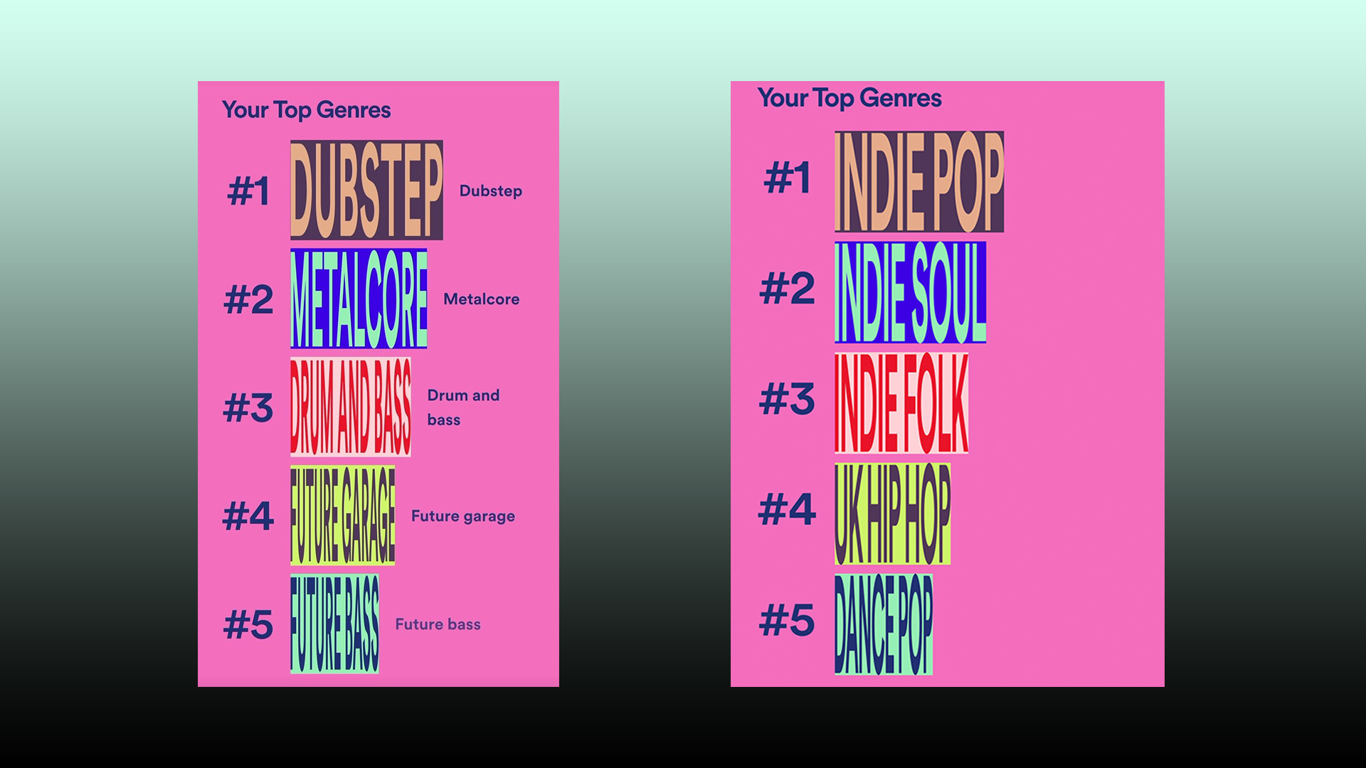
With exciting graphics and an insight into your music habits, Spotify Wrapped is when everyone overshares their listening stats with vibrant pre-made designs made by Spotify. We love the colourful, playful designs on Spotify Wrapped, especially the musical animations, as they really make all the stats so much more exciting. However, users over on Reddit have pointed out that the font used for this year's genre graphics looks totally bizarre. In fact, when we first saw them, we thought they were a glitch they were that bad. Looking for some fonts for your own project? Make sure you check out our roundup of the best free fonts.

While the text is barely even legible, we can't decide whether using the font was a stroke of genius, because so many people are now talking about it. One user on Reddit suggested that the font was part of an optical illusion, because if you tilt your phone backwards and look at the text from the bottom of the phone, it actually looks normal. Some others also theorise that Spotify purposely chose an awful font on purpose to get people talking...and we guess it worked.
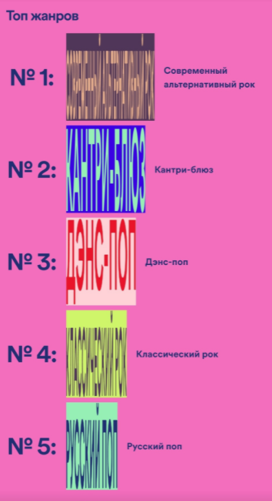
Article continues belowAnd just when you thought it couldn't get any more illegible, user Acendus shared the same graphic in Cryllic and it is even worse than the English version (see below). One Redditor responded to this particular graphic with, "Can't believe they went with this" – and we totally agree.

Not everyone disliked it though, one Redditor responded to the post, "We're so minimalist and straight-up boring right now, that I'll take anything that's actively and deliberately ugly," and another said, "It's refreshing to see something out of the norm". However, the majority were on our side and were seriously confused by this choice of typeface.
why_spotify_why from r/graphic_design
why_spotify_why from r/graphic_design
why_spotify_why from r/graphic_design
We aren't sure why Spotify would have chosen such an eyesore of a font, but we know that you can avoid doing the same thing by checking out our guide on font pairings. We also have a super handy roundup of the best places to download free fonts.
Read More:
Sign up to Creative Bloq's daily newsletter, which brings you the latest news and inspiration from the worlds of art, design and technology.
- Tesla’s new Cyberquad sells out immediately, and we have so many questions
- Apple iPhone 14: from design to specs, here's everything we know
- These transparent Apple AirPods look, erm, interesting

Amelia previously worked as Creative Bloq’s Staff Writer. After completing a degree in Popular Music and a Master’s in Song Writing, Amelia began designing posters, logos, album covers and websites for musicians. She covered a range of topics on Creative Bloq, including posters, optical illusions, logos (she's a particular fan of logo Easter eggs), gaming and illustration. In her free time, she relishes in the likes of art (especially the Pre-Raphaelites), photography and literature. Amelia prides herself on her unorthodox creative methods, her Animal Crossing island and her extensive music library.
