Usain Bolt's official logo could rival Nike's Jumpman
This logo should already exist, right?
Sign up to Creative Bloq's daily newsletter, which brings you the latest news and inspiration from the worlds of art, design and technology.
You are now subscribed
Your newsletter sign-up was successful
Want to add more newsletters?
Read the following description, and you're likely to guess whose prospective logo is being described: "The mark consists of the silhouette of a man in a distinctive pose, with one arm bent and pointing to the head, and the other arm raised and pointing upward." Pretty clear, right? (If you guessed Usain Bolt, you are correct).
Well, Bolt has just filed a trademark application for a logo featuring his 'To di World'/Lightning Bolt pose (with the exact wording as above). Frankly, we're surprised it isn't already a thing – the image is so prolific, it feels as if it already exists. It's the kind of branding concept you find behind the world's best logos and, if the court filing is anything to go by, you're going to be seeing a lot of it.
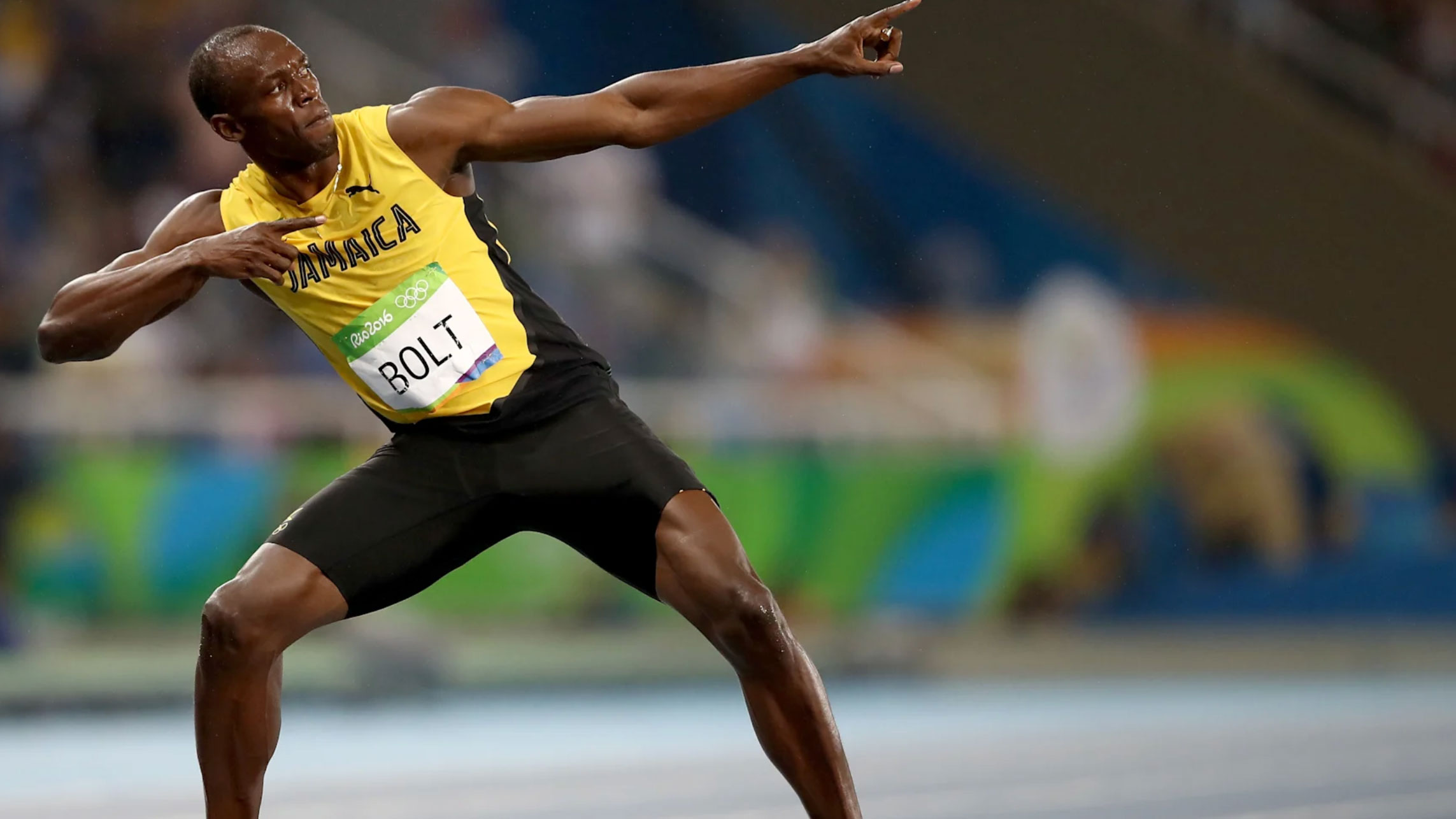
According to the application, the trademark will apply on goods from eyewear and jewellery to bags and clothing, and entertainment to restaurants (peruse the USPTO filing here for more info). It seems Bolt is planning to build up a branding empire to rival Yeezy's, and his recognisable silhouette will adorn it all (catch up on Kanye West's design exploits here).
Article continues below 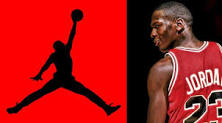
Of course, Bolt isn't the first sporting legend to be immortalised in a silhouette logo. The potential design reminds us of Jumpman, Michael Jordan's iconic Nike logo (above), which shows Jordan jumping with a basketball. The key difference here is that Bolt will own his own logo, whereas Jumpman remains the property of Nike.
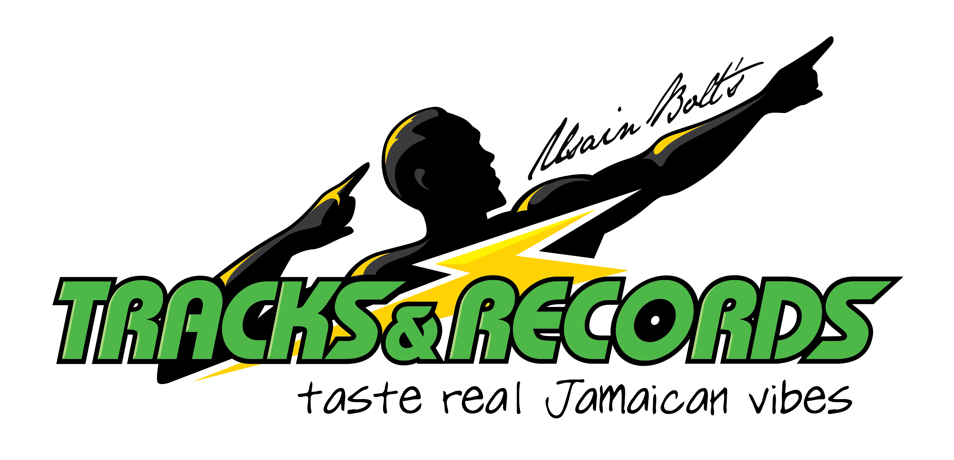
Aptly described as a "marketing juggernaut" by Forbes, Bolt's business acumen means he has been awash with sponsors over his career, has a stake in many successful businesses and two branches of his Track & Records restaurant in Jamaica – see the current branding above. Bolt also opened a restaurant in London in 2018, which closed shortly after, due to the pandemic.
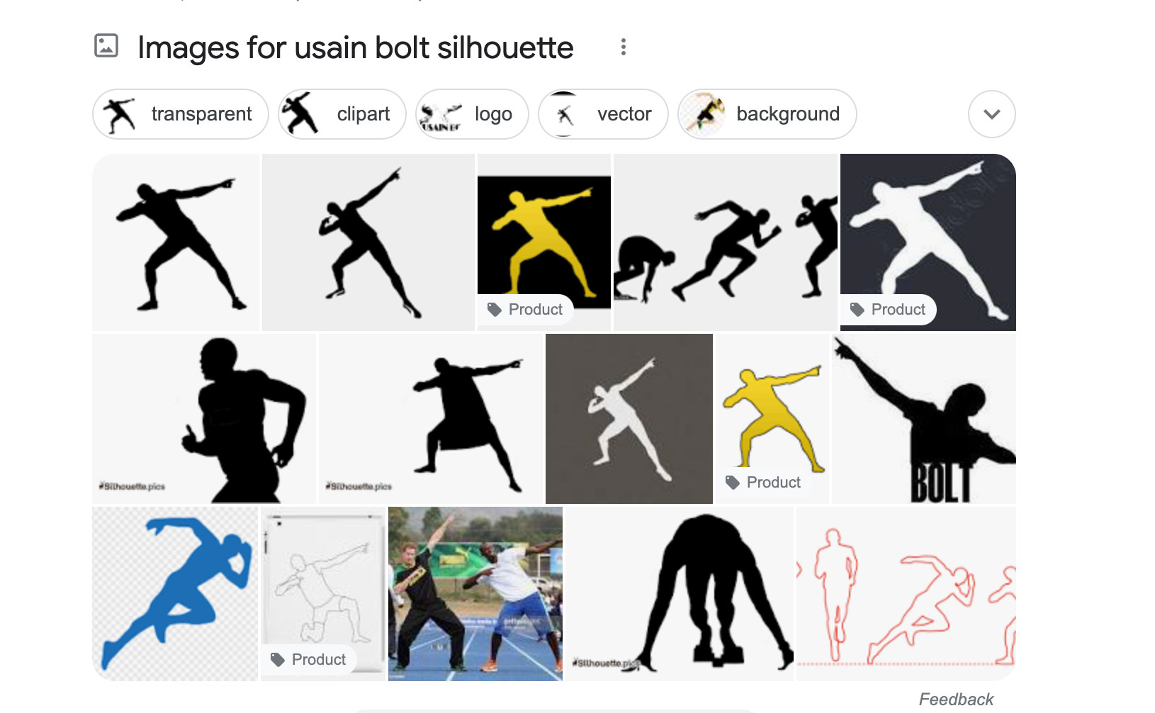
In terms of design, a good old Google search throws up enough Bolt silhouettes to give us a taster of what might be ahead (see above) so we're looking forward to seeing how the finished design will look, and how it differentiates from what has come before. We're sure it'll be infinitely more successful than the Russian Not-Starbucks-anymore logo, which really could have used more thought.
Read more:
Sign up to Creative Bloq's daily newsletter, which brings you the latest news and inspiration from the worlds of art, design and technology.

Georgia has worked on Creative Bloq since 2018, and has been the site's Editor since 2023. With a specialism in branding and design, Georgia is also Programme Director of CB's award scheme – the Brand Impact Awards. As well as immersing herself with the industry through attending events like Adobe Max and the D&AD Awards and steering the site's content streams, Georgia has an eye on new commercial opportunities and ensuring they reflect the needs and interests of creatives.
