Create the perfect website layout system
Discover a number of ways to create responsive layouts without media queries.
Sign up to Creative Bloq's daily newsletter, which brings you the latest news and inspiration from the worlds of art, design and technology.
You are now subscribed
Your newsletter sign-up was successful
Want to add more newsletters?

Thanks to media queries, we can create sites that work on any device. Without them the current web simply couldn't work. But there are other options as well. In certain situations, a different technique can solve our responsive design problems in a more systematic, algorithmic way.
If you're, like me, a lazy person, you might be interested in designing these kinds of layout systems whenever possible. Systems like these are self-governing – they have to be able to make decisions for themselves and for us, based on the constraints we give them.
We've always been able to create flexible layout systems on the web. Even with ancient CSS properties like float you could create layouts that adapted to different screen sizes. Recent implementations of new CSS features, like flexbox and viewport-relative units, have enabled us to take CSS layout to a level of flexibility we could only dream of before.
Article continues belowFloat and display: inline-blockLet's start this exploration of layout systems with a simple example. Many blogs show a list of introductions on their homepage. On a small screen you probably want to display these articles one on top of the other, but on wider screens a layout with more than one column makes sense.
If you give each article max-width: 20em and tell it to float: left, the browser will simply show as many columns as possible, depending on the width of your screen. This has worked since we invented floats. Floated items do not automatically clear; they bump against higher items. This means a blog that has been laid out this way will sometimes show gaps.
Depending on how you look at it, the chaos of floating things can either be a cause for concern or a wonderful, serendipitous design feature. You can think of these gaps as being chaotic, or you can call them 'active white space' and be very happy with them. If you don't like white space you can use display: inline-block;.

Float is a very simple technique that results in primitive yet flexible responsive layout systems. It works just fine without media queries, although you might want to add a few to tweak the design if needed. Bare-bones floating might not be perfect for all use cases, but it's definitely an option worth considering.
Sign up to Creative Bloq's daily newsletter, which brings you the latest news and inspiration from the worlds of art, design and technology.
Multi-column

I'm not sure why – perhaps because of buggy and incomplete implementations – but you don't see many websites that use CSS columns. This is a pity, since it's a highly flexible technique. It's perfect for lists of links, like navigations, footers, search results or photo blogs.
CSS columns are almost never used for articles. They become horrible to use when the article is higher than the viewport. People simply don't want to scroll down and up again while reading. There is a very nice and simple way to use columns in articles, but only if you can somehow convince your users to scroll horizontally.

You can create a simple horizontally scrolling multi-column layout by setting the height of the article to a maximum of 100 per cent of the viewport, and by telling it to use columns of no less than 20em. The problem you now need to solve is how to explain to your visitors that they should scroll horizontally.
You could add new UI elements to clear this up. Or if you're lazy, you could choose to always make sure the columns never fit completely in the viewport. It's remarkably simple to achieve this. These few lines of CSS are all you need:
article {
columns: 20em; /* never be smaller than 20em */
height: 100vh; /* be as high as the viewport */
width: 75vw; /* be 75% of the width of the viewport */
} 
There are many reasons why CSS is awesome, but the fact that the initial value for overflow is visible is definitely one of them. Without that weird but fantastic CSS property this multi-column layout wouldn't work.
Flexbox and the viewport
Tab Atkins gave a very clear description of what flexbox is:
"Flexbox is for one-dimensional layouts – anything that needs to be laid out in a straight line (or in a broken line, which would be a single straight line if they were joined back together)"
That sounds a bit like float, but of course it's much more powerful. With flexbox you can create simple looking layouts that would have been impossible a few years ago. For instance, you can tell items what to do with any leftover white space. You can leave it at one of the ends, you can distribute it evenly between (or around) them, or you can choose to stretch the items – which basically gets rid of the white space.
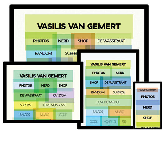
I used this last option to lay out the list of links to my online activities on my homepage. I didn't want this list to be an orderly multi-column layout, I wanted the browser to simply fit as many items on each row as possible. For the first version of this design I used this code:
ul {
display: flex;
flex-wrap: wrap;
font-size: 2.5em;
}
This looks OK on large screens, but is problematic on smaller screens (see image above). I wanted all items to always be visible inside the viewport, no matter the size. To fix this, I could have used media queries, of course. But wouldn't it be great if the browser could somehow adapt the font size to the size of the viewport? It turns out that, indeed, you can use viewport-relative units to do exactly that.

Viewport-relative units
Instead of using em and media queries to make sure our layout works in different viewports, you can use the vw unit, which is a percentage of the width of the viewport. If you set the font size to 2.9vw (for example) the layout will always fit in the viewport, as you can see in the example pictured below.

There is a serious usability problem with using the viewport width as a unit for text though: it can easily become too small to read on very small screens. This is an even bigger problem since there is no way for the user to increase the font size. Browser zoom does not work with viewport-relative units!
You can make sure that the font size never becomes too small by using a calc function: font-size: calc(1em + 1vw). This works like a minimum font size. But while this is a clever trick to make sure our text is always accessible, it doesn't solve the problem of how I can make all the links on my homepage fill up any viewport.
Viewport calculations
It's not really possible to always perfectly fit any text into any viewport with just CSS, but we can come close. There's a brilliant CodePen where Dillon de Voor explains this line of code:
font-size: calc(4vw + 4vh + 2vmin);With this specific calculation, this one sentence, set in a certain font, will always fit in any viewport.

For my own site I changed the numbers in this calc function a little bit, and now the layout on my homepage does what I want. The content will always try to fill up the viewport as much as possible.
Quantity selectors
The beauty of these techniques – float, CSS columns, and flexbox in combination with viewport calculations – is that you order the browser to behave in a certain manner. Instead of designing every possible layout for every possible screen size, you let the browser and the content figure it out together.

Of course, this doesn't always work. Often you need finer control over the different layouts, and for extreme screen sizes you need to define exceptions. For these cases media queries are usually the tool we need. And they're fantastic.
Container queries
Soon after we started creating responsive designs with media queries, we found out that, while they are extremely useful, they can't always help us achieve what we want. I bet you've often wished something like 'element queries' existed: changing the way elements look depending on their own size, instead of on the size of the screen. It makes so much sense.
The reason these don't exist yet is because they could cause endless loops. What should the browser do if you tell it that elements wider than 30em should be 20em wide? The Responsive Issues Community Group has come up with a possible future solution: we can't use element queries, but we might be able to use container queries. With a container query you wouldn't be able to style the element itself, you could only style its children. They might look something like this:
article:media( min-width: 30em ) screen {
…
}
The proposed syntax will probably change in the future, but the basic idea makes sense.
Quantity selectors
Aside from screen size, there are other conditions you can use to style things with. There have been a few brilliant articles recently about styling things based on quantity.
It turns out you can apply different styles to an element based on the number of siblings it has. This technique doesn't use media queries or container queries, of course; it makes very clever use of type selectors.

There are some wonderful and very useful things you can do with this technique. Quantity selectors are quite handy for search results, where you don't know if there will be one single result or hundreds of them. You can now change the way they look based on the number of results. It's handy for filtering as well, as you can see in the example above, in which it has been used to enable users to filter all speakers of the Frontend Conference in Zürich.
Initially, the user can see all the speakers and hosts. All images are small so they fit within the viewport. But when they filter the results to only show the hosts, and not the speakers, there's much more room. This brilliant technique gives us the possibility of filling up the viewport with just the two images.
The selectors that make this possible look quite complex at first. At first, I didn't understand how they worked at all. Luckily for us, Heydon Pickering has done a fantastic job in explaining quantity selectors in this article: netm.ag/quantity-274.
article {
flex-basis: 100vmax;
}
article:nth-last-of-type(n + 2),
article:nth-last-of-type(n + 2) ~ article {
flex-basis: 50vmax;
}
article:nth-last-of-type(n + 6),
article:nth-last-of-type(n + 6) ~ article {
flex-basis: 33.33vmax;
}
This block of code tells the browser each article should preferably be as wide as the longest side of the viewport. But if there are two or more articles, they should be 50 per cent of the longest side of the viewport. And if there are six or more, they must be 33.33 per cent.
Vmax doesn't just fill up the viewport in an efficient way, it also changes the composition depending on the ratio of the viewport. With just a few lines of code you can now create this layout system that responds to the content and the viewport.
Is this ideal?
We have always been able to let the browser decide what the layout should look like based on a few clear orders: use as many columns as needed, as long as they are not smaller than 20em. Ideal for lazy designers and developers.
New CSS features like flexbox and viewport-relative units have made this way of designing much more powerful. We've only scratched the surface of these super-flexible, clever layout systems. And the results are already fantastic. I'm looking forward to seeing the brilliant stuff you come up with once you start exploring the possibilities.
Sure, these kinds of design systems can't be used in every single use case. There are other CSS modules – like CSS Grid Layout and CSS Shapes – that give us fine control over our compositions. But whenever possible, we could let go of this control and let the browser and the content figure things out. Or, like John Allsop says in 'A dao of web design': let's "accept the ebb and flow of things".
This article was originally published in issue 274 of net magazine. Subscribe today!
