How to create animations that scale for all devices
Discover how to make animations shine in a multi-device world.
Animation on the web is particularly nuanced, as we have to adjust our work to take into account bandwidth, code compatibility and product design. In this article I'll explain the recommended set-up for a truly responsive scalable animation. I'll also cover different ways of working with the animation to achieve positive user experiences and parity across our multi-device world.
I will cover a selection of key use cases: adding CSS animation to SVG sprites, dealing with standalone graphics that require complex movement, creating a responsive experience that adjusts to the viewport, and making animations simpler for mobile.
I highly recommend using SVG (Scalable Vector Graphics) for graphics with responsive animations. These are resolution-independent, so you won't have to load up additional HTTP requests or bog yourself down with replacement image media queries.
Article continues belowAs an alternative to the img attribute, the picture element handles image replacement quite nicely, but when dealing with different-sized moving images, it becomes much more cumbersome to keep the animation consistent. SVG is far superior in this way: we can write code once and continue to adjust the visual complexity of our image.
SVG also provides a navigable DOM, so it becomes simple to reach inside a complicated graphic and animate elements individually. As its name suggests, SVG is built to scale. It's incredibly simple and intuitive to adjust the size of a SVG.
Even with these key features, though, units and even the way we perceive images will change from screen size to screen size. Don't worry; I've got you covered! Let's take a look at a few ways of working with responsive animation.
SVG sprites and CSS animation
This first technique works particularly well for responsive, standalone animation – for example when illustrating text. We start with a typical responsive sprite, and adapt not just the size of the image, but the complexity of the graphic too. This makes a lot of sense when you think about what we can visually interpret on a smaller screen. In order for the graphics of our animation to remain clear, we must also consider screen real estate.
Sign up to Creative Bloq's daily newsletter, which brings you the latest news and inspiration from the worlds of art, design and technology.

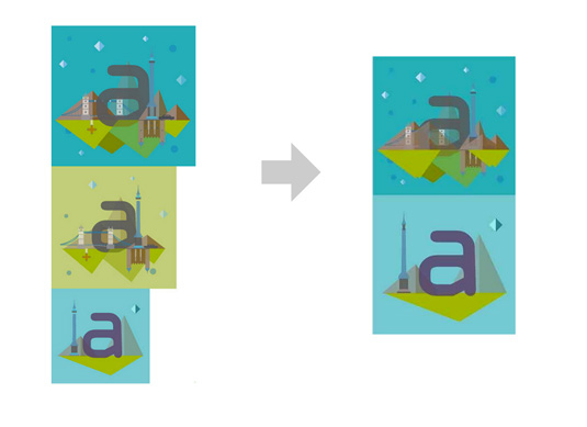
Take a look at the illustration above. On the left you can see we have designed for desktop, tablet and mobile implementations. On the right, we have done two things to get ready for export.
The first is to remove repetition. We can see clearly that the desktop and tablet views are similar enough that we could either alter the properties or replace them with CSS media queries. An example of such an alteration would be to adjust the background so it's green instead of blue. For the mountains, the change in design between different device sizes is significant enough that we will need to apply a class on the element to hide or reveal it.
The most important part of this technique lies in the way we're handling the viewBox attribute. You can think of the viewBox as a little window in which we view the SVG. The SVG itself can extend beyond the bounds of the viewBox, but only the area within it will be visible. The rest will be cropped out.
For the desktop and tablet versions, we want only the first tile to be shown, so initially we set the viewBox inline in the SVG to cover just the top section of the sprite: viewBox="0 0 490 474". We then shift the visible area with JavaScript to "0 490 500 500".
Complex movement
Any time you have a standalone graphic with
more complex movement, I suggest switching to the GreenSock Animation Platform (GSAP), rather than using CSS. Although there are loads of cool things that GSAP has to offer, the main advantages in this case are twofold.
The first is cross-browser stability.
Thanks to all our browsers and systems, frontend development means a large testing matrix. When we include mobile, it gets exponentially more complex. Older Safari browsers on older Apple devices can have spotty support for moving SVGs, and there are a lot of gotchas on Android as well. GSAP offers really stable movement, without sacrificing speed.
The second advantage is the timeline. This allows for the stacking of tweens and even staggered effects, with streamlined and intuitive code. For the rest of the examples in this article, I'll pair GSAP and SVG.
Let's first establish that animating elements with transforms and opacity is the most performant approach. It's easier for the browser to optimise because it reduces repaints, which is the most important thing to keep your eye on for jank- and stutter-free animation.
Also, if we use the attributes within the SVG DOM they will scale in tandem with the entire SVG, because they are honouring the space within the viewBox. So if you scale a complex SVG using percentage, flexbox or other techniques, your animation will also scale accordingly. This means you don't have to adjust anything; you can focus on writing your code correctly just once. And that is a pretty huge boon.

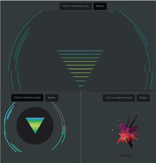
For example, let's consider a really complicated animation like the one shown in the image above. I will usually design all the elements I need first, and slowly reveal them over time. This allows me to plan things out in advance, which leads to cleaner, more legible code.
The finished animation is completely scalable – you can randomly adjust the button while it's running and have the entire thing adjust to a new percentage (see image below).

Responsive UX
Designing a responsive experience that adjusts to the viewport relies on some planning in the design stage. You can think of it like little interlocking Lego blocks: we go through the design, build and development stages, scoping each particular area to itself, but what the user ends up with is a complete (yet completely different) view on each viewport.
We took this approach for our Huggy Laser Panda animation. Take a look at it by visiting netm.ag/demo3-278. We designed this carefully, considering the units that would have to switch and stack.
On mobile, to make the pieces correctly interlock, we adjust the positioning of the right section (outlined in magenta for clarity), and flip it so it can stack appropriately.
We make sure each part shown in the boxed sections is exported within individual SVGs and properly named, including smaller units or groups. This means in our export settings (I use Jake Archibald's SVGOMG), we do not remove unnecessary IDs or groups.
We then use multiple functions. Each section is scoped independently, and there is one repeated function for all of the animations that loop.
function revolve() {

    var tl = new TimelineMax();

    tl.to(gear, 4, {transformOrigin:"50% 50%", rotation:360, repeat:-1, ease: Linear.easeNone}, "begin");
...
    return tl;
}
This makes the design much easier to build off and reason about. We can even pause each animation initially, so it can be triggered by a user click event. Now everything is scoped to its requisite section, all the way from design to finished product, it's easy to know where to go for adjustments.
We separate out these builds and have each Lego-like piece adjust via percentage, and it scales beautifully. Alternatively, flexbox would work equally well, depending on the support level.
Less pizazz on mobile
Let's face it, mobile connections (particularly in less developed countries), can be pretty slow. Whether you only have a few key animation interactions on your site or a huge WebGL experience, sometimes an animation that looks beautiful on desktop need not scale down to a mobile experience.
In the case of a large canvas animation, or even a really complex SVG animation that is non-critical to the user experience, sometimes the best thing you can do is to tone it down or turn it off for smaller devices.
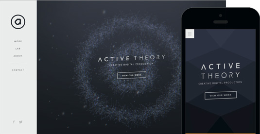
Active Theory's site does a beautiful job of this (see image below) by showing you a full particle canvas animation on desktop, which is replaced with a simple polygon background on mobile. The interactions on mobile are still very on-point, transitioning beautifully beyond even what we expect on native.

The team still shows off its interaction prowess in the way you navigate the site, which is arguably more impressive on mobile than an animated background would be anyway. The design saves the bandwidth for what counts.
Conclusion
Whether you design for responsive from start to finish or simply turn animations off on mobile, having a concrete plan for what your viewers experience from device to device is vital. This is particularly true in a landscape where mobile is king. Content, type of image, and user bandwidth all help guide animation choices for responsive design.
