Most design agency sites look very similar. Even when you have big-name clients, impressive projects or unique activities to boast of, shove all of your images into a standard grid and suddenly everything starts to look bland and formless.
It doesn’t have to be this way, though. These 10 sites, all new for 2017, have all done something a bit different with their use of images. And while that doesn’t mean the sites as a whole are perfect, they can provide some useful pointers to help you breathe some added life into your next redesign.
01. Creano
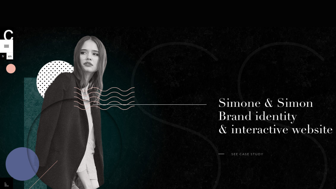
Founded in 2015, Creano is a digital studio based in Paris, with clients including Simone & Simon, Clarins and Truffaut. On its new website it takes somewhat of a ‘less is more’ approach to project imagery.
On first look, the image associated with each case study is hidden in soft focus behind a monochrome filter, establishing a feeling of distant allure. Click on the project title, though, and the image comes into sharp relief, encouraging you to explore further.
It’s a subtle but original and effective way to present project imagery that adds a nice touch of sophistication to this boutique agency’s portfolio.
02. The D4D
Established in 2006, The D4D stands for “The Department of the Fourth Dimension”, and describes itself as a ‘multidimensional storytelling agency’. An award-winning creative firm specialising in strategy, design and content creation, it’s based in Los Angeles and its impressive client list includes the likes of Apple, Cisco, NBC and the University of California.
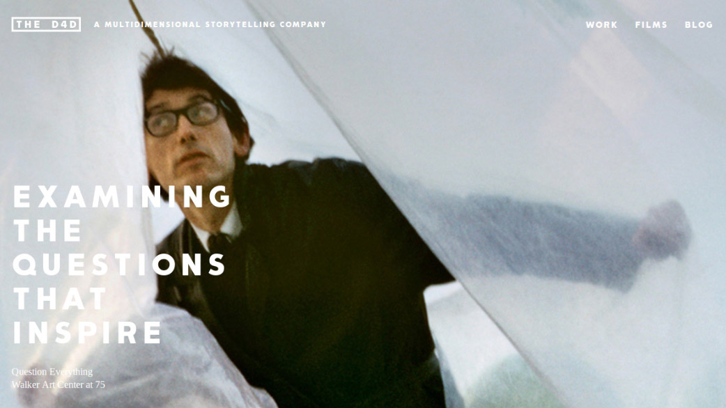
The D4D’s new website uses full-screen, impactful imagery to sell its case studies, but it’s the image selection that really raises eyebrows.
Daily design news, reviews, how-tos and more, as picked by the editors.
Light years away from the kind of bland, corporate-style photography of most design agency sites, the D4D has taken a real risk in picking a series of oblique, off-kilter, arty stills. It’s a risk that really pays off, though, giving the site a sense of personality and marking the studio out as a true innovator.
03. North 2
Based in Zagreb, Croatia, North 2 is a small studio that describes itself as “packed with creative energy”. Founded in 2010, its clients include building and architectural firm Hassan Abul, food production company Atlantic Grupa and cycling firm Bicikli Fumić.
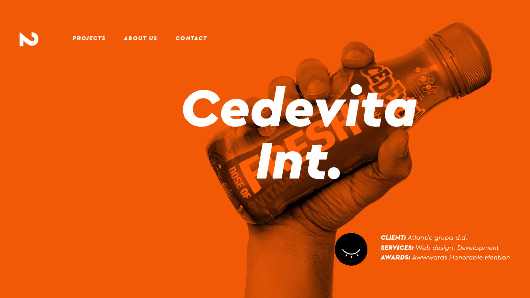
When it comes to presenting client work on an agency website, the normal approach is to use screengrabs or photography from the project itself. But here North 2 has decided to do something a little different.
On its new site, each case study in the carousel is represented by a bespoke piece of photography; of a hand holding up a relevant product. It’s quite an original strategy, and likely to appeal to any client looking for someone to take a thoughtful and imaginative approach to their day-to-day work.
04. Josephmark
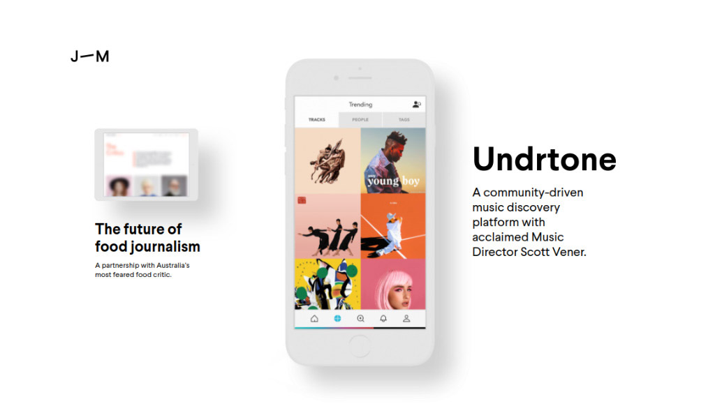
Founded in 2004, Josephmark is a global digital design company headquartered in Queensland, Australia. Its clients include community-driven music discovery platform Undrtone, startup hub Vest and social TV company Xumo.
One of the biggest frustrations when it comes to promoting agency work is when you’ve got numerous exciting projects you want to tell the world about, but you can’t because they’re not finished and so there’s nothing to show. Josephmark has found a rather elegant solution to this on its new site, by dividing its portfolio into ‘In-Progress’ and ‘Complete’. The former is represented pictorially by a colourful but blurred out image.
It’s a great idea, because this way you can see the range of activities the studio is working on at a glance, rather than assuming that, because there’s not much on show, it doesn’t have many clients.
05. Canvas United
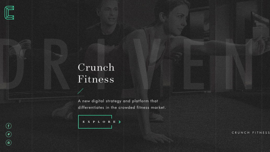
Canvas United is a full-service digital agency based in New York City. Founded in 2005, its clients include Showtime Networks, Credit Suisse, BBC Worldwide, and Estee Lauder.
While most agency websites seek out the most colourful and vibrant images for their site, Canvas United has gone defiantly in the opposite direction. It has brought all its project images firmly into the background behind a dynamic, monochrome filter that resembles the flickering picture from an old-style TV.
While it’s an odd approach, it works brilliantly in creating an original look and feel to the site, making you feel like this is not the standard agency but a bunch of people who think about things a little differently.
06. Epok Design
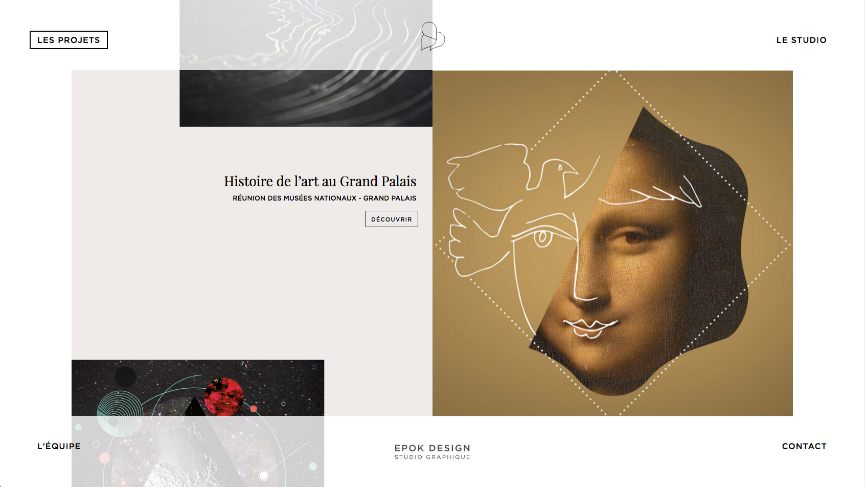
Founded in 2009 in Paris, France, Epok Design is a creative studio dedicated to visual identity, print and web design. Its homepage uses an unusual device that ‘frames’ the carousel of project images within a rectangular menu of options on each corner.
This adds an element of dynamism to the presentation, plus we like that if you keep pressing the arrow, you get extra text; keep going and yet more projects appear.
07. Boorbool
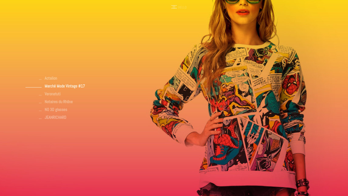
Founded in 2001 and based in Lyon, France, Boorbool specialises in global communication, graphic design and multimedia development. Its clients include fashion event Le Marché de la Mode Vintage Lyon, legal institution La Chambre des Notaires du Rhône and watchmaker Jean Richard.
Its website, new for 2017, makes great use of full-screen imagery as you scroll up and down the list of projects. While not all of the clients are that exciting, the images are brilliantly chosen and work successfully in drawing you into the world of the studio and its activities.
We’d like it to do something about the white text, though, which did present legibility issues on the devices we viewed it on.
08. Apploud
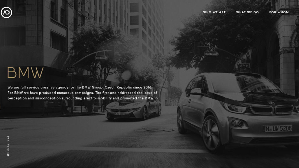
Founded in 2012, Apploud is a digital agency based in Prague, Czech Republic, that offers a mix of strategic thinking, creativity and technology. Its clients include BMW, MINI, Red Bull, Bang & Olufsen, Jaguar Land Rover, Vodafone and Airbnb.
Like Canvas United above, Apploud makes great use of monochrome on its new website. This treatment gives images that might otherwise look a little bland and corporate an arty sheen that provides an atmosphere of sophisticated thoughtfulness.
09. Equal Parts Studio
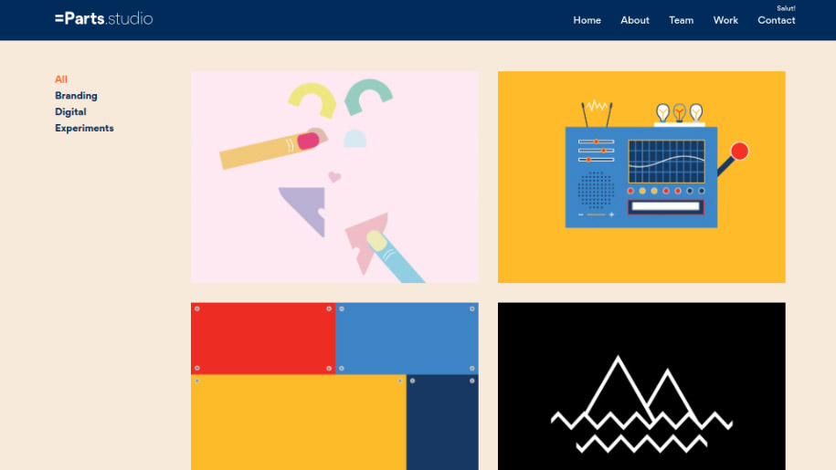
Founded in 2016, Equal Parts Studio is a studio in Toronto, Canada, that focuses on branding and digital design. Specialising in visual communication for small businesses and startups, it especially enjoys tackling challenging projects that combine multiple media.
When it comes to visually representing projects, most agencies either opt for stills or video, or occasionally a combination of both. Equal Parts Studio, however, takes a different tack, turning graphics from case studies into cute little GIFs. It’s bright, cheerful and a breath of fresh air for anyone bored with seeing the same cookie-cutter agency portfolios over and over again.
10. Merci-Michel
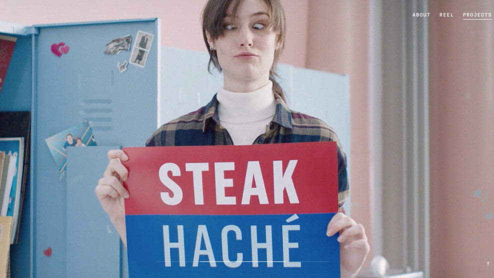
Merci-Michel is a digital production house based in Paris. Founded in 2012, it specialises in interactive solutions, user interfaces and immersive campaigns.
The way it presents images on its site is slick and dynamic, and it really puts thought into grabbing the most fun, offbeat and attention-grabbing stills from its superlative work.

Tom May is an award-winning journalist and author specialising in design, photography and technology. His latest book, The 50th Greatest Designers, was released in June 2025. He's also author of the Amazon #1 bestseller Great TED Talks: Creativity, published by Pavilion Books, Tom was previously editor of Professional Photography magazine, associate editor at Creative Bloq, and deputy editor at net magazine.
