Don't tell us the parallax scrolling websites trend has come and gone! Even in 2024, who doesn't still feel at least a tiny bit of delight when they scroll down a site and see that smooth movement of the background behind the foreground elements? Among changing web design trends, good parallax scrolling has hung around since it revolutionised the space in around 2010.
That's because parallax scrolling is fun but also an effective way and relatively simple way to create an immersive user experience. Sure, it adds to the weight of a site, and it can be overdone (see our first example below!), but it can be great for storytelling, and it can be used sparingly for subtle effects that make the foreground stand out and encourage users to stay on a page and keep scrolling – great for both SEO and conversions.
01. PORSCHEvolution
Parallax scrolling websites are a great way to tell a story, including one that's unfolded over many decades. The PORSCHEvolution site shows how Porsche cards have evolved, from the Type 64 Racing Coupé of the 1930s to the 2021 911. Created by UX designer Ondrej Homola, the parallax scrolling is super smooth, and it's made even more engaging through the soundtrack – Daft Punk reimagined for every decade since the 1930s.
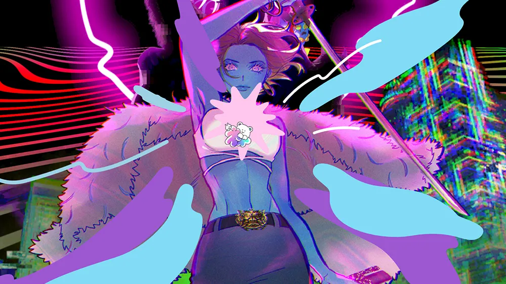
02. Hadaka Co
This Japanese parallax scrolling website is a lot – too much really for many uses, but it's a stunning example of the impact that parallax scrolling can still make. Also pictured at the top of this article, hadaka.jp features bright neon lines, someone flying a robot cat, a girl with a sword, a bunch of cute anime characters (did I mention that the site's Japanese?).
I'm not sure what it all says because some of the text is in Japanese, but the phrases 'We naked all to wonder' seems to fit just perfectly. Both the copy and the web design have me wanting to see more from this design agency. The site does also demonstrate one of the common drawbacks to a lot of parallax scrolling in that it takes some time to load.
03. Browser history 2020
After what was a very difficult year for businesses of all kinds in 2020, Squarespace decided to celebrate some of its customers who had launched new ventures against the odds. It commissioned six portraits of success stories that range from the comedian Ziwe Fumudoh to French actor-turned-baker Richard Valls and the fitness studio Good Move. As well as depicting each subject in beautiful illustrations, the whole online project, including Q&As with each person, is strung together with parallax scrolling that keeps us browsing to the end.
04. Web design art history
The history of art and the history of web design aren't two subjects you would necessarily put together, but they are beautifully combined in the captivating site web design art history, which makes the case for web design as a form of art.
The site traces the history, and future, of web design by looking at the history of art, using a whole range of parallax scrolling techniques to offer constant surprise and delight as you scroll down the page. The different techniques keep on coming, but they all serve a purpose, keeping the viewer engaged in the narrative throughout. With a range of links to interesting examples, this is a site that's well worth spending some time to explore.
05. The Qode Interactive Catalogue
The Qode Interactive Catalogue begins with parallax scrolling in the intro. Scroll past that, and you reach a stylised menu that reveals an image when each WordPress theme name is scrolled over. Clicking on the name of each theme then takes you to a scrolling portfolio of example applications that showcase its design possibilities.
It's not the most ground-breaking use of parallax scrolling in this list, but it shows how the technique can be used for a clear purpose and to enhance the user experience in a working commercial website rather than a piece of online art. Through parallax scrolling, Qode efficiently showcases a range of applications for each theme in a way that makes an impact. A scattering of animation is also used to good effect on this site.
06. Canals
Designed by Marcus Brown and developed by Aristide Benoist, Canals takes us on a 400-year journey through the creation and history of Amsterdam's canals, which were built in the 17th century. The site's designed to provide an editorial-style experience comparable to leafing through a lushly produced coffee table volume. Its smooth horizontal scrolling makes great use of parallax to draw attention to each new section of the story and to give the site a subtle impression of depth.
07. The story of The Goonies
Anyone of a certain age is guaranteed to have been a fan of '80s teen adventure flick The Goonies. If that's you, then this site is sure to get the nostalgia flowing. Created by Joseph Berry using WebFlow, The Story of The Goonies is an affectionate tribute to a retro classic. It uses parallax scrolling to draw viewers into the story, and then introduce the characters and reveal more about the film.
08. Louie Sellers
Parallax scrolling can also be very effective for use on portfolio sites. UX designer Louie Sellers uses a number of clever effects to keep visitors engaged right the way to the end of his portfolio site while demonstrating his eye for effective interactions. We love the marker pen that uncaps and then closes when you reach the end of the portfolio, reflecting his business name "Recap after use."
09. Delassus Group
Parallax scrolling websites most often work vertically, but a parallax effect can also be used on horizontal scrolling. This website from the Moroccan fruit grower Delassus Group, makes effective use of that technique to highlight its products in a simple but attractive way. There's nothing radical in the design, but it makes a memorable impression on the user.
10. Dogstudio
The focal attraction of Dogstudio's website is a beautiful animated 3D dog – or is it a wolf? – in the centre of the page. The animated canine scales and rotates as you scroll down the parallax page. Its lighting changes colour as you hover over the titles of Dogstudio's recent projects. Perhaps our favourite touch is that at one point dog revolves in front of some of the page copy, obscuring part of the text and creating added depth. It's a very smooth presentation.
11. New York Times: Tomato Can Blues
In an era of low attention spans and bite-size media, engaging readers in long-form journalism is a challenge. The New York Times shows that parallax scrolling might offer a solution in Tomato Can Blues, an article that combines clever web design techniques with storytelling and comic-inspired illustrations by Atilla Futaki.
Written by Mary Pilon, the article tells the story of a cage fighter. As you scroll through the story, the illustrations come to life with clever animations and alterations, immersing the reader in the content. Futaki's illustrations were based on police records, witness accounts, photographs and the reporter's own notes, and the attention to detail shines through. It's a great reading experience and one of the best examples we've seen of how parallax scrolling can help engage the user's attention and showcase the content rather than itself. It might just offer a sign of the future of online journalism in the process.
12. New York Times: Snow fall
We just had to include another piece from the New York Times, they're so beautiful. The article Snow Fall shows how parallax scrolling can be used to combine different elements to support a story. While the example mentioned above uses illustration to engage the reader in the story, this time the newspaper used parallax scrolling to present a range of photos and video that contribute to the story of the horror of an avalanche at Tunnel Creek.
It was published online in December 2012 but still stands strong as an example of how parallax scrolling can be used to present long-form journalism. The newspaper presented the Pulitzer-winning article in an innovative way that grabbed the design community's attention worldwide and made it one of the first newspaper sites to push the boundaries of what can be done with long-form editorial content online.
13. Firewatch
This website for the game Firewatch is one of the most pristine examples of layered parallax scrolling we’ve seen. It uses six moving layers to create a great sense of depth. The effect feels simple and unobtrusive, and there’s none of the scroll hijacking that sometimes accompanies the parallax scrolling effects.
It's also only used at the top of the page, making the site user-friendly so that the information can be read without the distraction of constant parallax. But it's also very effective. It's a lesson in superb parallax scrolling used in sensible moderation. To see how it’s done, there's a nice demo on CodePen.
14. Orken
There's a lot of movement going on in this bright and bold parallax scrolling website for the fantasy transmedia project Orken. It would be too busy for some situations, but it works well to present the art of this new fantasy world in a way that makes an impact and it seems well-suited to the multimedia approach of the series.
What is parallax scrolling?
Parallax is a technique that's long been used in computer graphics to create a 3D-like sense of depth in 2D scenes. Based on the multiplane camera technique used in traditional animation, it involves making a background image pass more slowly than foreground images, creating an illusion of distance.
It's basically an optical illusion that takes advantage of the way the human eye sees closer objects as larger and faster than things that are further away. It became popular in 2D computer graphics from the 1980s, including games like Sonic the Hedgehog.
When applied to a website as parallax scrolling, the parallax effect happens when the user scrolls down the site using their mouse of trackpad. Essentially a parallax scrolling website makes it look like the background layout moves more slowly than the foreground elements when the user scrolls, creating a 3D-like sense of depth.
How do I create a parallax scrolling website?
Parallax scrolling can be created using Cascading Style Sheets (CSS), which is the coding language used to design the appearance of a website, to set the positions and responses of different visual elements (see our tutorials on creating cool CSS animation effects). For example, you can fix the position of a background image for a section so that it stays still while other elements move.
Some web designers use parallax frameworks like Skrollr and Scroll Magic or the JavaScript animation library GSAP with ScrollTrigger. The easiest way to make a website with parallax scrolling if you're not a web designer is to use a pre-designed template that incorporates this effect. Wordpress has many templates that feature parallax scrolling out of the box (also see our guide to the best website builders for small businesses and the best website builders for artists.
What are the benefits of parallax scrolling?
There are several reasons to consider using parallax scrolling on a website design. It can have an initial 'wow' factor that pleases uses and makes them stay on the site. It encourages continued scrolling, which can also benefit time on site as well as conversions. It can also help tell stories in an immersive and engaging way, for example, revealing the story of a brand.
How should parallax scrolling be used?
There's no right way to use parallax scrolling. It can be made the star of the show, or it can be used more sparingly depending on what's desired. The right choice will depend on the desired effect for any given site. Many creative agencies tend to go heavy on effects on their sites to show off their tech prowess to potential clients and to peers, but they might go for a more subtle approach when it comes to a client's site.
It's important to make user experience the main priority. In many cases, this will mean it's best to keep the parallax effect to a minimum to avoid it becoming a distraction of an irritation for the user. Too much, and it could make it difficult for the user to navigate the site and find the information they're looking for. Parallax movements may be best used on only part of the screen. If you are going to use a heavy parallax effect, you might want to provide a button to allow users to toggle it on and off.
You must confirm your public display name before commenting
Please logout and then login again, you will then be prompted to enter your display name.
