How to design a striking magazine cover
5 key factors to consider when designing a newsstand magazine cover.
Sign up to Creative Bloq's daily newsletter, which brings you the latest news and inspiration from the worlds of art, design and technology.
You are now subscribed
Your newsletter sign-up was successful
Want to add more newsletters?
Designing a successful magazine cover is tricky at the best of times but when you’re a consumer magazine trying to vie for attention on a packed newsstand then it’s of the utmost importance that your cover works as hard as it possibly can to stand out.
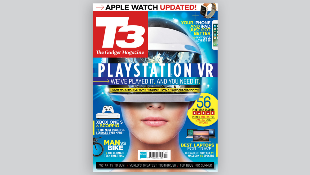
Through the next five stages I’ll dissect a recent T3 magazine cover that I designed, outlining the process that not only I but we as a team went through to achieve the finished result.
01. Start with a good idea
Having a good concept or idea is key to the success of any cover design. It’ll unify the cover as whole, feel like an event and grab the attention of the casual browser on the newsstand.
In this case we knew we wanted to make the main focus of the cover VR as it’s one of the biggest things going on in tech right now. We had been running mainly product-led covers but as this is a VR headset we felt that a model was necessary to convey the experience of VR.
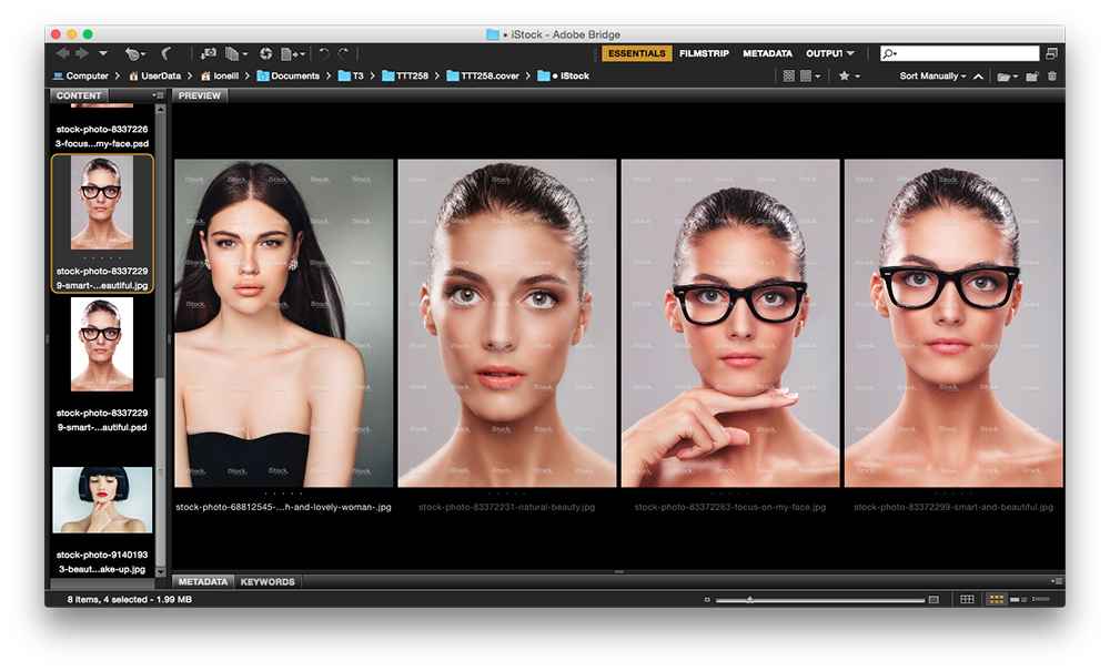
With no time to execute a model photo-shoot I began scouring iStock for suitable models that could be successfully comped together with the VR headset. After much contemplation and discussion we settled on this image from PeopleImages.
02. Main focal point
One of the key factors in standing out on a packed newsstand is to have a strong focal point. This can be anything from a face with strong eye contact or a bold typographic treatment, but it’s important that the main focus is in the top third of the cover due to the way that magazines are racked.
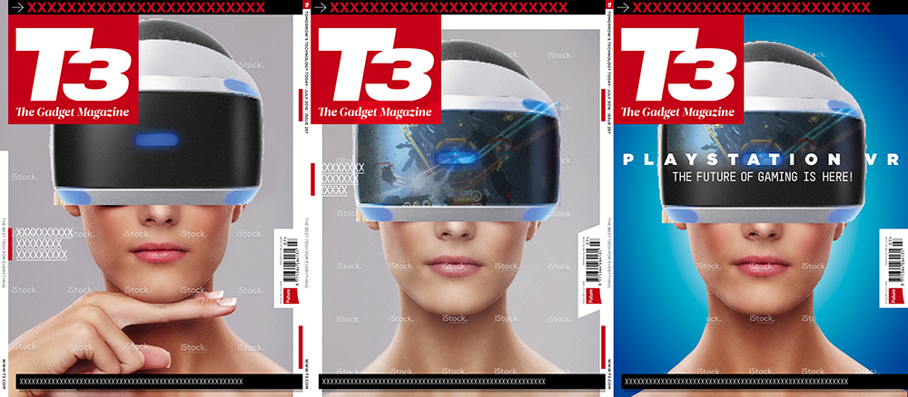
Once we’d decided on the stock image I began mocking up some cover compositionals, roughly comping the stock image with the headset and experimenting with some basic type treatments.
Sign up to Creative Bloq's daily newsletter, which brings you the latest news and inspiration from the worlds of art, design and technology.
At this stage, we knew the black visor wasn’t going to be enough to grab the attention on the newsstand. So we made the decision to feature a game on the visor to give an idea of what the viewer is experiencing.
03. Hierarchy of elements
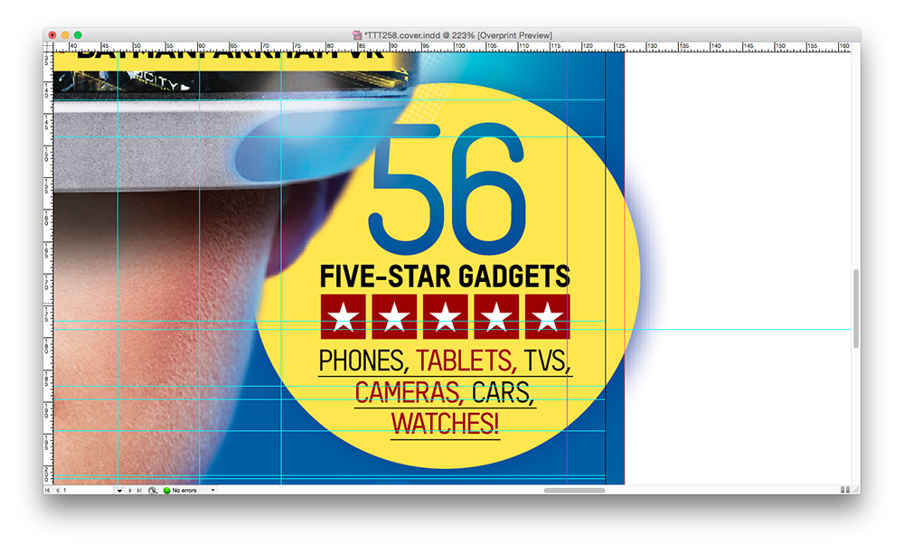
Hierarchy is extremely important on a magazine cover and you want content that you really want to 'sell' to stand-out from the rest.
In terms of placement there are 'hot' areas on a cover where key information should sit if you want to draw attention to it. Top third for main coverlines, plus top right or directly under logo for key secondary lines. A 'flash' or circle will catch the eye and denote value on a cover, so use these devices to sell key content.
04. Typographic treatment
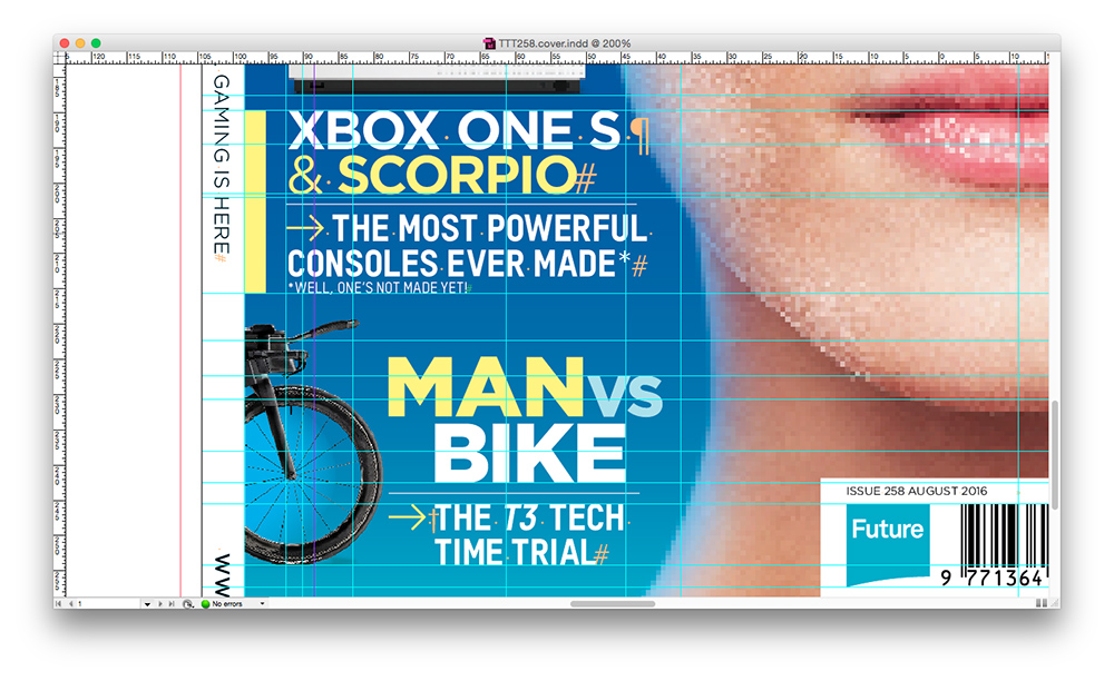
The typographic treatment on a cover is a large part of what will give a magazine its unified aesthetic and most magazines will have a set of fonts that they use within the magazine and then a handful within that set that they regularly use on the cover.
For this cover I used two of T3’s house fonts, Gotham and T-STAR. Gotham has an almost utilitarian feel to it and T-Star a very 'high-tech' feel, so perfect for this VR cover.
For the main headline, I used the condensed version of Gotham and tracked it wide to further bolster the high-tech and futuristic feel of the cover.
05. The wow factor
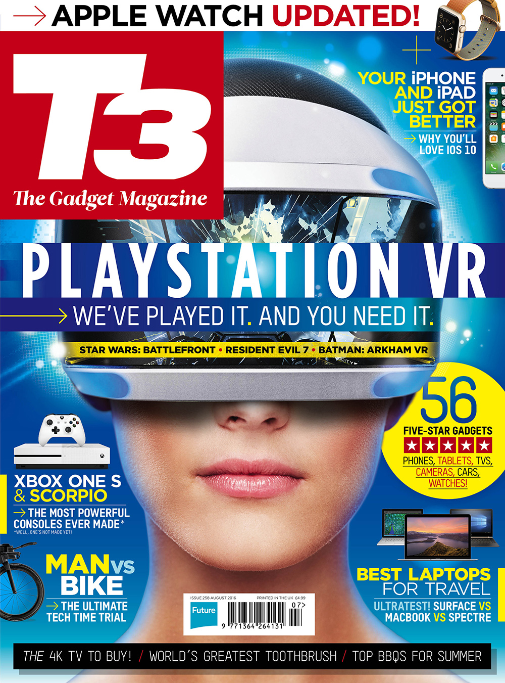
Every successful cover has a certain something that sets it off and as a designer it’s that something that we’re always searching for. It could be any number of things from a minimal but clever use of negative space to an eye-catching image and type treatment.
For this VR cover I decided that restraint wasn’t what we needed to go for and decided to go all out on the whole 'VR' look of the cover. We comped a more exciting game on to the visor, added in lots of graphic elements and glows around the headset and main headline and added some blue fringing around the stock model to make her better gel with the background.
It’s details like this that will help to unify your cover as whole and really make it stand out from the crowd.
Luke is a creative director, visual designer and digital artist, who works at THG Studios in Manchester as creative director of beauty. He previously worked for Future Publishing, where he was art editor of leading magazines such as Guitarist, T3 and Computer Arts.
