8 expert tips for creating a killer design portfolio
Sign up to Creative Bloq's daily newsletter, which brings you the latest news and inspiration from the worlds of art, design and technology.
You are now subscribed
Your newsletter sign-up was successful
Want to add more newsletters?
You've put a ton of work into your portfolio. But it doesn't seem to be cutting through. What's going on? Well, remember that creative directors and hiring managers get dozens of portfolios daily. In fact, they might even get hundreds. So standing out requires more than just good design work. It demands strategic thinking, careful curation and compelling presentation.
The challenge lies not just in showcasing your technical skills, but in telling your unique story as a designer. Whether you're a recent graduate seeking your first role, a middleweight designer looking to advance, or a seasoned professional pursuing new opportunities, your portfolio needs to instantly communicate who you are, what you do, and why it matters.
To help achieve that in practice we've gathered insights from leading creatives across the US and UK to help you craft a portfolio that truly resonates. From agency founders to creative directors, these industry experts share their perspectives on what makes a portfolio stand out. For more inspiration, also see our favourite design portfolio examples.
Article continues below01. Quality over quantity
We'll start with the piece of advice that you'll hear from absolutely everybody, and for good reason. A portfolio needs to be edited. No one, except possibly an elderly relative, wants to see a scrapbook of absolutely everything you've ever worked on. Instead, design leaders want to see a short, precisely curated selection of your best work.
Jessica Walsh, founder of creative agency &Walsh, speaks for many when she says. "I prefer quality over quantity with portfolios. I would much rather see a few strong pieces than a few strong pieces amongst numerous mediocre pieces. Generally, I’d start and end with your best projects to capture someone’s interest and end on a good note."
Renata Amaral Morris, founder of design agency EAT Studio, takes a similar line. "Less is more," she stresses. "A portfolio with five to eight great projects will make a stronger impression than one that includes a mix of great and average work, which can bring down the overall perception of quality."
02. What to include
So should you include a diverse range of work, or a more niche focus in your portfolio? "It doesn’t matter as long as the portfolio highlights what you do best," responds Renata. "We work with both generalist designers and those who specialise in key industries. What’s important is showcasing prime work – what’s freshest, most beautiful, and relevant."
Sign up to Creative Bloq's daily newsletter, which brings you the latest news and inspiration from the worlds of art, design and technology.
Visual artist Craig Black echoes this advice. "If you're applying for a specific role or targeting a particular industry, a niche focus that aligns with that direction is more impactful," he explains. "However, for someone just starting out or seeking to establish themselves, a diverse range of work can show versatility, experimentation and growth."
That said, Craig adds that: "Even in a diverse portfolio, there should be a sense of cohesion – something that ties the work together, whether it’s a unique style, consistent storytelling, or a clear purpose behind each project."
Jessica adds something else to think about. "Consider what work you love doing most," she advises. "The work you show in your portfolio is often the work you get hired for. So you may want to skew your portfolio towards work you love doing, and want to be making, in the future."
03. Let the work breathe
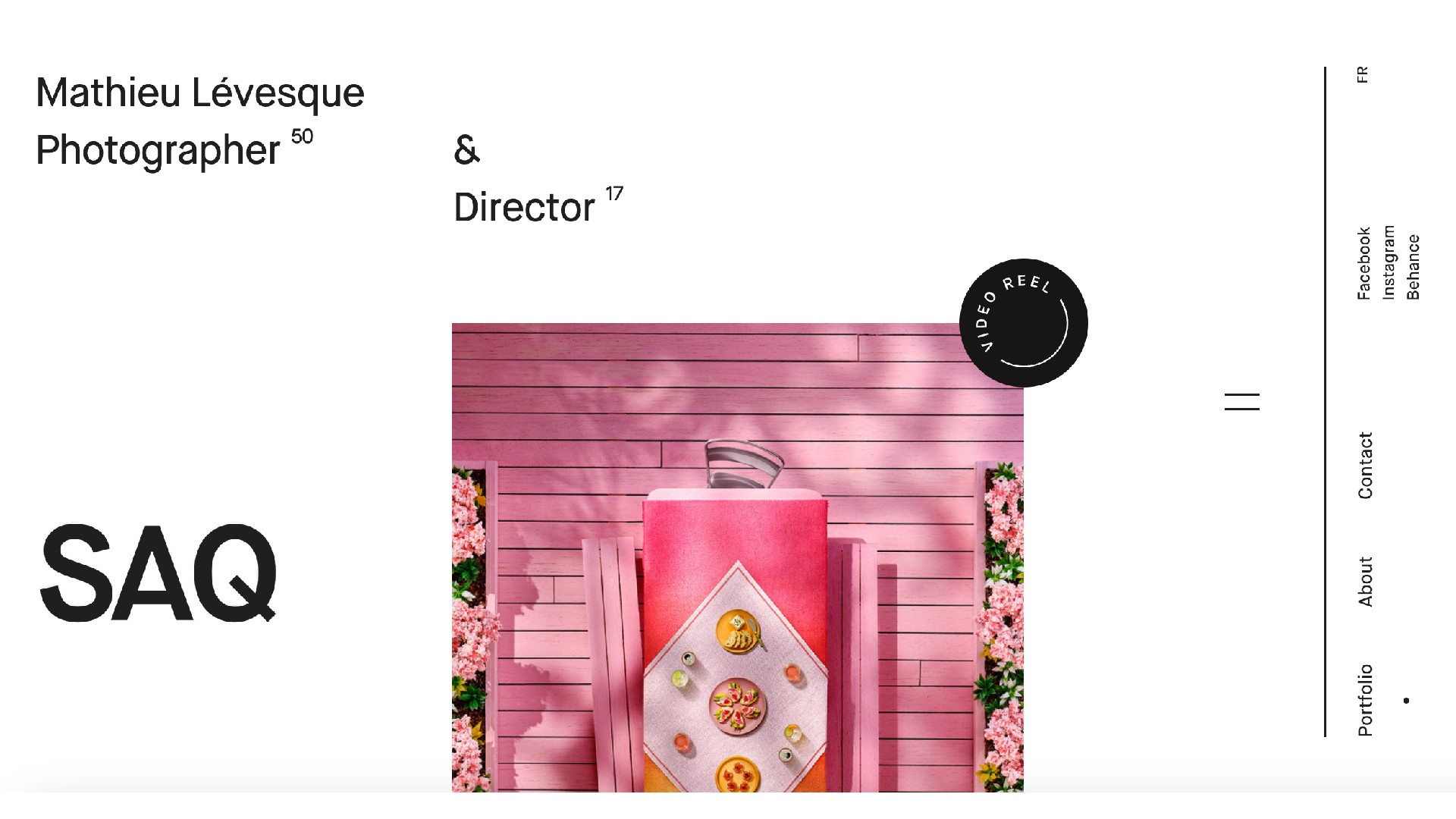
Once you've decided which pieces to include in your portfolio, you then have to find the best way to present them. However you go about this, the important thing is to make creative use of space, and let the work breathe.
"Simple, large thumbnails for a project gallery and big images on detail pages are ideal," advises Renata. "Websites that rely heavily on fancy animations or transitions can detract from the work itself, which should always be the focal point."
Similarly Abi Sargant, a midweight designer at Taxi Studio, recommends you "don't cram five to six images on a page. Instead, blow up key imagery to make a bold impact. Remember, portfolios are often reviewed on screens – whether it’s a phone or a laptop – so celebrate your work and present it in the best way possible. Show confidence in your visuals."
04. Focus on storytelling
Obviously, you want the work in your portfolio to look aesthetically pleasing. But if that's all you do, you've actually failed.
Why? Because eye candy by itself doesn't tell a prospective employer much at all. They want to glance at your portfolio and immediately get a sense of what kind of designer you are. And that means it needs to tell a story. Your story.
"Storytelling is absolutely essential," stresses Craig. "It’s what transforms a portfolio from simply a showcase of work into a memorable, engaging narrative. "For me, a portfolio isn’t just about presenting the final pieces; it’s about sharing the journey that brought them to life.
"The best way to document your creative process is through a combination of compelling visuals and concise, purposeful descriptions," he continues. "I use imagery and video to illustrate my process, showing how each step translates into the final creation. Taking the viewer on this journey helps them gain a deeper understanding of the project and the thought and craftsmanship behind the work."
05. Explain your process
Central to the narrative of your portfolio should be not what you did, but why you did it. As Frédéric Marchand, president of Locomotive, explains: "A strong portfolio goes beyond showcasing work – it reveals the thinking behind it. What problem did you solve? Why did it matter? Whether through case studies, design iterations or technical breakthroughs, sharing the journey adds depth to your expertise." This approach helps potential clients understand not just what you did, but why it matters.
With this in mind Issy Atkinson, a designer at Taxi Studio suggests you: "Create at least two portfolios. Have one that is narrative-driven and conversational, designed to talk through in interviews, and another for email sharing, which should focus on highlights."
That doesn't mean, though, that you should write War and Peace. "When it comes to annotating portfolios, less is more," says Becky Lysaght, senior designer at Taxi Studio. "Employers are often time-poor and won't have time to read long descriptions. So you'll normally want to limit text to one or two sentences per page."
06. Consider video content
Video content isn't essential, but it's certainly a tool that you might consider to improve your portfolio. "A well-crafted video reel is a powerful way to showcase your personality, process and creative style in seconds," advises Frédéric. "We’ve seen how an engaging reel can make an immediate impact, distilling your best work into a format that’s quick to absorb and hard to ignore. Use it as a highlight feature on your homepage or as an additional layer within project pages."
07. Make it personal
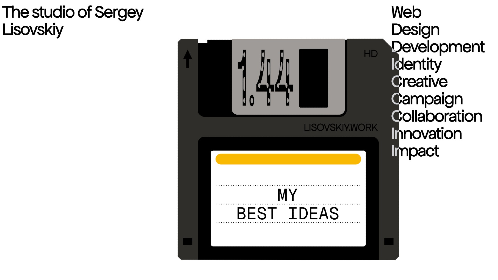
When you're compiling a portfolio, it's tempting to show a version of yourself you think people want to see, rather your true self. But that can easily backfire, because actually most design leaders don't want to see perfection (they know that's not really possible). Instead, they want to see authentic candidates with the potential to grow creatively over time.
You can showcase your authentic personality through your portfolio through the work you select, the copy you write and the way your portfolio is designed. Renata adds that she likes to discover something about your personality beyond just the work. "At EAT Studio, we appreciate having some personal information about the artist, such as a photo, location, interests, or industries they specialise in," she explains. "This helps us match designers to projects."
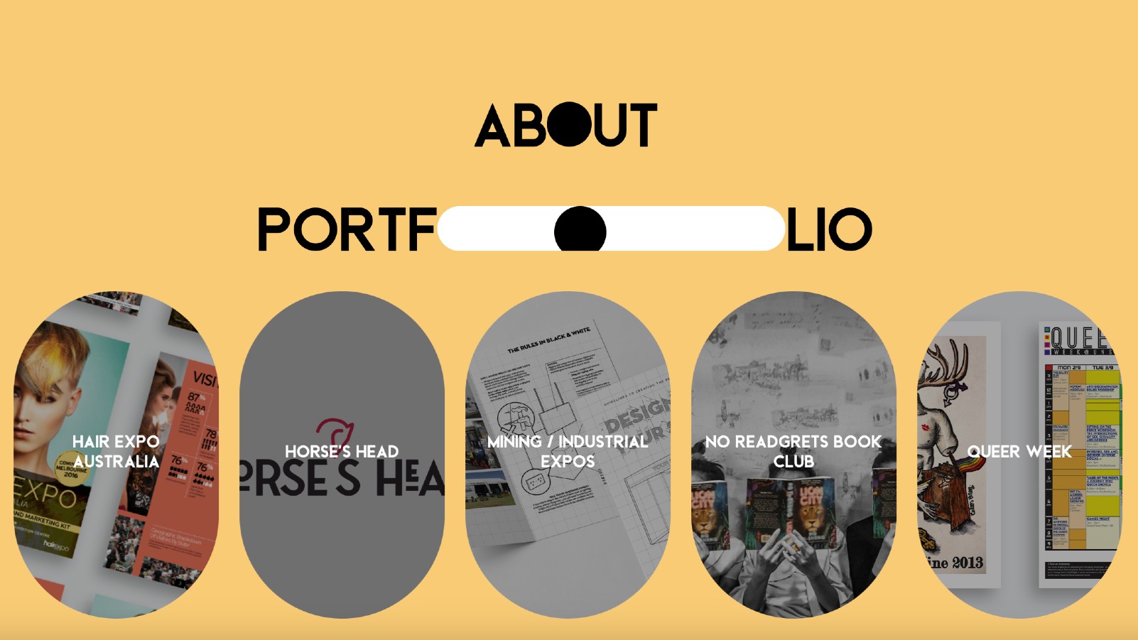
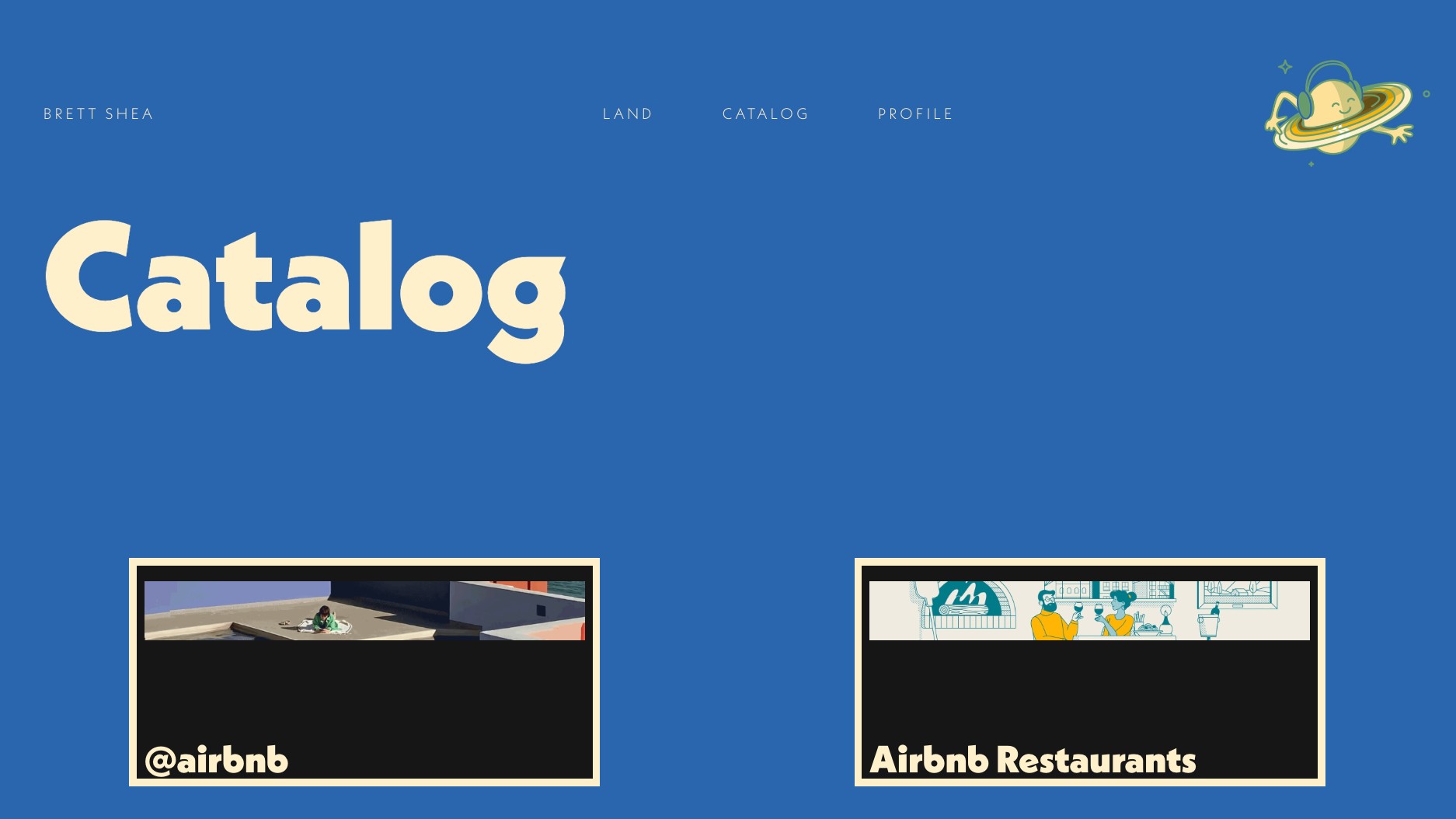
The portfolios showcased on this page are all great examples of creative websites that push the envelope on what a portfolio can be; click on them and you'll instantly get a sense of their creators' personalities. That said, you don't have to match this approach to make a successful portfolio.
"A flashy CV or creative format might catch the eye, but it's the strength of your portfolio that will ultimately secure the job," says Mike Goldsworthy, creative lead at ilk Agency. "Take the time to create and curate a collection of work that best highlights your skills and potential."
08. How to share your portfolio
Wondering about the nuts and bolts of actually sharing the portfolio? It's always worth reading the studio's website thoroughly, as this may specifying how they prefer you go about it. But Renata is typical when she says: "Send the portfolio ahead of the interview in a simple, clean, kind and fun email that lets the work shine. The portfolio should be the star – if the work is great, it will speak for itself, and we’ll be excited to add the designer to our talent database. We pride ourselves on replying to every applicant within 24 hours. It’s something we take very seriously."
She adds: "When we receive portfolio emails, we immediately look at the designs. So keeping emails concise, friendly and personal, rather than templated or mass-sent, is the best approach. It’s essential to clearly showcase the portfolio link or attachment, as that’s where our attention will go."
For more advice on portfolios, see our tips on how to photograph a portfolio and the best portfolio templates.

Tom May is an award-winning journalist specialising in art, design, photography and technology. His latest book, The 50 Greatest Designers (Arcturus Publishing), was published this June. He's also author of Great TED Talks: Creativity (Pavilion Books). Tom was previously editor of Professional Photography magazine, associate editor at Creative Bloq, and deputy editor at net magazine.
You must confirm your public display name before commenting
Please logout and then login again, you will then be prompted to enter your display name.
