Create a diagonal rotation with CSS transitions
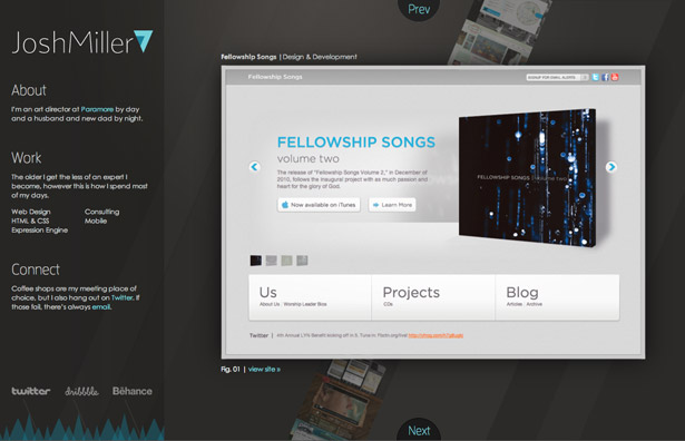
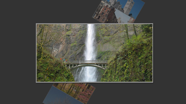
Web designer Josh Miller, the creative director of Paramore, shows us how to turn an unordered list into a rotating diagonal portfolio with CSS3 and jQuery, just like the one he built for joshmiller7.com
Sign up to Creative Bloq's daily newsletter, which brings you the latest news and inspiration from the worlds of art, design and technology.
You are now subscribed
Your newsletter sign-up was successful
Want to add more newsletters?
One of the hardest tasks any designer undertakes is the creation of his or her own site. It has to be interesting, informative, unique and show the work well. All this while satisfying the toughest critic, yourself. The pressure I put on myself while building joshmiller7.com was so enormous it took seven years to actually launch a site. After 20 or so starts, one actually launched. What set it apart for me was a combination of simple design, extreme focus and technical interest. However, I’m proudest of the diagonal rotating portfolio and that’s what I’d like to share with you.
I wanted to spend some time on an element that had some technical challenge and integrated well with the site. The diagonal rotating portfolio brought the excitement of taking on a new challenge and paired it with an overall fun way to display content without sacrificing usability. One of the restraints removed from a personal site is dealing with older browsers. Your past work speaks to your ability to code for the IE7s of the world, so your site can really experiment with what’s fresh. So, let’s dig in and create a diagonal rotation with CSS3 and jQuery.

Semantics and setup
We start with minimal markup. Always make your markup as simple as possible; don’t duplicate elements unless absolutely necessary. Markup should be a semantic outline of your content. With that in mind, here’s all the markup we need:
<ul class="portfolio"> <li><img src="img/portfolio-1.jpg" alt="Image 1"></li> <li><img src="img/portfolio-2.jpg" alt="Image 2"></li> <li class="feature"><img src="img/portfolio-3.jpg" alt="Image 3"></li> <li><img src="img/portfolio-4.jpg" alt="Image 4"></li> <li><img src="img/portfolio-5.jpg" alt="Image 5"></li></ul>There is one simple unordered list of images for the portfolio. A class of “feature” is applied to the list item housing the current highlighted image. That’s it for the HTML, let’s give this list some style.
Create only the large form of your images and use CSS to scale down. In this case all the images are 600 x 300.
Style
The CSS will do quite a bit of work for the markup. We can achieve all of our design and animation with only CSS and move into scripting from there. We’ll move through each element starting with the unordered list.
ul.portfolio{ margin: 50px auto 0; -ms-transform:rotate(30deg); -webkit-transform:rotate(30deg); -moz-transform:rotate(30deg); width: 200px;}This will rotate the whole list 30 degrees clockwise and pull it down from the top of the document. This sets the base for the rotation. Now for the individual list items and images.
ul.portfolio li{ border: 1px solid #999999; height: 100px; list-style:none; margin-left: 0; opacity: 0.5; -webkit-transition: all 0.5s ease-in; -moz-transition: all 0.5s ease-in; -o-transition: all 0.5s ease-in; width: 200px;} ul.portfolio li img{ height: 100px; -webkit-transition: all 0.5s ease-in; -moz-transition: all 0.5s ease-in; -o-transition: all 0.5s ease-in; width: 200px; }This is applying constraints to the list items and images to properly scale them. Since these images won’t be the main focus, we’re dropping their opacity to 0.5, to allow our feature image to stand out even more. At this point, we’ll also set the base for our transitions. The prefixes webkit, moz and o refer to specific browser engines that we want to target. The transition property is displayed as a shortcut. The values refer to property, duration and the timing function.
When the property is set to all as above it means we want to move between all properties that are different between the two elements. In this case it includes border, height, left margin, opacity and width.
The duration is simply how long we want the transition to take as a function of seconds, in this case, we want the transition time to be half a second.
The timing function refers to any easing you want to apply to the transition, in this case we’re going with an ease in.
Finally, we turn our focus to the featured list item.
ul.portfolio li.feature{ border: 5px solid #dddddd; -moz-box-shadow: 3px 3px 4px #222222; -webkit-box-shadow: 3px 3px 4px #222222; box-shadow: 3px 3px 4px #222222; height: 300px; margin-left: -200px; opacity: 1; position: relative; -ms-transform: rotate(-30deg); -webkit-transform: rotate(-30deg); -moz-transform: rotate(-30deg); width: 600px; z-index: 100;} ul.portfolio li.feature img{ height: 300px; width: 600px; }This is applying a series of styles to the list item with the “feature” class to override the inherited styles, and also create the other end of the transition. The negative rotation is canceling out the initial rotation of the list. Setting a high z-index will place this image above the other images in the list, don’t forget the relative positioning to help z-index. We’re also increasing the opacity and size. The result is a really unique list of images ready for action.
Sign up to Creative Bloq's daily newsletter, which brings you the latest news and inspiration from the worlds of art, design and technology.

Scripting
Now that we have everything set up and looking nice, it’s time to get moving. Take time to set up jQuery, then we’re ready to go. Since the transitions are already coded into the CSS, we only need a small amount of jQuery to make this work.
Our transitions are dependent on the feature class, so we use jQuery to switch classes on click. Here’s the code:
$(document).ready(function(){ $('.portfolio li').click(function() { var new_feature = $(this); if (!new_feature.hasClass('feature')){ $('li.feature').removeClass('feature'); setTimeout(function(){ new_feature.addClass('feature'); }, 500); } });});We start with the click function. Once a list item is clicked, we want to make sure it isn’t already the current li. After we know it’s a new one, we remove the feature class from the old list item. This causes a transition to occur shrinking and rotating the element back into the structure of the list.
The setTimeout function allows the transitions to occur sequentially as opposed to simultaneously. Once the first event is complete, the clicked li begins to grow and rotate into the values of the feature class. The change in features is complete.
Once you get the basics of the transitions down you can experiment with other properties. You can fade in information about the feature elements or add in next and previous buttons, even apply keyboard shortcuts. The combination of jQuery and CSS3 is a strong partnerships that leaves the door for creativity wide open.
This is just a small step into the world of CSS transitions. Just in the past week I’ve seen amazing examples like beta.theexpressiveweb.com. It’s a great time to be involved in front-end development. I would love to see what you come up with, don’t hesitate to email your experiments.

The Creative Bloq team is made up of a group of art and design enthusiasts, and has changed and evolved since Creative Bloq began back in 2012. The current website team consists of eight full-time members of staff: Editor Georgia Coggan, Deputy Editor Rosie Hilder, Ecommerce Editor Beren Neale, Senior News Editor Daniel Piper, Editor, Digital Art and 3D Ian Dean, Tech Reviews Editor Erlingur Einarsson, Ecommerce Writer Beth Nicholls and Staff Writer Natalie Fear, as well as a roster of freelancers from around the world. The ImagineFX magazine team also pitch in, ensuring that content from leading digital art publication ImagineFX is represented on Creative Bloq.
