10 beautiful examples of illustration on the web
As more and more graphic designers and illustrators gain web design skills, illustrations can increasingly be found on the web. UK designer Mike Kus showcases his 10 favourite examples of websites using illustration to enhance the user experience.
Sign up to Creative Bloq's daily newsletter, which brings you the latest news and inspiration from the worlds of art, design and technology.
You are now subscribed
Your newsletter sign-up was successful
Want to add more newsletters?
I'm a graphic/web designer and illustrator. For me, understanding how to design and build the front end of a website is part of a modern graphic designer's skill set. The web is just another canvas to design on. There are different considerations when designing for the web compared with designing a magazine layout, for example, but the crossover between the two disciplines is significant.
As more and more graphic designers/illustrators gain web design skills, we’re seeing a growth in the number of websites that use illustration.
I want to showcase a few websites that have caught my eye over the last year or so that use illustration to enhance the user experience.
Article continues below1. CXXVI Clothing Co
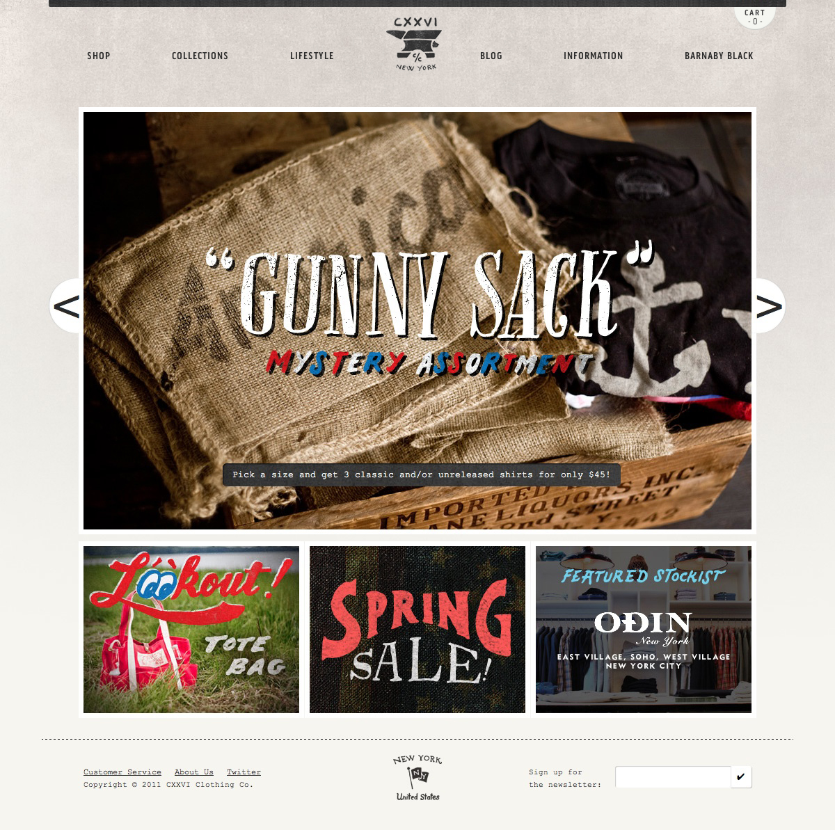
I'm going to start off with one of my favourite example of illustration on the web. CXXVI is a New York clothing company that produces American-made products with a matching aesthetic. The site uses illustration to carry this idea through to the web. Beautifully hand-drawn type creates an authentic handcrafted feel to a site, which already showcases equally good quality clothing products. The illustration reinforces the company's values, style and quality.
There is also a lovely set of hand-drawn product icons to help you navigate through the shop. This site is the perfect example of how illustration can be used to subtly enhance a user's experience without compromising the usability of the site.
2. Polecat
Polecat makes iPhone and iPad apps. It takes a slightly more full-on approach with regards to its use of illustration on its website. The entire site is illustrated, giving the impression that the company oozes creativity. In some ways, because of what Polecat does, I feel that the highly illustrated approach to this design is a little misplaced. It's not obvious at a glance exactly what its specialism is. Having said that, I think I might be picking holes for no reason! There are so many bog-standard website designs out there selling similar services, this one really stands out from the crowd.

3. Gerren Lamson
Something that Gerren Lamson does really well is blend illustration with iconography. Each entry into his portfolio is represented by a beautifully illustrated icon. Iconography can really add identity to a project. Rather than have big, elaborate illustrations, you can add these small bursts of creativity that really add some personality to a site. Iconography is often really useful when working on websites that are really more like web applications. You can create a visual identity to different sections of the site by introducing a family of icons. As well as adding some visual interest to the site, the icons actually aid the user’s journey through the site or app.
Sign up to Creative Bloq's daily newsletter, which brings you the latest news and inspiration from the worlds of art, design and technology.

4. The Many Faces Of... Leonoardo DiCaprio
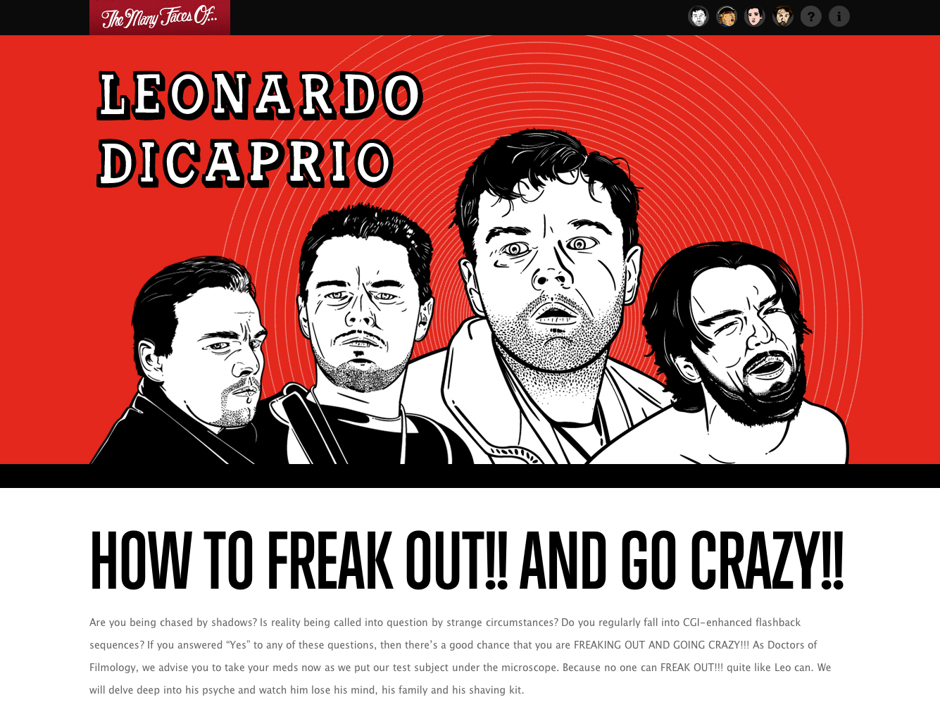
In complete contrast to adding illustrative touches with a set of icons you can also create an amazing impact with giant illustrations, especially when you're happy to dedicate the whole top part of your site to them! One of the best examples of this on the web is on themanyfacesof.com by paravelinc.com. These guys (Trent Walton, Reagan Ray and Dave Rupert) produce amazing web design and I think it's because of their in-depth knowledge of what you can achieve on the web using modern technologies and their understanding of how to combine that with their considerable creative talent.
5. Zaggy
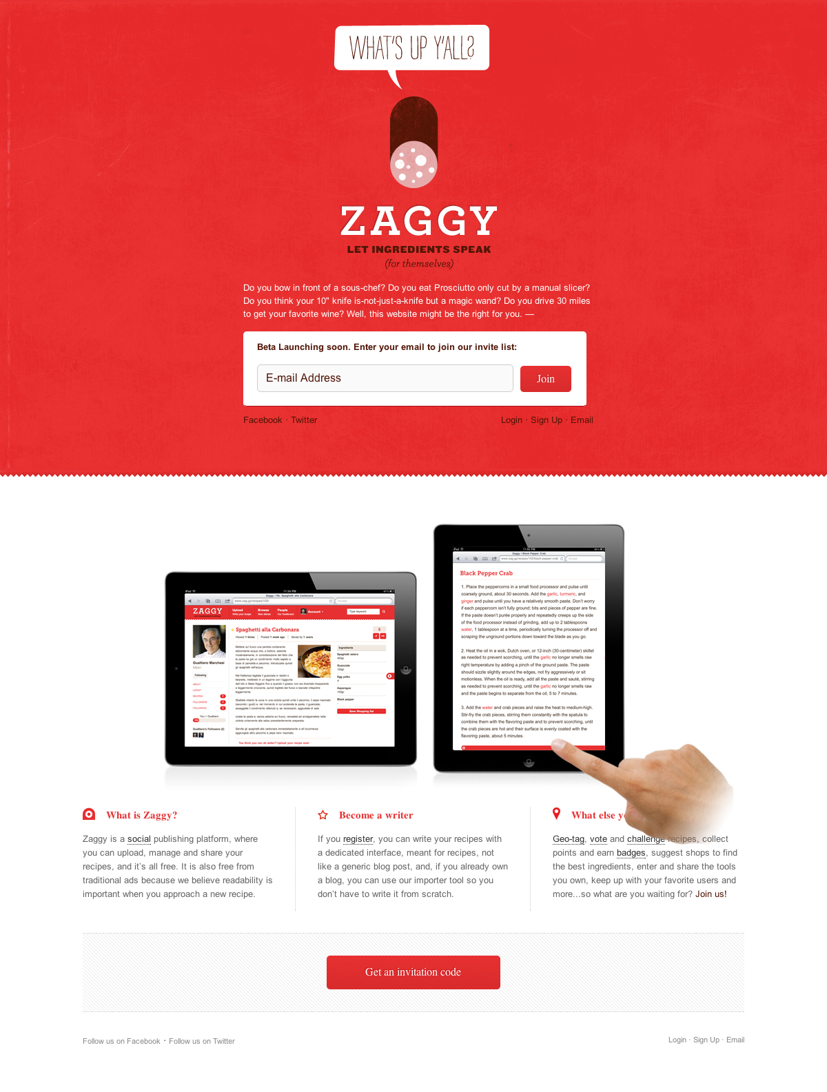
Zaggy is a brilliant example of how a really simple piece of illustration can totally transform the feel of what otherwise would be a pretty plain site. I love this effective use of simple illustrations. It's a reminder to a designer like myself that less is more! This is often the case and I think this site demonstrates this very well.
This is also a good example of how illustration can affect the tone and personality of a site. In this site the illustrations bring a personal and light-hearted feel that would not otherwise exist.
6. Girl Effect
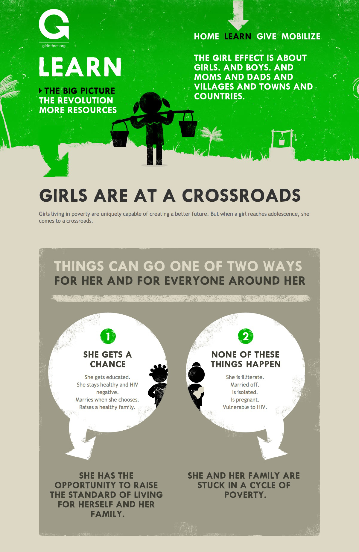
When you're using illustrations in your site design it's a good idea to think seriously about the colouring. Like I said above, less is often more and this is the same when using colour. Normally a small palette of two or three colours is what I'd go for. Girl Effect uses three colours per page and that's including black and white (off white). Each section of the site has one main colour, which gives the illustrations a unique feel on each page and helps the user know where they are on the site. It also creates visual impact.
7. Studio Ten and a Half
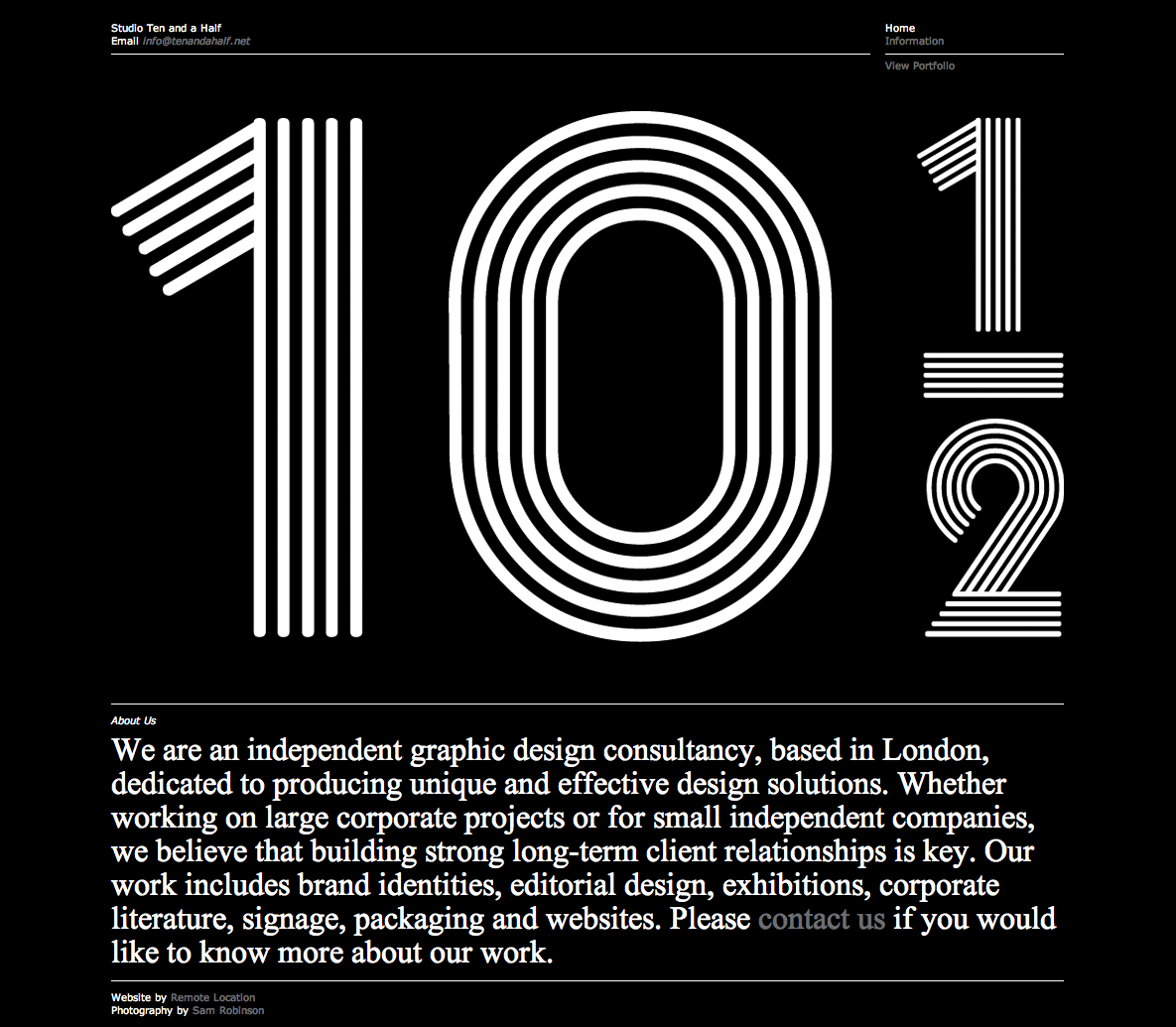
I guess the homepage of graphic design consultancy Studio Ten and a Half isn't really an example of pure illustration but one of illustrative typography. The giant ten-and-a-half changes typeface on refresh and, combined with the pure black and white, creates a really powerful impact. I just love the style of this site. I'd stick it on my wall if I had a decent print-out of it!
8. BountyBev
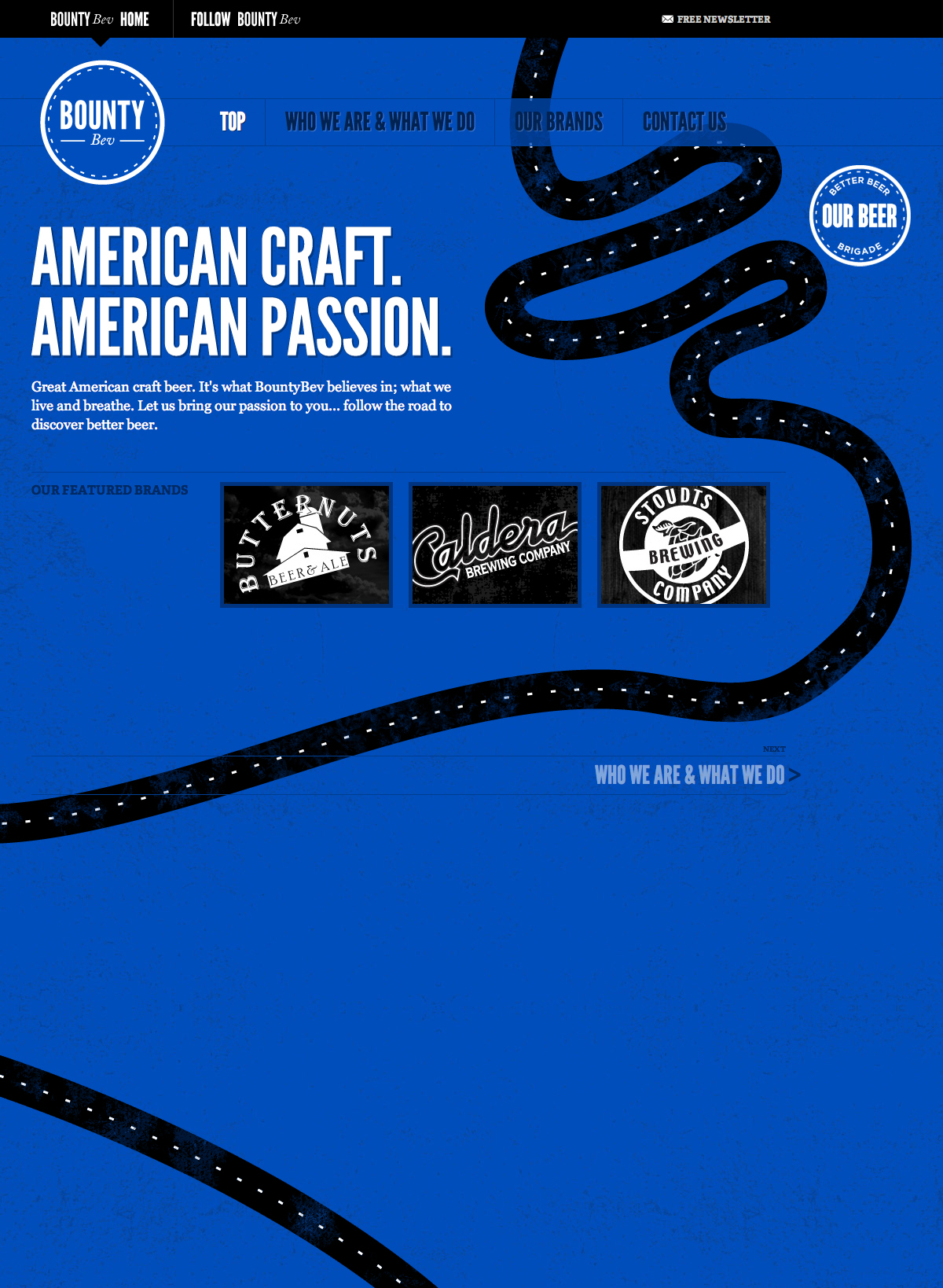
Bounty Bev uses this really fun road map illustration that cascades down the web page, leading the user right to the bottom of the page. The whole site has a sort of story-telling quality, with the road illustration leading the way. The site is also backed by a lovely blue texture which contributes to the site's successful visual design and illustrative quality.
9. Flight of the Conchords
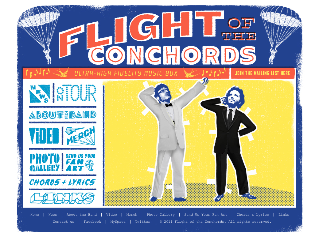
I've included flightoftheconchords.co.nz just because it's fun! It's a retro-styled piece of illustrative print design, but online! It also has an interactive costume changer for Bret and Jemaine… which is very amusing!
10. Voltage: Fashion Amplified 2011
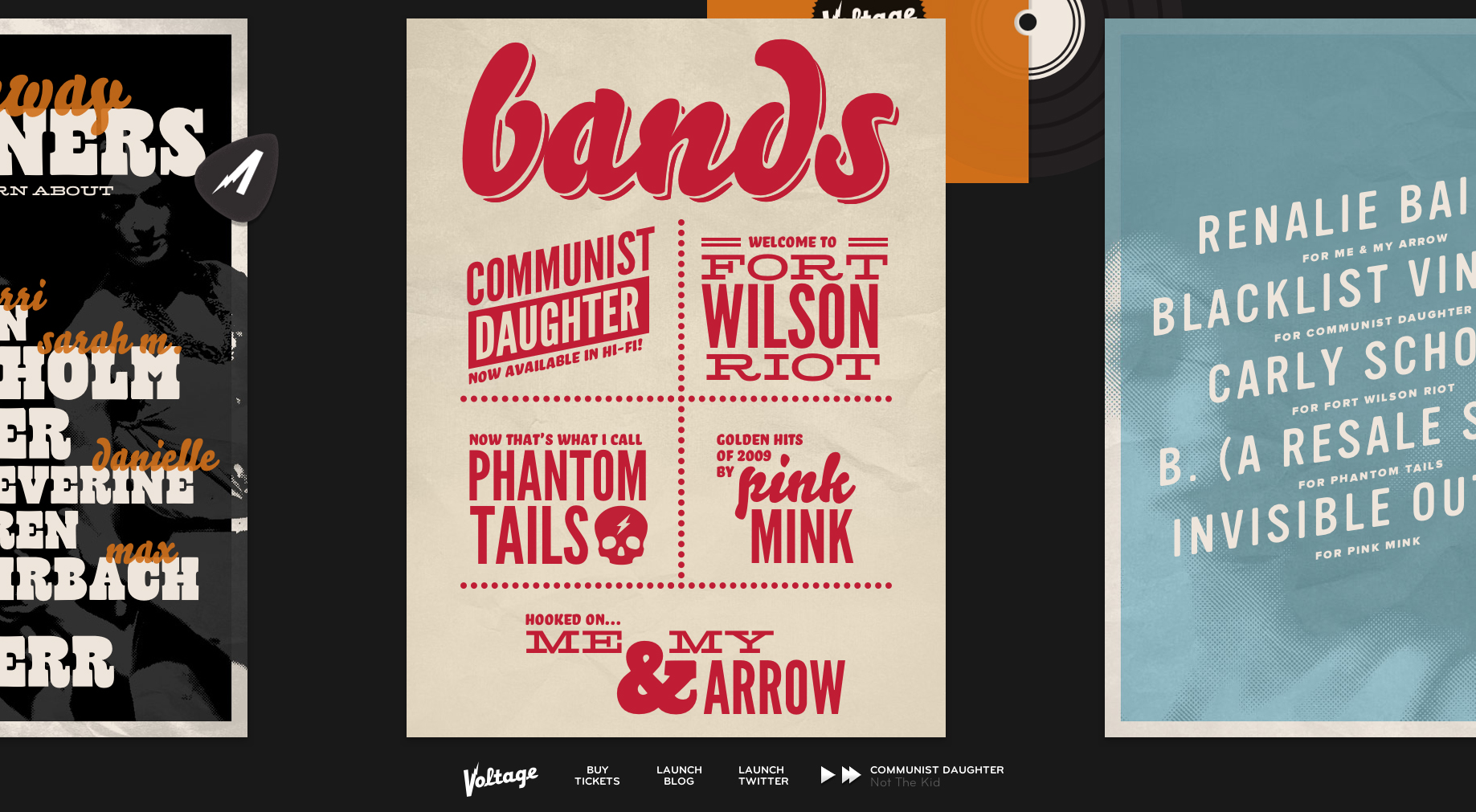
This site, for the American Midwest’s premier rock and fashion show, is really creative. The content is made up of a series of illustrative and typographical posters. It's a horizontal scrolling site, which works well in this case. It's a great example of a designer pushing web design creatively. It's important that some designers really push the creative boundaries of the web so that we can all be inspired by them and push web design forward in our own way.
Do you know any other great examples of illustration on the web? Let us know what you would add to the list in the comments!

The Creative Bloq team is made up of a group of art and design enthusiasts, and has changed and evolved since Creative Bloq began back in 2012. The current website team consists of eight full-time members of staff: Editor Georgia Coggan, Deputy Editor Rosie Hilder, Ecommerce Editor Beren Neale, Senior News Editor Daniel Piper, Editor, Digital Art and 3D Ian Dean, Tech Reviews Editor Erlingur Einarsson, Ecommerce Writer Beth Nicholls and Staff Writer Natalie Fear, as well as a roster of freelancers from around the world. The ImagineFX magazine team also pitch in, ensuring that content from leading digital art publication ImagineFX is represented on Creative Bloq.
