Learn to use visual language to convey mood with bestselling children's book artist Tony DiTerlizzi
Ten techniques for creating illustrations that carry emotion.
Sign up to Creative Bloq's daily newsletter, which brings you the latest news and inspiration from the worlds of art, design and technology.
You are now subscribed
Your newsletter sign-up was successful
Want to add more newsletters?
One thing I'm often asked as a children's book creator and artist is how I convey the tone, mood and feeling I want the reader to experience when I illustrate a story? To accomplish that, I rely on visual language, using a variety of elements to communicate to the viewer.
These range from the fundamental, abstract components of picture-making – line, shape and colour – to more complicated aspects. Let me share some tips on how I open a window into my imagined worlds. If you need any equipment, see our roundup of art supplies and our picks of the best drawing tablets and the best digital art software.
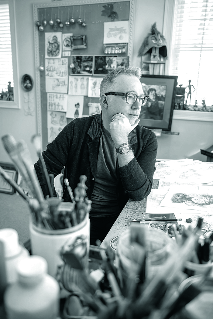
The best-selling author and illustrator has made children’s books for 25 years, including The Spiderwick Chronicles. His sci-fi trilogy, WondLa, has been turned into a series now streaming via Apple TV+. You can learn more about his influences in our piece on Tony Diterlizzi's 1980s inspirations.
01. Create storyful lines
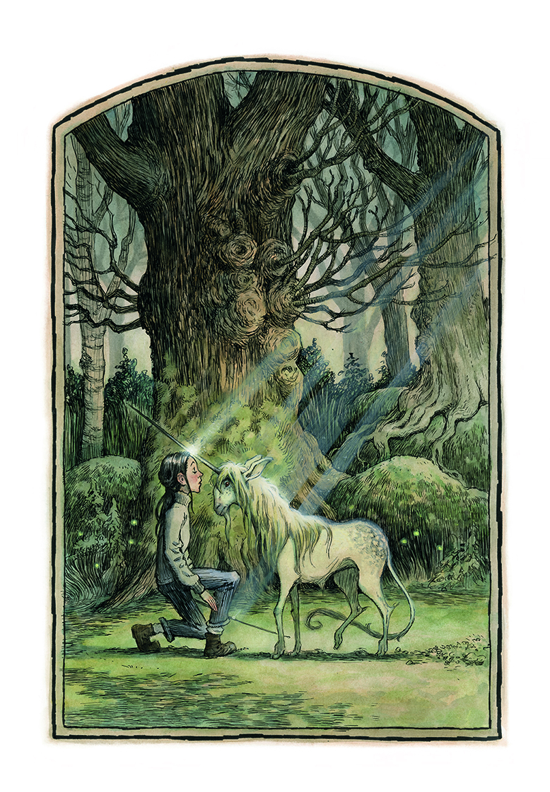
If we look at abstract art, we can see that a simple line can convey emotion. From sketchy and scratchy to sophisticated and smooth, I’ve made use of a variety of linework styles to build the foundation for my images.
For instance, when illustrating The Spiderwick Chronicles, I rendered the art in crow quill pens, creating an elegant calligraphic line. This inking style hearkens back to the imagery from classic fairy tales from the Golden Age of Illustration.
02. Use emotive shapes
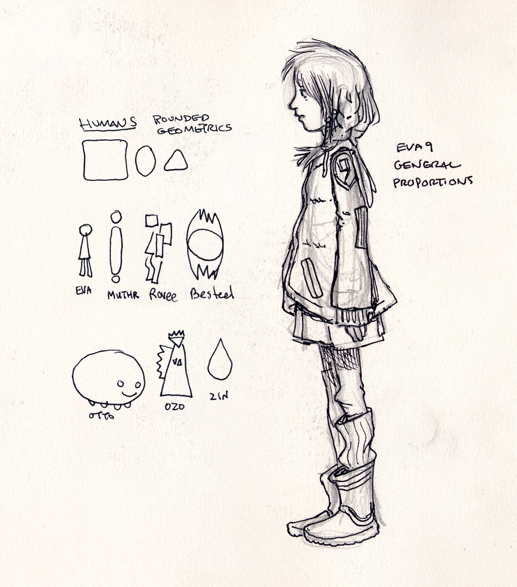
At a basic level, shapes can evoke an emotion. We equate circles and round silhouettes with wholeness or even comfort, while sharp triangles can be seen as power or aggression. Squares often give a sense of stability and solidness.
When I set out to design the cast of main characters for The Search for WondLa, I started with very simple drawings based on shape language. From there, I built up details and added elements to further impart their personalities.
03. Get clever with colours
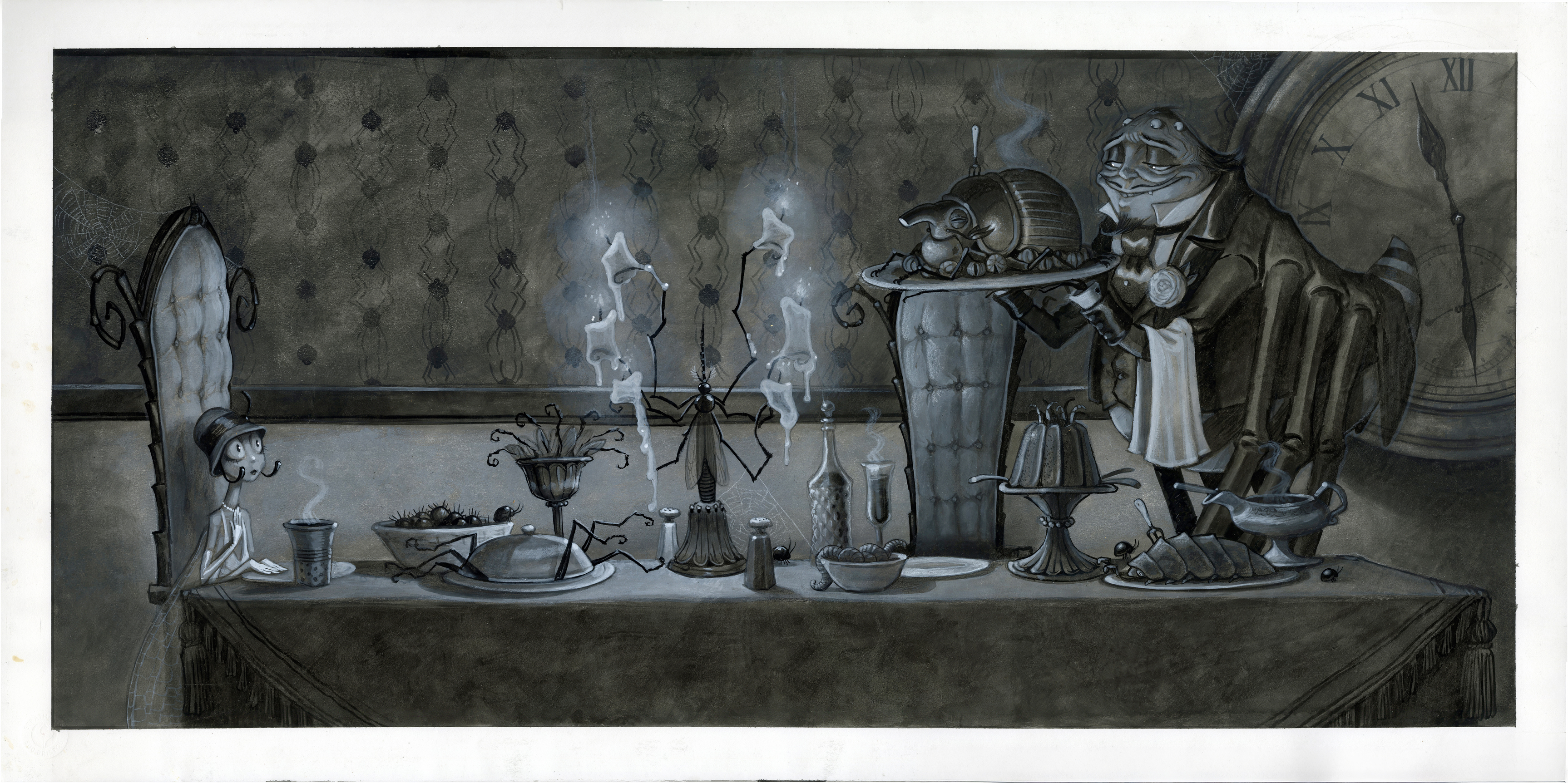
Through life experience with our natural environment, we learn that colour instills us with core emotions. Warmer tones, like red, yellow and orange, can give a feeling of comfort, as if sitting around a campfire, while blues and purples convey a colder sensation.
The lack of colour can create stark imagery (simple black and white) or a complicated, nuanced feeling through varying shades of grey. The monochromatic paintings for The Spider and The Fly suggest chilling horror movies from the early 20th century.
04. Play magic tricks
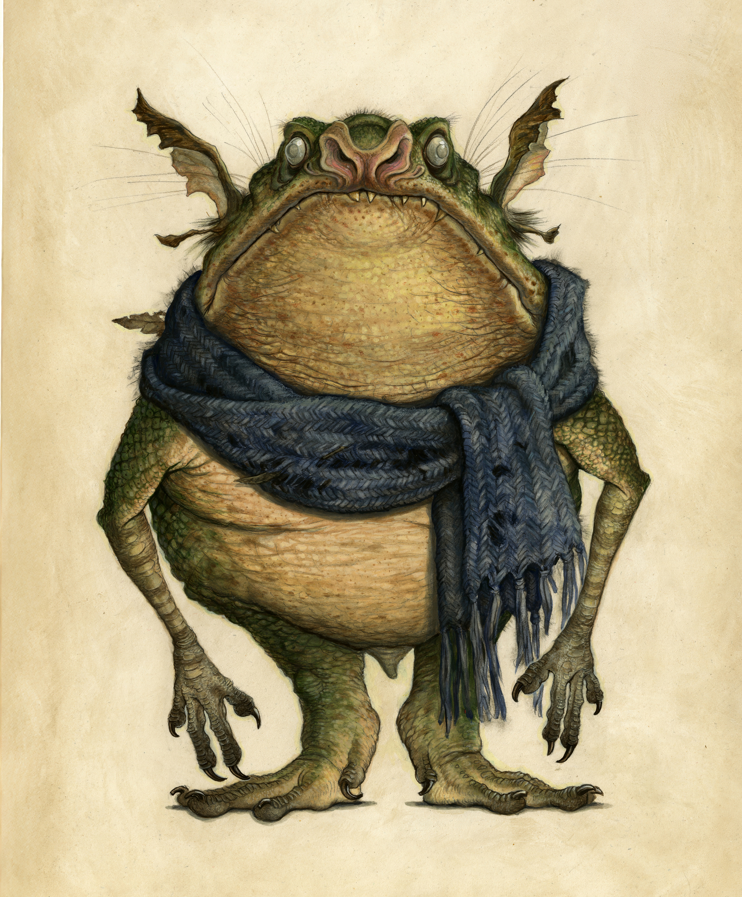
The illusion of a three-dimensional form is one of the best magic tricks in the world of art. Using light and shade, we can suspend the belief of the viewer and show a realistic vision of a world, or plane of existence, that only exists in the mind of the artist.
I made use of my understanding of form while illustrating Arthur Spiderwick’s Field Guide to the Fantastical World Around You. The lifelike renderings cause the viewer to question whether these creatures are real or not.
05. Explore size and Space
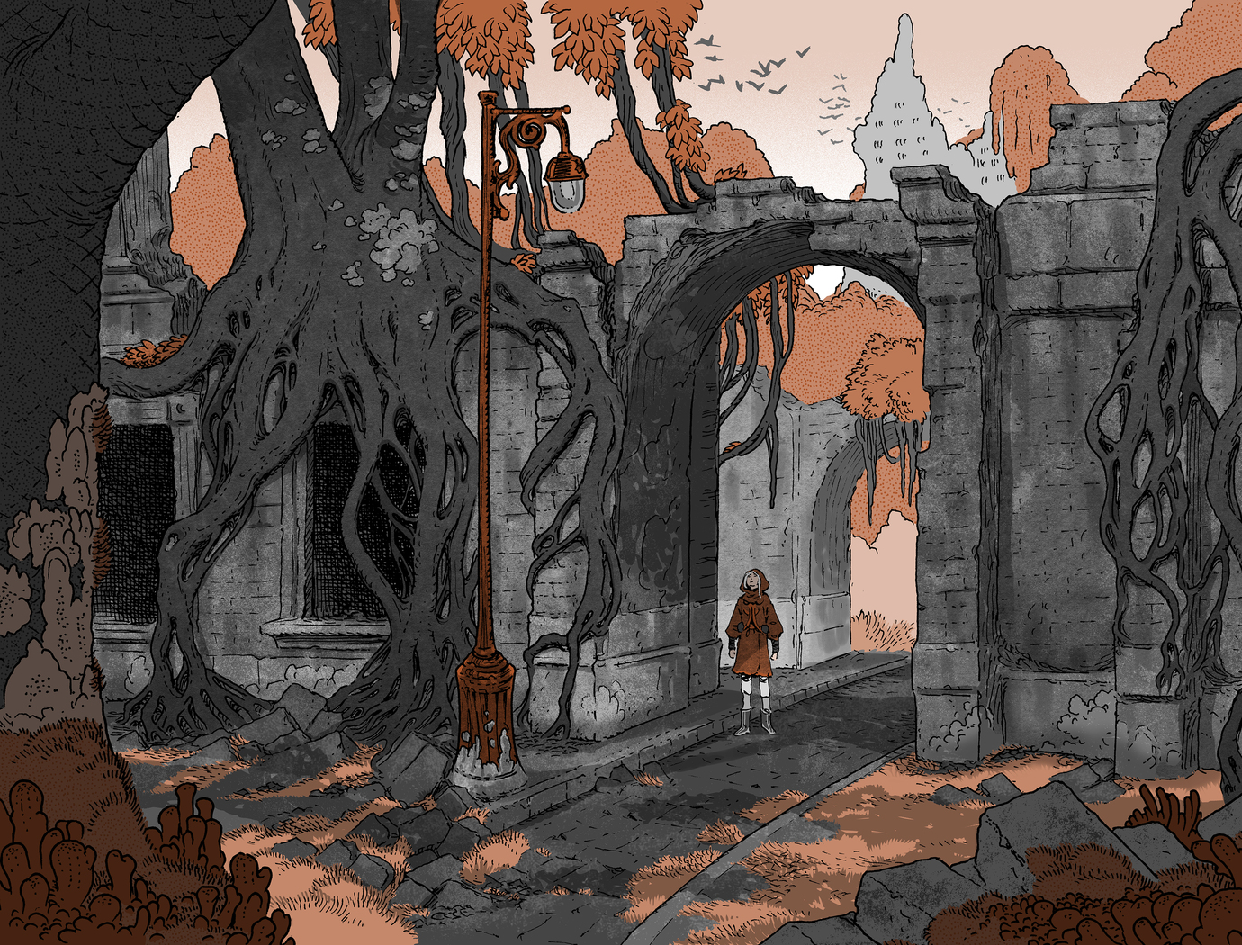
Whether it is positive space (the subjects your rendering), negative space (the area around those subjects) or creating three-dimensional space (by use of perspective), the staging of your image can elicit a sense of scope. Small spaces relay a feeling of coziness or confinement, while expansive spaces create epic vistas.
Spatial rendering is a key element to my artwork, as seen in this image from The Battle for WondLa, which gives a sense of vast ruins beyond the central figure.
06. Consider proportion
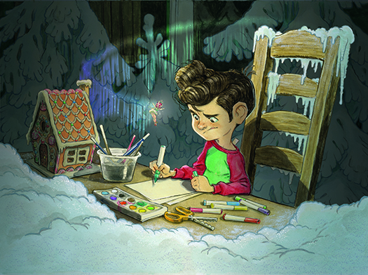
The relationship in size between different elements of a composition gives us a clue on how to perceive an image. Adjusting the size of these elements can push an illustration from one of realism to a more stylised vision.
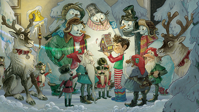
Think of the oversized eyes we often see in manga to show a character’s emotions. For my book, The Broken Ornament, the characters were rendered with slightly exaggerated proportions to give a lighthearted impression to the story, even though it contained deeper themes.
07. Use texture
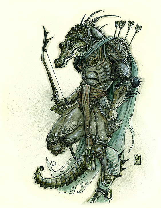
To add dimension, realism or depth to a piece, I add texture to the various elements. From hard, shiny metallics to subtle translucent skin tones, mastering the ability to render different textures can make your images all the more convincing. When I worked on the Dungeons & Dragons setting, Planescape, I often used a natural sponge—dipped in mix of black and umber ink—to create a pitted rusty texture to the armor of characters and monsters.
08. Play with Scale
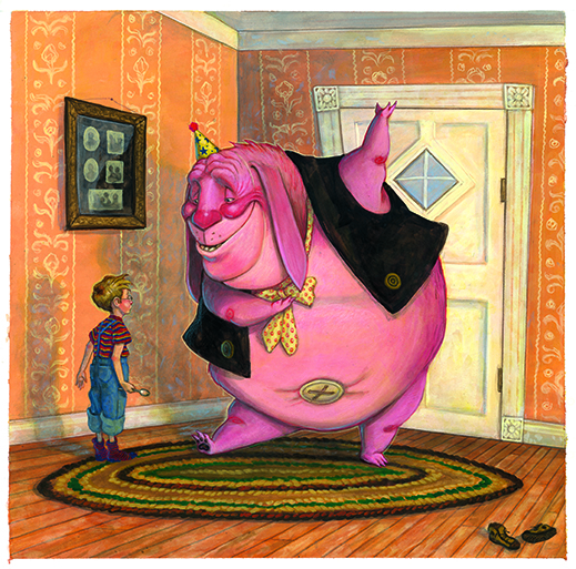
The relationship of rendered objects can have an impact on how the viewer perceives an image. Because most art is made by humans for humans, the scale is usually relevant to humans. I played with scale in my picture book, Ted, where an imaginary friend, who looks like a giant stuffie, creates a feeling of disorder. The reader is unsure if he’s a reliable friend or up to no good.
09. Try out different angles
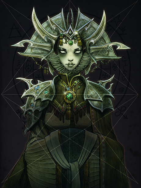
Controlling where the viewer’s eye travels over a piece can be accomplished with angles. The way lines intersect can impact the perception of a piece. Angles are used to create the illusion of depth (by means of perspective) or can be applied more abstractly in the composition of a piece. The “sacred geometry” often used by renaissance artists was used in my rendition of The Lady of Pain for the updated edition of the Dungeons & Dragons multiverse setting, Planescape.
10. Don't forget about orientation
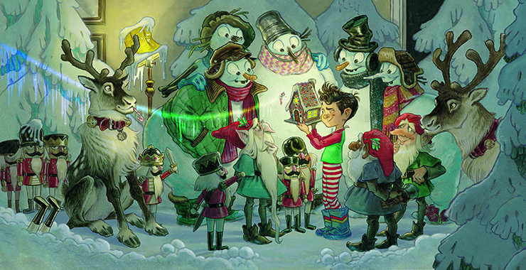
It seems simple but, at an abstract level, the orientation of a piece is important. Tall vertical images can lift a viewer up or down while a horizontal layout can help give a sense of a wide-open space.
Lines and other elements within the piece can work with, or against, the orientation. Because so many of us view stories in the movie theater, television or device, I often resort to a horizontal format to give a cinematic feeling to my images.
For more pointers, see Lynn Chen's tips for building creative confidence in your art and Greg Manchess's art tips for dynamic paintings. No time to practise? See our ideas for quick creative exercises.
Get more tutorials in ImagineFX
This content originally appeared in ImagineFX magazine, the world's leading digital art and fantasy art magazine. ImagineFX is on sale in the UK, Europe, United States, Canada, Australia and more. Limited numbers of ImagineFX print editions are available for delivery from our online store (the shipping costs are included in all prices).
Article continues belowSign up to Creative Bloq's daily newsletter, which brings you the latest news and inspiration from the worlds of art, design and technology.

Multi-talented Tony is a bestselling author and illustrator. He was also the executive producer for TV versions of The Spiderwick Chronicles and WondLa.
You must confirm your public display name before commenting
Please logout and then login again, you will then be prompted to enter your display name.
