I hate minimalist branding but Blank Street has won me over
The sleek refresh perfectly suits the brand.

Sign up to Creative Bloq's daily newsletter, which brings you the latest news and inspiration from the worlds of art, design and technology.
You are now subscribed
Your newsletter sign-up was successful
Want to add more newsletters?
While I'm not typically a fan of minimalist design, some brands call for stripped-back branding, and one company that's nailing the aesthetic is Blank Street. A Gen Z favourite, the laidback highstreet coffee store knows its customers to a tee, championing chic, lowkey vibes with a deliciously Instagrammable aesthetic.
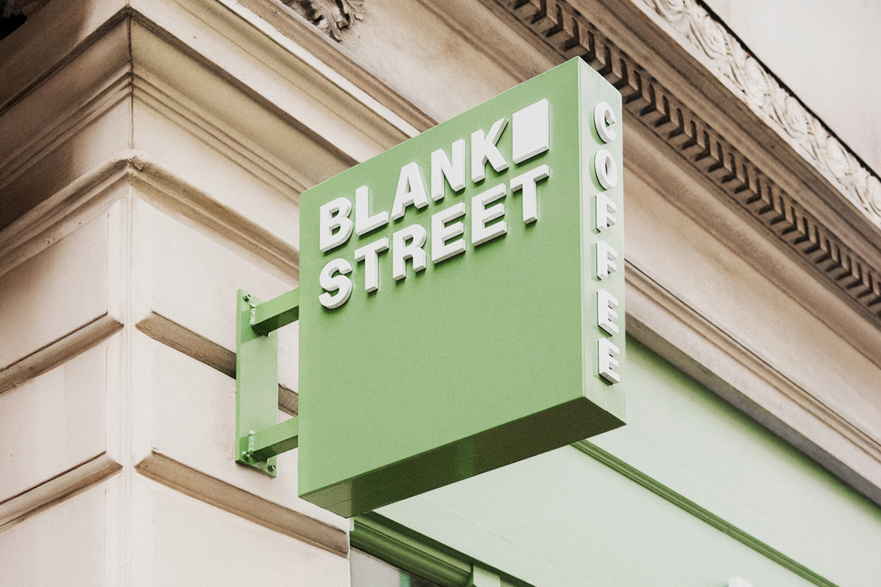
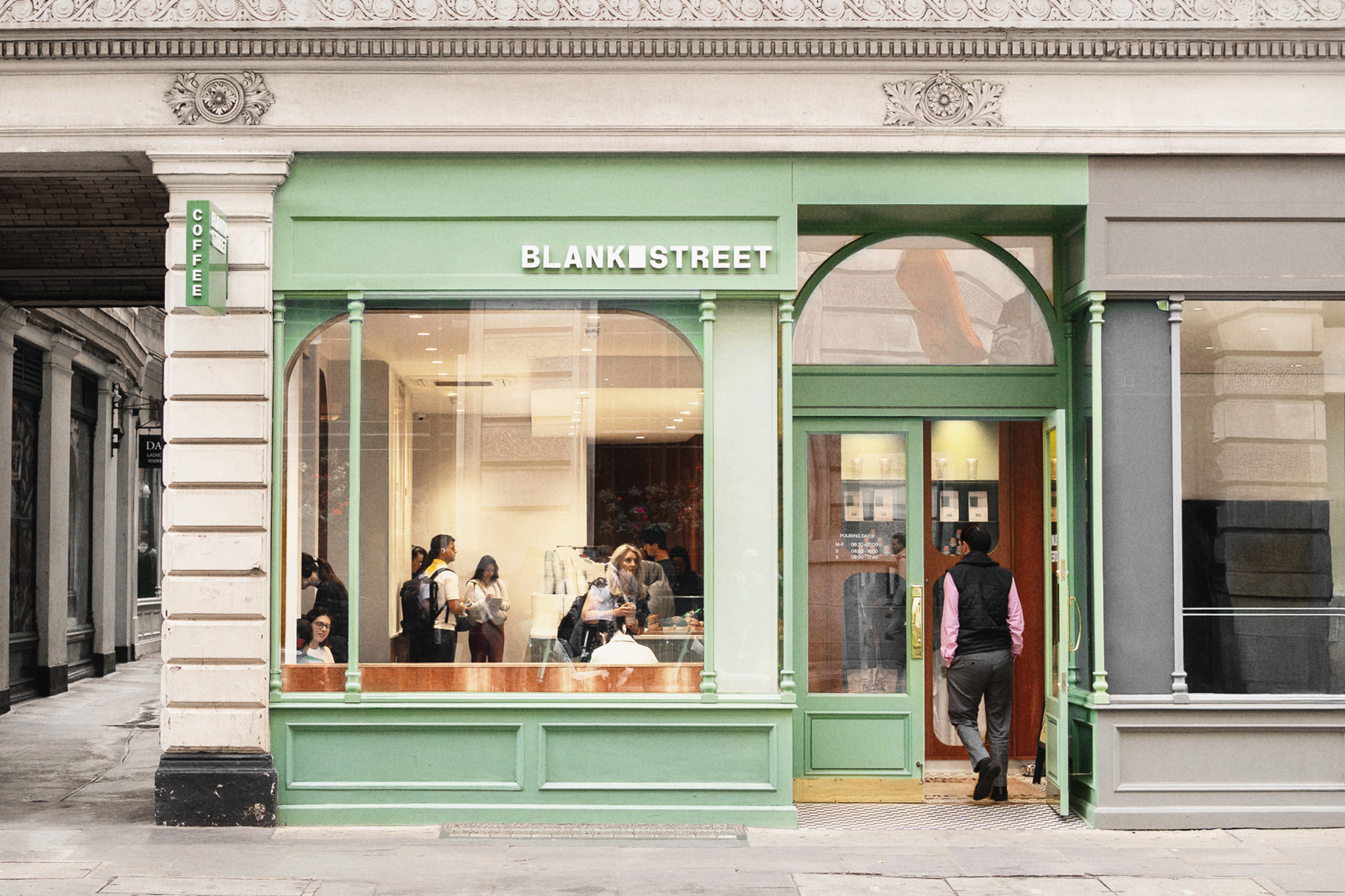
Recently unveiling its slick new rebrand, Blank Street reestablishes itself as a global lifestyle brand, owning its identity as a cult favourite. While simple and sleek, the new visual identity is a refined evolution that expertly balances sophistication with cohesion and stylistic cultivation.
Created in collaboration with global brand consultancy Wolff Olins, the new brand identity is centred around strengthening Blank Street's brand while building a scalable, future-proof new look.
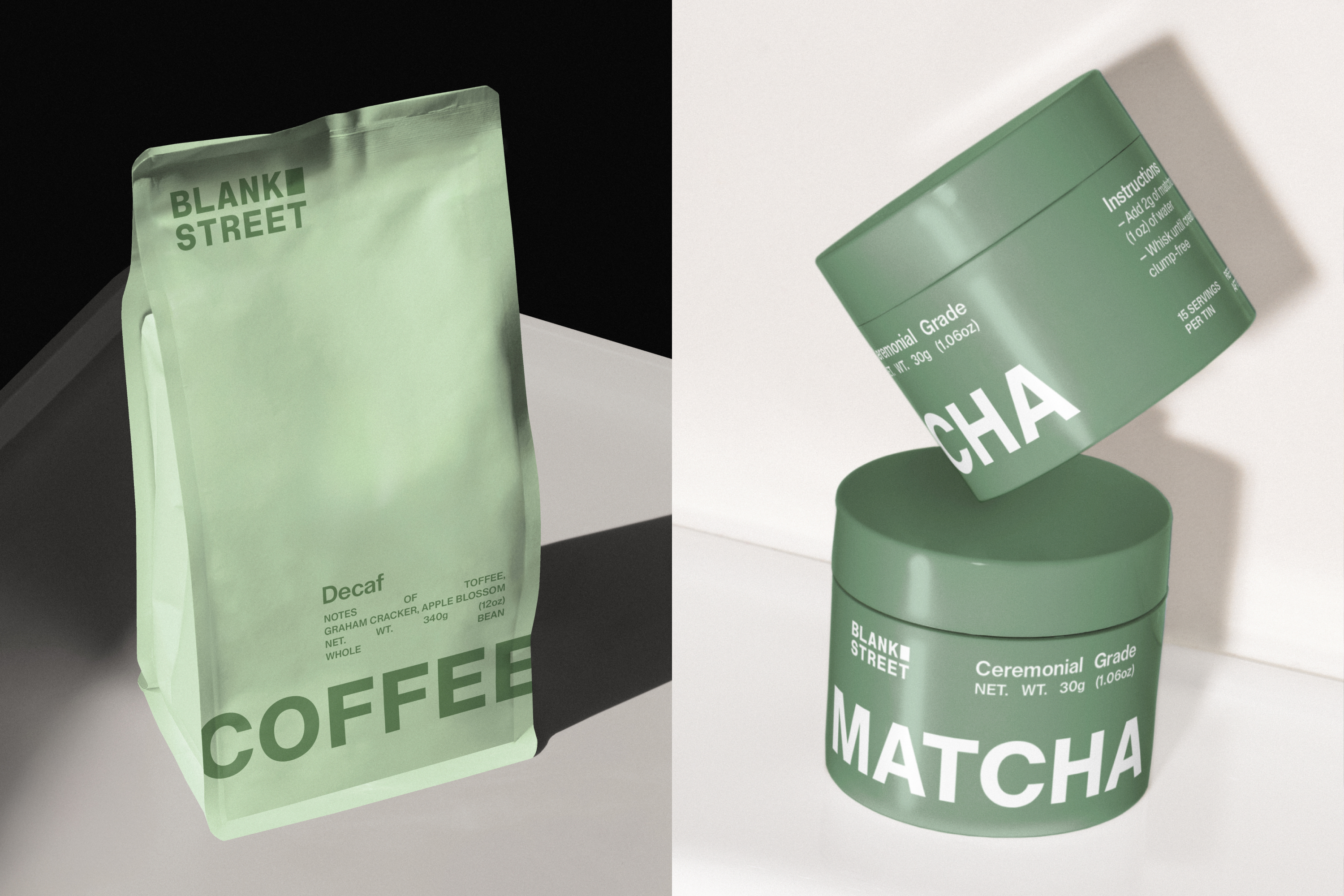
Article continues belowThe updated logo and symbol introduce a blank space "window" motif, acting as a visual cue for "imagination and possibility." Alongside it, custom typography developed in partnership with Due Studio, gives the brand its signature minimalist polish, using a combination of Regular Sans (primary) and Remarkable Sans (secondary) to balance playfulness with authority and legibility.
While Blank Street began as a humble coffee cart in Brooklyn during the early days of the pandemic, it's becoming a global brand known more recently for its matcha. In keeping with this, its new “Blank Street Green” takes centre stage throughout the identity, complemented by a secondary palette of green hues named after "the different colours a Blank Street cup takes on in morning, afternoon, and evening light."
“During the creative process, we set out to elevate the essence of Blank Street – transforming regular moments into something remarkable," says Wolff Olins' creative director, George Lavender. "Every detail draws inspiration from their unique story: from the shape of the window on their first coffee cart to the signature drinks that are beloved by their regulars,” he adds.

“This transformation was not about doing a 180, it was about becoming more ourselves," says Mohammad Rabaa, global creative director at Blank Street. "Our brand is built on tensions: function and form, utility and indulgence, sophistication and playfulness, and you’ll see these explored more critically through this new brand identity. This evolution takes the best parts of Blank Street and doubles down, creating a more cohesive brand experience that feels both exciting and familiar,” he concludes.
Sign up to Creative Bloq's daily newsletter, which brings you the latest news and inspiration from the worlds of art, design and technology.

For more design inspiration from Wolff Olins, check out our interview with their global executive creative director, Emma Barratt or take a look at their sleek brand refresh for Lloyds.

Natalie Fear is Creative Bloq's staff writer. With an eye for trending topics and a passion for internet culture, she brings you the latest in art and design news. Natalie also runs Creative Bloq’s 5 Questions series, spotlighting diverse talent across the creative industries. Outside of work, she loves all things literature and music (although she’s partial to a spot of TikTok brain rot).
You must confirm your public display name before commenting
Please logout and then login again, you will then be prompted to enter your display name.
