Behold, the drinks brand making Papyrus cool again
Fhirst proves “health” and “soda” can be a joyful combination.

Sign up to Creative Bloq's daily newsletter, which brings you the latest news and inspiration from the worlds of art, design and technology.
You are now subscribed
Your newsletter sign-up was successful
Want to add more newsletters?
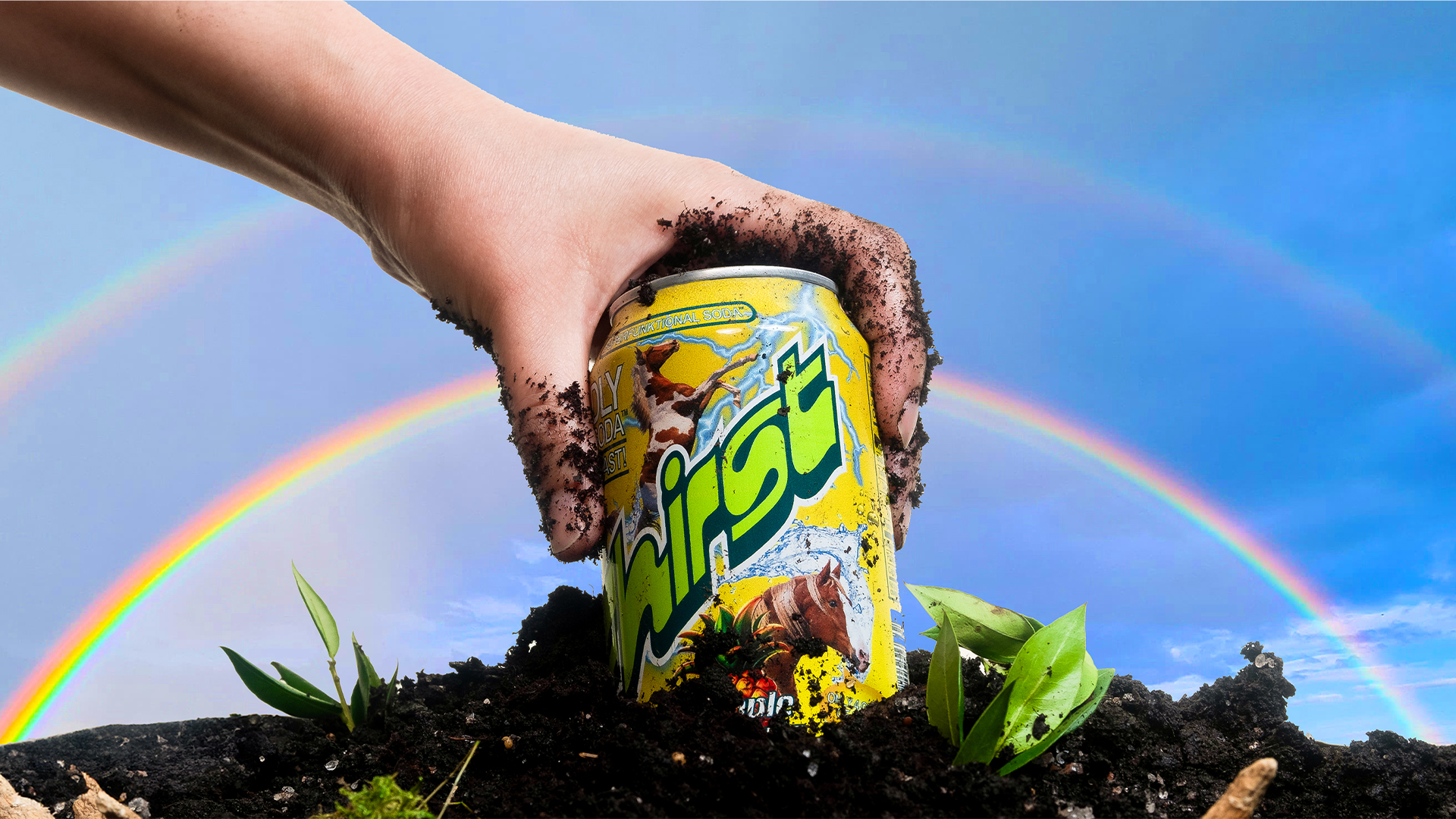
Today's hottest drinks trend is all about prebiotic pop, with kombuchas, flavoured water, and juices invading our shelves. However, as with many health brands, they tend to take the minimalist (and visually underwhelming) design route. Popping a well-needed dose of fun back into the sodasphere, 'superfunktional' drinks brand, Fhirst bursts onto the scene with its vibrant packaging and bold brand voice to add some flavour to the mix.
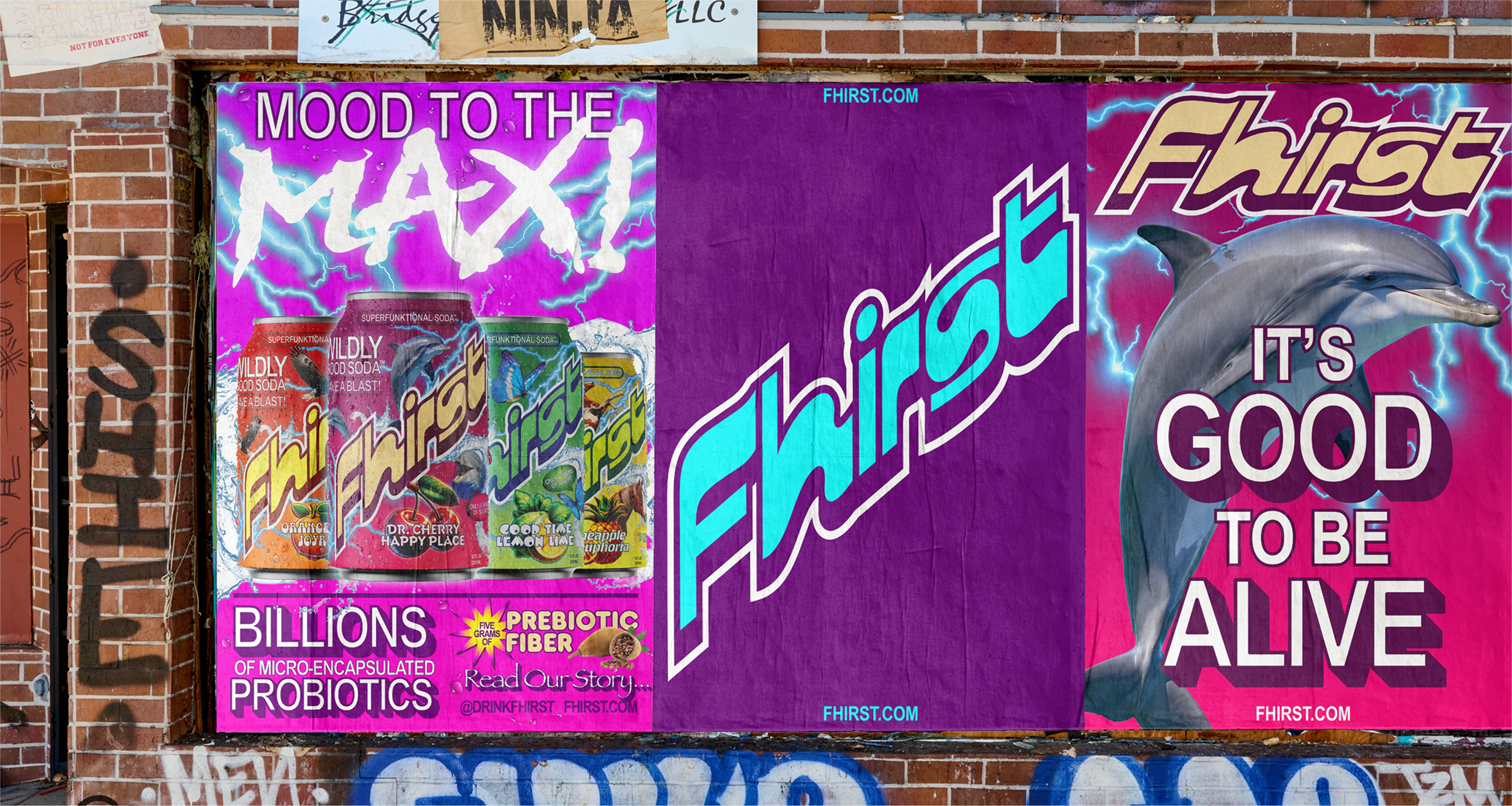
In a crowded beverage market, packaging design is a brand's secret weapon, and Fhirst expertly demonstrates how to stand out. With an energetic voice, vivid colours and playful visuals, the drinks brand bucks the trend to make a standout identity that's wonderfully refreshing.
Created by Mother Design in the USA, Fhirst's rebrand centres around uniting the polarised worlds of "health" and "soda" branding. Mark Sloan, head of design at Mother Design, tells Creative Bloq this was achieved "by pulling visual cues from both and letting them play off each other. From the health side, we leaned into signals of credibility – like clear typography, layered information, and a structured architecture that communicates function without feeling clinical."
Article continues below"From the soda side, we brought in energy and joy – bright color gradients, an expressive wordmark, bold flavor language, and even character illustrations that channel the playful spirit of mainstream soft drinks," he adds.
"The balance comes from not letting one side dominate. Too much “health” and it risks feeling sterile; too much “soda” and it loses its functional edge. By holding both in tension, the identity feels credible enough to trust but vibrant enough to crave – making gut health look less like medicine and more like a treat you actually want to reach for," Mark continues.

Central to the visual identity is the brand's new wordmark, inspired by the Motter Regatta typeface. This vibrant, playful typeface is paired with familiar fonts of "bygone 90’s health-food store signage", bringing a timeless retro vibe without feeling stale or derivative.
"Bringing back 90s typefaces like Papyrus was about flipping expectations.," Mark says. "In wellness, you often see stripped-back, minimalist design that signals 'clean' but can also feel cold or exclusive. By contrast, Fhirst wanted to celebrate gut health with joy and inclusivity. Using typefaces which had inherent energy – but which had been overused, even ridiculed over the years – gave us a way to present them in a new light."
Sign up to Creative Bloq's daily newsletter, which brings you the latest news and inspiration from the worlds of art, design and technology.
"Papyrus in this context isn’t ironic; it’s a reminder that design doesn’t have to be precious or perfect to be powerful. When treated with bold colors, layering, and a sense of humor, these 'uncool' typefaces suddenly feel fun, nostalgic, and approachable. It helped us break from the category clichés and create an identity that people can connect with on a gut level – literally and emotionally."
Alongside Fhirst's dynamic brand voice, gesturing to the ‘living’ nature of its probiotic content, the visuals create an immersive, transcendental brand experience. From animal mascots to vivid colour gradients, each touchpoint carries a visceral energy that embodies joy.
"That’s the beauty of literally being placed alongside our fellow better-for-you sodas," says Danielle Horanieh, managing director at Mother Design. "There’s an inherent message that is signalling what it is but the whole purpose of this work was to get people to notice and pick up the can." she continues.
"Our favorite part of this project has been working with incredibly brave, creative and brilliant people like Steven & Catherine. Their dare-to-be-different attitude is what allowed us to create something so wildly expressive and joyful. The process from start to finish was, appropriately, a blast!" Danielle adds.

Natalie Fear is Creative Bloq's staff writer. With an eye for trending topics and a passion for internet culture, she brings you the latest in art and design news. Natalie also runs Creative Bloq’s 5 Questions series, spotlighting diverse talent across the creative industries. Outside of work, she loves all things literature and music (although she’s partial to a spot of TikTok brain rot).
You must confirm your public display name before commenting
Please logout and then login again, you will then be prompted to enter your display name.
