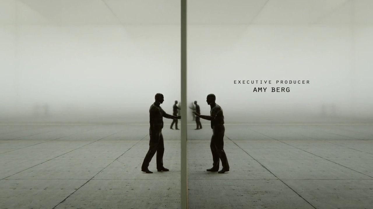
Movie title sequences set the tone, atmosphere and characters of a film for the audience. The likes of Saul Bass and Kyle Cooper have set the highest of movie title standards and as you'll see from this list, many graphic designers have clearly been influenced by them, while creating a new breed of iconic and culturally relevant movie title sequences of their own.
Here – in no particular order – we pick some of the best movie title sequences ever created and professional designers tell us why they work. And if you want to nerd out further, take a look at our collection of the most imaginative movie wallpapers.
01. Spider-Man: Into the Spider-Verse
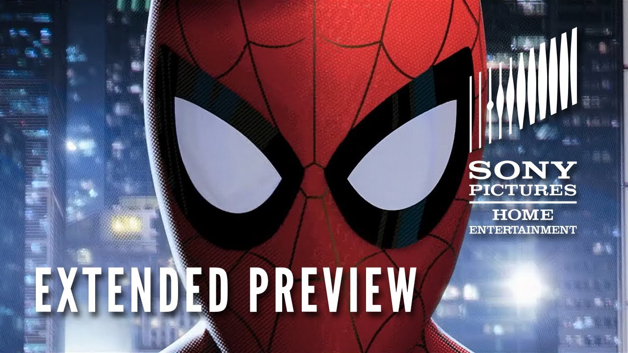
- Studio: Sony Pictures
- Sequence Designer: Devastudios
- Year of release: 2018
More of an intro than a title sequence, the beginning of the Academy Award-winning Spider-Man: Into the Spider-Verse does a glorious job of bringing you up to speed. There's an only slightly tongue-in-cheek potted history of Spider-Man, encompassing not only Peter Parker's character but also the larger franchise, with some fantastic nods to highs such as that '70s theme song and lows like a terrifying Spider-Man ice lolly, as well as animated recreations of iconic scenes from previous Spider-Man films.
The sequence features some beautifully executed glitch action and liberal use of halftone and visual sound effect flashes to emphasise the comics feel, and it all culminates in a shot of the Spider-Man we all know and love. "There's only one Spider-Man," he says, "and you're looking at him." Wink to camera, and then cut to... Miles Morales, a completely different Spider-Man! Perfect.
02. Dr. No
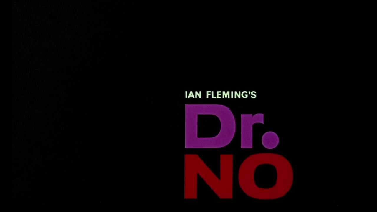
- Studio: United Artists
- Sequence Designer: Maurice Binder
- Year of release: 1962
The original James Bond movie kicked off a franchise that's still just about limping along to this day, and in its title sequence there's plenty you'll recognise. There's the iconic gun barrel sequence, there are sexy dancing ladies in silhouette form and of course there's the James Bond theme by Monty Norman; basically you can see most of the elements that would form the template for the rest of the series' openings.
However a good portion of the sequence seems more influenced by Saul Bass than anything else, combining typographic elements with animated patterns consisting of simple coloured circles in a strict grid layout. The result is something that doesn't quite fit with most of the other films, and that might be for the best.
03. Anne with an E
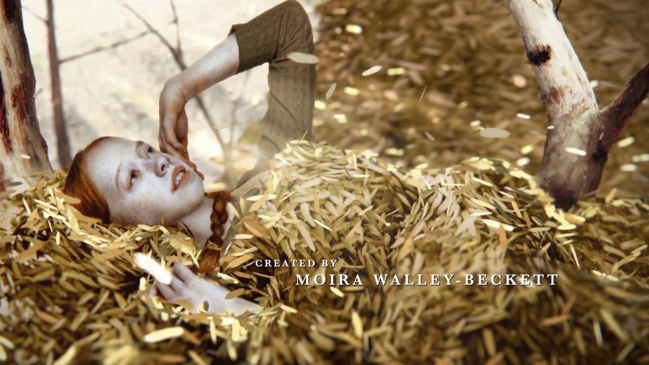
- Studio: Imaginary Forces
- Sequence Designer: Alan Williams
- Year of release: 2017
Alan Williams worked as creative director on the title sequence for Anne with an E, a TV show based on the novel Anne of Green Gables about an imaginative girl who loves to immerse herself in nature. For this sequence Williams sought to bring the natural texture of real paintings into the 3D space.
“Looking outside the standard pool of Photoshop artists in NYC, we wanted to find an authentic, handpainted style that would speak to the humanity of this character,” says Williams. The work of artist Brad Kunkle was selected for its depth and realism and also its use of gold and silver leaf, which creates interesting reflections.
“We were always trying to find a balance between retaining the beauty of Brad’s artwork and introducing dimensionality, moving reflections and dynamic lighting through CG,” Williams tells us. Brad Kunkle created additional paintings especially for the sequence and also served as art director, helping the team to ensure that his style was preserved.
“Our CG artist used Cinema 4D and Maya to sculpt geometry that matched the contours of the objects in Brad’s work. Once modelled, we then projected these painted elements onto them. There was a bit of digital painting needed to fill in portions of the paintings due to the addition of camera movement,” Williams explains.
“It was our CG teams’ ability to practise restraint that I am most proud of. Yes, we could have had the camera move more dynamically throughout each scene – and we tried – but very quickly Brad’s perfectly composed scenes felt off, fighting against the overall authenticity and cohesiveness of the piece. We even rigged and animated our Anne character but found it no longer read as a painting, feeling digital and uncanny.”
The result of this restraint, plus the presence of Brad Kunkle as art director, is a 3D sequence with beautiful movement and light that preserves the natural feel of the original works.
04. Jessica Jones
- Studio: Imaginary Forces
- Sequence Designer: Arisu Kashiwagi
- Year of release: 2015
Director and motion graphics designer Arisu Kashiwagi was lead designer on the title sequence for Marvel’s Jessica Jones, which, like the Anne with an E titles, uses paintings brought into the 3D space to convey something of the essence of the show’s protagonist.
For the initial concept design, Arisu and the team at Imaginary Forces sought to depict the nature of Jessica’s work as a private detective, sneaking around and peeping through the windows of Hell’s Kitchen. “A lot of the compositions are designed to carry a voyeuristic tone,” she tells us. “The vignettes would be blocked by some object in the foreground or enclosed inside a door or window. So you never saw the scene in full; it was always a partial view surrounded by a sea of black negative space.”
Jessica Jones is a dark story of a human psyche damaged by trauma and abuse – Jessica has PTSD and drinks heavily – so the team looked for ways to hint at the vulnerable aspects of her character.
“We asked ourselves, what does PTSD look like? How would the world look through her point of view? From there, I explored a direction where layers of paint were smeared across various vignettes in Hell’s Kitchen. Paint became the driving visual metaphor for Jessica Jones’ blurred visions, and acted as a transitional element between the scenes. Incorporating negative space was intentional – it symbolised pockets of her blackout.”
05. Black Sails
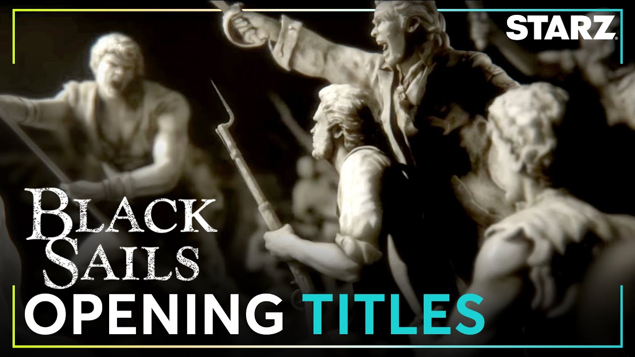
- Studio: Imaginary Forces
- Sequence Designer: Karin Fong and Michelle Dougherty
- Year of release: 2014
Karin Fong sees the Black Sails titles as a milestone in terms of the capabilities of CG tools. “So many people thought we shot that sequence, which was extremely flattering,” she says.
“When we first concepted it we drew these elaborate baroque statues and we considered getting craftspeople to make them, or printing them with a 3D printer and shooting them. But we worked with an amazing team of lighting and modellers and were able to get those details just right in CG, which I don’t think even a decade ago would have been as realistic or feasible as it was for us just a few years ago.”
06. Counterpart
- Studio: Imaginary Forces
- Sequence Designer: Karin Fong and Michelle Dougherty
- Year of release: 2018
Recently, Fong directed the title sequence for the new Starz show Counterpart, a science fiction espionage thriller in which a UN bureaucrat discovers his agency is guarding a crossing point to a parallel dimension.
Fong tells us that it was important to the show’s creators that, despite the sci-fi themes, the sequence felt grounded in reality, so it was important to capture the essence of the real-world setting – which was a mundane government office in Berlin. Once again, bringing natural textures into the 3D space was the key to creating a sense of authenticity, so Fong and her team photographed the set.
“I love being able to take what is photographic – textures and real things from the analogue world – and merge it with the digital world,” says Fong. “We were able to shoot textures – the wood, the brass, the concrete – that sort of typify that Eastern European style bureaucracy, and bring them into the CG environments we were building that were more metaphorical.”
The sequence brings natural textures as well as motifs from East German architecture into a surreal space in which figures move past each other on different planes, perhaps interacting, perhaps not.
“[We had] the production designer from Mad Men so every detail of colour and texture was considered on the set,” she tells us. “To be able to bring that in and work with those same very tactile things within CG was amazing. Our lead modeller and animator Jake Ferguson was able to concept up spaces with different materials and lighting quickly, and in a way that was very fluid – that’s getting better and better all the time.”
07. The Pink Panther
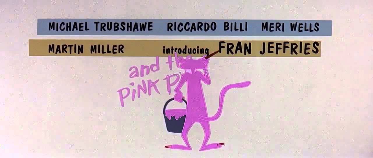
- Studio: Mirisch Company/United Artists
- Sequence Designer: DePatie-Freleng Enterprises
- Year of release: 1963
Blake Edwards' 1963 comedy The Pink Panther is a generally uninspired crime caper that's redeemed by two things: Peter Sellers' relentlessly funny performance as Inspector Clouseau, and its spectacular title sequence that marries Henry Mancini's instantly recognisabletheme tune to animation by the legendary Friz Freleng.
The creator of iconic cartoon characters such as Yosemite Sam, Speed Gonzales and Sylvester and Tweety, Freleng produced an inspired cartoon short for The Pink Panther, turning the film's titular diamond into an actual pink panther who proved so popular that he swiftly became the star of his own long-running series of cartoons, as well as featuring in the titles of nearly all of the Pink Panther movie sequels.
08. Guardians of the Galaxy Vol. 2
- Studio: 20th Century Fox
- Sequence Designer: Framestore
- Year of release: 2017
The 2017 sequel to Marvel's Guardians of the Galaxy kicks off with an epic title sequence that cleverly combines 11 different visual effect shots into a single tracking shot. And while in the normal course of things we'd be concentrating on the pitched battle between the the Guardians and a massive tentacled beast, the title sequence neatly focuses instead on Baby Groot dancing to ELO's 'Mr Blue Sky', virtually oblivious to the mayhem unfolding around him. It's joyful, explosive stuff that sets the tone for the rest of the movie perfectly.
09. Vertigo
- Studio: Paramount Pictures
- Sequence Designer: Saul Bass
- Year of release: 1958
"Alfred Hitchcock may have been the master of suspense, but Saul Bass was undoubtedly the master of suspenseful title sequences," says freelance graphic designer and illustrator Joe Stone.
"Everything from the shifty eyes, melodramatic music to the swooping typography give a sense of unease, culminating in the shifting, spiralling shapes and patterns that twist in and out of Kim Novak's pupils. Still effective and tense more than 50 years later, this is one of the most iconic title sequences committed to film."
10. JCVD
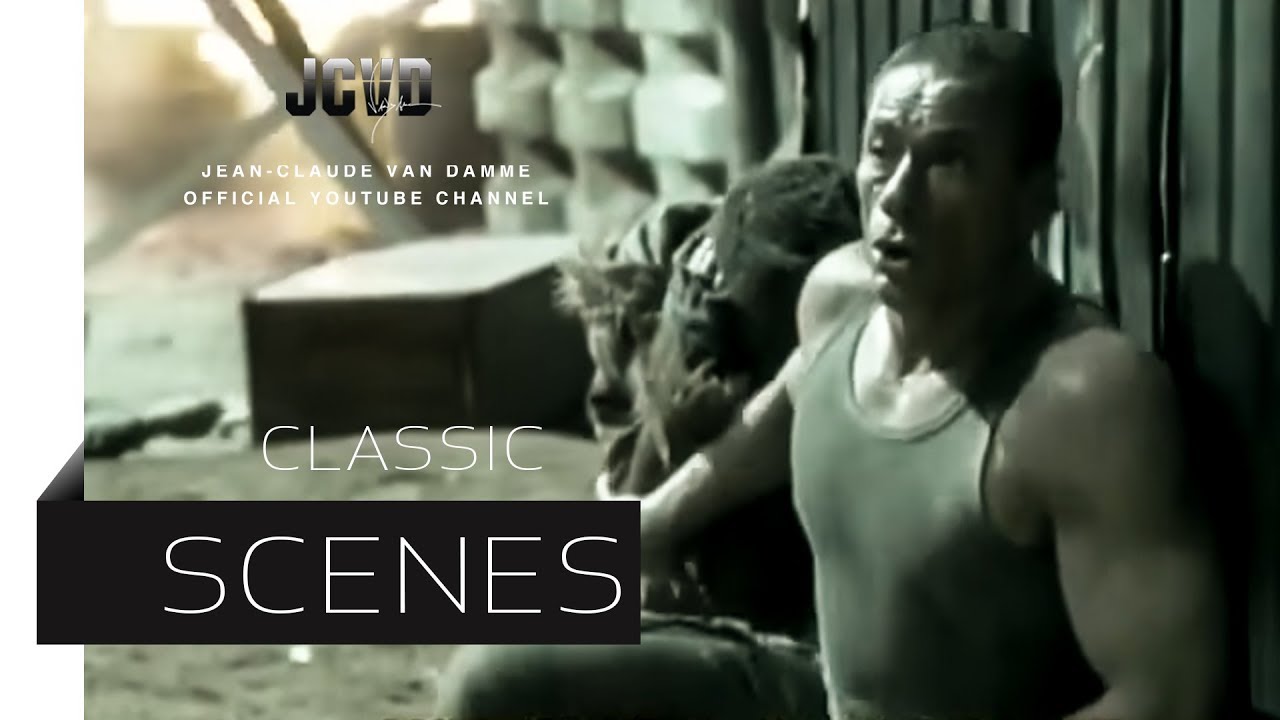
- Studio: Gaumont
- Sequence Designer: Gaumont
- Year of release: 2008
"In 2008 Jean-Claude Van Damme was a laughing stock," comments Erskine Design designer Tim Maggs. "He hadn't had a hit film since 1994's 'Time Cop' and since then had produced a stream of straight-to-video garbage. If anyone was going to take this film seriously, the title sequence for JCVD had to take on the unenviable task of restoring his pride and possibly throw in a laugh or too at the same time.
"A three and a half minute one-take non-stop action-packed choreography whirlwind awaits. This insane crescendo of aggression building to Van Damme's escape – only for the scene to be ruined by a clumsy extra at the last moment – and you to realise that this was all a deceitful ruse.
"The accompanying military font and contrasting backing soul track 'Hard Times' play right into the scene's hands, pushing you further into your initial presumption that this is just another Van Damme trash fest."
11. Batman
- Studio: Warner Bros.
- Sequence Designer: Richard Morrison
- Year of release: 1989
"This was one of the first films I ever watched at the cinema, and I can clearly remember the impact it had on the unnerved audience," says Autodesk 3D solutions engineer Jamie Gwilliam. "We are confronted by distinctive yellow text on black/blue tones, which echo the bold bat-wing logo. We are then left for two and a half minutes, unsure of what we're witnessing. Is it Gotham City? Is it the bat-cave?
"The slow camera pace symbolises the measured sweeping motion of a bat soaring over its prey, accompanied by intense and evocative audio. We are flung into the film's dark tones, which we then witness for the remainder of the 1989 cult-classic.
"We're confronted by bold graphics, which complement the narrative, whilst ensuring we proudly focus on the movie crew's talents, seamlessly building the audiences suspense."
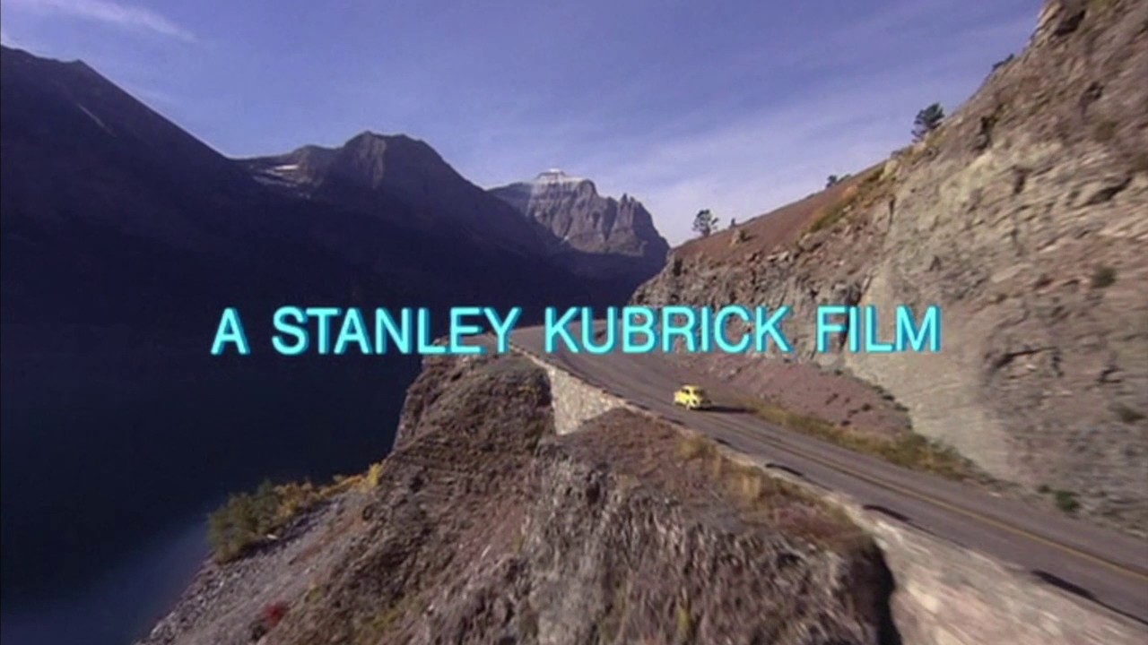
12. Star Wars
- Studio: Lucasfilm & 20th Century Fox
- Sequence Designer: Dennis Muren
- Year of release: 1977
"The infamous 'crawl' has by now become an unmistakable part of contemporary pop culture, and has been praised, analysed and parodied in equal measure," says graphic designer Tom Muller. Still, even so many years on, the brutal simplicity of the titles haven't lost any impact, especially coupled with the equally revered John Williams score.
"The perfect timing of the hard cut between 'A long time ago in a galaxy far, far away...' and the bombastic reveal of the title followed by the 'story so far' synopsis crawling over the screen (a nice homage to old pulp serials) make no qualms about the fact you're about to see something of epic proportions."
13. Mission Impossible: Ghost Protocol
- Studio: Paramount
- Sequence Designer: Kyle Cooper
- Year of release: 2011
Graphic designer Andrew Kelsall says: "The great thing about the sequence – apart from only starting a full 10 minutes into the feature – is the explosive start when a fuse is lit as the music begins. This fuse is subsequently featured throughout the entire sequence and ties the whole thing together, with the camera following it wherever it goes.
"With burning circuit boards, skyscrapers with graphically-overlaid blueprints, an underwater shot, bullets, missiles and fast cars, the viewer tends to miss the fact that some of the movie ending (such as the circular car park) is featured in these opening credits! Overall, a captivating and enthralling sequence."
14. Enter the Void
- Studio: Fidélité Films
- Sequence Designer: Tom Kan
- Year of release: 2009
An onslaught of typographic design, Tom Kan's opening title sequence for Gaspar Noé's Enter the Void is certainly not for the faint-hearted.
The typographical choices were picked to depict each team member's personality and style throughout the film and is often described as a homage to their hard work throughout the filming process. The finishing touch of LFO's 'Freak' perfectly sets the tone for the rest of the movie.
15. Scott Pilgrim vs. the World
- Studio: Universal Pictures
- Sequence Designer: Richard Kenworthy
- Year of release: 2010
"I felt like Knives Chau when I first saw this sequence," Stone comments. "The hyper-kinetic, multi-coloured onslaught of text and imagery, soundtracked by Beck's incredible interpretation of Sex Bom-omb, was just the perfect way to start the film.
"The references to each character played by the actor whose name is displayed is such a brilliant touch and offers tantalising hints at things to come. Everything about it matches the stylised comic-book world of the movie so well, which gets the film off to a great start."
16. Lord of the Rings
- Studio: Miramax Films
- Sequence Designer:
- Year of release: 1978
Artist and musician Daryl Waller says: "This was released the year that I was born. My Dad taped it onto VHS from the TV in the 80's. It thrilled and terrified me in equal measure. The opening sequence is a mixture of live action in silhouette and animation in black deep red.
"A voice tells the story of the ring so far. This film has haunted me over the years, the way it looks, the music, the creepy atmosphere of it. Later on at college I studied NC Wyeth, who influenced Bakshi; and I made some work directly influenced by both."
17. Se7en
- Studio: New Line Cinema
- Sequence Designer: Kyle Cooper
- Year of release: 1995
"I admit that this one has become almost 'required viewing' if you ever discuss opening titles, and rightly so," Muller comments.
"The maniacal amount of detail that went into the title sequence (with a vast amount of props created just for giving the audience a few glimpses into John Doe's deranged mind), coupled with the remixed NIN track 'Closer', make you shift uncomfortably in your seat, anxious for what's to be unleashed, and in one fell swoop it made title design cool and relevant again."
18. Catch Me If You Can
- Studio: Dreamworks
- Sequence Designer: Kuntzel and Deygas
- Year of release: 2002
"The first movie title scene that came to mind for me was Catch Me If You Can, which by its simple illustrative nature is highly memorable," says graphic designer Jacob Cass. "The scenes take you through a sneak peak of the movie which always helps set the mood and the jazzy soundtrack tops it off perfectly."
19. Touch of Evil
- Studio: Universal
- Sequence Designer: Orson Welles
- Year of release: 1958
VFX artist Paul Franklin says: "The opening shot of Orson Welles' film Touch of Evil isn't really a title sequence in the strictest sense, but in it's tightly choreographed three minutes and 20 seconds it does a masterful job of setting up the tension at the heart of the story.
"From the moment we see an unknown pair of hands literally starting the clock ticking through to the climax of the scene the camera is in constant, restless movement. Despite Venice Beach standing in for Mexico – and Charlton Heston standing in for a Mexican – the image is compellingly authentic, alive with an excited anticipation of what is to come."
20. Napoleon Dynamite
- Studio: Fox Searchlights Pictures
- Sequence Designer: Jared Hess
- Year of release: 2004
When Napoleon Dynamite was first made, the budget was so tight that the filmmakers didn't actually have an opening title sequence.
Once the film sold to Foxlight, Jared Hess was able to film the iconic titles that have gone on to influence many a film. Sticking to the film's organic look, the sequence features an array of objects including burgers, highschool IDs and ready meals. Not bad for a title sequence that was shot just with a 35mm camera and a Kino Flo in the basement of Jared's close friend and photographer Aaron Ruell.
21. Kiss Kiss Bang Bang
- Studio: Warner Bros.
- Sequence Designer: Danny Yount
- Year of release: 2005
"Stylish and witty, this clever sequence has its tongue planted firmly in its cheek," Stone says. "Borrowing heavily from Saul Bass' iconic style, the wonderful animation employs a bold colour scheme and great typography to playfully poke fun at the film-noir genre while still giving a brief overview of the story and locations the film takes place in. It's a perfect match for the funny and intelligent film."
22. Fight Club
- Studio: Fox 2000 Pictures
- Sequence Designer: Kevin Tod Haug & P. Scott Makela
- Year of release: 1999
3D World editor Rob Redman says: "Everybody knows the first rule of Fight Club, but the opening sequence is one of the most memorable from the '90s – so let's break the rule and talk about it....
"The titles run for a minute and a half and set the scene and tone of the film perfectly. Starting off at the fear centre of the narrator's brain – the viewer is taken on a rollercoaster ride through a beautifully dark and disturbing ride out to the skull, complete with neuron firing 'lighting'. Technically the shots were pretty cutting edge at the time. VFX supervisor Kevin Mack led the team from Digital Domain who used ray tracing for depth of field effects.
"The actual neural pathways were plotted using L-systems, which were more usually used for creating trees and natural growth patterns. The feeling of being taken on a ride meant some compromise with the technical accuracy of the biological aspect of the shots (supplied by medical artist Kathryn Jones), but the final result leaves a real sense of a white water journey being taken.
"The overriding impression you are left with is one of slight unsettled anxiety and unease and you're left in no doubt that you're about to watch film with themes of darkness and introspection."
23. Juno
- Studio: Fox Searchlight Pictures
- Sequence Designer: Gareth Smith & Jenny Lee
- Year of release: 2007
Love it or hate it, Juno has become a cult classic since its release back in 2007. The opening titles perfectly set the scene of teenage innocence and instantly depict Ellen Page as the main character.
As she walks through her home town, designers Gareth and Jenny use a mixture of 2D and 3D animation along with hand-drawn illustrations. The song All I Want is You by Barry Louis Polisar finishes off the title sequence perfectly, as Ellen Page effortlessly glides into live action.
24. The Shining
- Studio: Warner Bros.
- Sequence Designer: Greg McGillivray & Garrett Brown
- Year of release: 1980
"This stands out as one of the best title sequences ever to me, not to say in particular for the horror/thriller genre," Muller says. "It's a deceptively simple and economic approach that, in a few minutes, proves to be the perfect setup for the film.
"The flyover sequence, combined with Wendy Carlos' haunting synth score, hammer home the isolation of the characters within the vastness of the landscape. Whilst you're following the tiny car in an almost sublime landscape, the hints of Indian chanting add to the overall dreadful eeriness of the titles, enhanced by the cold credit sequence which rolls in reverse over the screen. You're almost relieved when you finally arrive at the Overlook Hotel - but then you still have to discover room 237."
25. Snatch
WARNING: Explicit content!
- Studio: Columbia Pictures Corporation
- Sequence Designer: Stuart Hilton
- Year of release: 2000
"Snatch begins with an ingenious title sequence," Tim Maggs comments. "Ignoring the convention of introducing the actors' names, it focuses instead on characters, thus giving the audience an immediate head start in understanding the complex plot.
"The titles flow seamlessly and quickly, interspersed with gritty, pop-art like freeze-frames. As well as introducing the characters, the title sequence cleverly shows their entwined connections whilst the motif of exchanged monetary objects alludes to a subliminal parallel desire the men all share."
26. 101 Dalmatians
- Studio: Walt Disney Productions
- Sequence Designer: Stephen Frankfurt
- Year of release: 1961
"Disney title sequences have always had incredible attention to detail – a convention that goes right back to the early days of the animation studio," Simon Jobling comments. "101 Dalmatians is a prime example of this. The aesthetics of the title sequence are typical of 1961.
"The retro feel of the typography and illustration, the way the score of the soundtrack audibly matches the animation motion – it really engages with the audience. It makes typically boring credits exciting, especially with the mood of the music."
27. The Girl with the Dragon Tattoo
- Studio: Columbia Pictures
- Sequence Designer: Neil Kellerhouse & Blur Studios
- Year of release: 2011
"Full of hints at story elements and references to the characters, it's easy to be overwhelmed by the sheer amount of imagery presented in this sequence," says Stone.
"From keyboards and phoenixes to blooming flowers and grabbing hands, it creates an abstract map of Lisbeth Salander's mind, all drench in thick black tar. Offset by tasteful and subtle typography and driven by Trent Reznor and Karen O's thumping version of Immigrant Song, it's a dramatic and intense start that sets the dark tone for the rest of the film."
Read more:

