Get up to speed with CSS Grid
This guide is here to walk you through the basics of the CSS Grid Layout Specification.
Sign up to Creative Bloq's daily newsletter, which brings you the latest news and inspiration from the worlds of art, design and technology.
You are now subscribed
Your newsletter sign-up was successful
Want to add more newsletters?
Over the past few years, it’s been interesting to watch web layouts take centre stage within the world of CSS. The main catalyst for this coming to the forefront is a better understanding by everyone of the importance of the user experience and content flow of any responsive website. Or maybe we’re in a post-float development world. First with Flexbox and most recently with CSS Grid layout options, our choices and abilities for thoughtful layouts are expanding greatly.

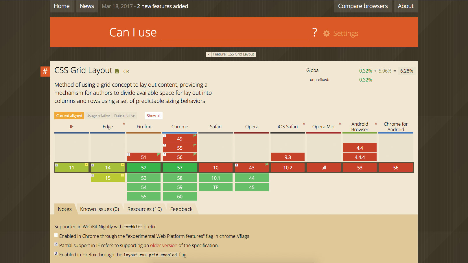
We’re still in the early days of Grid’s adoption in browsers. Visit caniuse.com/#feat=css-grid for some interesting numbers and notes around the current adoption.
It is currently supported on the WebKit Nightly if prefixed with -webkitand it looks like non-mobile browsers such as IE, Edge, Firefox, Chrome, Safari, and Opera will all have partial to full support in their next release. My hope is that relatively soon, the global support percentage will have gone up significantly from the current 6.28 per cent.
Article continues below 
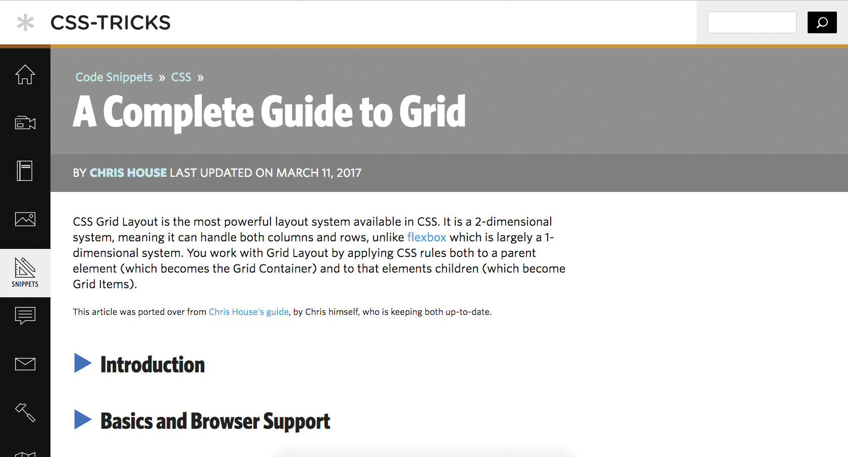
There are some helpful resources around CSS Grid. Luckily, css-tricks.com/snippets/css/complete-guide-grid has a complete guide, written and updated by Chris House.

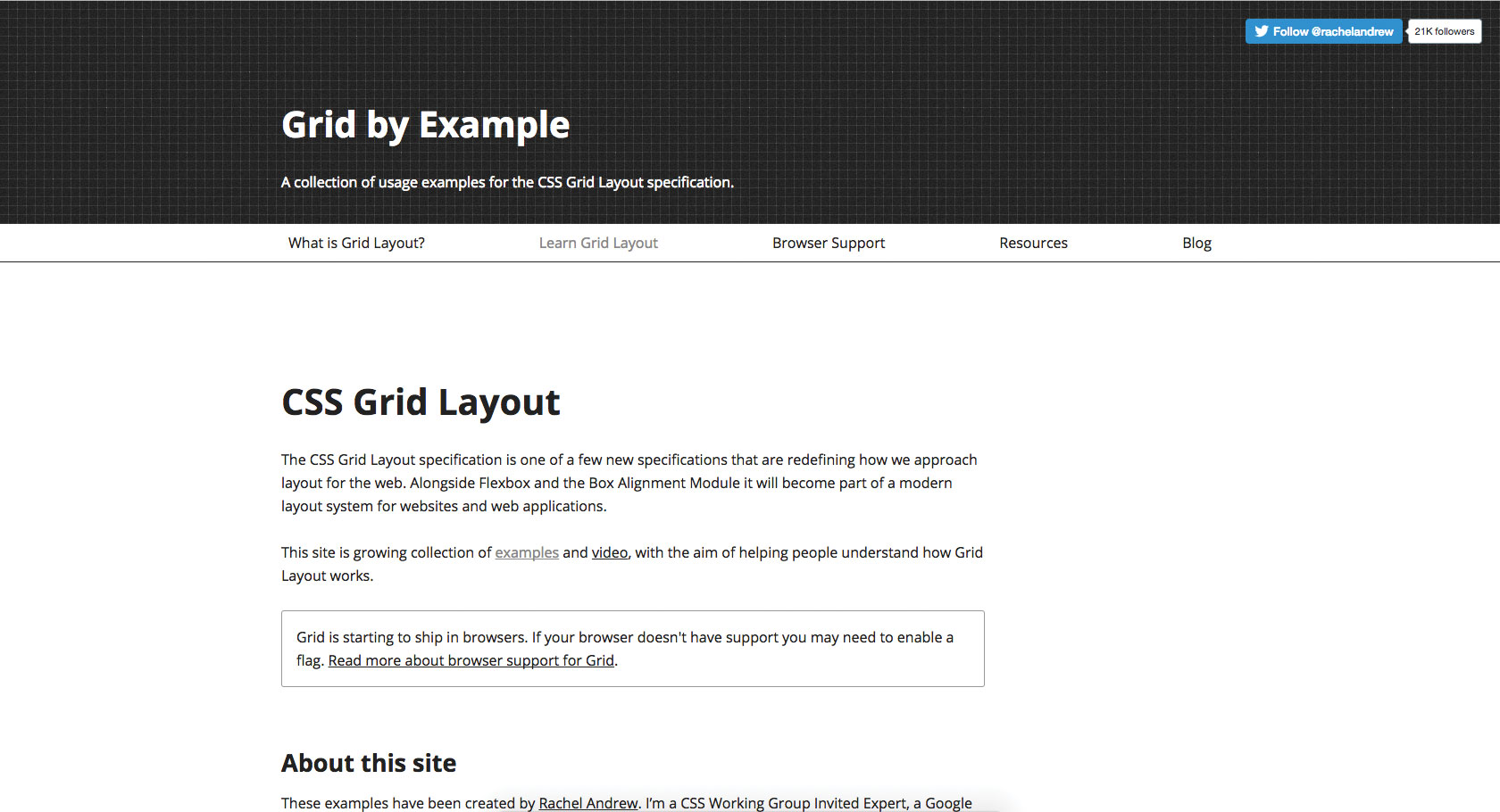
Also, for the more visually inclined, Rachel Andrew has done a phenomenal job collecting all resources around grid, with blog updates and, best of all, examples of common UI patterns. These resources should have you up and running in supporting browsers in no time.
This article was originally published in net magazine issue 293. Buy it here.
Related articles:
Sign up to Creative Bloq's daily newsletter, which brings you the latest news and inspiration from the worlds of art, design and technology.

Sam is a designer living in Austin, Texas, who speaks and writes extensively about web and product design, diversity, inclusion, and equity. In 2011, she wrote the first university course on the topic of Responsive Web Design. She is currently Design Director at thoughtbot, and serves on several design advisory boards in Austin.
